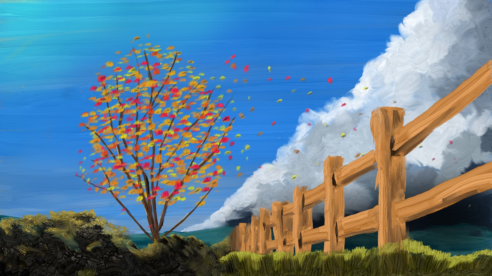
A vine maple in my yard made me think of skyrockets, with the limbs reaching into the sky and an explosion of fall colors in the leaves.
I worried that the explosion would lead the eye out of the picture, so I tried to create a loop with the leaves blowing into the distance and the converging lines of the fence, the clouds and the darkness leading back to the tree.
I used a worms eye view to make the converging lines lead to the base of the tree at the bottom of the painting so there would be plenty of room for the foliage and sky.
I like how you used the brush texture. Looks really great on the wooden fence, clouds and the mossy rocks. For the leave-shape this directional brush was maybe not optimal (the small straight-down strokes don’t look random or natural enough). The leaves flying away look better.
If the tree was intended to be the main focus, I must say he has a big competitor with the bright fence now, and the clouds are also a high contrast area at the bottom.
I see how you thought about leading the eye into the right direction, however it is a bit unnatural that a cloud front like this can be seen in the direction the wind is blowing. Usually the wind will blow such a rain front towards you, so here from right to left. The other side of the rain clouds often does not show such a clear frontline, but more dissolving into smaller clouds.
I am still trying to figure out which brushes look right together and which strokes. I try to use a limited set of brushes in a given painting, to kind of establish the language of the painting. I’ll try some other things for the leaves.
I’ll wait a little to decide what to do about the fence. I think if I had looked at the painting myself a few days after painting it I would have seen that the fence is a little distracting. Although I love the fence because it just painted itself with very few, clear brush strokes.
I think the dark values under the clouds can still work to lead the eye to the left. I might look at softening their contrast along the right edge, though.
The leaves started off blowing away to the left, carrying your eye right along with them. Intuitively, I knew it was the realistic thing to do. But I’m just not going to allow them to go that way. I’ll look into having them blow more in or out of the picture plane as alternatives to mostly going right. Or I’ll look into the “back of the weather front” idea you proposed if I can figure out how to maintain the radiating lines.
Thanks again for you critique, suggestions and helping me think about this.
Yes. I think you don’t have to repaint it entirely. If it is on a separate layer, like most of us digital artists like to do it, you could first try to just lower the saturation and maybe make it darker. (If not, a quick try with magic wand selection worked pretty well for me too, thanks to the distinct colour and high contrast). A fence that is exposed to sun and weather might be of a more pale brown or even greyish tone anyway.