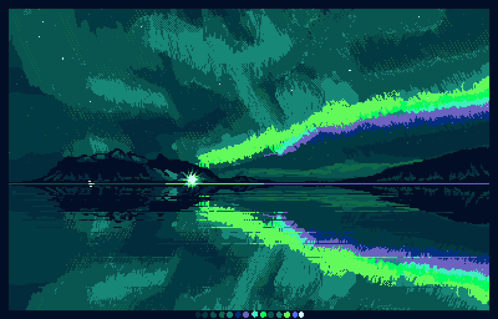
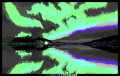
I originally drew this picture of the Aurora with a different palette to enter a contest to draw something using that particular palette, but I changed it to post here so it looks better (15 colours, 400x256 pixels).
The original palette was quite difficult to work with as it was mostly grey scale with just a few other colours. Perhaps I will pop that version below too.
I find it hard to do tweaking of colours like this in Krita and eventually resorted to Aseprite where I can use an indexed image and adjust the colours whilst seeing how they affect the image as I move the sliders. There are various ways to change them in Krita but it is not as easy as adjusting an indexed palette. I’d love to hear from anyone with experiences to share.
It looks pretty good! Especially the colors palette you are using. But I’m not a fan of how the aurora looked, maybe you can make a part of the aurora that fades so it look less harsh.
Hi @barn_owllys, I completely agree. If I had the freedom of palette choice to begin with the drawing would be totally different. Because of the lack of colour in the palette I attempted to do some dithering to get a bit more gradient, but it didn’t look very good, unfortunately. In the updated version I restricted myself to just changing the palette, because otherwise I would change the whole Aurora and may as well have started again.
@MangooSalade
Congratulations, this is now featured on the gallery wall.
May I have your permission to post this on K-A’s Mastodon and X accounts? If yes, I will credit your user name (unless you specify a different name). If no, no problem.
Hi @sooz, no problem, thank you. I was conflicted and I couldn’t actually bring myself to vote for this, as it is by no means my best work, just something I challenged myself with to use the difficult palette.