oh wow, I did not know even you could look inside G’mic code.
where can I take a look into it? I know almost nothing about G’MIC or it’s capabilities let alone the code of it.
I will google around to see if I can find something about it.
oh wow, I did not know even you could look inside G’mic code.
where can I take a look into it? I know almost nothing about G’MIC or it’s capabilities let alone the code of it.
I will google around to see if I can find something about it.
Here, you go:
#@cli ryb2rgb
#@cli : Convert color representation of selected images from RYB to RGB.
ryb2rgb :
  e[^-1] "Convert color representation of image$? from RYB to RGB."
  to_color
  f "red = R;
     yellow = G;
     blue = B;
     white = min(red,yellow,blue);
     red-=white;
     yellow-=white;
     blue-=white;
     maxyellow = max(red,yellow,blue);
     green = min(yellow,blue);
     yellow-=green;
     blue-=green;
     blue>0 && green>0?(blue*=2; green*=2);
     red+=yellow;
     green+=yellow;
     maxgreen = max(red,green,blue);
     maxgreen>0?(
       N = maxyellow/maxgreen;
       red*=N;
       green*=N;
       blue*=N;
     );
     red+=white;
     green+=white;
     blue+=white;
     [ red,green,blue ]"
#@cli rgb2ryb
#@cli : Convert color representation of selected images from RGB to RYB.
#@cli : $ image.jpg rgb2ryb split c
rgb2ryb :
  e[^-1] "Convert color representation of image$? from RGB to RYB."
  to_color
  f "red = R;
     green = G;
     blue = B;
     white = min(red,green,blue);
     red-=white;
     green-=white;
     blue-=white;
     maxgreen = max(red,green,blue);
     yellow = min(red,green);
     red-=yellow;
     green-=yellow;
     blue>0 && green>0?(blue/=2; green/=2);
     yellow+=green;
     blue+=green;
     maxyellow = max(red,yellow,blue);
     maxyellow>0?(
       N = maxgreen/maxyellow;
       red*=N;
       yellow*=N;
       blue*=N;
     );
     red+=white;
     yellow+=white;
     blue+=white;
     [ red,yellow,blue ]"
@Venn
are these sites good examples of what your looking for?
http://paletton.com/#uid=50O0w0kllllaFw0g0qFqFg0w0aF
https://www.canva.com/colors/color-wheel/
@Reptorian
I just finished implementing the other stuff and just did CMY now. Only now I caught your RYB formulas. Sorry.
But I have a question though about them. I went out on the internet and found and strangely found you talking about the same topic on another forum. I am not sure how out of date your comments are there considering any differences that might have occurred until now, but I kinda need to ask if those transformations are able to go back and forth and find the same value or they are like one way ticket? I ask because on my picker I am outside of krita so I do a redundancy check by default. So it impacts on how i may implement or even if I can implement at all.
it seems RGB and CMY are just 2 side of the same coin though. really curious.
@EyeOdin You’re talking about the discuss.pixls forum. The amount of info preserved is over 99.9%, there is some minuscule loss.
The evidence to support this:
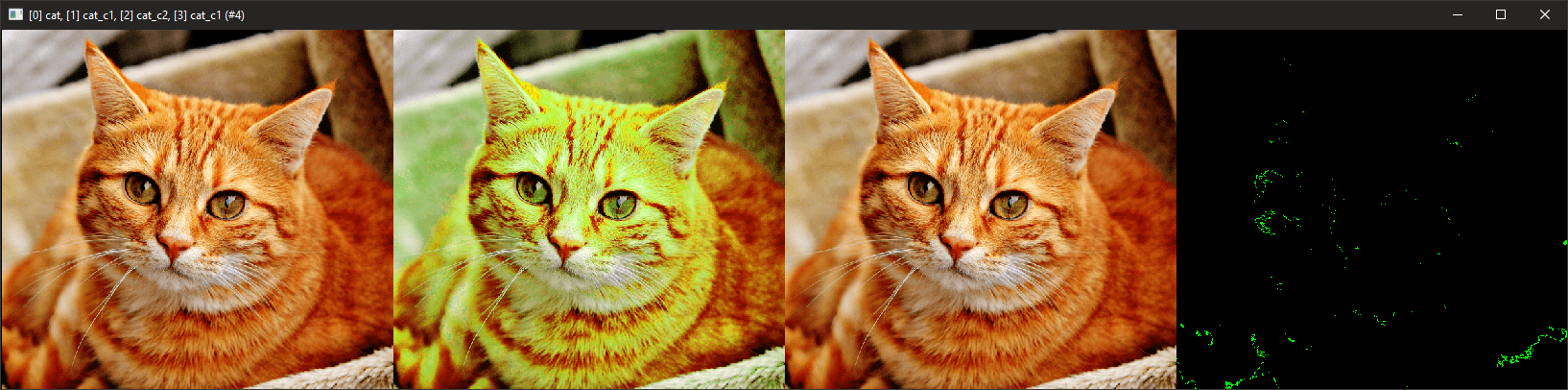
$ sp cat +rgb2ryb +ryb2rgb. +blend[0,-1] xor
A 0.1% error is very workable.
usually i am around 0.003% if I recall the values right but occasionally I would pop up to 0.05% and then the simplification would kick it making it worse that it is internally on odd numbers. But I think I can handle that amount pretty smoothly.
I think I have a color space with a larger error than that and it works, but I just did not measured it, I am afraid too.
From what i read I was left with the impression it could be a worse scenario than 0.1% sorry.
Here’s the actual error rate.
rep_rgb2ryb:
#Create a image plane with allrgb colors#
4096,4096,1,3,[x%256,y%256,floor(x/256)+(floor(y/256)*16),i(#-1,x%256,y%256,floor(x/256)+(floor(y/256)*16))?$]
+rgb2ryb
ryb2rgb.
blend difference
echo {ia#-1}
echo {iM#-1}

C:\WINDOWS\system32>gmic rep_rgb2ryb
[gmic]-0./ Start G'MIC interpreter.
[gmic]-1./rep_rgb2ryb/ 6.3404135512238702e-007
[gmic]-1./rep_rgb2ryb/ 3.0517578125e-005
First number is the average of color based on difference.
Second color is the max difference between original color and new color.
I think you can do it without any loss. How are you going to notice the different 0.00005 color on a HD monitor?
@EyeOdin
http://paletton.com/#uid=50O0w0kllllaFw0g0qFqFg0w0aF
Paletton would be a deluxe version of the palette concept I originally had in mind, double wow!
If you’re interested to write a similar code, the results couldn’t be better!
I had no reason to use any another color wheel from then on , 
If not possible, I’m glad with any idea you come up too
Since we talk about your script,
I’d love to have access to some features via shortcut keys, eg
I mean I will try…
I just feel I am in a good position to try and make something like this happen considering what I have done prior. And I had ideas of doing something like this too. But occasionally function trumps initial thoughts so the web site is just a guideline of the path to take.
I have to work to be able to do practical stuff before I can consider those suggestions (I might be overly worried but I am still ) but I will keep them noted for when i arrive at that part. but I can say at the get go that a shortcut for saturation / light darkness seems a bit odd. I have like 3 different saturation and values already if anything you will have to set the one you want. not to mention making any default shortcuts for krita I find a bit impossible because the layout is simply all taken besides 3 or 4 keys it will need user remaping in all scenarios i can imagine as of now. I have avoided shortcuts until now because of that. I was kinda hoping for radial shortcuts to become a thing in Krita still.
Just a side note,
If I write code, my usual method is to open up a mind map app to organize my ideas, besides doing research. Prior I’ve been writing extensive comments to my code, but that’s just not enough to guide me.
Maybe you do use even better methods than me …
I need to add, sadly I’ve no clue about python,
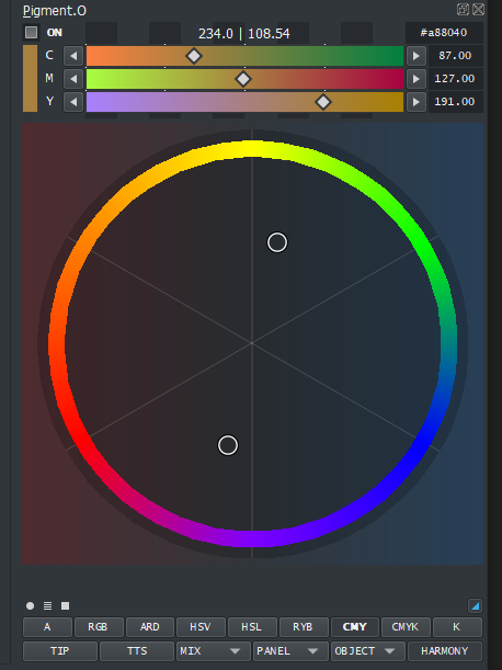
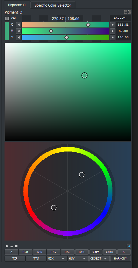
GUI WIP. yes things are missing.
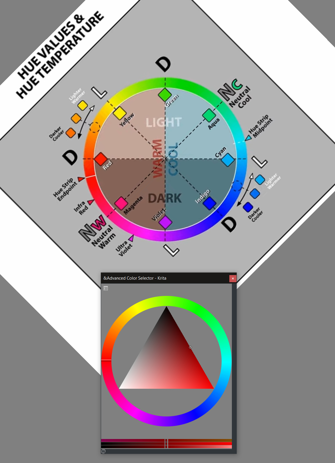
I have been eating color theory videos to review everything I learnt a long while back and with that I made this ring.
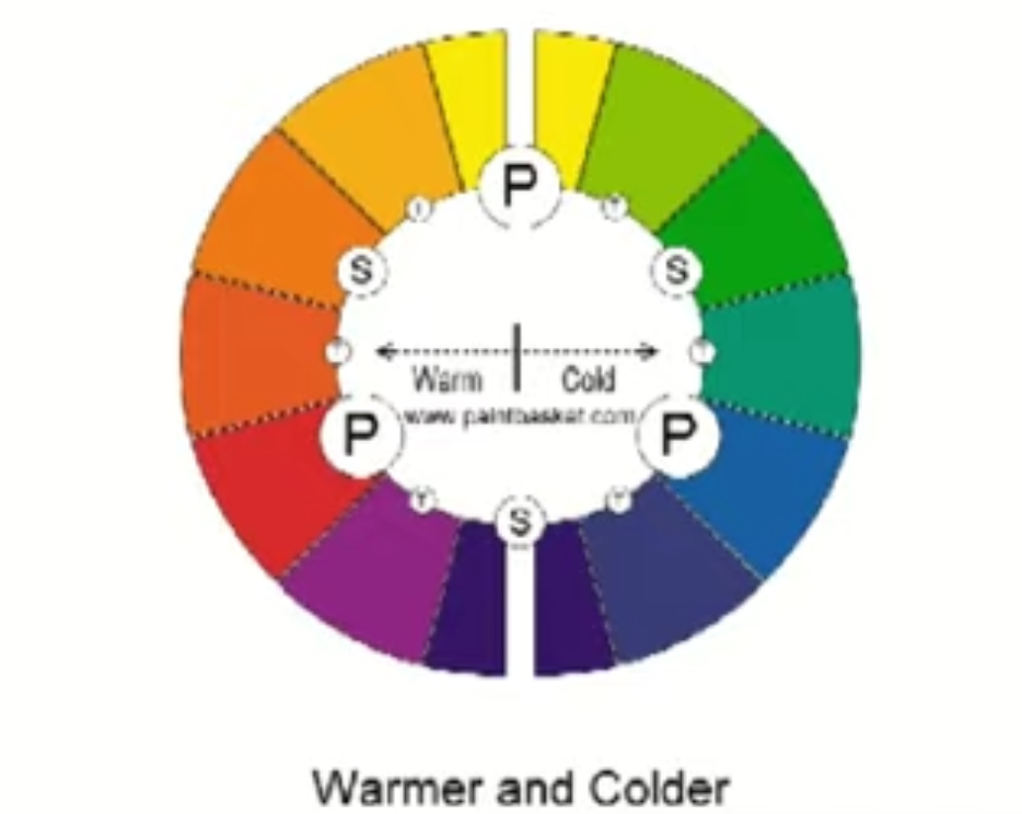
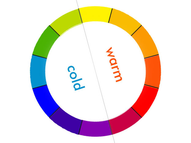
It displays the hot and cold sides (dunno if this is well divided may interpretations on color wheels around) and it also displays yellow as the most light color at the top and darkest ones below when you hue shift.
How does that hue display feel? does it feel correct with color theory? Internet has very loose in responses for this overall as it seems subject to interpretation.
Also I made a complementary color cursor just to get the feel of it and the speed of response and it goes pretty fast so multiple cursors should be more than okay.
But I have a question though…
I have been thinking on what would be the best thing to place inside the hue ring?
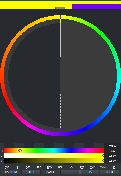
You can see the color in the other panels at the same time still, here HSV and Harmony are displayed. So I am not sure if I choose the second option but it feels right still though. But limited color masks also seems like a good thing for color theory way of thought.
Uhmm let me see.
Hmm, you mean by dragging the complementary cursor closer to the center or closer to the hue ring?
Currently we can adjust brightness or darkness but no bar merged so far tone (b/w) and saturation in one bar.
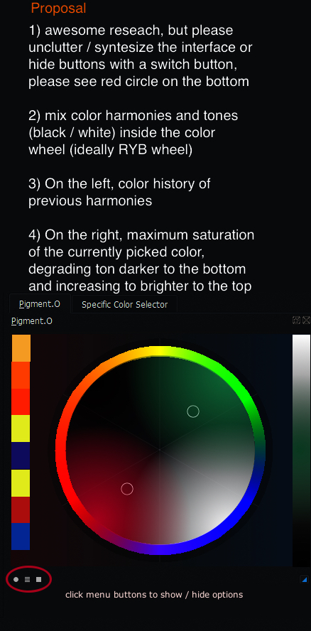
Combining tones and colors would be awesome, imo
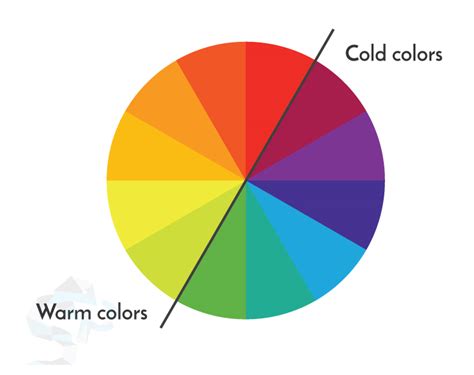
This color wheel has equilibrated and “sober” warm and cold colors.
I’d say, the second choice.
Finally no need to add the usual triangle of other shape, we better mix colors instead.
The wheel should be a color concept to pick from not a universal palette to pick from, because color harmonies are generated with the input of the color picker
I know it has been a while but yesterday I launched the new version of my color picker and it has the basic framework of Harmony colors. It might need still some polishing to work more smoothly but I need to use it to see what needs attention. Sometimes you imagine something and it works as designed but then in practice it is not practical. I still need to see that.
No RYB at the moment because of reasons, the more I watched Color Theory the more I became convinced it was not even that important as CMY has supplanted it terms of performance in mixing colors. So I kindda placed it on the back of my head as I wanted to solve other issues I was more worried about at the time as the picker was not designed to work with something like this from the ground up and that needed more attention than everything else.
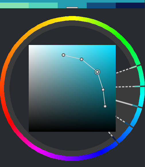
With Harmony mode active you can see the 5 color set above and select one of them, also you can use the HUE panel to click with your mouse around. in this image Analogous mode is selected. if you activate the Edit mode you can adjust Saturation and Value/Lightness separate of each other.
I still hope to polish it more.
I need to say it’s fantastic to see how much enthusiasm you spend on this project as it continues not just to grow but to mature as well.
Not just because of the implementation of color harmony, although I consider that feature essential.
To tell me mine, I’m very intrigued, still a bit sceptic because of the amount of controls you added, which should be a bonus I know.
Anyway,  .
.
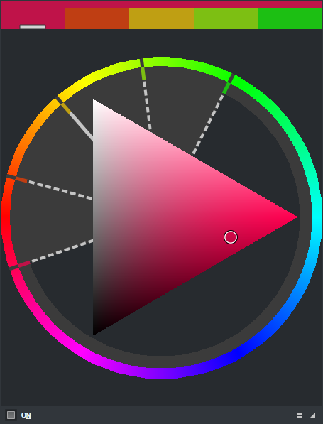
well yesterday I managed to finish the ryb wheel that was pending research. I implemented it and made it look like this. and I set it up to red = 0 as you can see.
cmy rybtoday I should be converting the harmonies for it, just not sure how yet. but considering this as is it should come out on the next version.
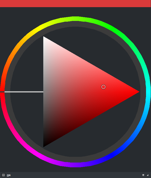
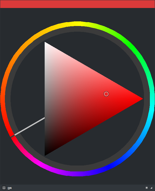
Harmonies converted to the new RYB color wheel. Here you can see the Complementary mode on.
After I fix the OBJ panel I will work on the Gamut Mask that is is kindda of a derivative of this harmony thing then I should launch the new version.
Also I did this display does this feel right? if you guys like it I will apply it to the others.
It shows the different pairs of (sat,value) of the other hues of the harmony you choose when they are different in edit mode. Here you have color 3 selected and you can see the difference of the colors next to it left and right.
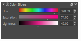
Hello, there is no color slider since version 4.1. I like it, will it come back?