The funds website on desktop definitely is looking a lot better (loving the sleek, modern look!) but there are two things worth mentioning:
Firstly, the topmost bubble for donations is clipped by the header, which should probably be addressed as it is a bit jarring to see. Secondly, in dark mode, some of the elements of the page aren’t rendering right; for one, the Krita logo at the top left is missing, and…
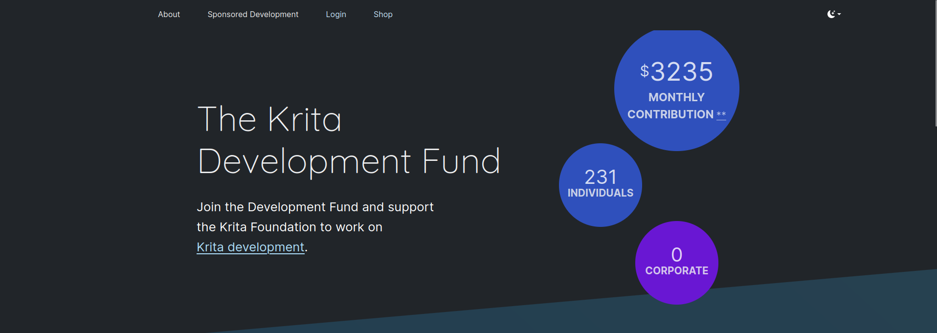
…as shown here, the donation levels don’t render properly, likely out of some CSS style that’s targeting them improperly. I have double checked to see if this happens in light mode, and it doesn’t - the only thing there would still be the donation bubble being cut off at the top.
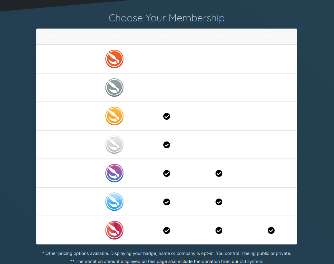
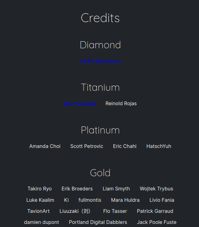
This, and the hyperlink to the “old system” under the badges points to a dead link (404). Finally, and this is more of a personal preference, but the default saturated dark blue color for the donators with links is a bit intense, and doesn’t match the color theme of the rest of the page:
Finally, I’ve also noticed that the roadmap page does seem updated, as in, the language appears different and re-written, but it’s still written as though it’s currently 2018. Since I’m new to Krita, I wouldn’t be able to suggest how, in specific, to change this, but I do feel that each of the years starting from 2017 should have a quick paragraph talking about big feats in the community, and then maybe an unordered list of the feats accomplished by the Krita software itself, with 2024 being the very last entry. I feel that having a roadmap that’s nearly 6 years out of date would inspire a bit of worry in prospective users.