How to make a pixel art signage look non-flat?

I’m trying to create some basic pixel-art propaganda flyers for a book.

I create the original version in Inkscape as an SVG, then export it to Krita, where I use the brush tool to add effects, like scratches, singed edges, and blood (please try to ignore the cringeworthy text - it’s embarrassing to me too, but it works for the setting):

Sol-3

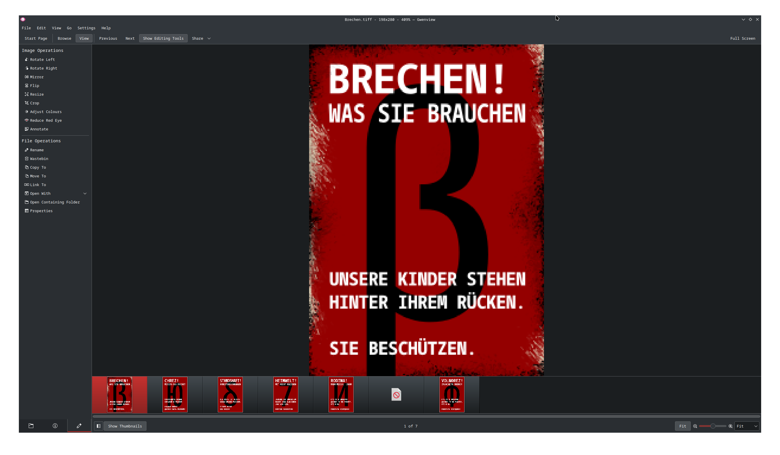
Although I believe that this paper flyer looks like it’s paper, the undermentioned propaganda poster

Brechen

doesn’t appear as worn as its edges would demonstrate. I don’t want it to look like paper - it should appear to be painted atop metal - but it should certainly have a little more deformation than its currently perfect front depicts.

How can I achieve this? I can think of applying a noise map for slightly crumpled paper (although I don’t know how to do that either) but I can’t think of what to do to make it look like a dented, rigid panel.


By the way, if any of you can think of a way to make it look really good which relies upon the poster being paper, I’ll remove the scratches and apply that - I don’t particularly mind. I just want it to look realistic, ultimately.

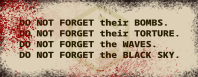
I do also intend to create some more interesting content, rather than limit myself to mere text. However, I’m not even at the stage where I can ascertain how to render to a low resolution (like this demonstrates) due to a myriad of issues with Blender, like:

  1. Can't snap to faces - only centres - Basics & Interface - Blender Artists Community and
  2. How to draw a square face on an object? - #3 by rokejulianlockhart - Modeling - Blender Artists Community

This is my first attempt at creating digital artwork, so I apologize for my ineptitude. You’ll probably be seeing more of me here as time progresses.

I would advise against noise it almost always just makes the image look worse instead of giving any practical effect. For when it’s supposed to be a poster I’d say make some deep cuts in it, bend a corner, perhaps a burn mark and make it look like it was folded at some point. You know like when you unfold a note you had for ages in your pockets on the fold lines the color is also gone and maybe it also comes loose at these points.

On another note it still looks too “high res” for pixel art. Actual pixel art is like really blocky like a video game from the 80s or something. Also the German doesn’t sound right, it reads like something from google translate.

1 Like

@Takiro,

Not even a small amount?

Thank you - those are great ideas.

Are you viewing it at 100% zoom?

They’re only going to be viewed at quite a large size. Note that it’s only 24 DPI. I used https://www.reddit.com/r/signalis/comments/yj5bff/signalis_propaganda_posters/#lightbox as examples for the best resolution, since they seem like the best comparison available.

Yeah, I’m terrible at it. This is only to test concepts. I used a translator for the words I didn’t know so that I could gauge how large the text would be.

Per

can someone move this to Art Discussions - Krita Artists, since I incorrectly filed it?

Category changed.

2 Likes