Layer docker UI improvement ideas

2_v2
I like the ideas of seeing opacity and blending mode on layer name


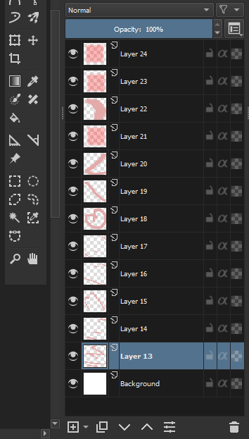
My Idea

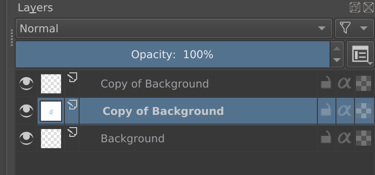
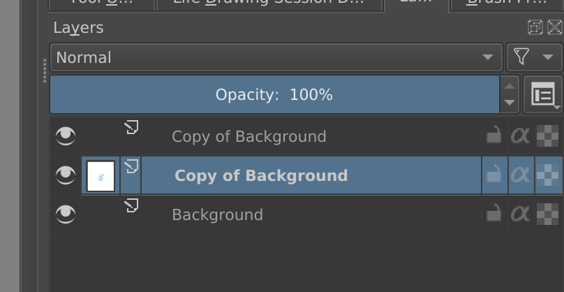
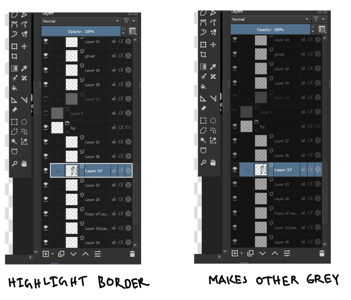
Left : Normal , Right : Isolate Layer

I thinks Isolate layer is not visible enough to see if it’s open or not.
Making the non-selected text more grey or create a border around selected layer would make it more visible I think.

My Mockup
Edit: Improved on 4.3
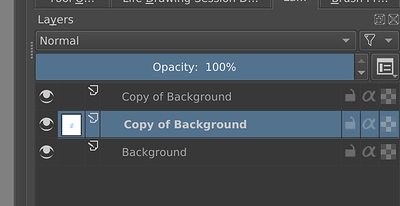
image Image by tiar

There is some discussion or work by @emmetpdx for isolate layer, I have not looked into it but I think the plan is to enable isolate and edit group layers too.

Have you seen the 4.3.0 Krita update? It is different there than in 4.2.9.
Krita 4.2.9 behaviour:


Krita 4.3.0 behaviour:

I think it’s even better than yours because it clearly shows that all the other layers don’t mean anything at all now… (at first I wanted to agree with you that this behaviour is bad but then I checked and notice that it changed :slight_smile: )

woah, true. Annoying checkerboard thumbnails are gone. It’s less confusing now.

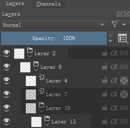
Sorry for resurrecting this post but I just got one idea. How about indicating opacity level with a slight change in layer background:
197fe699010d3ac0efd596d87d0da11b264c0051
Usually when we search for this “1% opacity” layer we don’t really know the exact value. This way you can just look at all your layers at once, and instantaneously tell that layer 2 has about 50% opacity, 7 and 10 are at low opacity (15% I guess) and 13 about 60-70. I guess this feels a bit more cramped than current one (which don’t convey this information at all), but I think that it is muss less cramped than text “Opacity:100%” on each layer, while being faster to read. We just need to ensure the contrast isn’t too big (not to be distracting, and both to be clearly darker than selected and colored layers) and decide, whether hidden layer should automatically get this darker color. Current layer don’t really need that, as you have the current value on the top of the docker.
How about that? :slight_smile:

Thank you, this is a good idea. :smiling_face_with_three_hearts:

My English is poor, this is Google Translate.

This reply has been modified.

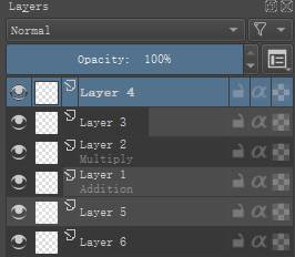
I improved it according to your ideas, how does this look?
The difference is that light colors indicate transparency, and dark colors indicate opacity.

new_v4

Layer 4, the selected layer can get relevant information from the top of docker.

Layer 3, “Opacity” is about 50%, “Layer Blending Mode” is “Normal”.

Layer 2, “Opacity” is 100%, “Layer Blending Mode” is “Multiply”.

Layer 1, “Opacity” is about 20%, “Layer Blending Mode” is “Additive”.

Layer 5, “Opacity” is 0%, “Layer Blending Mode” is “Normal”.

Layer 6, “Opacity” is 100%, “Layer Blending Mode” is “Normal”.

Thank you - I like it :slight_smile:
For me 100% opacity is very confusing here, as I thought about this brighter color as of a opacity bar - for me both layers 2 and 5 read as 0% opacity - empty bar. This is what it would look like when you set a layer to 0% opacity in your mockup too - they shouldn’t be displayed the same way. For me the bright gray is the default color, and you make it darker on the right to indicate non-default opacity.
Edit: as I look longer at it I start to understand it. This option makes some sense, as they differ more from 100% layers. Maybe it’s worth asking other users which one they think looks less confusing.

The layer mode though look great for me. It’s very clean when it’s grayed out and the only information. I was thinking of some small, colored abbreviations like ‘ovr’ for overlay, ‘mul’ for multiply on the right side, near the lock icon, but now I think I really like this one here.
Great work, thanks again :wink:

Thanks for the reply.
Sorry :sweat_smile:, there are errors in the pictures and text.
I modified the response above and it should be correct now. :slightly_smiling_face:

Approaching the lock logo may make it more crowded. Below is when “Layer Style” is enabled.
fx_v2

My English is poor, this is Google Translate.

I like the way your design looks!!! :smile: