I haven’t really thought out much the UX.
Everytime I think of it - I said it would be nice but also the clutter that can easily happen.
I havent made Kanvas Buddy work on my pc that well so I can’t comment on the approach. ^-^.
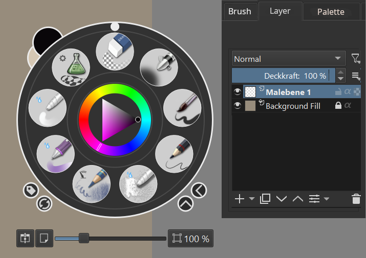
I was thinking more of switchable tab that utilize something similar to this
so when that one is active the other one is hidden - but it remembers the last one active.
it my head this is one of the panel [ the default] , then if another panel is active this one is hidden and another one shows up.
Now i we go to - the what ifs of usability.
What if its already docked panel? and sorts.
Balancing the clean with more possible options is hard.
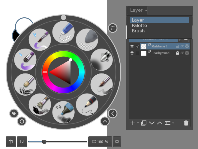
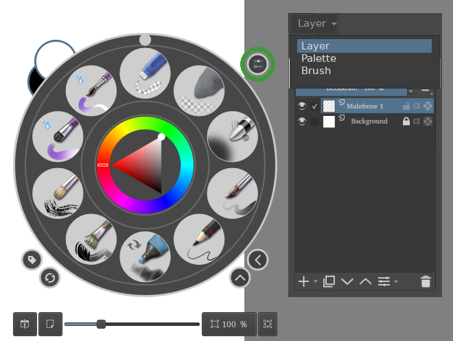
You know, it should be relatively easy to use the different dockers again. You can already show or hide them. Why not combining it with the pop-up palette?
As for the docker position: that is already solved. There is a docker for the brush settings. They could add a tab for each new docker, like they already implemented for the dockers in the default view.
Brush / Layer / Palette / other dockers. It is already all here, the problem is the combination of these features.
as they are [even if simple] are surprisingly headaches to deal with codewise. afaik. atleast the current dockers being use. I hope someone can find a similar solution since this is good mockup.
Only issue is if gets to the number of panel there → the header can get cluttered fast. 3 is a good default with option to add more.
Though yeah my idea is similar but ulilizes the perimeter of the docker [it will be limited in number though] - so i myself is unsure about it.
For space we need to have a plan, probably the popup can be slightly elongated.
There are too many in-between whitespaces when all options are there.
Here is a pointwise reply
no we don’t want drag and drop. It’s more a copy of the existing docker. This docker should be a checkbox away. This is imagined for canvas only mode, once we tab out, everything should be the same as current UI.
show hide docker completely breaks immersion and noticeably changes canvas a bit too. This workflow will avoid all this. Unless unhide docker floats in (I have a separate topic for that too)
the mockup you have posted, is this from your plugin?
Kanvas Buddy only works on PCs since it’s a plugin and does not help Android users. If that function can be made native then maybe we can start thinking of its UI
as mentioned, I have a mockup for floating dockers in another thread. If that can be implemented then pop-up pallet docker integration can be ignored.
I think we should start with just layers docker in pop-up before thinking of any docker.
@BeARToys , holy cow that’s a good mock-up. This could potentially make pop-up single-handedly the best tool for Krita. But I would agree that anything above 3 would be too cluttered.
@kaichi1342 agreed, I don’t think pop-up pallet should become the whole UI. So maybe some limits on a number of dockers or one docker at a time. Choose your poison kind of thing
Oof… I really like the thought process behind this. Not sure how challenging is for devs to implement this. But this mockup demonstrates complete configurability and ease of use.
This might not be as difficult as I thought. Rough proof of concept:
This works by borrowing the dockers’ inner widgets and hiding the docker themselves, then returning the widgets and unhiding the dockers (if they were shown).
-Obviously there’s no settings button at the moment.
-The ‘on-canvas brush editor’ that was in the panel probably could be made into a docker.
OMG that’s amazing. how i was seeing it in my imagination. How was the performance in canvas only mode?
This is exciting. Thank you very much.
You know I have ideas for that. But thats an entire differentcase. If it becomes a panel - i really then need to get my butt off and sit down to learn c++ and the code base. I’ve been wanting alot of small stuff for a simple brush editor for on the fly editing.
Manage expectation though. hahaha. this can take bit long depending on the complexity, schedules and priorities but @freyalupen have been doing some working mockups for us to look at and they’ve been a contributor ^-^.
About hiding the docker, maybe we should just let user enable docker in pop up when in full screen (canvas only mode) so that it doesn’t just disappears from regular mode.
Or if this can be further enhanced with copy of docker somehow.
But the tabbed docker is already working when the mockup was shared just yesterday is amazing effort. Thanks @freyalupen !
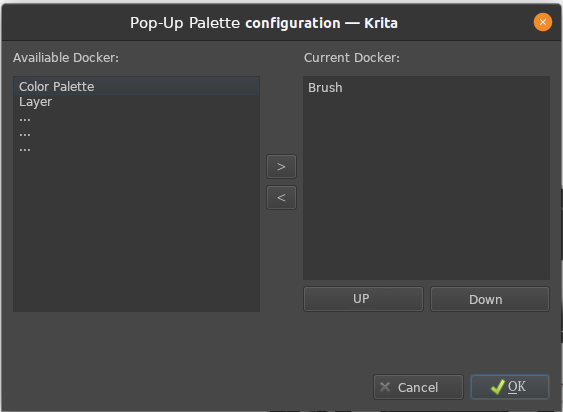
I think you can borrow the list of docker from the menu. Excluding those, which are already in the pop-up palette such as the colorwheel and brush-list. And the settings button I borrowed from the brush settings, which is already in place. Maybe you can make it so, that you can reuse that.
There is a placeholder button to open the config, there is no config yet.
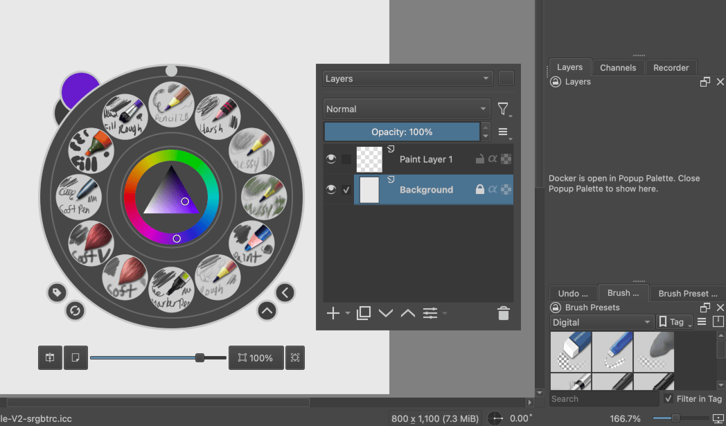
I thought, instead of hiding the docker with the missing widget, just show a message, to avoid messing with the UI positioning by hiding the docker, while making it clear what happened. I haven’t thought about how to make the placeholder message look nice.
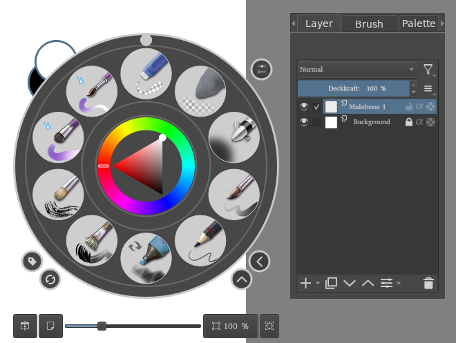
And I’ve switched to a combobox to select the docker rather than tabs. The contents is a known list where only one can be active at a time, so a combobox is fitting. And it avoids issues navigating many tabs in a tab bar.
Using a combobox also lets me easily scroll through the dockers and make a video showing what they all currently look like when put in the popup palette:
This is every default docker (including the Python ones), plus four from the plugins section of this forum that I happened to have active: Plugin Developer Tools, Pottery Wheel, Compact Brush Toggler, and Reference Tabs. (They’re currently sorted by internal name.)
Some dockers have size issues, which might be to do with the dockers needing better default sizes. I haven’t investigated that.
The Channels docker’s widget for some reason doesn’t show anything unless the actual docker is shown, which I worked around by showing it, for now.
I am getting excited! It is nice, that you have this list. And it shows , that you can uses the dockers in the popup palette even if it is not native.
I think it is unnecessary to show the docker in the popup palette if you are not in canvas only mode.
If in canvas only mode show docker on palette. If not, default to bush settings and show at the normal location. Or show both at the same time, linked, so that a change in one docker is also applied to the other… but I know that is way more complex…
@freyalupen thats exceeding my imagination . awesome.
I think centering the text maybe with some padding and a light dotted border for the placeholder text.
I think its ok to be showing in non canvas only mode. though it creates additional complication. having different view on with panel and canvas only mode will also have its own set of complication.
Some have minimal view type of layout going. They would still have a couple dock like the overview panel and tool options panel and the rest hidden. Maybe a histogram , the timer panel.
its potential for mobile
like this will solve quite a number of issue with android regarding not having enough space to access certain panels.
Yeah, this is a boon for android users. But also killer for minimalist people. I saw animation docker in it too. I am actually thinking of even more advance things like pinning dockers and tools as dockers but i should not stray from initial request.
I btw agree with freyas approach to have text in original docker place cuz this can open up other minimal interface strategy and not only canvas only mode.
Eg, if we remove all dockers but keep tools and top bar.