I absolutely love those! These discoveries were part of the reason i created this account, just to let you know o/
1 Like
These illustrations are amazing.
I am currently going to develop a background, could you give me tips on how to make it as good as possible?
1 Like
Hello! Well, this is so complex topic. I can mention main aspects and recomend some resources.
Art of background include composition, divivsion into plans, light and color, perspective.
I recommend this site Free Video Library — Ctrl+Paint - Digital Painting Simplified , I studied composition basics with them. Moreover you can watch some video about perspective.
I also advise book “Color and light” by James Gurney. So I study and watch how other artists work with color.
Some Youtube channels about landscapes
https://www.youtube.com/channel/UCFCH0kQCWs-U5kBMRuUTaEQ
https://www.youtube.com/channel/UC6onXhwqdL6eyiCY8w5TT9g
You can study art technique, composition and color with favourite pieces or scenes from films. I save some lovely photos from internet and try to stylize their or search clear composition in this scenes.
You can ask specific questions, I’ll try to answer 
4 Likes
I am so glad to read this (✿◠‿◠) Thank you!
1 Like
oh, so, a more specific question.
How do you get the character lost in the fog?
If you still have the layers uncombined (in Krita) I’d like to see a step by step. (if it’s not too much to ask)
Also, how do you successfully blend the colors and create a gradient?
Actually I will make a separate forum for other users to help me with other things. Still, I would really like your answers.
magnifique travail!
Wow, that is inspiring!
Hi,
1)just gradient or soft brush in normal or lighten layer. Make this character without contrast accent.
2)I have really different approaches for each work. Sometimes I work really chaotic and messy like this old gif Проверка браузера I also tried create video process with Krita 5, but it was really heavy and long video. But I am going to create new video process in the future which i could demonstrate.
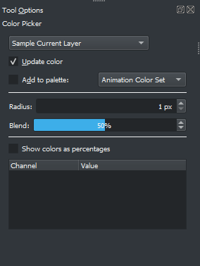
3) Useful feature is blend in color picker. I use 50% blending in tool option to get color between 2.
Gradient is regular instrument in the workflow.
I hope I speak clearly 
2 Likes
Amazing landscapes. Really conveys a mood.
The Lighthouse and the forest are my favorites. Mostly the lighthouse, I really light your treatment on the textures of rocks and water. The color palette is very nice, too !
I hope you can make the videos 
Thanks for the reply
awesome