Potential improvements to Inherit Alpha in Krita

Ok so I admit that I misunderstood you here, I first thought you were talking about Inherit Alpha (level B) vs Clipping Mask (level A), but you were talking about Destination In vs Clipping Mask. So, my further words will be a bit less suitable for this quote but I found a good analogy and wanted to add it to the thread anyway. I hope you don’t mind.

Basically, if we only consider Krita users, then the sort that users use most is Inherit Alpha, because that’s what is available. Thinking “well but users come from other software and if Krita has CM, then they would come here quicker/more gladly” is a bit of a fallacy; there are plenty of reasons people use other software and it’s usually not just one feature that a software has. Hence, usually we only or mostly consider already existing Krita users. If we improve Krita for existing Krita users, it should be by default improved for potential Krita users as well. No-Krita users are a bigger and more diverse category so it’s harder to improve Krita for them in a meaningful way.

Example: Krita has Colorize Masks, while some other programs have Ignore small gaps in lineart in their Fill Tools. The feature request considered here would be: “Add Ignore Small Gaps feature to our Fill Tool”.

Bad arguments:

  • “Because all other software has it” (I hope this one is obvious :wink: )
  • “People would be more willing to try/use Krita” (Bad: because it doesn’t address existing users and how they work, but potential users)
  • “Because that’s what people expect/know” (Bad: because just because something is common doesn’t mean it’s good)

Good arguments:

  • “Because Colorize Mask is good for big, complicated lineart but if you want just a quick fix, having to go through all the steps to set up Colorize Mask might be a bit too tedious, would be good to have something quick” (Reason why it’s good: addresses actual shortcomings of the feature and shows a workflow where this requested feature would be more suitable)
  • “Because Colorize Mask doesn’t work with animation” (Note here that there is a MR to make it work with animation, which would invalidate this argument, but for now, it’s a good/valid one). (Reason why it’s good/valid: addresses actual shortcomings of the feature and shows a workflow where this requested feature would be more suitable).

“Chaotic neutral” arguments:

  • “Because there is way too many steps to create Colorize Mask” (If the problem is tediousness of setting up CM, maybe we should work on the problem instead of blindly following other programs? Sometimes improving something that already exists is easier and leads to better results than implementing multiple ways of doing the same thing; especially since the last one can actually cause confusion in those same new users). (Okay okay I know it’s very similar to the first “good” argument but I used it more like an analogy and to say something important, please don’t hate :expressionless: )

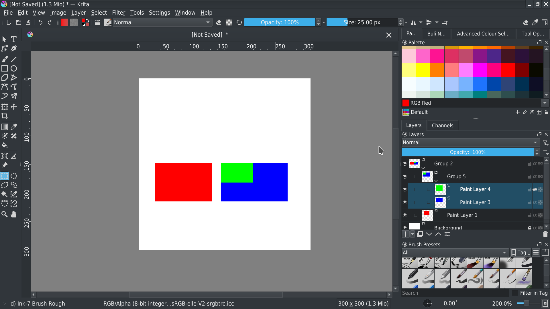
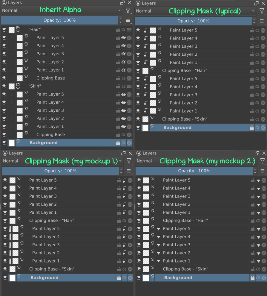
The last one is of course an equivalent of “Because Inherit Alpha creates a group and I don’t like it”. I still don’t really understand why is that a problem. It doesn’t “create a more complex structure”, it’s literally the same thing except that it gives you one more horizontal entry (for the group layer) (what I would call “more complex”: for example if there was one more level needed - but the clipping masks are basically children of the clipping base, except that they are painted above, not below like a Colorize Mask - most apps even show it like that, with an indentation). In the next comment, I will add my own potential mockup and then a comparison of Inherit Alpha and Clipping Mask with the standard way of showing it and with my mockup way of showing it. (I’m not 100% against this feature request which is why I want to make a mockup that would fit my standards, but I’m still on the fence whether I find it potentially useful or just a gimmick).

6 Likes

Promised Mockup (I’m not dead set on this, while I don’t like the indent in the typical Clipping Mask, I think the mockups I made make the relationship a bit too much hidden for my taste…):

Also not a mockup, but shows the additional advantage of using Inherit Alpha; apparently in CSP you can’t “fold” the clipping mask? Though it does depend on implementation, we should be able to fix it even if we do implement CM.

8 Likes

Hi

I didn’t read everything, too much to read and too many point of view about how this should be implemented.
I just have a question: is the current implementation will be kept or it will be replaced by the clipping mask?

Because for me how the current alpha mode + group is clear and simple to understand.

The clipping mask seems to be complex to use (especially mockup “my mockup 1.” and “my mockup 2.” for which it’s really difficult to understand relationship between layer)
For “typical” I think I can understand but it seems not natural to have them ‘above’ instead of ‘under’
(And in all case, I don’t see in mockup how to collapse all of these layers?)

Finally, I don’t really care about how it will be implemented as I’m not really sure to use it :sweat_smile:
My only worry is to know if the current alpha layer + group way of organization will be kept :slight_smile:

Grum999

5 Likes

What does “folding” the clipping mask mean? You mean the clipped layers can’t be folded like a group? You can’t do that in Photoshop/SAI/Fire Alpaca, either.

1 Like

There are no actual plans yet, this is just a discussion for now. And the current implementation will be kept. Also I agree with you with the relationship being more confusing.

2 Likes

Ok thanks :slight_smile:

Even if it’s just a discussion about a potential implementation of clipping mask, it was just to be sure that current inherit alpha is not impacted :slight_smile:

The title “Potential improvements to Inherit Alpha in Krita” is confusing :sweat_smile:

Grum999

1 Like

It’s not. See this image.

Top is normal.
Middle is “clipping group”/“clipping mask”. (proposed feature.)
Bottom is “inherit alpha.” (what we have now.)

1 Like

It’s not for you.
It is for me.
Especially mockup provided by @tiar are really disturbing me.

Currently I do it like this:


It’s visually easy for me to understand groups

Otherwise I do it like it:

But ok, it doesn’t really matter.
As the possibility to use current workflow is kept, clipping mask can be added, it’s not a problem for me.
If it can be useful for other, as it doesn’t break the current inherit alpha mode I like to use :slight_smile:

Grum999

2 Likes

The icon of “Inherit Alpha” is alpha and horizontal line. Indicates that it does not use its own alpha channel. This can also be found in the “Layer Properties”: when you turn off the alpha channel, it will check “Inherit Alpha”
This is a deep meaning, and I think we can keep it. Use the CM icon only as alpha and vertical line (or vertical arrow)

“Folding” the clipping mask? Do you want to achieve it? I can’t imagine…

1 Like

Uhh, maybe I called it wrong? I mean that thing where you can fold and unfold a group layer or a layer with masks to show and hide its children.

1 Like

@Grum999 and others.
For me the “clipping mask” thing is very simple: it is the same as inherit alpha but the layer is only clipped/masked by the layer/group directly below.
Having the full inherit alpha we have, this is just a shortcut. I would use it for quick compositing and edits, without having to create groups.
If I had something like in tiar’s mockups, which looks like a more permanent and complex layer structure, I would use groups, with or without the new option we are discussing.

5 Likes

I think “inherit alpha” and “clipping mask” are the more intuitive to me visually, because the clipping is represented visually in a nice manner.
Although having that deep of an indent + the natural indent of using groups would make it a little bit less clean - if were to implement clipping masks as is.

And the solution, if we were to implement my suggestions would be to do something with the indent while still have clipping visually represented.
So I’ve made some additions to your mockups if you don’t mind.

On mockup1 we have a very small indent that is represented with just a line instead of a more wide arrow. Shouldn’t look too clunky with groups as well.
On mockup2 there’s no indend at all, but I’ve added that neat arrow icon between the layer icon and the layer name. Now I don’t know whether it’s me being used to it or not, but to me having that icon on the left side of the layer docker is more noticable at a glance instead of the right side.

I don’t have a strong opinion on indents, so either or another way of implementing that would work for me,
but I would love to have the ability to just clip a layer to a layer below and a layer to a group below, affecting all its contents (which could be represented the same way as on mockups 1 and 2).

2 Likes

CM’s children are on top. And CM can be used for groups, will the “Folding” button overlap?

1 Like

I like the way “clipping mask typical” and “clipping mask (my mockup 1.)” looks. Even if the feature in this thread is never implemented, I like the look of the “return key ” symbol a little more than the crossed out α symbol to represent inherited alpha. It looks easier to read in my opinion.

2 Likes

Hm, IMO it seems clear now that any arguments comparing clarity between CM and IA are moot, since they’re so dependent on familiarity bias. Not that there isn’t an argument there; the vast majority of existing digital artists interested in migrating to Krita from elsewhere will always be thusly biased in favor of CM, as long as it’s what’s used everywhere else. And, although I know this falls into “bad” arguments, because CM is equal in capability to IA, there is a net positive there. The problem is just that it’s difficult to quantify.

I will say that when you often group many layers for organizational purposes as I do, IA is certainly less compact. Anything involving clipping automatically requiring, at minimum, a double fat indent just to function is quite the eyesore :sweat_smile:

I know I sound like a broken record, but I do so value my canvas space…

For usability though, both are IMO easy enough to pick up relatively quickly, especially with ctrl+shift+G for quickly creating alpha inheritance groups. Because capabilities overlap, I’m having difficulty seeing the value beyond cleanliness, and the aforementioned “bad” argument (and my other OT argument which shall not be named in this thread).

1 Like

I know I am gonna be anything but helpfull here I find both methods really ugly. Over and under. To me there is no real gain for one over the other. For screen saving space altering thumbnails would gain more than the clip masks organization.

Also I feel compelled to say tiwards bad and arguments for a proposal “sometimes you don’t need to invent the wheel.” The wheel already exists you just have to use it.

If this was me making improment ideas I would do something totally different :face_with_monocle: a node setup that would automatically setup up like layer stack with a default zoom that would look the same as currently but if you zoomed out you could make a alpha connection from one layer to another layer or group and bam problem solved. This would by pass the would linearity of the layer stack and you would be able to optimize your layers if needed by going around the layer stack, so up or down :exploding_head:

3 Likes

I mean, a node-based raster painting app is like the one thing I ever really wanted from Santa, but I suspect you and I are in a minority here. The kind of minority where we’d have to move to Mars to not get pitchforked by every other digital painter :smiley:

The biggest downside, after the sheer unconventionality of it, would probably be the performance overhead. Not that a simple stack of nodes would be too bad, but once people start making spaghetti, I can just see all the “why is this so slow” threads on this forum. Still, one can dream…

4 Likes

Yeah I now. But you can make layers and time lines with it, it solves all kinds of problems. And this problem is so minor under or over. It is more people are used to certain stardard and that is the only reason to request it not that it actually any real advantage by doing so.

I speak of a node setup but the goal would be to force the render result and path to stack like layers. I don’t think it would cause slowdowns. like no merge nodes the layer stack would be the merge nodes. It would have extra pipes around that could be hidden or seen to display non linearity better for displaying where the info comes from and that would be the only difference.

But I know everyone here hates this idea but one can dream.

1 Like

You can already do this with clone layers. The point of CM/IA is to have a quick, easy, simple way to mask.

The layers have to be somewhere, and most artists will have the layers that need to be clipped right next to the layers that define the mask they want to clip with. CM and to a lesser extend IA simply make use of the linear way most artists organize their layers.

I said this before but I really don’t see the point in the indentation of layers in a clipping group. It’s redundant since the inherit alpha button already works as an indicator.

It’s true that software with clipping groups have indentation (SAI, Fire Alpaca/Medibang, Photoshop, Clip Studio all have it), but those software don’t have an inherit alpha/clipping mask button for every layer in their layer stack.

Instead, you have to select a layer, and then click a “clipping” button above the list of layers.

This is just like how selecting blend mode or opacity works in Krita. If you have 5 layers, you won’t have 5 blend mode drop downs in the layers stack, one for each layer. You just click the layer and then change the blend mode.

But in Krita, every layer gets an inherit alpha button, so I think if the button is already there and already changes from off/down arrow/horizontal line, indicating the clipping mode, then there is no need to indent the layers to indicate the clipping mode twice.

I mean, inherit alpha doesn’t need an indent, so why would clipping mask need one? Sure, at first glance it may be confusing which layers are clipped to what, but the artist knows how their layers are organized. Like in TheTwo’s example there’s skin detail and skin base color, and obviously one is clipped to the other that comes under it. You don’t need 2 down arrows plus indentation to figure this out.

I think maybe the down arrow should have an “a” for alpha under it somehow, otherwise it might look like a folding down arrow icon. Shouldn’t be too important since if you know what the arrow means you wouldn’t need it.

6 Likes

Clone layer is not comparable. There is no indication from what is the source and I can’t recall if it updated from the source and you would need to make many redundant layers instead of connecting them directly.

Also nodes can be linear… Or not.

1 Like