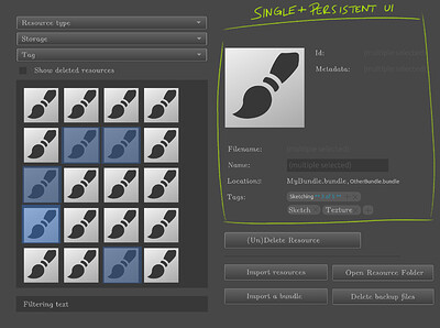
Here’s a suggestion based on a popular UX pattern from mass-tagging (in audio/video).
Basically the idea here is to stay with a single, persistent UI:
- No matter if editing one or multiple items, the interface does not change or jump around
- All fields stay in place, only the editability changes, depending on the field
- All unique data fields are disabled, textually indicating “different across multiple selected” or such
- The
Locationfield would list multiple locations for the selected resources =>Locations - The large icon preview would change to show multiple cascading icons (not illustrated below)
- The
Tagsfield always shows which tags are assigned - no matter if single or multi selection - Tags that only exist on some of the selected items are labeled as such
- Adding/removing tags works the same for single or multi selection
- Another button is added for “expanding a tag to all selected items” on each tag where it applies (here illustrated with a “+”, but that needs to be much clearer)
I personally find this sort of approach the most efficient, understandable and simple for the UX problem at hand here. If multiple people have requested a drag-and-drop solution for this I’d be really curious where they have seen/used such a drag and drop tag UI. I can’t recall having seen any myself, but I’m always eager to get inspired. ![]()
Either way thanks for your work on this @tiar ![]()
