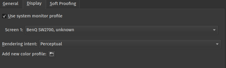
Here on linux I my display and set the resulting profile on the os level, then in Krita I merely check the “use monitor profile” checkbox.
So I actually read the manual page on this fully; my confusion is much cleared now. I was trying to first understand how the display profile chosen in Krita’s colour management settings interfaces with the colour profile chosen in Windows display settings, but as I read the manual, I realized the point is moot, as I’m using ACES OCIO luts anyway. Which should mean that the colour management settings are ignored, right?
Am I doing this right:
- For ACES workflow, I set the working space for my image document by selecting ACEScg-elle-V4-g10.icc as the profile.
- I use either 16-bit or 32-bit float bit depth
- In the LUT management docker, I check “Use OpenColorIO”, then set colour engine to OCIO.
- I set the input colourspace to acescg. (I think “raw” is the same here as my working space is acescg?)
- I set my view transform to sRGB since my monitor is sRGB calibrated.
This should now produce identical results as i.e. Nuke, and the my calibrated display profile is applied by the OS (Windows in my case), correct?
Edit: What was @tiar referring to with “there are no optimizations for 16bit”? Is this a performance issue or something else?
Okay, here’s the thing.
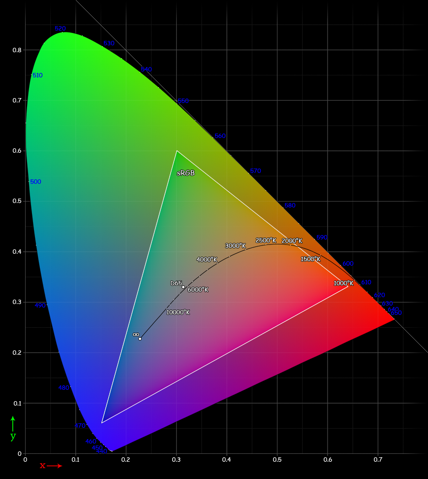
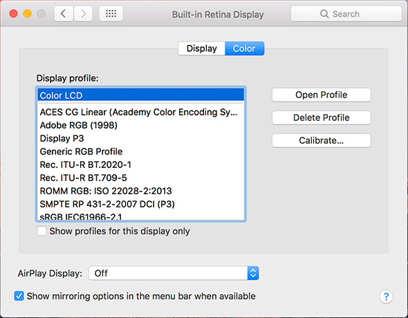
Mac OSX screens are DCI-P3, that’s this one.
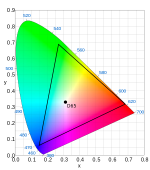
If you draw images for the web, you are drawing images for the most common colorspace, that’s sRGB:
So, what you need to do is to set up the display settings (settings->configure Krita->color management) to use DCI-P3, but to make sure that the images you create are converted to sRGB before final export, probably even without any embedding. If everything’s correct, the macos image viewer should be treating images without embedded icc profile as sRGB.
(So, if you want to experiment, and want to create images in a larger colorspace than sRGB, like DCI-p3, or more commonly something like Rec2020, or ACEScg then you can do that for the working file, but the final image will need to be converted down to sRGB, unless you understand CMS and want to experiment :D)
Browsers are a little bit more confusing, but that’s because some, like firefox have seperate toggles for how to treat untagged images, and I understand why they did it, but it is confusing none the less. That said, if converted to sRGB the final image shouldn’t have significant difference from when you view them in Krita to when you view them in a browser on a different computer(the only difference being the difference between different computer screens).
1 Like
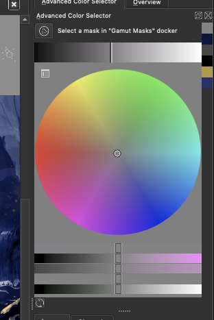
The only one I have is this:
And I can’t work with this as it’s gamma is so bright and there’s almost no range in the dark colors.
That might be because the advanced color selector is being interpreted as sRGB, which means that you now see the full sRGB gamut(which is smaller and thus more faded than DCI-p3). Does the small color selector give the same issue?
(and if you make a small image that uses rec 2020, does the small color selector change? (it should have full saturation at that point))
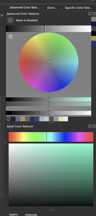
And this is when i create a image with profile Rec2020 with 16bit
now Krita crashed ![]()
At one point I also had the issue where the color I selected with the color picker where different than the one in the image.
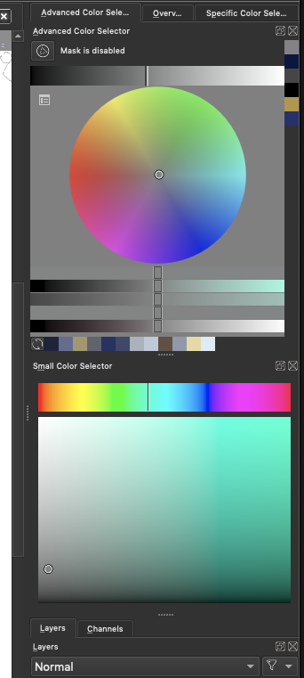
That’s the advanced color selector, I am asking about the small color selector?
The other issue sounds like an opengl issue, but that would require a lot more diagnosing. As for the crash, it’d be great if you could report the crash log to bugs.kde.org, but it might not be relevant to this specific issue ![]()
Open the thumnail to see the small
Ack, I cannot get used to discourse’s weird thumbnail behaviour.
Okay, so, the rec2020 profile small selector looks the way it does because it is a linear profile: here the darker colors are smooshed together because that is what is physically correct, our eyes are just better at differentiating shadows(the hows and whys of why the regular sRGB selector doesn’t have that has to do with CRT monitors default behaviour and a long fiddly story).
Now, here’s the sad part: You have set up your computer correctly. However, your computer’s screen is so significantly good that sRGB looks muted and washed out. You have two options:
Either accept this is what sRGB images look like on your computer and work in this space. If I were to teleport with my laptop to your side, the images that you created on your mac will look the same on my laptop screen, except you feel kinda bummed out because your screen is better than mine and thus has the possibility of more saturated colors, which you can’t use.
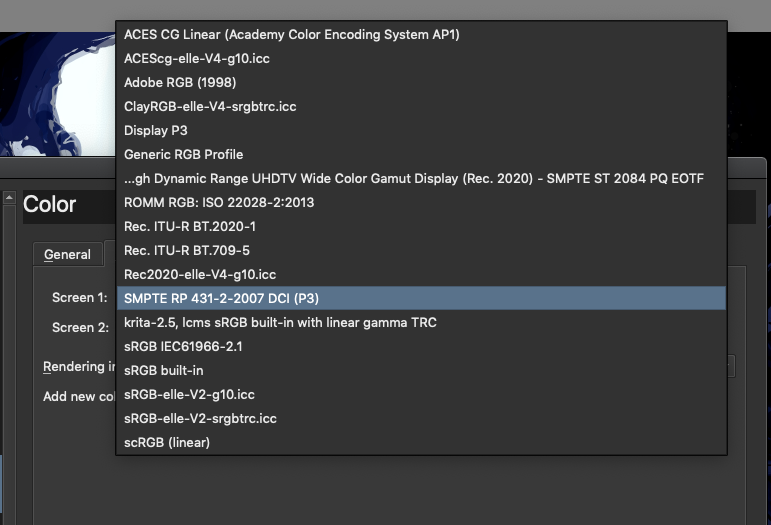
Or, you can try to work in a wide gamut profile that is not linear. Looking at your list, the Adobe RGB 1998 / ClayRGB-elle-v4-srgbtrc.icc (these describe the same space, the second is just one we have permission to ship) would be a good choice. With this, while it has brighter colors, you will need to use the small color selector as the advanced selector can only show sRGB at the moment, as well, the final images still need to be converted to sRGB, which means that the final image will not have as bright colors.
I hope this didn’t make it even more confusing ![]()
1 Like
Im on my way home and am more confused now. ![]()
Its just a MacBookPro. And its the same issues for me on Windows pc where I use to paint on my cintiq 16" or on a HP monitor.
Hm as far as I can tell - Our eyes can see better light shades than dark ones.
All i want is to have consistent behavior and that the saturation and value range is acceptable for painting. ![]() ill maybe just use the generic rgb.
ill maybe just use the generic rgb.
It seemsbi cant send pm on mobile. Are you willing or able to voice chat with me some time?
The DCI P3 doesn’t give me the color range I want it’s all bland and too bright. And why does it affect the image and values and colors so drastically, when viewed when exported and viewed in MacOS or Windows or other software.
My image is fine as long as I’m in Krita, but opening the saved file it turns very dark, in OS it looks fine when I save with embeded ICC profile but when I upload somewhere it turns complete dark.
As soon as I started messing around with color profiles, I start to have problems and everytime I try something it goes worse and worse.
Please tell me, did you set up the DCI-P3 profile in Krita and used sRGB profile for images, or did you set it up differently? If so, please tell me what exact color space was of the image and in Color Management settings.
Please also tell me what setting do you have here:
Oh my Glob. What did I start with this thread x3?
Yeah, color management is a huge can of worms ![]()
@Soma It’s the other way around, to double the perceived brightness of a light stimulus, the actual light output from the source needs to be more than quadrupled. The gamma curve that’s part of image color definitions then tries to compensate for this behavior, so that the jumps between neighboring brightness levels in the displayed image are about the same and optimally distribution. If you’re working with a linear color profile in just 8 bit per channel, you can easily spot banding artifacts in the darkest shades.
In many areas, often a more extreme logarithmic function is used to model the response, though that seems not entirely accurate, and confusingly there appears to be some disparity between rod and cone cells. For a deep dive way out of scope here, read Eye intensity response, contrast sensitivity
But on the orignal topic - a higher bit depth can be useful not only to counteract banding artifacts in brightness, but also color intensity, which get more visible if you’re using wider color gamuts than sRGB - Wider color gamut means wider gaps between each distinct color value using the same bit depth.
It’s a bit of a performance consideration of course, and I’d argue it mostly depends on what kind of work you’re doing in the first place - Like when you’re trying to achieve a super clean art style with gradients, or for example when creating specific texture maps where the precision matters, like normal maps or HDR (environment) light maps that require 32 or 16 bit float.