Hello there! Since Krita 5 is in the way to be released in some months, I want to make a suggestion about the default themes of Krita.
First, I’m suggesting these themes, but I WANT your feedback to improve it and if it’s good enough maybe the devs will accept those themes as the default ones ![]() .
.
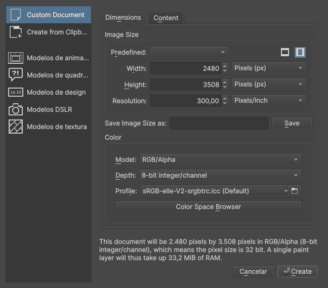
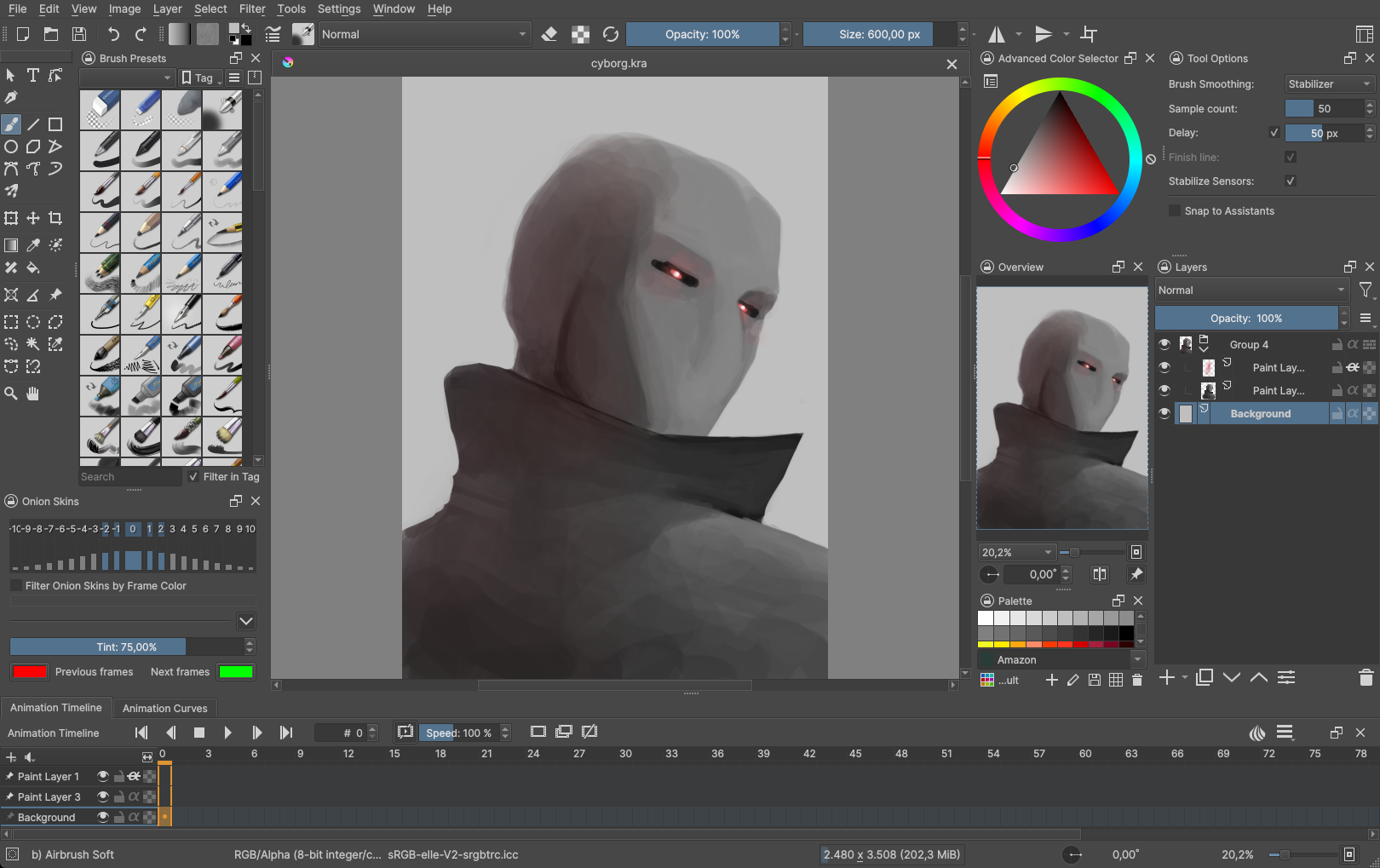
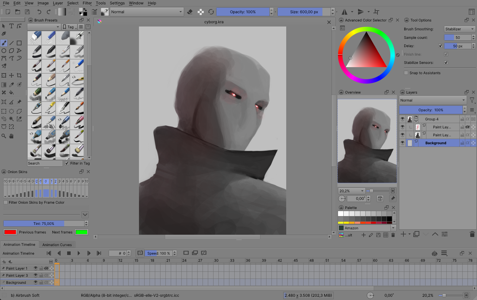
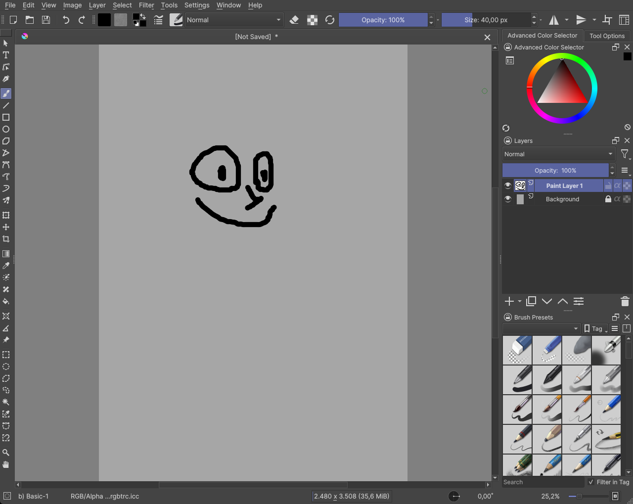
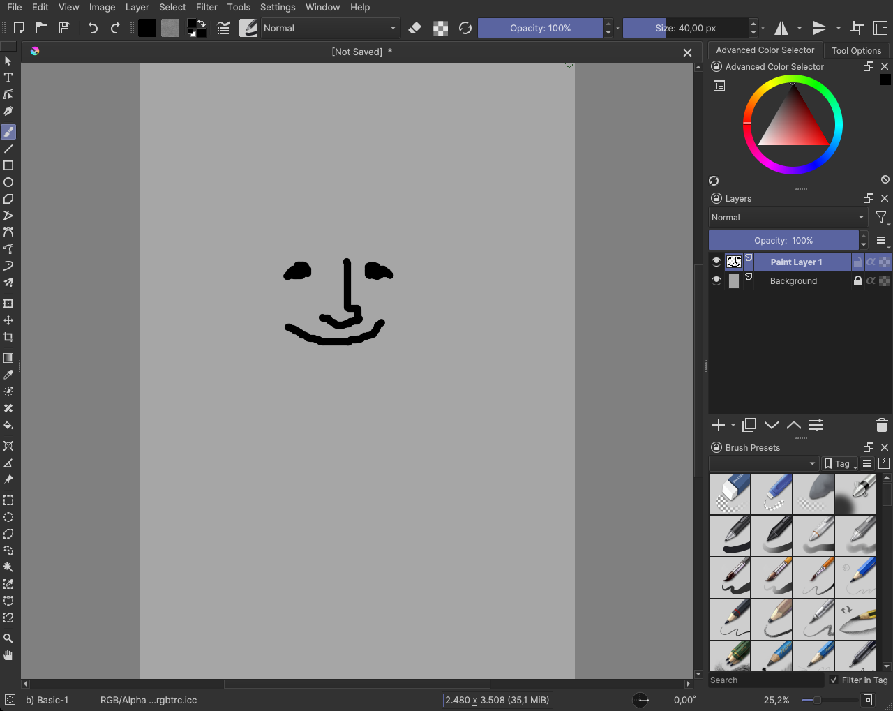
I used Krita 5 pre-alpha in the screenshots, so, let’s go:
Krita Bright
Original Bright Theme // My suggestion


Ok, now I will explain what I don’t like in the original bright theme.
-
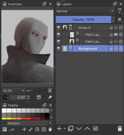
Too much contrast in dockers, I think that’s distracting to have so much contrast and I find it’s a little hard to look at dockers when they have such difference in brightness
-
The second thing I don’t like is the inconsistency with text color, some part it is white, some parts it is dark.
-
The third thing is, I don’t like the “accent” color, it’s ugly IMO
Krita Dark
Original Krita Theme // My suggestion

What I don’t like in the original Dark Theme:
-
Points 2 and 3 about the bright theme
-
I think it should be a little darker
-
The dockers have a darker color instead of a brighter color in the parts you interact with the UI. Bright things draw more attention than darker things, so, because these are the parts of UI we interact with, it’s the UI elements that should be brighter.
Maybe here the dockers and list view have too much contrast on my try here, please give me your opinion! ![]()
Krita Darker

What I don’t like about the Darker Theme:
- Points 2 and 3 about the bright theme, points 2 and 3 about dark theme
- The point 3 in dark theme here is even worse, it’s just too dark.
- The font is in full white, it’s make the text so hard to read, specially on the darkest parts, it’s really, REALLY hard to read what is there
(If you have bad eyesight and my version is hard for you to read, then MAYBE, Krita should have an option to change the font brightness)
Krita Neutral
What I don’t like about neutral theme:
- Point 2 and 3 about bright theme
- It is a little bright for a neutral theme
Krita Ultra Dark
This is my suggestion to add a third dark theme for Krita

Please, give me your opinions/suggestions
So, now I want to suggest some changes to Krita team, these suggestions probably need some code (I guess?) but I believe is nothing too complex, so I will suggest and if you are a Krita Dev, let me know if it’s possible!
-
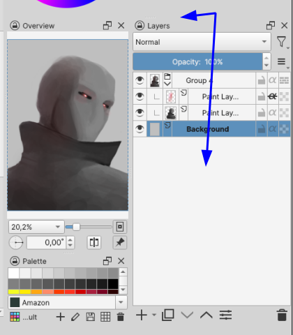
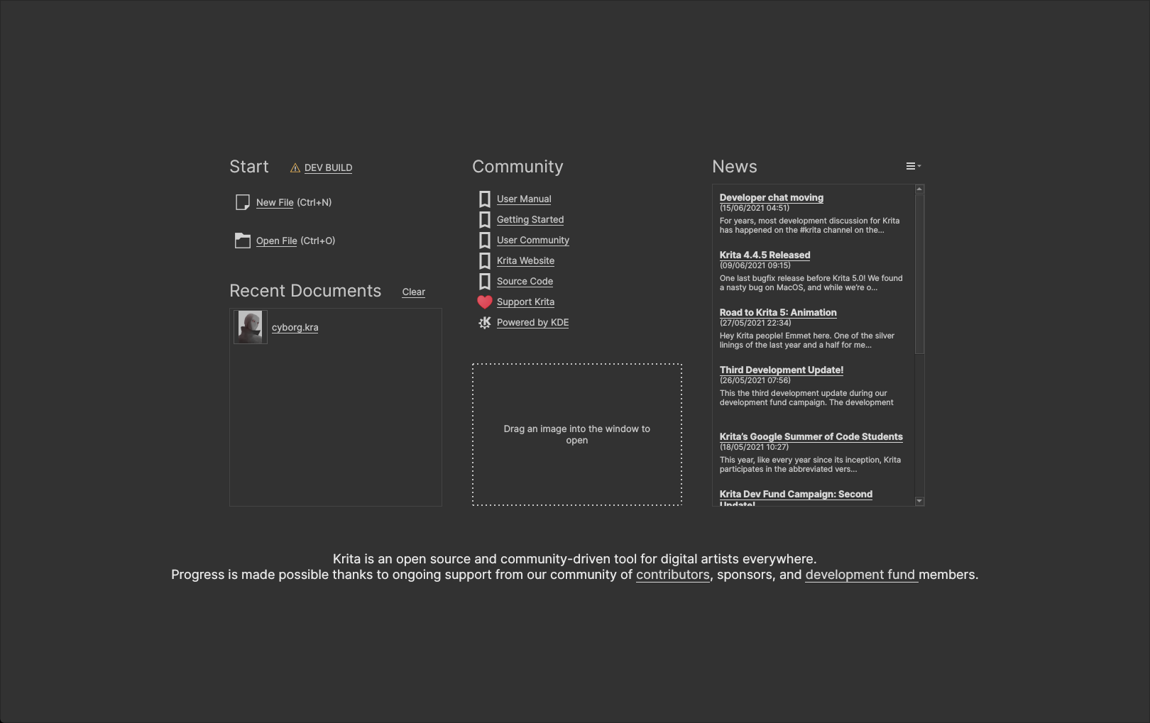
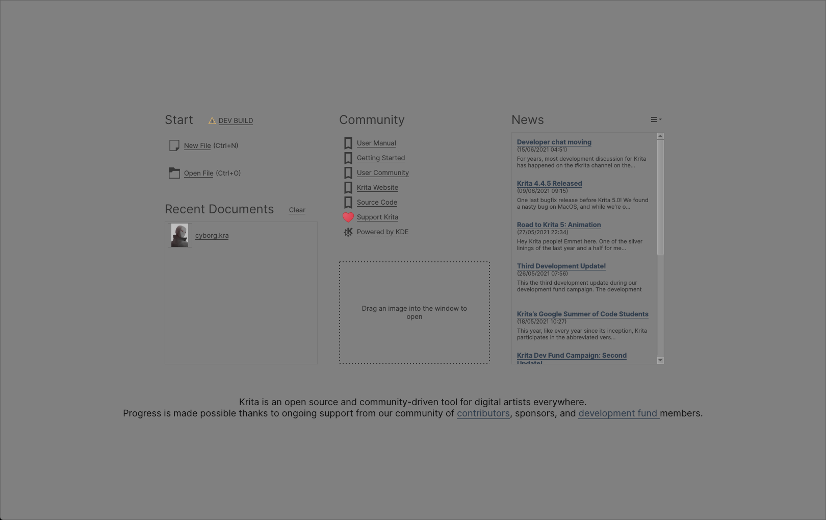
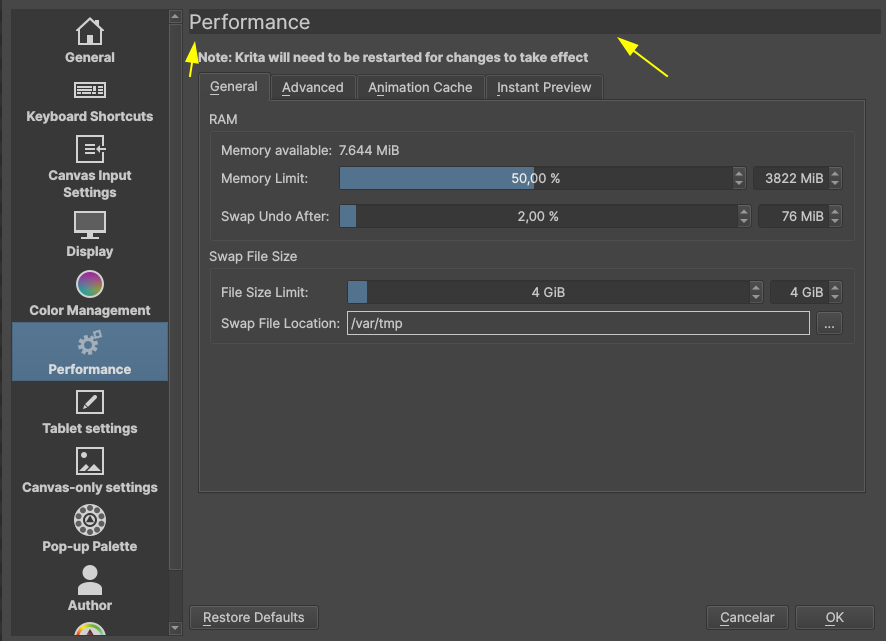
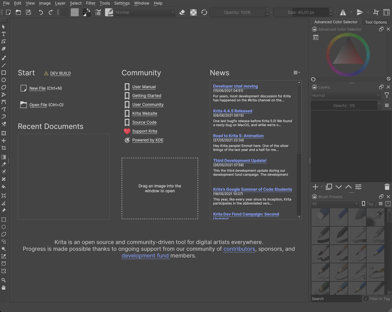
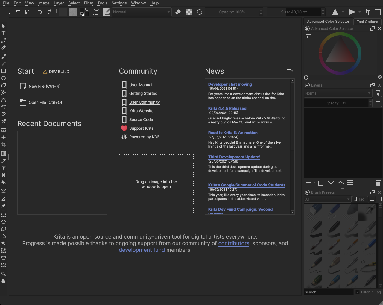
Hide dockers when we are in the welcome/initial page:
Why do that? Because we can’t use the dockers, so why should they appear here? It can also cause some issues if the user has too many dockers or a small screen:
This shouldn’t be hard to do, since it’s just hiding the dockers (here I just used the tab to hide everything beside the title bar and closed the document) -
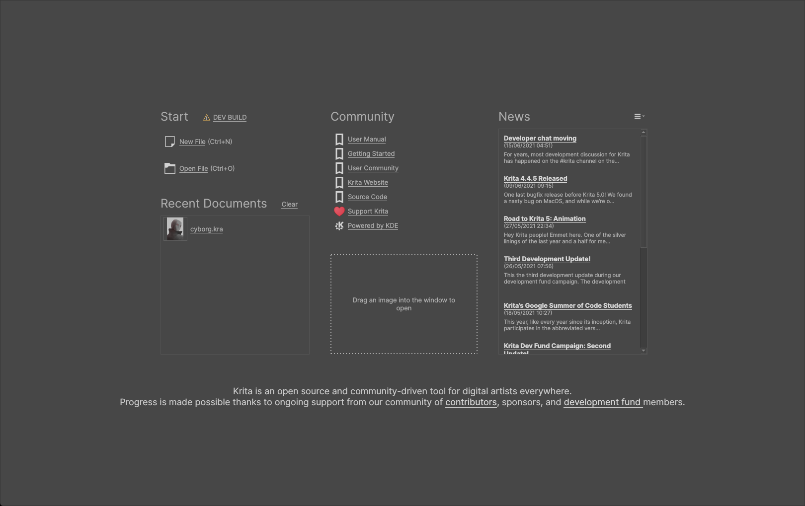
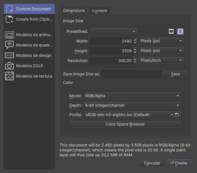
Remove this rectangular box and align the text
Why? It will make the UI look more polish. That is it
-
Adjustable font brightness. As I have said in the darker theme:
(If you have bad eyesight and my version is hard for you to read, then MAYBE, Krita should have an option to change the font brightness)
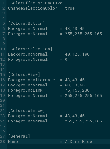
I don’t know if it is too hard to implement, it would need a place in the settings window, but beside that, it’s just a matter of changing the value in the .colors file and update the theme. It would also require a consideration about bright theme.
- Accent colors, let’s say users would have 4 colors to pick as accent colors:
This is basically as hard to implement as the font brightness, needs UI design, and a way to change the color value in the .colors file, also need consideration about how saturated and light/dark the color needs to be (most of it can be done changing the opacity of the color).
If you want to try the themes, here are the files:
Krita_Color_Schemes-new
To use it, go to:
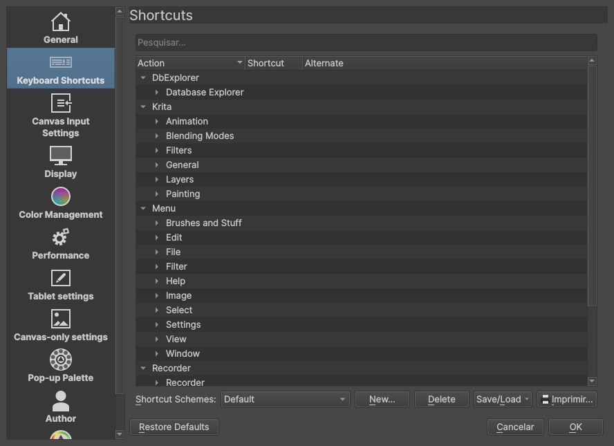
Settings → Manage Resources → Open Resouces Folder
In resources folder, look for “color-schemes” extract the zip file in that folder, restart Krita and the themes will appear in:
Settings → Themes
 “new look, new me”
 was it inspired from it? May be because it is in the purple side it looks that way.


 in the theme I use, I really like it.