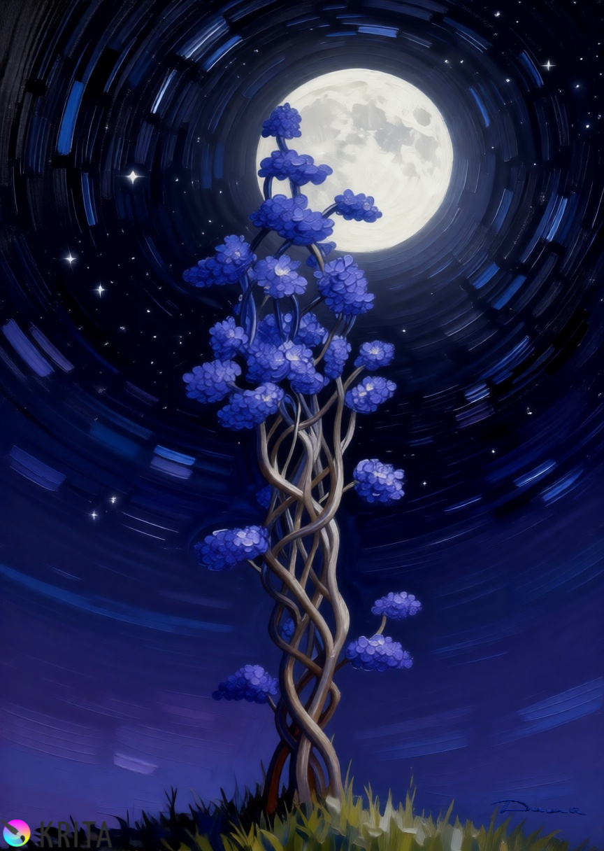
This was the original sketch, in blue and black.
38 Likes
I know this question may get old…but what brush did you use for the leaves/petals? Is it from an older version of the impasto set, or a custom one maybe?
Love how they build up. Also the concentric circles suggesting the earth rotation are a nice touch. ![]()
1 Like
@TaleOfACat Hi. Unfortunately, I can’t say for sure what kind of brushes I used in the drawing. However, I can confidently say that I used the standard set of RGBA brushes. I had never seriously used these brushes before, so I decided to give them a try. I took a brush and started adjusting various settings, and if I liked it, I kept using it. If I didn’t like it, I would take another brush from the same family and experiment with the settings. In fact, there are more than ten layers, overlays, layer copies for enhancing texture, and the use of auxiliary tools, such as ellipses, to create a rotating starry sky. I drew the leaves using the Basic mix soft brush and the canvas texture.
Привет. К сожалению сказать точно что в рисунке и какими кистями именно я не смогу. Но уверенно скажу что использовал стандартный набор кистей RGBA. Я никогда ими серьёзно не рисовал и решил попробовать. Брал кисть и начинал выкручивать различные параметры в настройках, если нравилось оставлял если нет брал другую кисть из этого семейства и также начинал играть с настройками. По факту здесь более десяти слоёв, есть наложения, копии слоёв для усиления текстуры, использование вспомогательных инструментов в частности эллипсов для создания вращения звёздного неба. Листья рисовал с использованием текстуры холста кистью Basic mix soft и наложения
1 Like
looks great!
1 Like
Thanks ![]()
1 Like
Yeah, I see now. ![]() With full zoom I can actually see it is a canvas texture on the leaves, not only simulated brush hair. But still works the same way. Together with the border around each leaf, it gave me the impression of someone applying light blue paint in round spots on (wet) dark blue background colour.
With full zoom I can actually see it is a canvas texture on the leaves, not only simulated brush hair. But still works the same way. Together with the border around each leaf, it gave me the impression of someone applying light blue paint in round spots on (wet) dark blue background colour.
Though looking it up, the RGBA set and soft blender do have (impasto-) brush-like feel as well, not too different from memileo impasto set. Makes sense. ![]()
1 Like
I made the outline of the petals on a separate layer. Then, on this layer, I blocked the transparent pixels and colored the outline with ira tones. After that, I selected the blending mode for the outline.
This drawing is more of an experiment than a conscious understanding of the result. But I liked what I got, so I decided to show it. There are other versions of it, but I would be ashamed of them.
Обвод контура у лепестков я делал на отдельном слое. Потом на этом слое блокировав прозрачные пиксели, раскрасил ирая тонами этот контур. После выбрал для него режим наложения.
Этот рисунок, скорее эксперимент чем осознанное понимание результата. Но мне понравилось то что получилось и я решил его показать. Есть и другие его версии, но за них мне будет стыдно.
1 Like
I’ve been taking a close look at your latest posts, and I couldn’t help but comment on the more elaborate version. The result is simply incredible.
What impresses me most about this piece is how you worked the atmosphere. The digital painting technique applied has brought impressive depth to the night sky; that circular motion of the stars around the moon creates a sense of dynamism that leads the viewer’s eye directly to the center of the composition. The contrast between the cold, diffuse glow of the moon and the vibrant blue tones in the tree canopies shows an admirable technical balance.
Speaking specifically about the vegetation, I must highlight the brush you used. The texture and the behavior of the brushstrokes in the canopies are fantastic, providing a volume and organic quality that bring the scene to life. I have tried many times—really, quite a lot—to create or configure a brush that could achieve this result, but I must confess I have never managed to get anywhere near it. Congratulations on your mastery of this tool; it is a detail that makes all the difference in the final finish.
Furthermore, the structure of the intertwined trunks reveals a very careful study of form. The transition of textures on the branches and the volume provided by the light bring a solidity that perfectly supports the delicacy of the canopies, preventing the drawing from looking static. The work with the brushes and the variations of opacity in the shadows demonstrate a technical command that greatly elevates the scene, giving it an almost ethereal quality, yet with a very well-defined physical presence. It is, without a doubt, a piece of art with great visual impact and is very well executed.
I apologize for my absence from the forum lately. I’ve had a very heavy workload, and to make matters worse, the Krita-Artists notification system stopped alerting me to your new posts. I ended up missing the chance to follow the process closely, which I truly regret, as it is always a learning experience to see what you have been producing.
Congratulations on the excellent work and the artistic sensitivity you bring to your pieces. It is always a pleasure to appreciate what you share here.
Best regards!
Russian by Gemini:
Привет, Дима!
Я внимательно рассмотрел твои последние публикации и не мог не прокомментировать более проработанную версию. Результат просто невероятный.
Что больше всего впечатляет меня в этой работе, так это то, как ты проработал атмосферу. Техника цифровой живописи привнесла потрясающую глубину в ночное небо; это круговое движение звезд вокруг луны создает ощущение динамики, которое направляет взгляд зрителя прямо в центр композиции. Контраст между холодным, рассеянным свечением луны и яркими синими тонами крон деревьев демонстрирует восхитительный технический баланс.
Говоря конкретно о растительности, я должен отметить кисть, которую ты использовал. Текстура и поведение мазков на кронах просто фантастические, они придают объем и органичность, которые оживляют сцену. Я много раз — правда, очень много — пытался создать или настроить кисть, которая дала бы такой результат, но признаюсь, мне так и не удалось добиться ничего похожего. Поздравляю с мастерским владением этим инструментом; это деталь, которая делает всю разницу в финальной отделке.
Более того, структура переплетенных стволов раскрывает очень тщательное изучение формы. Переход текстур на ветвях и объем, приданный светом, создают солидность, которая идеально поддерживает изящество крон, не давая рисунку выглядеть статичным. Работа с кистями и вариации прозрачности в тенях демонстрируют техническое мастерство, которое значительно повышает уровень сцены, придавая ей почти эфирное качество при очень четко выраженном физическом присутствии. Это, без сомнения, произведение искусства с большим визуальным воздействием, выполненное на высоком уровне.
Прошу прощения за мое отсутствие на форуме в последнее время. У меня была очень большая рабочая нагрузка, и, в довершение всего, система уведомлений Krita-Artists перестала сообщать мне о твоих новых публикациях. Я упустил возможность следить за процессом, о чем искренне сожалею, так как всегда интересно наблюдать за тем, что ты создаешь.
Поздравляю с отличной работой и художественной чуткостью, которую ты вкладываешь в свои произведения. Всегда приятно ценить то, чем ты делишься здесь.
С наилучшими пожеланиями!
2 Likes
@Valquer Hi, friend. Thank you for the flattering comment. I feel a little awkward, because I didn’t put much effort into it. I just played around with the brush settings, trying different things. I’m still learning, and I’ve been inspired by the work of others on this forum. I decided to give it a try. I’m also looking for a different style of drawing, as my current method of achieving maximum realism takes a lot of time. I want something that’s quick to create, easy to understand, and highly customizable in terms of shading. So I’m currently re-learning. In my home country, my method of realism is perceived as an AI product, and I’m tired of this hate. If I can come up with something in terms of style, I’ll be able to draw a lot, and I need a lot of drawings for my book. Remember when I mentioned that as a child, I was given a book with illustrations on every page? I have a dream of writing and drawing my own book, which will be like a comic book but on a completely different level and style. I’m glad you’re doing well, but I have a lot of work to do this summer, so I’ll be less available.
It’s been a while since you’ve shared your work with us, so is there anything new?
Привет дружище. Благодарю за столь лестный комментарий. Мне даже не ловко стало, я ведь не особо старался, просто выкручивал все настройки кистей то туда то сюда то обратно. Я можно сказать учился, мне нравились некоторые работы этими кистями у других на этом форуме, и я решил наконец попробовать. И ещё я сейчас ищу для себя другой стиль рисунков, потому что мой данный метод максимального реализма, отнимает очень много времени. Мне нужен быстрый в исполнении, лёгкий в понимании и очень послушный в оттенках. Поэтому я сейчас скажем так переучиваюсь. Мой метод реализма, у меня на Родине воспринимают как продукт ИИ, меня этот хейт утомляет. Если я что то придумаю в области стиля, то смогу рисовать много, а мне для моей книги нужно очень много рисунков. Помнишь я где-то писал, что в детстве мне подарили книгу, где на каждой странице были картинки по тексту. Я мечтаю написать и нарисовать свою, это будет как комикс но только совсем другого уровня и стиля. Я рад что у тебя всё хорошо, у меня сейчас в летний сезон тоже много работы, поэтому буду появляться реже.
Ты давненько не делился с нами своим творчеством, неужели нет ничего новенького?
How do you add the Krita Watermark? nice job man, as always
@Joseiby_Tapia Hi. Thank you, I’m very pleased that you liked my drawing. I did the following with the logo. I searched for the official Krita logo in Google. I found it in PNG format with a transparent background, which is important when inserting it into any background. However, I will provide you with a link to a thread on our forum where the main topic is the promotion of Krita. The guys there have provided numerous links where you can find information on how to achieve this. Marketing Krita – a community-driven idea , but I couldn’t look at them because of these useless sanctions.![]()
Привет. Спасибо, мне очень приятно что тебе понравился мой рисунок. С логотипом я поступил так. Задал в поисковике официальный логотип Krita. Из всех вариантов отыскал в формате PNG у него прозрачный фон, а это важно когда вставляешь он вписывается в любой фон. Но я тебе скину сноску на нашем форуме есть ветка где главной темой является пиар нашей Krita. Ребята там накидали много сносок где можно что-то для этого раздобыть. Правда я никуда не смог заглянуть по ним, из-за этих бесполезных санкций.
1 Like
For everyone who wants to express their gratitude to our beloved program, I suggest adding Krita logos to your drawings. This will help draw attention to the program, support its popularity, and prove that it is not an AI but a human-made creation. Feel free to use them, as we are stronger together.
Всем кто хочет выразить благодарность нашей любимой программе, предлагаю ставить логотипы Krita на свои рисунки. Так мы привлечем внимание к ней, поддержим её популярность, а заодно докажем что это не ИИ, а рукотворное произведение. Пользуйтесь ими не стесняйтесь, вместе мы сила.

This logo is in PNG format. It has a transparent background, which is convenient for inserting it on any color, but if it’s still not visible, there are simple logos on a white background below.
To get it, click and select: Save as?
Этот логотип в формате PNG. У него прозрачный фон, это удобно для вставки на любой цвет, но если всё таки будет не видно ниже есть простые, на белом фоне.
Для того что бы её получить кликните и выберите: Сохранить как?

2 Likes
thanks Im very pleased that you show us your paint. keep up the good work
You asked, and I not only answered your question, but also shared the logos. I wouldn’t bother you just to see my pictures.
Вы спросили, я не только ответил на ваш вопрос но и поделился логотипами. Я бы не стал вас беспокоить, ради просмотра моих картинок.
This looks amazing. The sky totally reminded me of Vincent van Gogh’s Starry Night
@yartydesign Thank you for the comparison, it’s very nice.![]()
Спасибо за такое сравнение, очень приятно.
1 Like
ITS AMAZING i hope you keep making art like this or better cuz this is amazing art i lowkey could never make such good art
1 Like
@Kitkat723 Hi. Thank you. Never say that about yourself, you’ll start to believe it. You can do anything, achieve anything, master anything. Just don’t doubt yourself, believe in yourself, and be yourself. There’s a way to develop and unlock your hidden talent. Give yourself a year to draw one quick drawing every fifteen minutes for a month, and change the subject every day. Repeat the topics for the next month, but remember that the drawings should be different, for example, today it’s a dog, next month it’s a cat, then a rabbit, a hedgehog… Date all the drawings and put them in a folder. After a year, place the drawings from the first month in front of you, and the drawings from the last month next to them. I assure you that you will cry with happiness. Remember that every victory is preceded by a battle with oneself. Check out my scotch, where I share my drawing techniques and provide some motivation.
(My translator keeps writing “draw every 15 minutes.” NO. 15 minutes per drawing. I recommend translating my original text through your translator.)
Привет. Спасибо. Никогда не говори так про себя, сам же и поверишь в сказанное. Всё ты можешь, всего можно добиться, всем возможно овладеть. Главное не сомневайся в себе, поверь в себя, будь собой. Есть один способ развить и дораскрыть в себе скрытый талант. Дай себе слово в течении одного года, в день рисовать по одному быстрому рисунку за пятнадцать минут. В течении месяца каждый день разная тема. На следующий месяц темы повторяешь, но запомни рисунки должны быть разные, например сегодня собака, на следующий месяц кошка, потом кролик, ёж… Все рисунки датируй и клади в папку. Через год положи перед собой те что рисовал в первый а рядом за последний месяц. Уверяю ты заплачешь от счастья. Запомни, перед любой победой всегда идёт бой с собой. Загляни в мой скотч, там делюсь тем как я рисую ну и немного мотивирую.