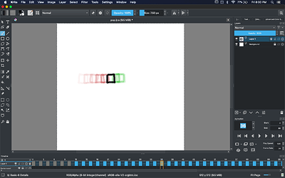
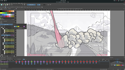
@tiar and @AhabGreybeard : Hmmm. The workspace issue is probably due to the fact that you already have the old Animation workspace in your Krita configuration directory. I pushed the new workspace to master, but it’s probably not replacing, and still loading, the old workspace. This is my first time tweaking any of the workspaces or other static resources that Krita includes, so I’ve probably overlooked something.
I would have liked the old dockers to be available as ‘Old Timeline’ and ‘Old Animation’ because sometimes I do like nice big buttons all grouped together for easy access.
I realise this may have been a policy decision to throw out the old and possibly to avoid confusing new users.
Truth be told, I’m not interested in doing this and I don’t really see it happening any time soon. Of course, Krita is an open source project and I’m not in a position to dictate anything, nor do I want to be, so if someone wants to bring back the old stuff it’s certainly possible–with the caveat that some code would need to be changed for it to work with other changes that we’ve made under the hood.
Objectively speaking, the old design was not only very space-inefficient, but it was also faux modular, in the sense that the classic Animation and Timeline dockers were so strongly coupled and codependent that there was essentially no scenario in which one of those pieces could be used without the other. If two things are always needed for a single task and can’t be used independently in any meaningful way, they are effectively one thing. Right? That’s my thought on it at least.
Why has the Auto Frame Mode on/off icon been tucked away in the ‘Animation settings menu’ drop down, so that it needs two clicks to operate it?
There is room for it closer to the other icons that it used to be grouped with.
The overall strategy here is to put the widgets that are central to the animation workflow (stuff that is used or tweaked a lot during the course of animating) front and center, while taking the set-and-forget, configuration kinds of things and place them in a little cupboard. Why?
For a few reasons. The first and biggest one being clarity. In my opinion, the more UI chrome is on the screen at once the more cluttered, confusing and potentially overwhelming the program becomes, especially for inexperienced users. Ideally, any user, even someone who is brand new to Krita, should be able to look at the Timeline and understand it in a glance. Of course experience users will just get used to anything, but I hope that even they can benefit from a Timeline that shows what they want to see more immediately.
The second (arguably less important) reason for hiding some low-traffic widgets in a submenu is that UI space is a resource. Yes, there is a lot of room on the Timeline’s titlebar right now but Krita is by no means finished, and as we continue to add features to the animation system Eoin and I both felt that some space should be reserved for potential new, high-traffic widgets.
With all that said, I think there’s definitely still room to debate which UI elements should be out front and which should be hidden. AutoKey seems to me like the type of thing that you only change occasionally, so we hid it… But I don’t know how every animator works!
The Onion Skin icon has a tool tip that says ‘Audio menu’.
I assume this is a simple error.
Yeah. That’s a bug. Nice catch! I’ll fix it on Monday. 
If you arrange the Onion Skin docker at the right side of the Animation Timeline, then when you activate it the Onion Skin on/off icon jumps to the left; a bit of visual disruption.
The Onion Skin icon could be placed at the left so that it’s closer to the layer onion skin lightbulb icons so forming a closer and natural association.
Yeah. But if you were to place the Onion Skins Docker on the right of the timeline then just about everything would jump, no? I’d prefer to keep all of submenus (Onion Skins, Settings, and eventually a newly designed Audio Menu) near each other, and the right feels like a better place to do that than the left.
Maybe we can play with some alternate arrangements though. I’ve heard some people suggest having the transport controls in the middle of the titlebar like Blender does.
The Last Frame button was useful in that it would jump to the End frame number as set in the Animation docker.
I don’t see the utility in this, so we removed it. We could remake the action for it so that it could be bound to a hotkey still, but it doesn’t seem useful enough to dedicate a button to. Do you use this button often?
The First Frame button would jump to the previously selected active frame which I didn’t think was much use and I’d have preferred it to jump to the Start frame number.
The secret of the new Timeline transport controls is that the stop button has 2 behaviors:
- Clicking
stop once brings you back to the select frame (where you started playing from).
- Clicking
stop again (or anytime the active frame is the selected frame) brings you back to the starting frame of your animation.
In other words, click once for the old way, and click twice to bring you back to the first frame. Of course, none of this is documented yet and maybe we can can illustrate it better.
Anyway, I appreciate the feedback. I hope I don’t come across as defensive, I’m not trying to be, I just want to help explain some of the rationale behind various design decisions. More information can be found ⚓ T12983 New Animation Timeline Docker and New Animation Timeline GUI (!317) · Merge requests · Graphics / Krita · GitLab.


