Add general Apply/Cancel/Option buttons to Toolbox, Add Export button to Main Toolbar by default

Today I installed Krita for a colleague with zero image processing experience. All she needed was to crop a picture and export it as JPG. Watching her struggle on first use, I identified two key improvements to boost first-time usability:

  1. Add Apply/Cancel/Options buttons directly to the Toolbox
  2. Add an Export button to the Main Toolbar by default

On a 1920×1080 screen, the Tool Options docker is easy to miss:
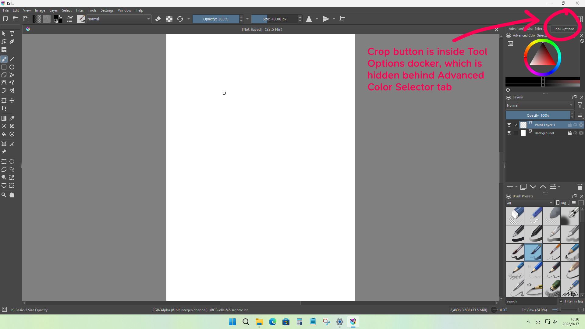
Even when activated, the main action button (e.g., Crop) is often hidden below the visible area due to insufficient vertical space:
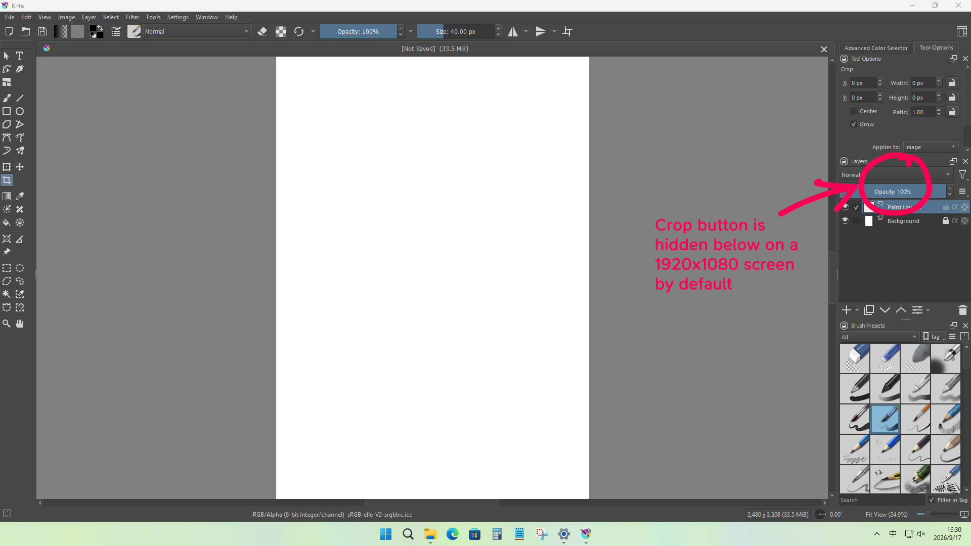
She couldn’t find how to crop – there was no visual cue. Younger or less tech-savvy users rarely think of keyboard shortcuts like Enter; they use the keyboard only for typing.

If a user selects a tool from the Toolbox, they expect its primary controls to be immediately visible nearby – not buried in a distant, scroll-dependent panel. This is a major first-use usability issue.

SAI does this better, because all its panels are grouped to the left side, and it shows more panels, so people can always find what they want.

While we can’t overload the Toolbox with options, ample unused space exists to add three essential buttons:

  1. Apply: label changes per tool (Crop, Transform, etc.)
  2. Cancel: lets users abort the current tool action
  3. Tool Option: opens the Tool Options docker, ideally as an on-screen popup

After instructing her to crop the image, she ran into a problem of saving the result as a JPG.
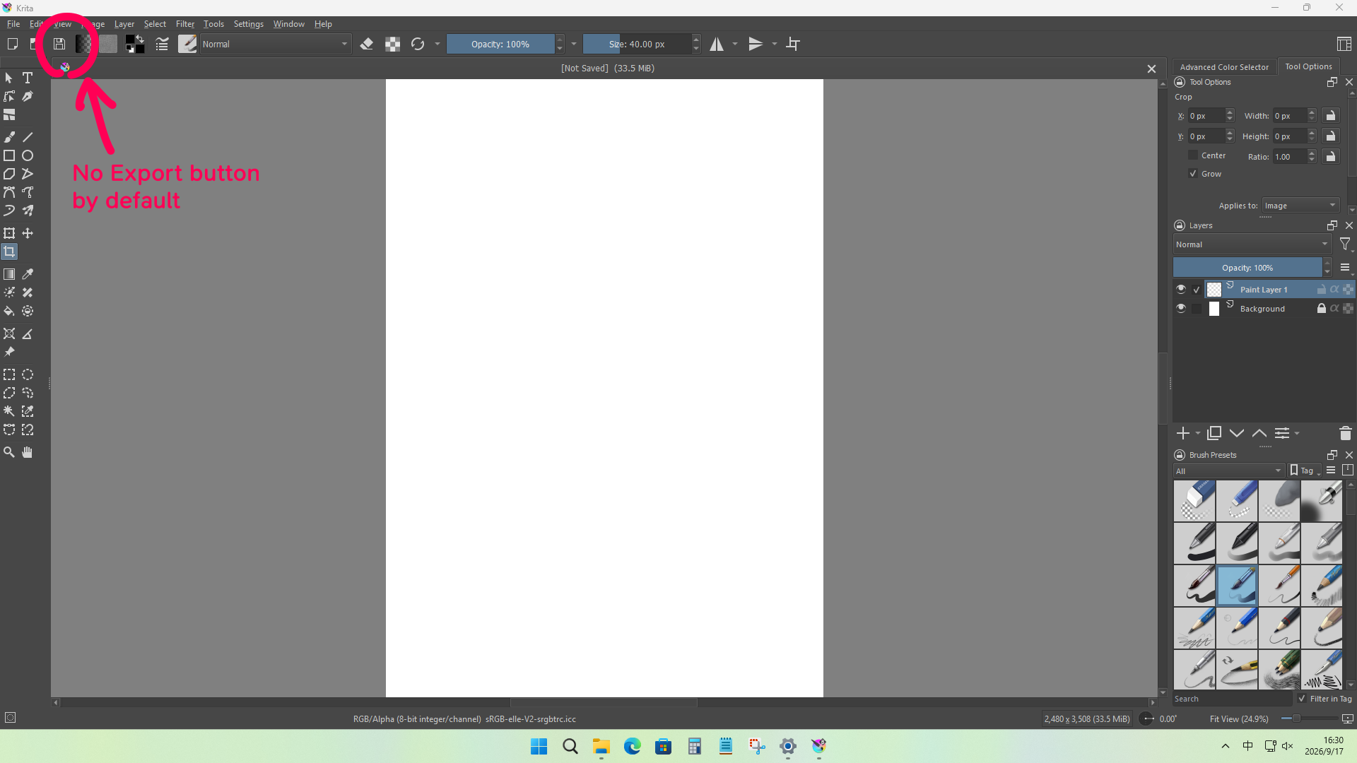
Krita lacks a visible Export button by default. New or younger users often miss the File menu entirely – they don’t even click the menu bar, assuming it’s not interactive.

We should add an Export button to Krita’s Main Toolbar by default.

So I added the button for her, but it was not enough – when she clicked it, she immediately hit another wall:
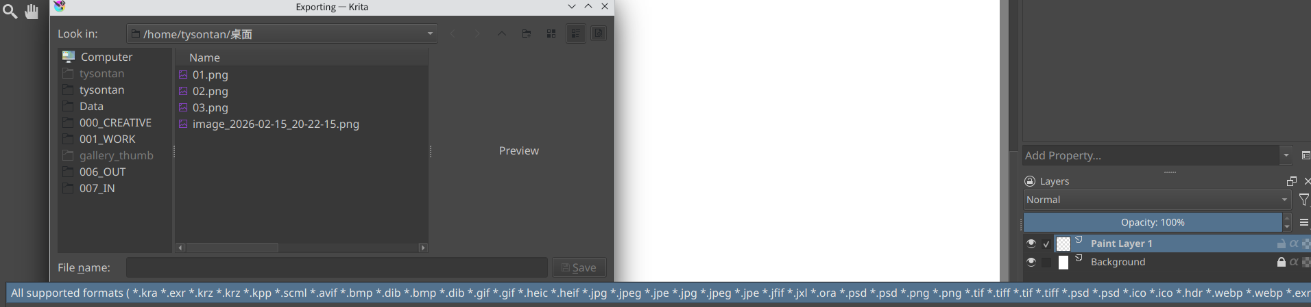
The insane Exporting dialogue, defaulting to “All supporting formats”, which is useless unless you specify a correct extension, it doesn’t look very clickable with all the stuff, either. And when she clicked on that droplist, it exploded into an overwhelming mess, both horizontally and vertically, with ~90% unfamiliar formats, including JPEG-XL, which distracts from the trusty old JPEG she actually needs.

Photoshop’s “Save for Web” exists for good reason. Krita needs something similar: a beginner-friendly export button:

Save for Web: a toolbar button next to Save, opening a clean popup with only 4 round icons:

  1. JPG
  2. PNG
  3. WebP
  4. Others (opens the full export dialog)

This is less a formal suggestion than a call for discussion – but every time I introduced Krita to a new user, they got stuck at exactly the same steps, struggling with the simplest tasks. I hope we can make it easier to learn, and these buttons also benefit Android users.
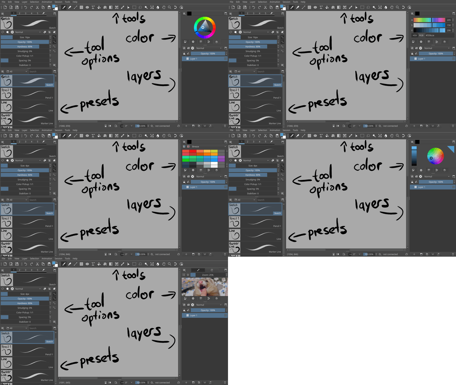
Sensible defaults are a very good idea, but I think it needs someone to be given dictatorship over it. While a degree of discussion makes sense, there needs to be someone who will make the decision in the end and overrule the dissent. There will never be a total consensus on this stuff, someone will always have totally legitimate arguments why a different default may be better and in the end it’s just a matter of taste. I’d personally be fine if that dictat was given to you, Tyson, for example.

Otherwise, I can back up the issues with the default layout, questions in that regard come up repeatedly. It hides the tool options, doesn’t fit on smaller screens and users struggle to find commonly-used docks like HSV sliders.

Similar questions used to come up in Drawpile as well, which I solved with the following kind of layout. The questions went away. This layout doesn’t map exactly to Krita, since it e.g. doesn’t put brush properties in the tool options (which is questionable usability as well, I don’t need to see brush settings while I’m holding the select or transform tool) but I think the idea is clear enough.

Default layout

Relatedly, it also hides the color wheel’s shade selector by default because people confuse it for HSV sliders and obviously that only causes despair.

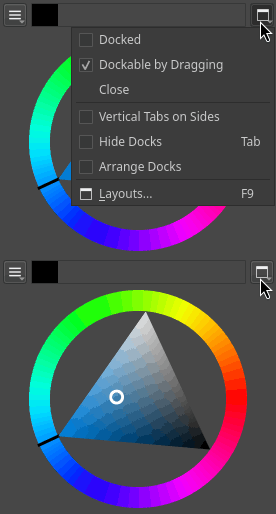
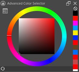
This adds much more space to the tool options to make scrolling less of an issue. We could still get some more though. Currently in Krita, the dock header consists mostly of useless items: a lock button, a title that says something cryptic like “advanced color selector” you can drag the dock by and two buttons that users click on accident and then they ask where their dock went.

That’s how they looked like in Drawpile once as well, but they’ve since been rejigged to instead use the title bar for sensible menus and additional space. Stuff that you need once in a blue moon like closing docks, toggling their floating state etc. is stuffed in the menu.

Drawpile dock headers

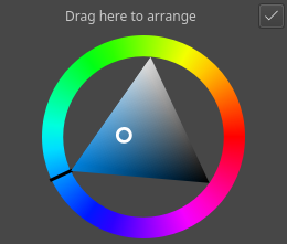
If you want to rearrange your docks, you hit “Arrange Docks” and then it turns the title bars into this so you can drag them and hit the button when you’re done.

In the latest version, I also turned off double-clicking to toggle the floating state of docks and made the drag threshold when not in arrange mode significantly higher than normal, since users would regularly rearrange their docks when they didn’t mean to. A mode like this would also maybe let us solve that annoying problem of the drag handles on the sides of docks being impossible to hit with a finger, since we could make their hit area bigger in that mode, but I haven’t looked at it yet.

With regards to apply and cancel buttons, I think stacking that into the already very full top toolbar is not a good idea. They are contextual, not general, so they have no business being in a general area like this. Users are likely to discover them while they’re not using a tool where they matter and then mentally mark it off as some useless button in the giant cockpit that they don’t understand.

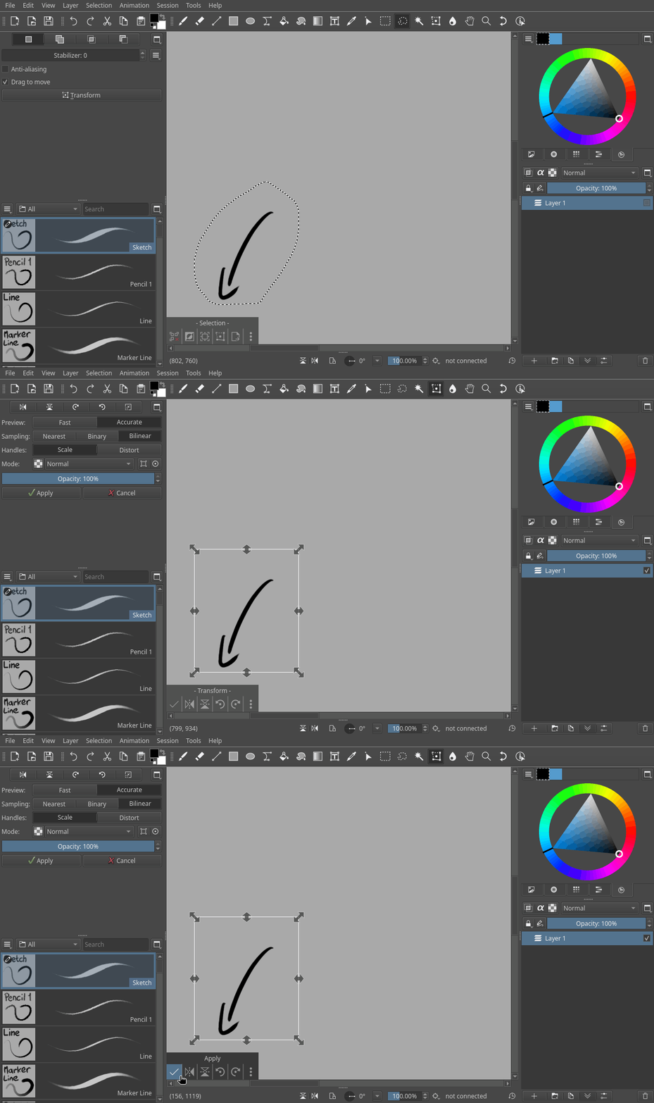
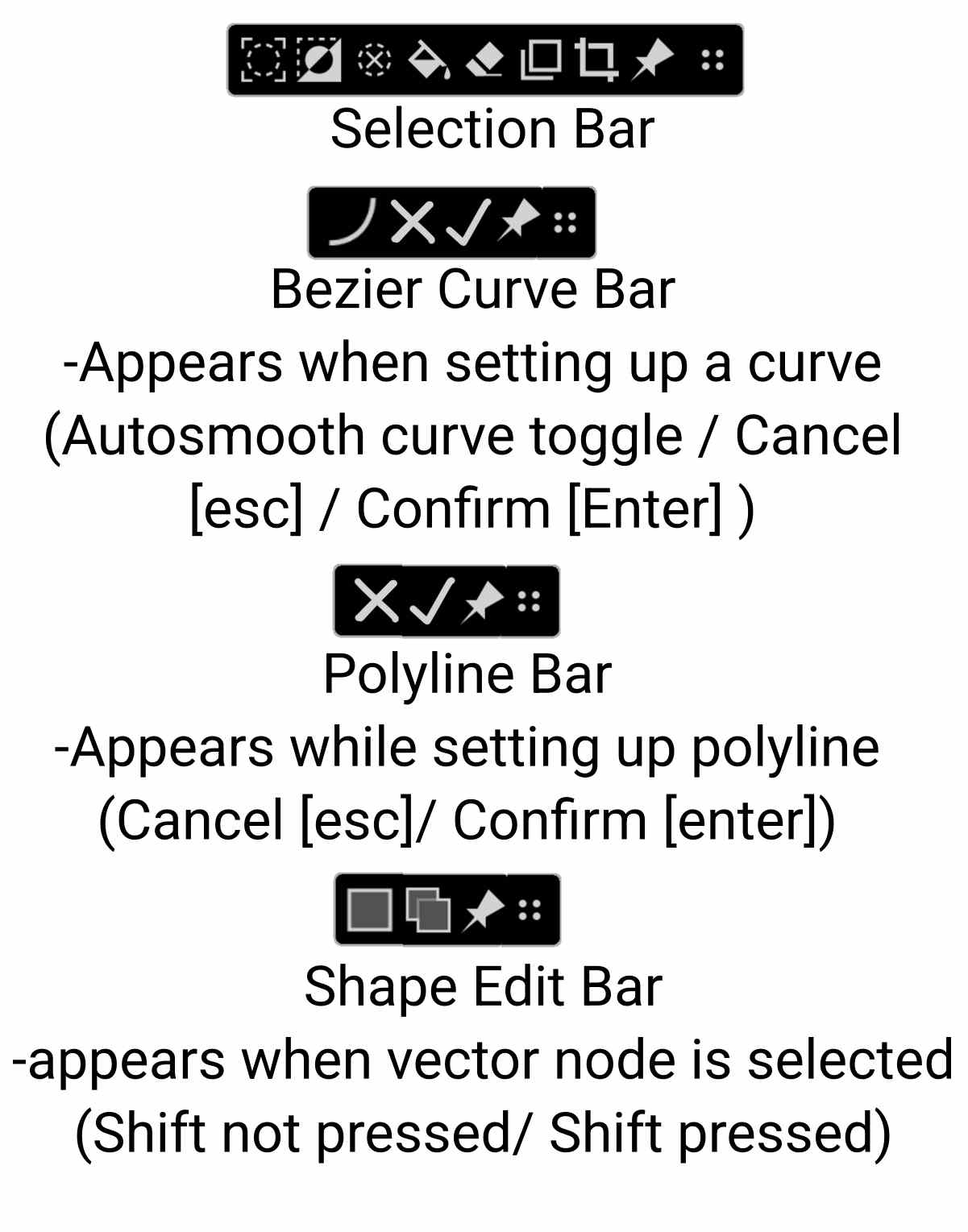
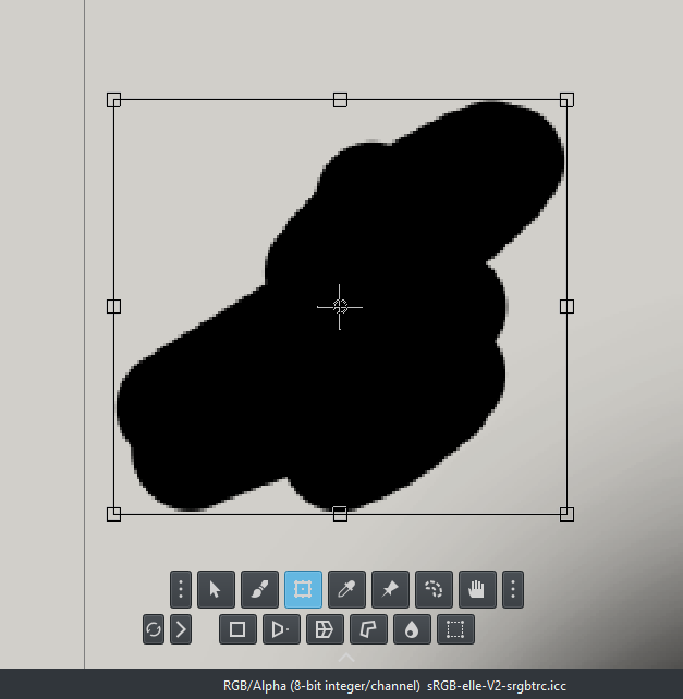
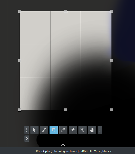
Having some kind of HUD popup thing on the other hand is a good idea. Krita has it with the selection action bar already, even though its implementation is questionable. Drawpile instead has a fixed HUD thingy in the corner, which shows up for transforms and selections. This idea works for any kind of multi-part tool and can show various contextual options, apply and cancel being among them.

Action bar

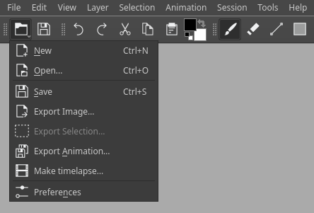
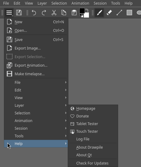
I’ve personally never heard of somebody being unable to find an “export” or “save as” button. However, maybe having some kind of hamburger button in the top-left corner with this sort of common stuff in would make sense I think. We could maybe even replace the “new” and “open” actions with it, most users are probably not creating and opening documents with such alarming frequency that they need to have them available with one click, it could just as well be one click on a “file” button and then another on a big menu item with a pretty icon. I have no evidence that this would be a good idea, but I may just do that for Drawpile and see if it garners major complaints :slight_smile:

Edit: did that now. I like this personally, will see if there’s dissent. I kind of doubt it though, New and Open seem like they are much more rarely used than e.g. Export.

And somewhat unrelated: the export dialog drop-down being super wide looks like a bug with the system dialog? Mine doesn’t look like that, it lists no file extensions. So it might be a bug to report elsewhere.

Thank you, Carsten – as a developer, you dive much deeper into these issues than I can.

I agree the Selection Action Bar (SAB) is a good starting point. My current concerns:

  1. Too many unlabeled icons – hard to distinguish. We should consider default to =<4 icons, with all others collapsed into a hamburger menu (Icon + Text).
  2. It should be docked by default – e.g., to a corner (like Drawpile) or screen bottom.

This makes SAB a flexible base for ALL functions – not just selection actions. Apply/Cancel/Tool Options could live here, giving users consistent visual cues.

Regarding the file dialog: probably it’s not a bug – “All supported formats” lists all extensions inline. But it expects users to manually type an extension unless they pick from the dropdown – which is overwhelming and confusing due to excessive, redundant entries.

That said, few users complain about missing “Export/Save for Web” – perhaps not because they didn’t run into the issue, but because less experienced users rarely report issues; they just stop using the app. I often see new users save their working files as JPEG (losing layers) or KRA (unshareable online) --issues resolved only by clearly distinguishing SAVE from EXPORT.

Confidence in an app’s ability to complete a task keeps users engaged. As an experienced user, I assume a solution exists somewhere – but new/casual users don’t share that expectation, so we must keep that in mind.

Yes, the selection action bar in Drawpile actually got implemented because I got annoyed at how it worked in Krita and wanted to make sure I wasn’t talking nonsense with feedback. Among other things, it has less icons, lists the purpose of them when you hover over them and has an overflow menu. I recorded a video for it at the time for suggestions, slightly too large to upload it inline though: https://drive.proton.me/urls/ZJGTSQ0TVR#cqJBeLXENpO2

Although I don’t want to actually make these kinds of usability changes to Krita myself, since I feel like I’m too biased from having done the work in Drawpile already. I’d rather provide the experiences and have someone else adapt it for Krita with a fresh mind, they may be able to do even better than me just copying the solution I like.

And yeah, it might just be something I’m unaware of. In Drawpile, we often don’t see these “beginner problems” because our beginners are almost never starting on their own, they’ll be drawing together with more experienced users and will simply ask them for help. I’ve definitely seen the occasional question from people saving as PNG or PSD instead of a sensible format though.

Separating “save” from “export” is definitely also something I’ve considered, but I feel like I can’t really tell a user “oh no to save as a PNG it’s wrong to click on save as,” they’ll think I’m pulling their leg. However, it would make sense to me to turn requests to save the image as a data-losing format into implicitly exporting it instead, so that the document will not be marked as saved and when you try to close the image it’ll tell you that you have unsaved changes.

Just to throw my 2 cents into this.

It could be just me, but when I use a new program I know where to look for my save option I learned that in school in my IT course. It is always under file. I don’t care which program I use. I see it as a bug if it is not there. So I either expect a button to jump in my face or it better be found under file.

The second thing I do in a new program, is hover over the icon and wait for a popup to show, which explains what that button does, which krita does by the way. So a new user should, without a problem, be able to find the crop tool.

On that note, I like the idea of the tool options docker to be moved into an action bar. It happens often, that there is an option, but the user does not know it exists, because the option docker was closed because "when using a brush I don’t need stabilisation " so it is gone. And never to be seen again. I think that is also the problem, why the new text tools got so much bad feedback. There are now 2 docker hiding the power of the text tool.
If the action bar would display a set of options, which could be configured and open the docker with a button to show the additional options when clicked would greatly increase the user experience in my opinion.

I would recommend you just go ahead and implement what you have in mind for Krita. Everybody seems to have their own work going on right now. In the open source world, if you noticed something that annoys you, and you are a developer, chances are you are the only one capable of/willing to fix it. XD

My view on the Save/Export issue is strictly from a beginner’s perspective. I know about the File menu – but younger, less experienced users often don’t. Many grew up on mobile devices, not desktops, and prefer editing videos on phones over desktops (which is insane to me). Most of their apps – browsers, Office, social media, messaging, games – use button- or icon-driven UIs, not dropdown menus. As an IT admin and tech helper for family and friends, I constantly see people struggle: they look desperately for a save button or check the context menu, then freeze when they can’t find it. The menu bar doesn’t feel clickable to them – and Krita may be the first app they’ve ever seen with one. A hamburger menu would be more intuitive to them, which they understand to be “more options.”

“Oh that menu is clickable?” Does not sound like a beginner, but a person who doesn’t know anything about programs. And if that is the case, it is not a problem for krita to fix.

Making a user-friendly interface for mobile is also another feature request.

I think @Drawpile did a good job with that drop-down menu, I think it would be better to use another icon to suggest to the user, what you can do here, but it is a redundant feature as it is already implemented in the menu. Well if the menu will someday disappear, that won’t be a problem anymore :person_shrugging:

It is my experience that it is much easier to fix software than it is to fix people. It may not be Krita’s fault, but it’s probably something Krita can fix.

We could even just dump a duplicate of entire menu bar into a hamburger menu at the top-left. Like, it could have the most common actions like New, Open and Export, but then also just File, Edit, Settings etc… actually, now that I wrote it, that seems like a good idea in general, so I changed the Drawpile menu accordingly. Doesn’t hurt to have these here as well.

And according to some bug reports, the menu bar does disappear on some Linux systems because somehow the silly global menu eats it. So it could also serve as a bit of a bodge around that if we stuck it in Krita as well like this.

I made this concept image a while ago that expands on the Action Bar idea to also encompass additional tools, which I think would also work well with the Crop Tool. Things like having Enter/Cancel appear during the usage of a specific tool would be very useful.

tried to do a reset and apply button for transform tool and also for the crop tool


I am divided, but it is there I suppose.

I agree about the save options, many new users are used to hand held and touch devices now. So a button for export is expected. We from millennials age group know about the file menu etc but newer generation starts from the tablets and hand held devices so a export button helps. CSP too has quick export to jpg and png buttons. So I think having those buttons is good to have.

Separating the buttons actually makes things much more readable, and if we can add spacer like the toolbars, then we can group the actions better, too.