Your work is actually good if taken by themselves. Nothing actually very bad about them. Each piece is a great work in their own right.
But, you are going for emulating specific looks. It is the emulation that you are failing and what I’m criticizing the pieces for. If you are going to emulate Picasso but end up doing a Monet or even Leonardo… Yeah, Monet and Leonardo are great, but they certainly are not Picasso.
So, I’m just kinda pointing you to a general direction about the style. Each poster you are emulating have their own distinct styles so no single way applies. You have to study the individual posters. But there are general similarities between the posters that I could point out.
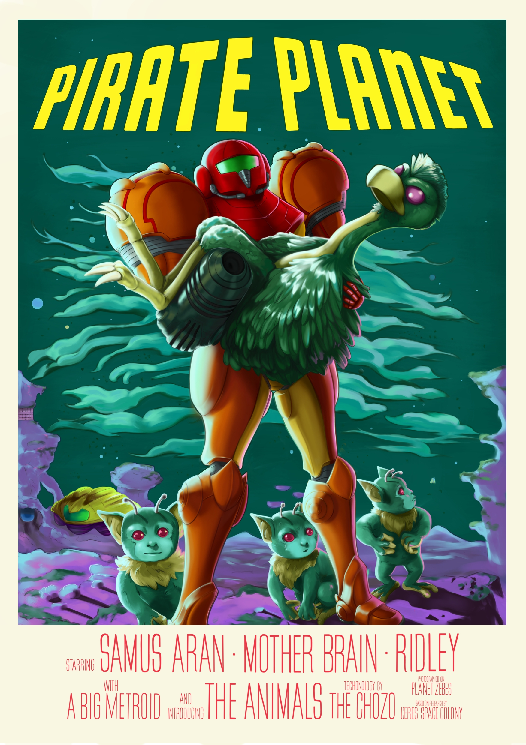
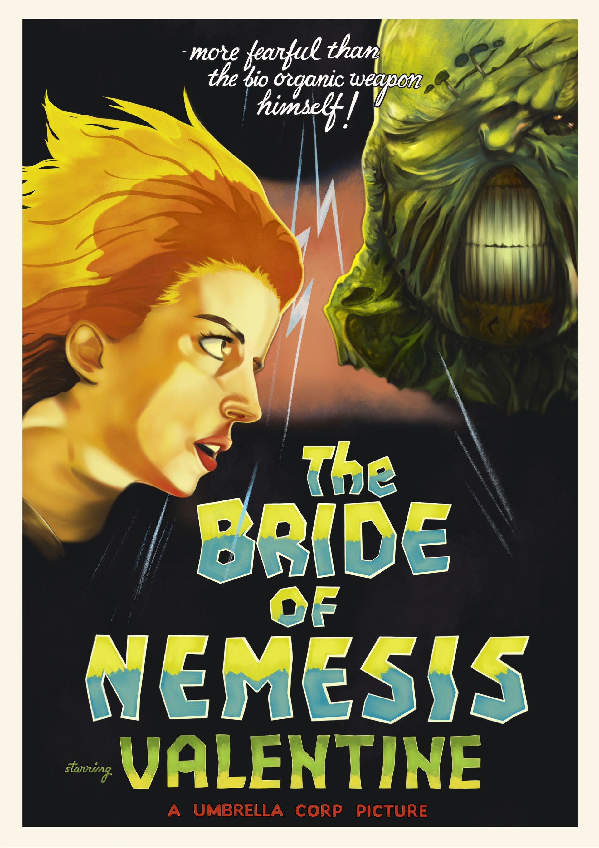
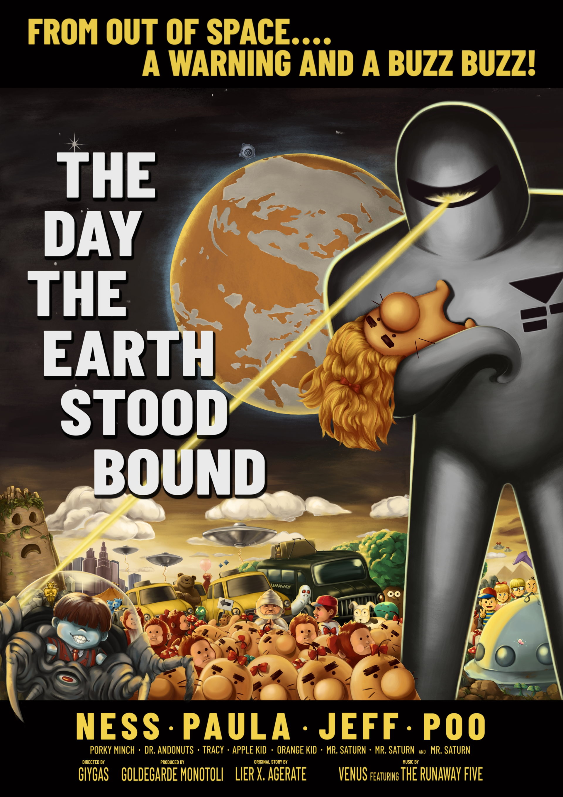
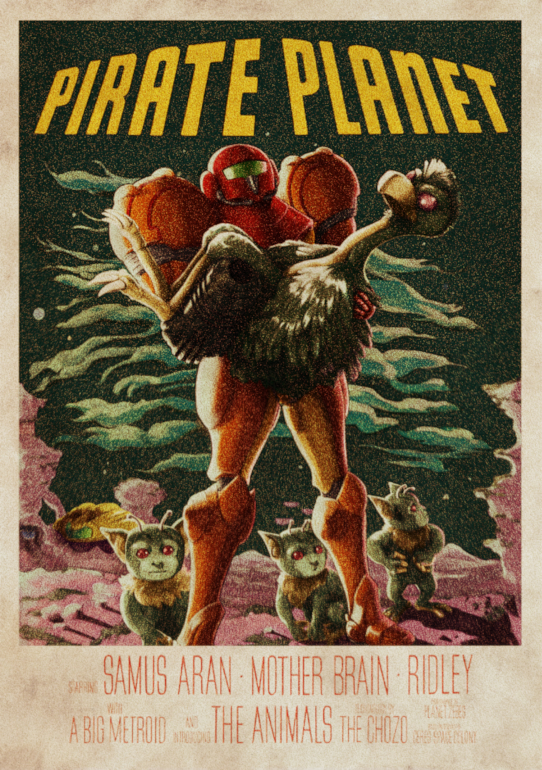
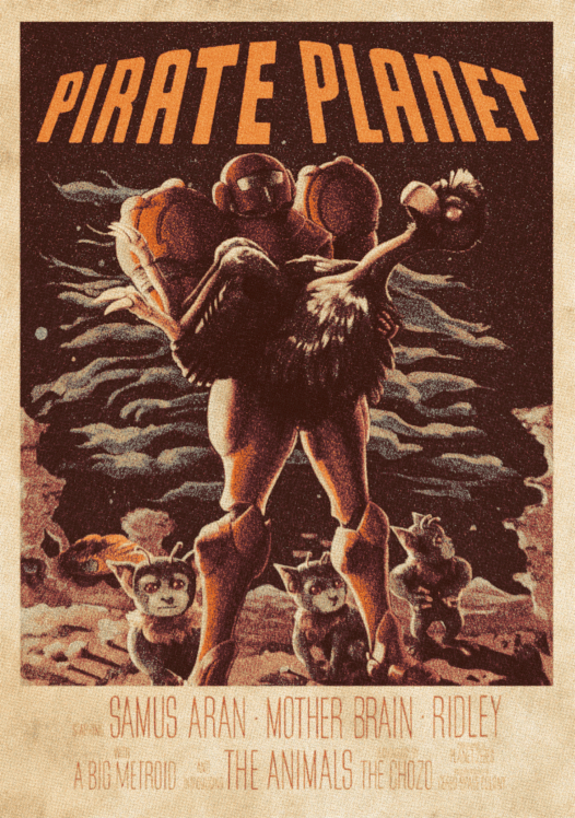
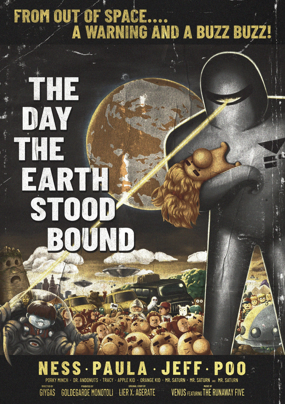
From my reply: don’t do very smooth gradations/blend when the poster you are imitating doesn’t do it or didn’t do it as much. Pretty much all three posters you are trying to emulate doesn’t have very smooth gradations. What they have are actually closer to cell shading. Colors besides each other with very little if any blending.
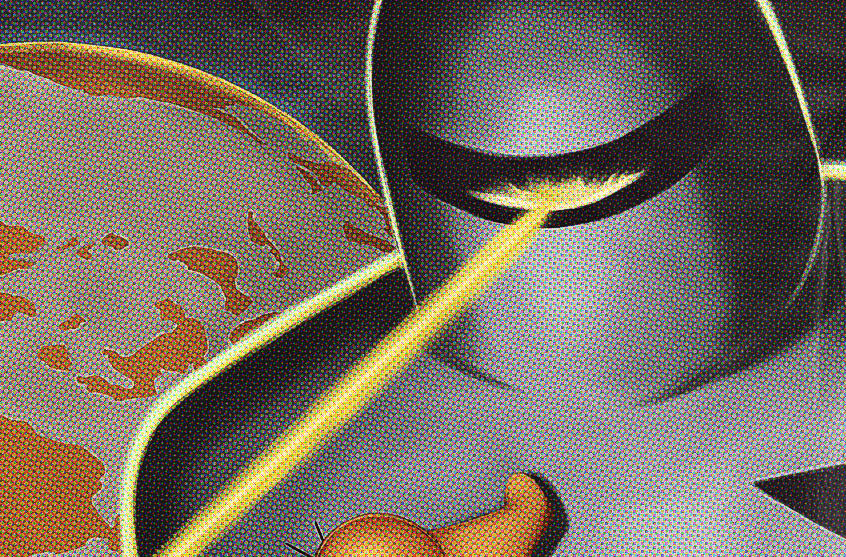
The lack of contrast. All the three original posters have very strong contrast in color and values. This seem to be practically a defining trait of the three. In all your versions you flatten all of that. In the The Day The Earth Stood Still poster for example, the small figures on the lower left are strongly backlit in white (practically thick white outlines) which is then directly contrasted with a dark color or even black just directly next to it with almost no blending between them. It is the strongest application of the technique. That sharp contrast is gone from your version, no white backlight in all the figures. Your Pirate Planet is the worst sinner of this since the original poster uses this sharp contrast in every bit of it and you took it all away.
And then there are the details. You over rendered everything. You practically rendered thin strands of hair or individual feathers. Your outlines are also incredibly thin. These posters never do anything close to that mainly because the nature of the medium.
If you want, maybe I can try rendering small parts to show what I mean? I’m not very great artist myself though and I never tried doing anything like this but I do hope that I could show you what I mean.
And also, the others actually have very good ideas too that are worth trying. Kronos practically advice to lean into your own style and go for posters/art/illustrations that closely resemble yours. That is a good way to go forward. I mean, your own style is not bad at all, it is just not the style the posters you are emulating have.
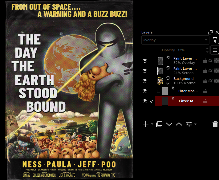
By the way, the best one I think is The Bride of Nemesis. That one actually gets really close to the original style. You can do more of course to get the style (like reduce the amount of rendered detail), but this the closest one. A bit of filters and textures and that one might actually look like a vintage poster.