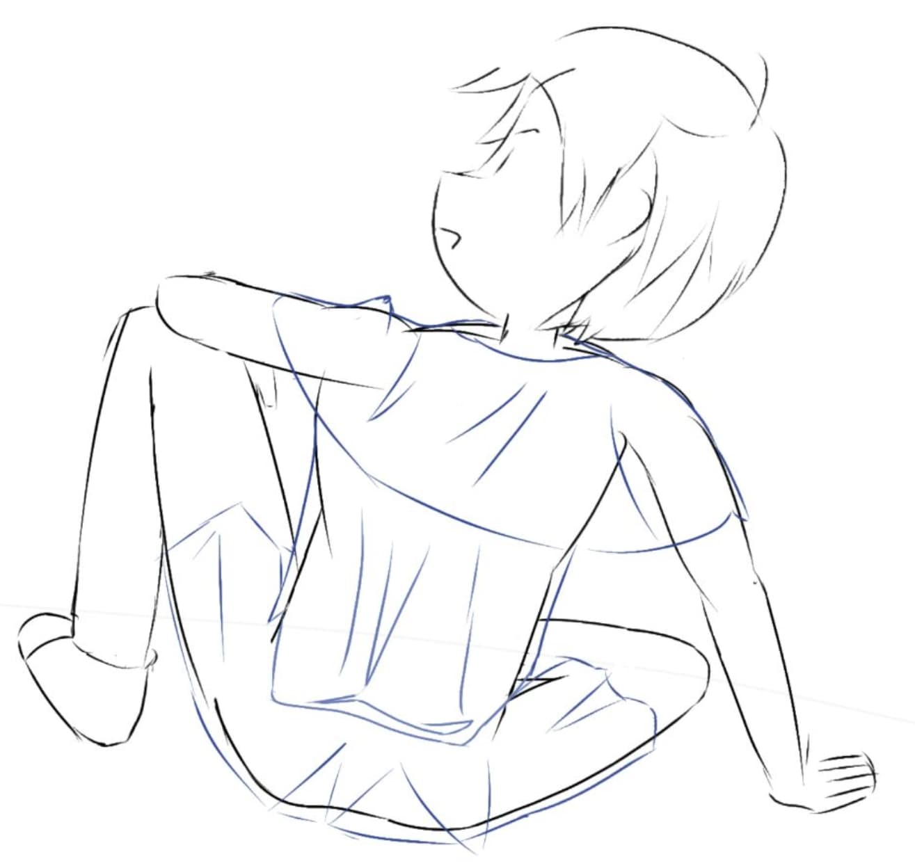
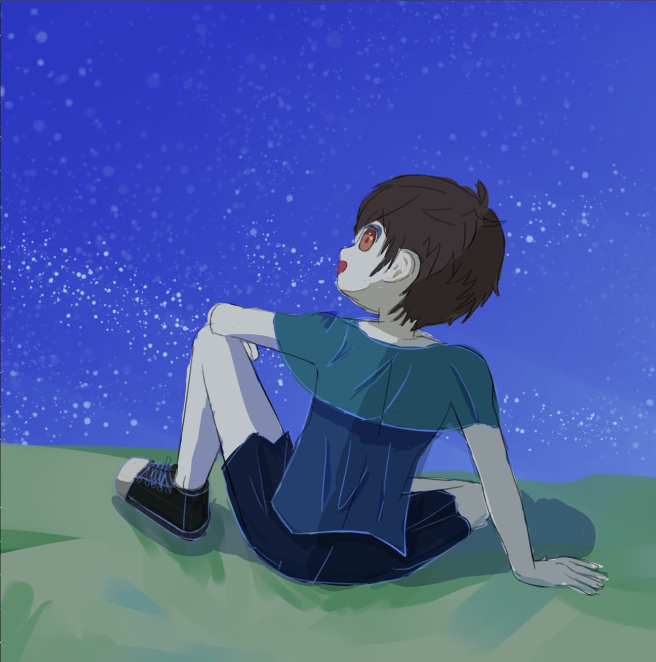
In the first draft version, I mainly decided the pose and scene of this artwork. But the overall color theme can’t inspire me a lot, so does the facial expression.
4 Likes
The eyes are better than before since perspective is considered.
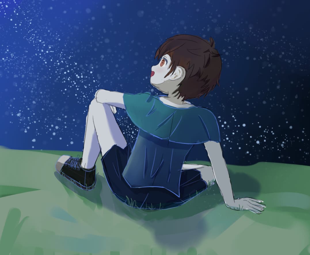
More shadow details and interactions with the environment are added in this version of draft.
3 Likes

New Experiment points out that warm skin color still works good in cold color invironment(and makes the charactor looks less like zombie), and I will keep with that.
Also, some of my friends told me the stars doesn’t look like that. I think this version is better for a milky way?
3 Likes
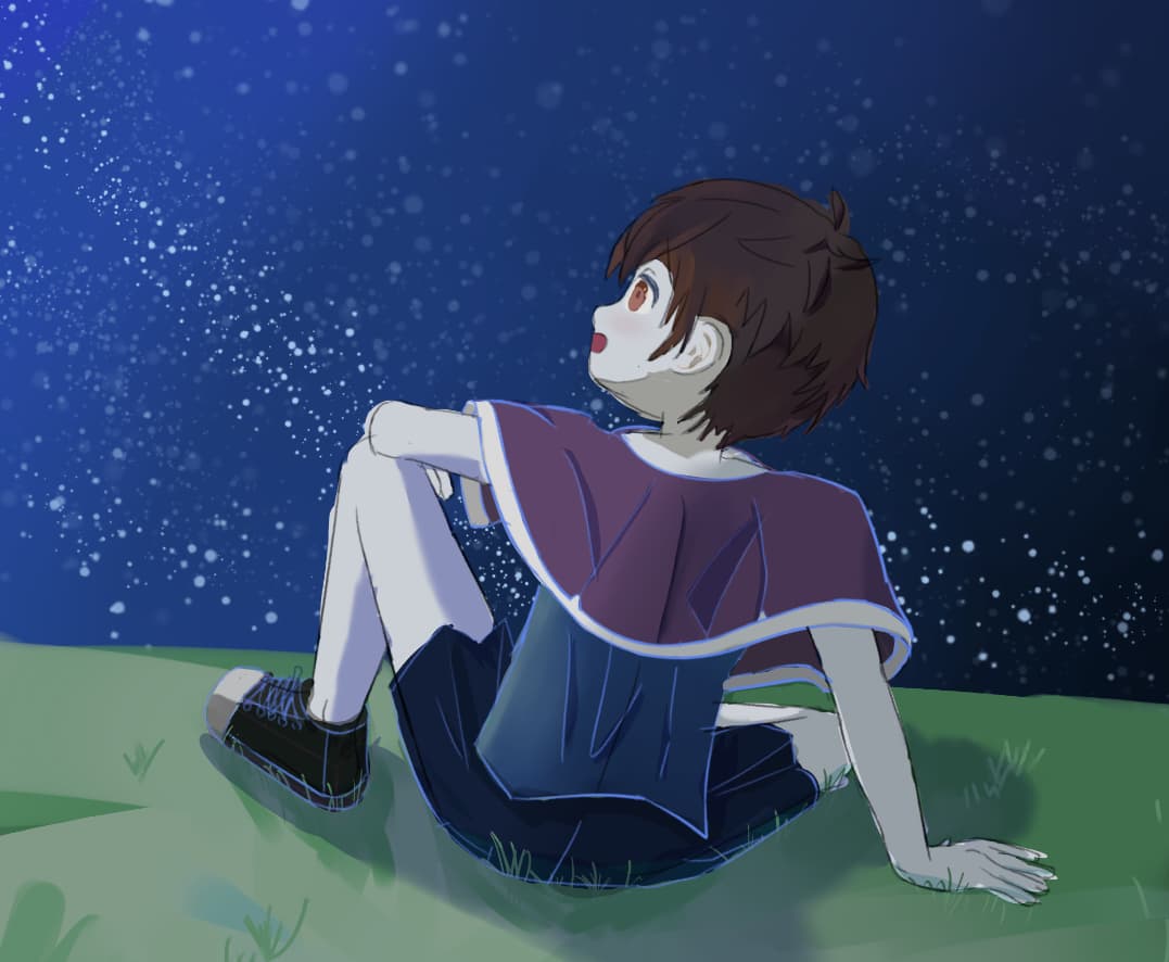
@ryohai I think that you meant “Star” when you typed “Start” in the title, so I changed it. By the way, with the amount of light depicted emanating from the corner, it feels like the kid is looking at The Moon rather than a star.