Search bar might be part of the final design is some shape of form, yes.
My problem with your design is this:
Few drop-downs in one row would be confusing for other users. You know how it works, but it doesn’t explain what is happening clearly.
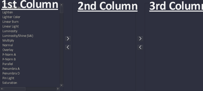
This menu solves the problem of visual grouping and finding favorite modes, but makes it even more complex, and the menu itself is even bigger than the current one.
Currently, I’m thinking about removing “Menu Editing” from the “Blend Modes” menu and move this part to the Krita Settings, where it can get proper GUI.
There it would be possible, for each user, to organize the menu how they like, so selecting will be easier for them. Columns might be part of the possible options there.
This is just an idea. First I want more feedback what are all the problem of users before I will work on final design.