Krita has a lot of blend modes. And likely more in the pipeline.
Question: I reinstalled Krita. I saved things like workspaces, but I didn;t think of saving the blend modes I liked most. Is there a way to do that? imo that is pretty important to have.
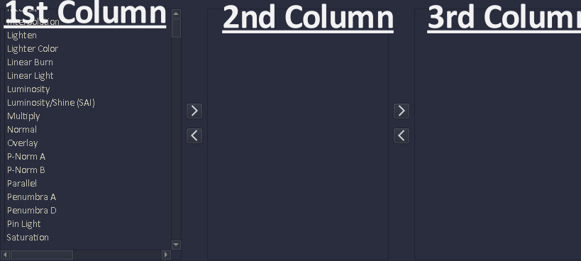
this can be optional: but I’d like to be able to have 3 buttons to choose from, each showing a different Column of blend modes.
here you can see that normal is found in the 1st column because that column button is highlighted.
the small edit button would open this window
In the edit window you can move any blend up/down the list. With an apply button.
you would pick (from all the blend modes (area not shown in picture) the ones you want to go in a prefered column. and maybe have the ability to add dividers like this
[--------------brighten modes] inside the column.
It would be optional, a search bar could work well too especially if you tag each blend modes.
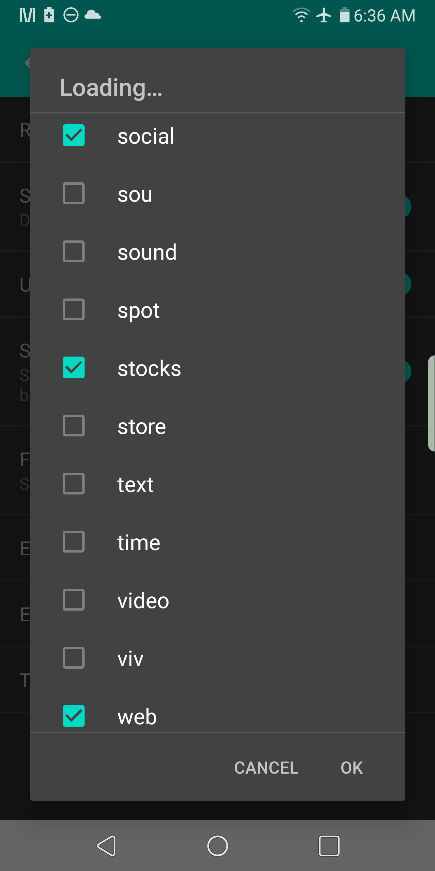
Maybe in the edit button you can edit the number of bars and turn on/off a search bar. I use Kiss launcher for android and it uses a search bar with tags to find apps. Typing like web will show only your web apps.
This menu solves the problem of visual grouping and finding favorite modes, but makes it even more complex, and the menu itself is even bigger than the current one.
Currently, I’m thinking about removing “Menu Editing” from the “Blend Modes” menu and move this part to the Krita Settings, where it can get proper GUI.
There it would be possible, for each user, to organize the menu how they like, so selecting will be easier for them. Columns might be part of the possible options there.
This is just an idea. First I want more feedback what are all the problem of users before I will work on final design.
Ya placing the edit section in the Krita settings would be good.
Just to be clear, the 3 column menu is only shown is where the editing takes place. Only one column would show when pressing one of the 3 buttons.
Columns might be part of the possible options there.
That would be sweet, but I’m open to other solutions too, I like what you’ve worked on in the pass.
I support this option. three columns would make it hard to adapt for mobile Ui or the screen where space is limited. Search bar is known paradigm for example we have search based dropdown on website for country selection etc.
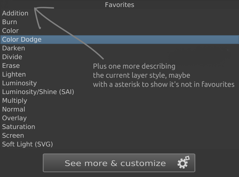
Adding favourite from search results
The search results can have star icons to make it easier to add it to the list of favourites We do have a checbox now we can use it too but a star icon is more clear about adding it to favourite category. This list of favourites should ideally be saved in preference.
Automatically add frequently or recently used modes to favourite list.
Another thing is that we can automatically populate the favourite category with frequently used modes. so that once user searches and uses the mode, they may not add it to favourite but over the period of time krita should automatically add frequently or recently used blend modes to the list.
And then clicking the button would show a dialog like for filters, on the left side there would be categories, and on the right side blending modes, or maybe the old combobox. It could be designed very well later.
However that wouldn’t work for the usecase of “let’s just go through the list of blending modes and see which one makes my picture the prettiest”.
This is one of the possible solutions (I think keeping the old combobox would be fine because it still works quite well in brush editor etc. - we could possibly add a search bar to it as well):
Oops I confused thread. But maybe some of you might want to see this too:
The advance area might be a place to assign tags to blend modes and what tags you want to see (turned on or off) by clicking tag button.
EDIT: @tiar I might put the [see more & customize area] button to the right of the Normal blend mode. And prevent normal from being removed from the main favorite tag.
Just to save space.
I like this idea. In your mock-up, there’s plenty of space for a GIF to show the optimal use case for a particular blend mode. That will also help lower the burden on new users and, with a brief description, it may let you match it with your own use case.
As for layer blend modes testing, it would be a major help if you would get a live preview of a particular blend mode as soon as you hover your cursor over a mode within the dropdown. That saves lots of clicks to confirm and test.
I do second the search function, but I think that it should be expanded. For example, if I want to darken a colour, I would type in “darken” and find each and every blend mode that darkens. Meaning, it may be good to tag blend modes under the hood to be able to search both on name and function.
Most of this is on a tangent with the topic though.
I think a great example is to try the Android Launcher Kiss Launcher or a fork of it called Zen Launcher. You can have a favorite tag bar where you choose which tags to show on this bar.
Checkmark those you want: