One of the things I want to work on is UX and GUI improvements for ‘Blending Modes’.
I have few of my own pet peeves with the current solution, but to tackle new design properly I need more user input.
So you can complain and be harsh as much as you want, let yourselves out, what makes you angry or annoyed when working with ‘Blending Modes’?
You can write your ideas for solution of your problems, but focus on the problem first. Write your ideas after.
EDIT
UX requirements (WIP):
Modes are easy to locate
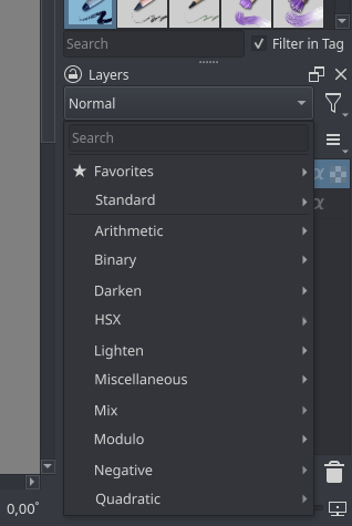
1 Grouping
2 Arranging
3 Marking (?)
4 Keyboard search
5 Filtering (?)
6 Per user curated list
Modes are easy to organize
1 Separate selection from organization
2 Organization in one place
3 Organization per context (brush, layers, other (?))
Ease of experimentation
1 Fast mode switching/scrolling for preview
Screen tablet friendly
1 You shouldn’t need to use a keyboard, but you can
It’s super hard to find the mode I want to select. I have a hard time to locate the mode I want, especially the ones I use the most. Even favorite feature is not enough because I have there the more and less used.
It’s annoying to organize two menus separately (brush modes and layer modes) but at the same time I like they are different lists, because I don’t use some modes in context of a layer mode.
2.1 An extra problem is when I forget that they are not the same lists, and I’m searching in favorites for mode that is not there…
A probably solution is to have a search based dropdown like there are in the website. For example huge country list and when user starts to type in the dropdown is populated with matching key word.
So in this case user will start to type in the name of the blend mode and find it easily. They can also click on the star icon to add it to favourites from this list.
Another thing is that we can automatically populate the favourite category with frequently used modes. so that once user searches and uses the mode, they may not add it to favourite but over the period of time krita should automatically add frequently or recently used blend modes to the list.
I too would love a search that narrows down the list as you type. The list of blending modes is really long when everything is expanded, sometimes even leaves the screen.
Solution? Please NOT a search bar! Personally I’d prefer something that can be easily navigated using pen/mouse only. Having to type in order to narrow down a long list is both clunky to use and overkill in this context. Most of the blending modes won’t be needed by a majority of users - quite a few are outright esotheric. How about:
customisable groups that can be collapsed/expanded in similar way as it is now
add/remove/rename/reorder items in groups and the groups themselves
customisation should take place in a separate dialogue - not tucked away in configuration settings, but rather easily accessible from the layer docker and the brush dropdown
This sounds like a good solution to me.
Additionally I would like to suggest we take some inspiration from Blender’s “Add” menu for shader nodes. There is the search option at the top (although it needs to be clicked to be activated) and you can browse all the nodes just by hovering the mouse over each category.
It would solve another issue with browsing blend modes, which is that opening and closing categories tends to resize the entire list. It makes for a lot of additional clicks up and down, and you keep having to reorient yourself visually. Popping the categories out to the side like with a menu would be of great help here.
Something that’s a bit of a double edged sword with Krita is that there is a very large number of blend modes. Having a lot of options is great but it also makes it harder find the one you need. And having 4 variations of the same blend mode with subtle differences (like Soft Light) adds to that.
Would it be possible to add an option to the Layer Properties to determine which HSX model to use for each layer when blending (and an option elsewhere to change the default model)? That way we could potentially free up a bit of repetition in the blend mode list.
Modes are easy to locate
1 Grouping
2 Arranging
3 Marking (?)
4 Keyboard search
5 Filtering (?)
6 Per user curated list
7 Named custom curated lists (?)
Modes are easy to organize
1 Separate selection from organization
2 Organization in one place
3 Organization per context (brush, layers, other (?))
Ease of experimentation
1 Fast mode switching/scrolling for preview
2 Access to all modes on demand
Screen tablet friendly
1 You shouldn’t need to use a keyboard, but you can
As it was said above but one of the things that annoys me is clicking on the arrows of the tabs changes position of the menu and since it is so long it does some weird repositioning. Sub menus would probably be best but I am not sure.
A search option at the top would be very practical to locating weird catalogued blend modes.
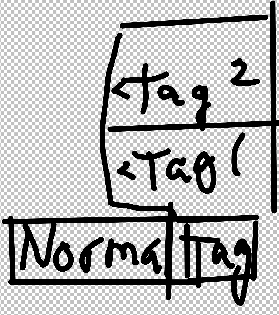
You would be able to assign tags to blend modes in the Krita settings. They would be accessible in search bar, or by way of a button to right of the blend mode button. Hovering over the tags shows contents.
That would satisfy my column idea. I can just name a tag column 1 and 2.
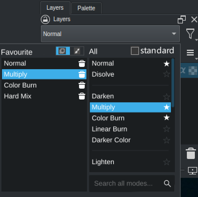
Three lists: favourites, standard, all.
“Standard modes” contains the common ones used in multiple apps and other places like svg, the photoshop ones. I think those need to be easily selected.
In “all modes” I put the same modes as in “standard modes” in the mockup but all the modes organized by section would be there, as it is currently. Also a search field can be used to filter the modes in that list.
One can select a mode as favourite on the “standard” or “all” lists, by clicking on the star.
I don’t need any complex categorization mechanism, and I also think that can be detrimental. We have a complex drop down now and it would become even more complex, for a small benefit in my opinion.
Edit: the “standard” list could even be removed and make the filter in “all modes” show those modes if the user writes “photoshop” or similar. But it is less discoverable. Some suggestions for filter texts could appear when the user clicks on the search field.
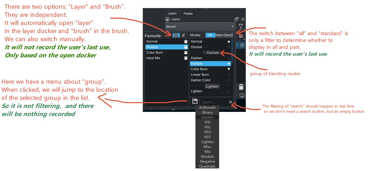
I think we can change the term “all modes” to “all”. Then a “standard” option can be added to the space left behind. When this option is checked, it will automatically filter.
Similarly, we can add the switchable options of brush and layer after “favourite”, and the corresponding options will be automatically opened in the corresponding docker, or you can switch manually.
Maybe it’s just me, but I feel like these widgets with multiple side-by-side scrollable lists is more complex to browse/navigate than just a QMenu with a search bar. Especially with a pen.
I too feel like this will overwhelm a lot of people most of the time people expect it to be small list if it opens this large dialog type thing it will hinder the usage. There is also lots of mouse travel in that drop down design to select modes from the favourite list. Simple drop-down with search and favourites at the top is good in my opinion
I think I speak for a lot of people when I say I only really use a small handful of modes. A better and more condensed way to choose one of these favorited modes would be great, but it looks like that’s the most requested thing.
Other than that, the only major, major problem I have is that when I select a blending mode, I have to draw on the canvas before I can rotate it.
As in I have to select the mode, draw a line, undo the line, then roate the canvas.
This is because my rotate shortcut is set to r, and pressing r without first clicking the canvas switches my blending mode to ‘reflect’. And clicking the canvas with the pen tool active draws a line. This has probably happened to me several hundred or possibly thousand times at this point.
I complained about that before and was told that it would pretty much never be fixed/is borderline impossible to fix. I don’t know how true that is but if you find a way to prevent that from happening, that’d save me one of the biggest headaches in the entire program.
So I guess my request is for a feature that allows me to rotate my canvas without changing my blend mode.
@Ralek@Agitato
Oh… I’m constantly ending with behind or saturation blending modes by accident…
It also makes me furious if others also find this annoying and it’s not just me, then… It might be hard but I will make my life mission to fix it. It breaks the flow so hard…