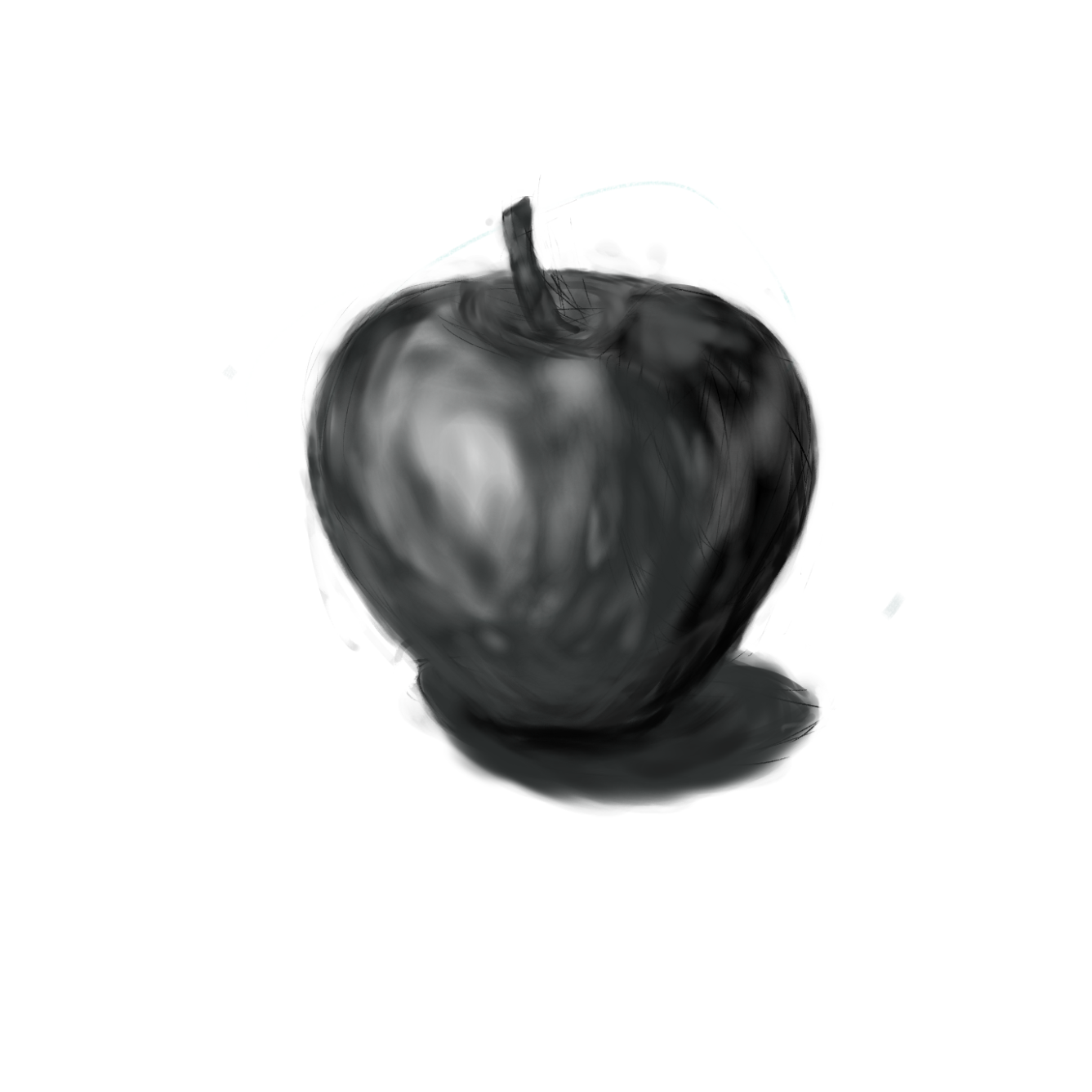
My first art, testing how dark and light colors behave on an object. I did this on my first graphics tablet.
Note: I’ve never drawn anything before, I don’t think even as a child, except for unrecognizable scribbles. So, if you’d like to give me tips on how I can improve, it would help.
Hello, thank you for the comment and the compliment. Yes, there’s something that’s making it a bit difficult for me. Regarding the image above, I’m still trying to understand the right amount of light and shadow. I wonder if it has more to do with the artist’s intuition than something ‘scientific’?
Off-topic from the image, but also related, I have some difficulty with perspective, especially with more than one thing in the image, like a simple mountain. My main interest is creating landscapes or interior and exterior buildings (I confess that playing Minecraft for years has influenced me a lot). I already have a basic understanding, but I make mistakes in proportion. For example, I really like to make buildings on the diagonal, but I make mistakes in making them fit on the ground, like they seem to be lost there in the air. If you could give me some advice or something like that on how to improve this, it would help me a lot. Right now, I’m trying to create my first character without reference (in fact, I do almost everything from my head since I consider myself to have a good imagination. Before trying art, I was a writer, and one thing I did well was describing the scenarios in detail)