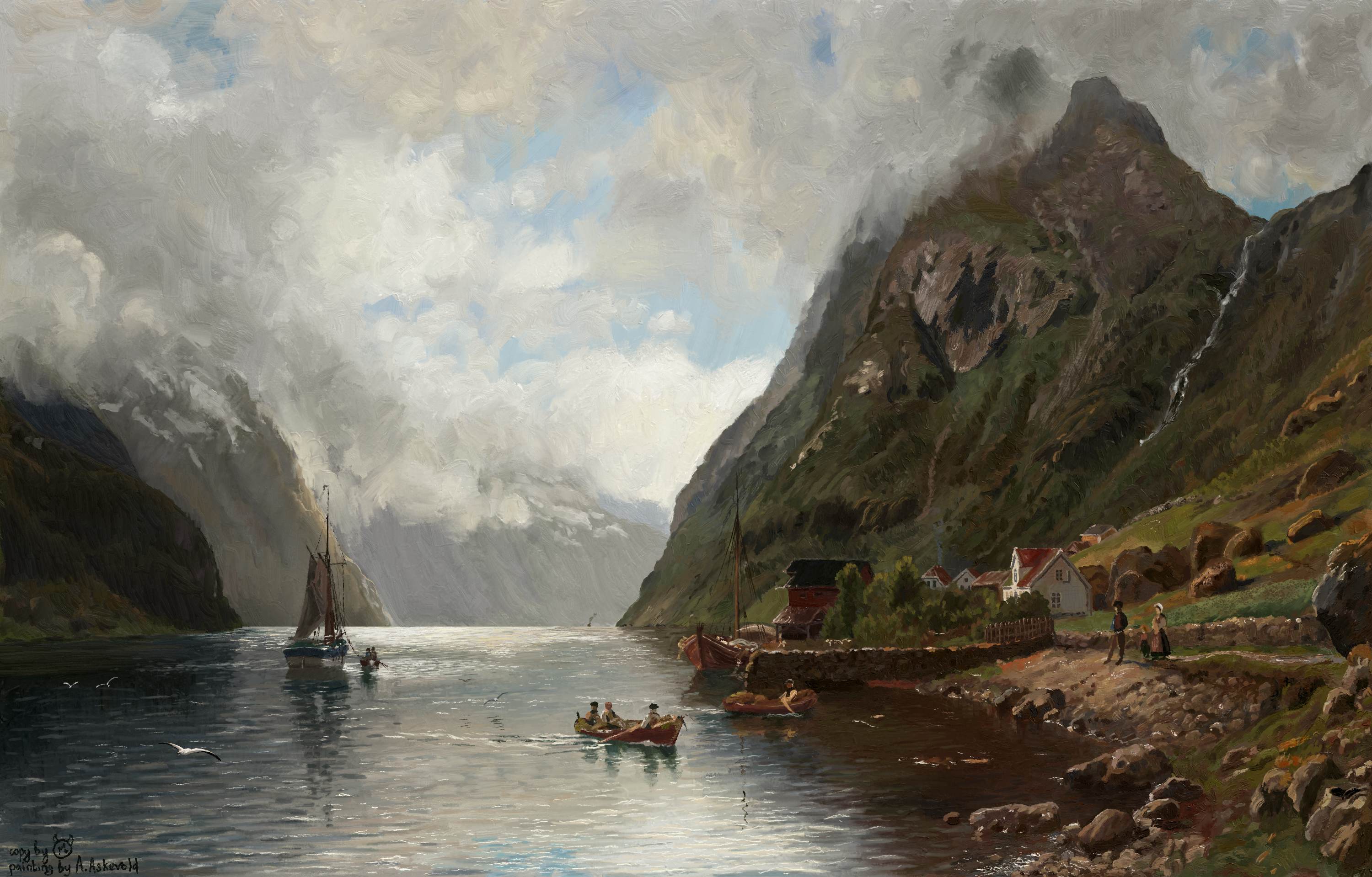
Today I have finished my copy (is it the right way of saying that?) of Norwegian Fjord Landscape painting by A. Askevold. It’s an amazing piece of art and I felt great while painting it.
No colour sampling were done in any way and I am pretty proud about it!
Most of the work was done with oil brushes by @emilm
It took me about 35 hours from start to finish.
I know there are a lot of stuff that can be done better but I’m already a little tired with it.
@FireShepherd@mike-art-table@canedo and @Rhea_Asma
Thank you so much!
All these painting stuff is very new and even slightly alien to me and this kind of responses and reactions help me a lot!
I’m still having colossal problems copying real life and photos with painterly (non-digital) feel because I still get this “smartphone photo” colours and that is why I try to copy some classic paintings.
First conclusion so far: There are no green (at all!) on the mostly green paiting
I’ve noticed that my image was greatly downscaled after uploading
Here is the full one. Hope someone from admins group (whom I can’t tag) can replace the title one with this one.
Thanks for the backstory! That’s an interesting observation about the ‘smartphone photo’ colours, as you say. Your idea to study/copy classic paintings - before tackling real life/photos - is very clever! Again, you’re doing a magnificent job imitating the classics. And I won’t be surprised at all when you’re able to transmit that style and colour palette to the photos you want to paint.
Really incredible @maleficmax . I mean, it really looks like an original painting from that era. Stopped me in my tracks, the likeness is so good. Wasn’t sure if it was digital. Took you a lot of patience, I’m sure, but it really paid off. It’s amazing.
Today I’ve already started the new painting (is it the right word for this?), and I am trying to adapt my photo to this live colours style.
Can’t say that I’ve succeeded yet


 Took you a lot of patience, I’m sure, but it really paid off. It’s amazing.

 )
)