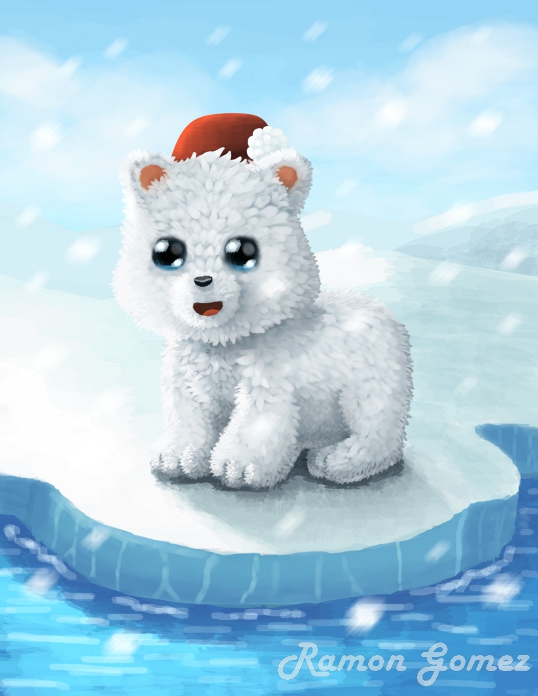
Hello, I am learning digital art with Krita and I would like to receive a critique for this painting I have done, Thank you…!!
11 Likes
Nice work so far. I like pretty much everything that is fluffy and I appreciate when artist take their time and put so much work in the fluffynes of a subject, like you did.
Since you asked for it here is critique ![]() :
:
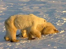
The white polar bear is a bit hard to make out before the background that is mostly also white. The tiny bits of color helps a bit centering the view on the subject but on the left side of the image the bear merges into the background. Of course there is a limitation in your color palette when you want to draw a polar bear in its natural habitat but the good news is, polar bears are not actually white. Well they are very white but their fur usually has some yellowish or light brown tint because of the way their (actually “transparent”) fur interacts with light and also dirt that gets caught in it. Check these Pictures from Wikipedia.
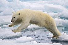
It is more subtile in this photo, but still noticeable.
The blue tint from the snow and ice, probably the reflection of the sky and the water help too. So colors are very subtile but it’s there. It’s okay to take some artistic license and exaggerate on the colors a bit.
Of course it is totally okay to have an actual white polar bear in that case you have other options like changing the color of the light.
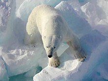
Take this photo for example, also from wikipedia.
this is a sunset or sunrise picture. You can see how the orange light hugely affects the fur color but the snow and ice, since it is reflecting most of the light, stays mostly the same with just a bit of red tint. This is a good option when you want to go for cozy Christmas theme.
Or simply put something dark in the background. This could be a blue sky, a black night sky (remember the cocke commercials in the late 90?), or a dark mountain. Of course there are no actual mountains on the north pole but in the borders of the polar region, there is some land.
For the fluffy part: A thing that a lot of artist often forget or ignore for brevity (me too x3), is that fur has perspective too. Depending on in which direction it faces you can look through it and see the skin underneath. The fur between the eyes and on the forehead look like the single pieces of fluff are directed to the viewer but the should go up and over the head. You can mitigate that effect by painting fur patches of less width and without much contrast change between them so they don’t stick out so much. Kinda what you did on the paws.
3 Likes
I really appreciate the time you have taken for critique my painting, Thank you so much…!! Those are helpful tips, I will put them in practice…
1 Like