Best Practices for creating canvas textures? (Experiences and techniques)

Best Practices for creating canvas textures? (Experiences and techniques)

@Voronwe13 @dkazakov Thank you guys again so much. This is awesome.

I have a question for you guys (anyone who knows about this is surely welcome to jump in, too!)
How would you say can I get the smoothest, best texture behaviour for brushes if we are only talking about the texture itself? Format, levels of grey, bitdepth etc.

I made a 3d canvas, just to have the full control over everything. We have a texture map for the color and an actual height map, the z-depth of the 3d model. JPG and PNG don’t seem to make a big difference.

Here they are in action but the translation of the color in the brush could feel smoother, it doesn’t translate as smooth from low pressure to high pressure as I imagine. Maybe I’m missing something. I will investigate further how I can get the maximum quality out of this. One thing is for sure, we’re all pumped and I’m already in talks with @RamonM about this, we wanna create a pack of brushes I wanted to work on in forever.

TLDR: what are the best practices of patterns for the greatest possible quality?

Anyway here’s what I came up with already.
2021-05-13_21-14-05

10 Likes

When you say ā€˜texture’ are you specifically referring to pattern texture (as there are many different parameters available for creating texture in a brush)?

Is it the behaviour in the video clip you’re referring to?

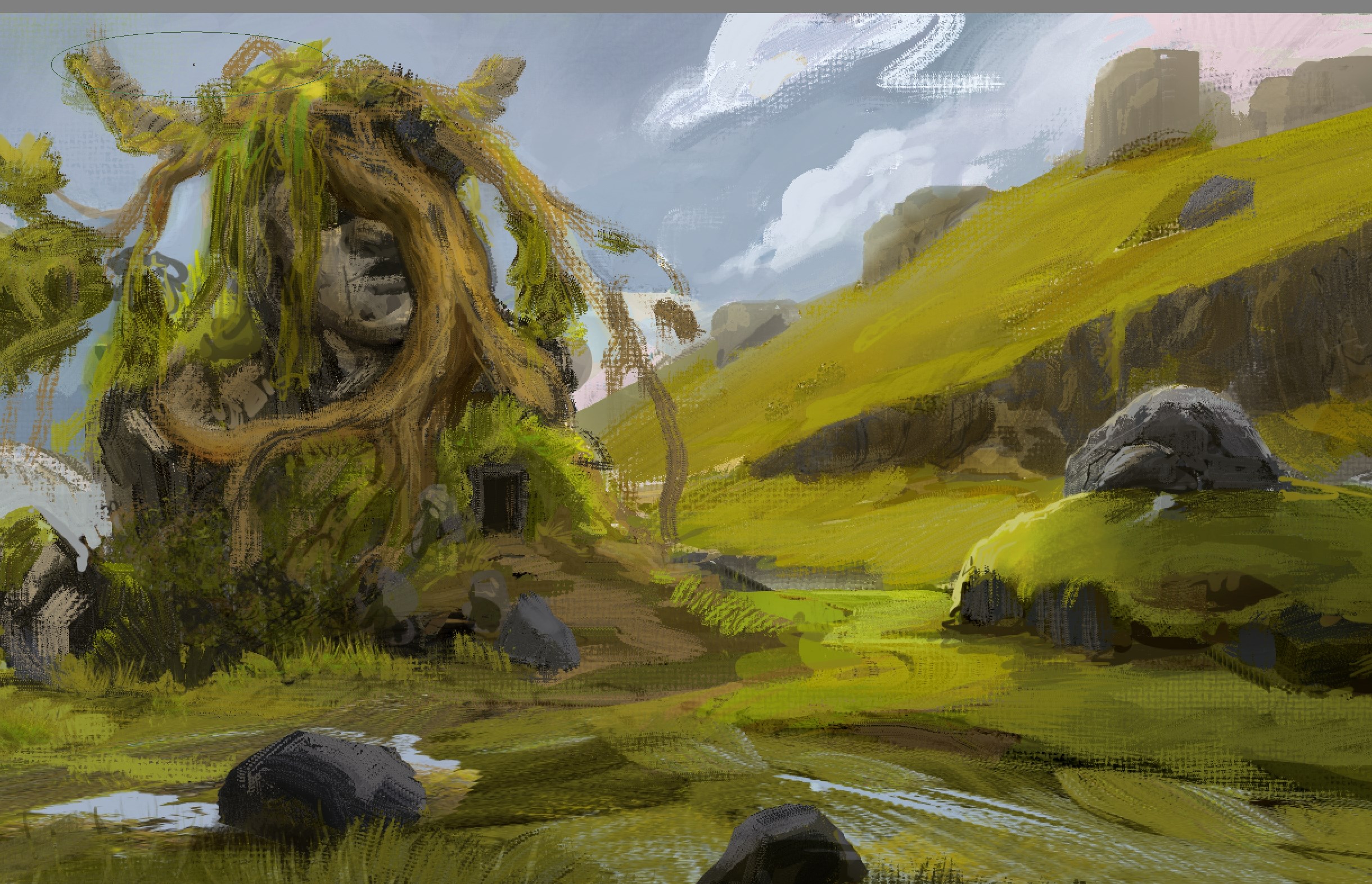
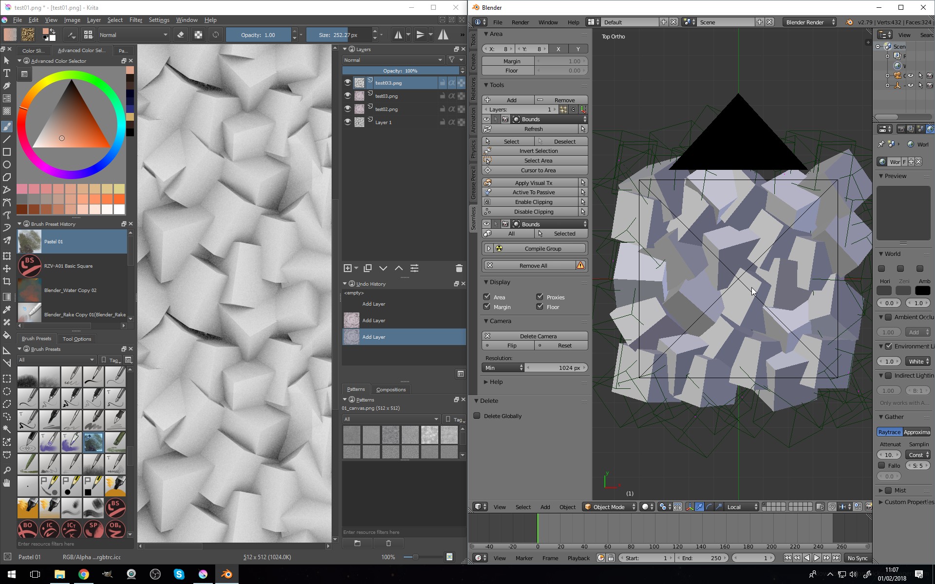
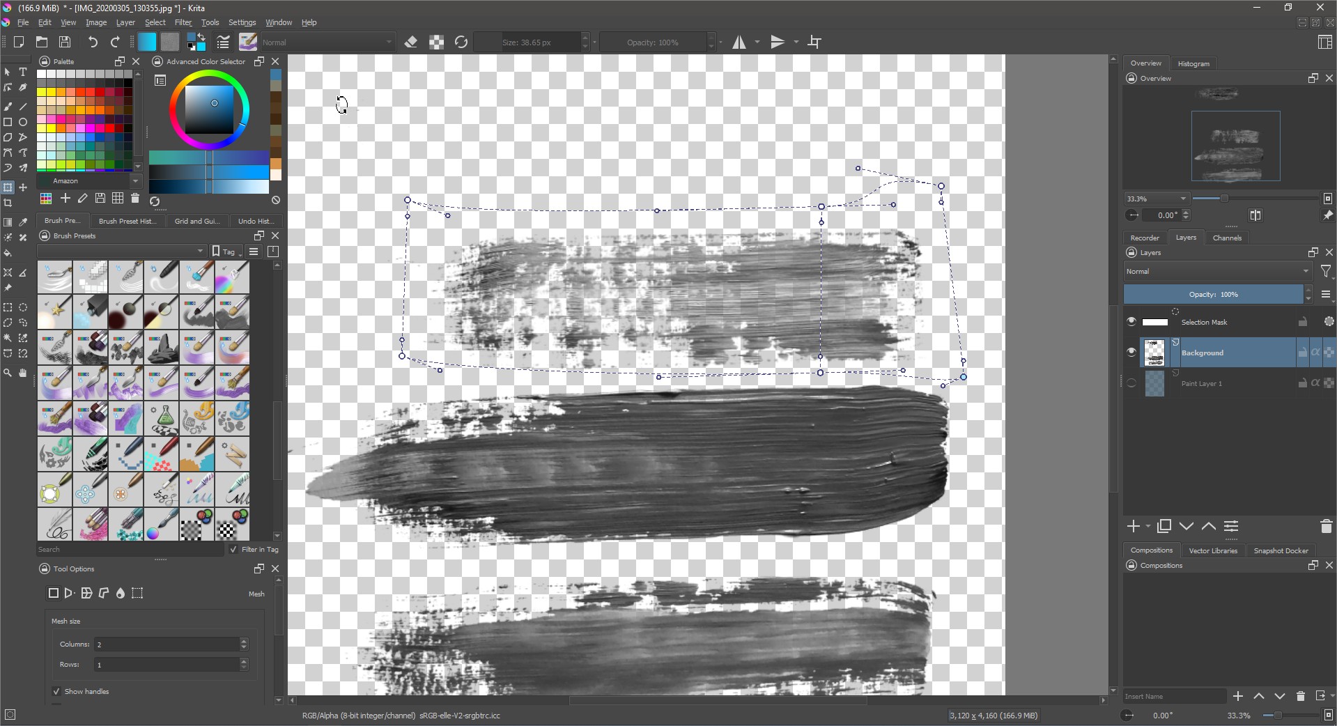
So; In that clip it looks like you’ve used your pattern as a background, then applied the same pattern as a brush texture - to try and make it look like you’re brushing real paint over a canvas. Is that right? :thinking:

I have tried a similar thing before - it’s quite limited because it’s like applying a single mask layer to the brush strokes. I think that works better with dry media - such as the charcoal brushes.

With real paint, there’s a lot of complexity to how it interacts with the texture of the canvas. A thick paint might drag across the peaks, where a more fluid paint will sink into the grooves for example. I believe you’d need a more complex pattern application to imitate that.

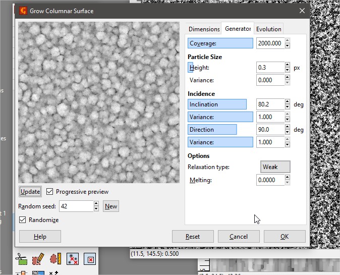
I’m not the best person to advise on patterns though - I’ve never used them extensively because of the perceived limitations. I know they’ve just added new options though, and there are some things like lightness map that might help, but isn’t available for this engine.

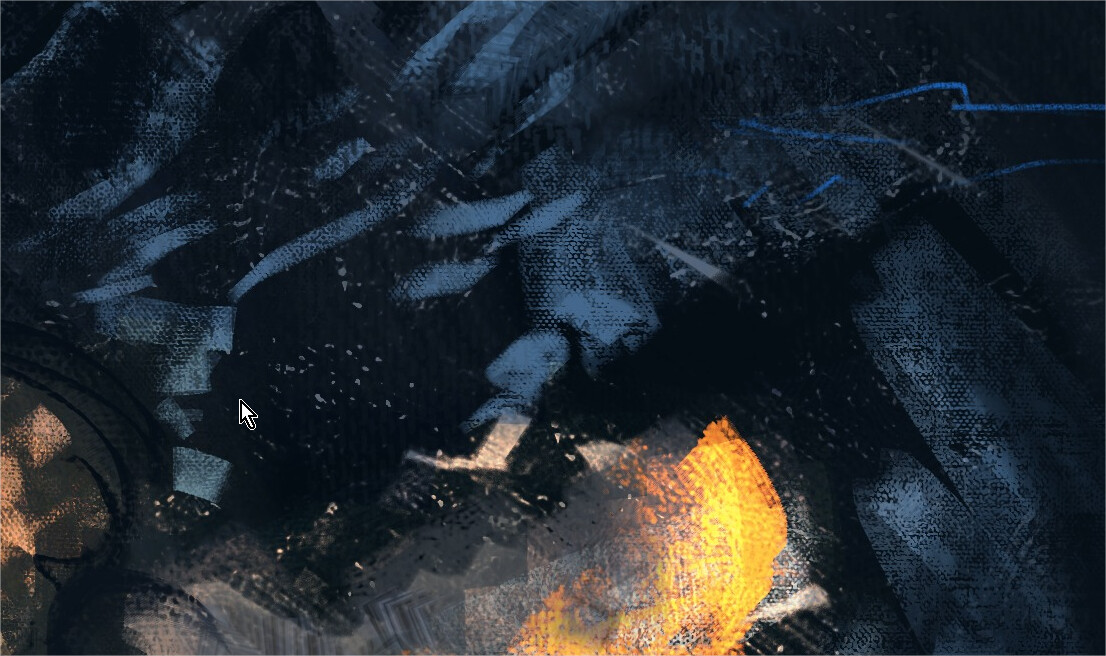
Where I’ve applied a pattern to an impasto brush, I’ve kept the effect quite subtle - so it’s not breaking the illusion of thickness. Looking again at your video - I wonder if it would help to add some scatter to your brush - but only apply it with low pressure; so that it breaks up the hard edge that’s disrupting the illusion of dimensionality.

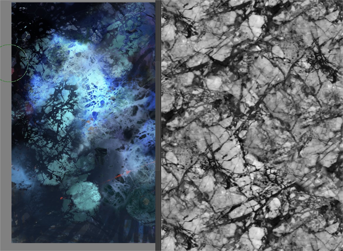
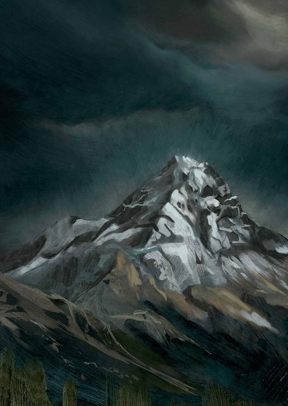
I did do an experiment last year where I was trying to replicate a more natural look. I used the layered impasto effect (as in the templates I posted) to create a thick texture, then I created two opposite transparency masks from the values of the texture: One represented the depth/troughs, and the other the peaks - I then I painted the two masked layers to simulate a wash and dry-brush look.

I did already post that somewhere, but I’ll upload it again here to save hunting for it:

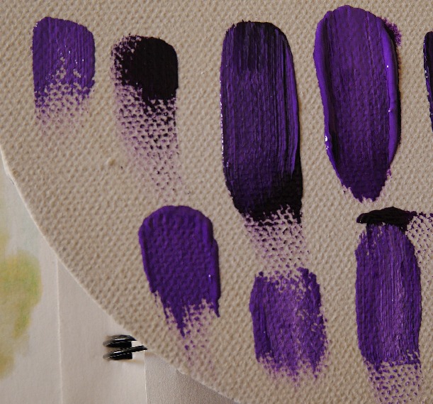
I’ve been wanting to use the technique on a painting, but haven’t got around to it yet - The idea is based on texturing a canvas using modelling paste. I’ve always loved how the Japanese illustrator Ayami Kojima uses it in her paintings - so I was trying to replicate that kind of effect.

I actually bought some modelling paste last weekend so I can use it to create thick dabs and textures for Krita brushes! :yum:

Umm… I don’t know if any of that helps with what your asking, but it’s fun to try and figure this stuff out! :upside_down_face:

Okay - I’ll shut-up now; it’s late and I’m falling asleep… :sleeping:

2 Likes

@Mythmaker I’ll keep it short since we are in off topic area already and I could talk forever about these things hehe. Happens a lot because of all the excitement. NICE results, love it. I was talking more about the technical side how Krita takes the patterns and connects them to the brush pressure, or rather how the ā€œperfectly balancedā€ texture pattern image should look. Since I set up all that stuff in Blender with my texture you have seen in that GIF, I have all the control in the world. :slight_smile:

I flagged my initial comments, so we might get it split into a new thread.

1 Like

Hmm, I know I worked on the texturing engine (adding Lightness Map and Gradient modes) last year, but I haven’t really tried making new canvas textures. I mostly use textures for quickly painting things like tree bark, rocks, etc, so it’s a completely different application (which the modes I added are great for).

Also, there are a whole bunch of additional modes that just got added, that I haven’t even really looked at how they work yet. @Deif_Lou who worked on the new modes, or some of the other people who contributed to the discussion in the [Testing Needed] New brush texture modes might be able to give good advice on making canvas textures.

2 Likes

Should I make a new thread for this? or Should I hide it for you?

I have already split the thread. Perhaps I didn’t mark that accordingly, sorry :slight_smile:

UPD:
Oh, it might be a different flag. Better ask @Voronwe13 what was meat.

I don’t know if you can move it back to the original thread, but a new thread might be better. I think we’ll probably want a thread for new RGBA Smudge brushes anyway, especially now that the feature has been merged into the nightlies. This way maybe we can come together on a set of curated brushes to include with Krita 5.0 when it actually releases.

1 Like

For some reason, when I awoke this morning, my brain decided that was a good time to start problem solving how to use layers to create a convincing canvas interaction. All I wanted was to sleep for another hour… but no! - stupid brain wouldn’t let me!.. :angry:

It also explained to me in vivid detail why I don’t like using patterns, and wanted me to pass on the information; But I’m not going to because it’s boring and now it’s late again and I don’t want to write another wall of text! :stuck_out_tongue:

But here’s some experimental layer effects I did this afternoon… :upside_down_face:

^ This is the base layer - for toning the canvas with a wash.

^ Then the main paint layer for the impasto. The canvas texture always shows; I haven’t thought of a way around that yet (not sure if it’s possible) - but the texture is quite well hidden by a thick impasto effect. The thick strokes with show the canvas texture again if smoothed out.

I also discovered that layered impasto effects can be applied to the impasto brushes without looking harsh - I thought it would be overkill, but I’ll have to investigate further to see if it broadens what’s possible.

I thought all the tricks I was using would cause things to lag badly - but it remained really smooth regardless!

I was also just testing the spacing trick @Voronwe13 suggested and it seems to work really well! - I thought it would cause the spacing to become very obvious with faster strokes, but it doesn’t. I can’t actually understand what’s going on - I think the strokes look smoother, and perform better. What is this sorcery?! :hushed:

7 Likes

I would say that for brush texture the best is to use a height/bump map as you do. The best would be to make it so that it uses the full range of intensities from black to white. Then you could use the brightness and contrast to modify it if you want.

3 Likes

Thanks, yeah that is what I thought. I’ve been playing around with contrasts and think I have a somewhat good result. :slight_smile:

@Mythmaker I really like this, am just focused on the most simple workflow possible → create a canvas, select a brush and paint. No setup.
What you did looks kind of like a half fluid, half impasto kind of underpainting, which I think could be combined with a layer on top with more painting that won’t let the texture show through all the way. Currently I work on a small set of brushes, just for fun and to try out the new features. Thanks for your input. :slight_smile: Shouldn’t something like what you did set up here be possible as a template for new canvas? Been thinking about that a little. Oh, this is all so EXCITING!!! :star_struck:

Yeah - I’m just experimenting to see what’s possible with all the variables available.

I do that sometimes - I might not use the technique, but it’s fun trying to do stuff you wouldn’t think possible. The two brushes I demoed in this thread are a good example.

I have learnt a lot doing that stuff though - it’s a good way to teach yourself what functions do that you might not have used before. I drew on the understanding gained from making the impasto templates to visualise how to figure out this canvas effect.

Simple is best though; Just as I’m already using the impasto brushes, yet never use the impasto templates I made!

That’s the ideal, but I haven’t found a way to effectively implement both properties. This is the best compromise I’ve managed so far; with the thick impasto obscuring the texture to a degree, but showing more clearly when it’s flattened out.

Yeah - that’s basically what it is! It’s a bit complicated though, because you need to apply the pattern you want to use as a background, and use it as an overlaid effect on two other layers (but they are cloned so should only need one fill), then you need to use the same pattern for the brush preset (with the same scale as the background so it aligns). :upside_down_face:

I need to reconnect with the dropbox I made for the impasto templates; Then I can share my templates and brushes. I haven’t used it for a while, so I hope it’s still active. :sweat_smile:

1 Like

I found a way around the texture problem - basically using the layered impasto technique to bring out the depth of the canvas texture in the brush strokes. It’s not ideal, but the current iteration can look pretty convincing. Here’s a quick sketch I did of an imaginary apple to test the workflow and effect:

The brush settings are more critical with this approach as there’s no canvas texture overlay on top; so the main paint layer is entirely dependant on how the brush applies the pattern. The bumpmap is also applied to the entire layer - so might look overdone if used with some impasto tips.

Oh! - I keep forgetting to say; I’ve been using one of Ramon’s atelier patterns for the canvas - I like this one as it has a light sheen which brings out the depth.

3 Likes

That is a pretty interesting result! Thanks for sharing the layer setup. I like the little highlights in the canvas texture. :slight_smile: Ramon offered me to give me a few other scans that he made already, I will need to see what I can come up with since the main idea in my own small package of brushes was to really just use that one texture.

After days of testing to find a ā€œstandardā€ setting in my programs (be it in blender for rendering the canvas, Krita for changing the contrast, sharpness judging by eye), I came to the conclusion that I probably went into a rabbit hole and the simple truth is:
it needs to have contrast, brightness, sharpness as needed. There is no standard, as long as there is a good range between darks, mids and whites.

Because the blend modes behave differently, the brush tips behave different, it all just depends.

I’ve been working on a kit of brushes that are mainly for experimentation studies, shapes, getting the painting going. So mostly they are a mix of ā€œrealistā€ and ā€œabstractā€ to have a sense of something familiar and also some spontaneity. The painting is pretty rough, I’ll need to refine the main idea more, I’ll work on it more - but look at what it is made up of. Brush soup. I love to work like that. :smiley:
I don’t really love the brush icons either, might need to overthink that again also.

Obviously, if we think game art or the kind of illustration that I like, I don’t really can part ways with the hard round brush. As long as it looks sweet from a mile away, all good to me.

5 Likes

Nice work! - Looks like you’ve got a good variety of textures going with those brushes. :slightly_smiling_face: :+1:

Standardising things is very hard when there’s so many variables. I think it helps if a pattern has a good range of values - makes it easier to bring out the depth instead of it looking like a rubbing/dry-brush effect.

1 Like

@TheFlow Gr8t results and brushes! Are you going to release these brushes one day? :wink:
And will they need to have latest Krita v5 installed?

1 Like

Thank you! Yeah that is the plan. I first want to get them sorted out, so I will have to actually paint a bit more with them, find weaknesses, tweak, probably make more and throw some out and then, eventually, release them. Yep, since I made them in Krita 5 with all the good new features (Colorsmudge and the new height brush blending modes), you will need Krita 5.

1 Like

After a long talk with @TheFlow we realized that more resources would add more interest to Krita so here we go. I have used a lot of ways to create textures. my 2 cents.

Software
in this talk i explained the creative process start in 23:49- lot of tricks for texture and brushtip malking. It has English subtitles

Krita

Gwyddion

Inkscape

Gimp (voronoi plugin)

My own photographs.

Blender 2.74 Piles and tiles.

Patterns
I use only 512px because Krita now behaves better while adjusting values, in brushes. And also in Krita 5 right now 1000px is the limit.


I think this could be really interesting. I want effects like this too.

A rounded texture ,not like cross shapes. In real life at least where i live is hard to find a canvas like this.

Brushtips for painting. RGBA.

Here i am using mesh transform to fix the angle of the brushstroke. 4 of this can create awesome scattered RGBA brushes.

If people wants help me to transform these photographs to brushtips for me is ok. But is not a fast task.

5 Likes

Thank you for your input Ramon. Once I am done with my current brushes I will start working on a few other new canvas textures that I’ll create with the best quality that I can deliver. Probably two or so. I feel we have ā€œenoughā€ textures in Krita, maybe even too many because honestly, 95% I don’t ever use. But I guess a few selected ones more for traditional inspired digital painting could add quality of life. :slight_smile:

Here’s the first batch of my brushes. Initially I had 137 versions, reduced them down to 27. Then after I went through manually and deleted a lot of brushes, some wouldn’t work anymore. I’m fed up for today about this, wasted probably five or six hours fixing it. I shouldn’t use alpha software for these kinds of things… but what do we care, we want new brushes from the new engine huh?

https://drive.google.com/drive/folders/1ddiGmjEEWLQMPK6uVWW3g5gL-xYWWl6p?usp=sharing

Let me know what you think guys. I hope in the coming weeks I can fix it and finally save out a bundle with the best brushes I currently have in store.

As you might see, Krita currently duplicates brushe and all that craziness. This pack only contains 3 Brushes and the pattern I created in grey for the blending modes and in color as a background to paint on, kind of like a sketchbook.

I hope you guys like the brushes, have fun and let me know if they work as expected!
Here’s some sketching I with with them partly and with Ramons new RGBA brushes from like two weeks ago.


6 Likes

137?! You’ve been busy! :grinning_face_with_smiling_eyes:

The results look like it was worth the effort though. :slightly_smiling_face: :+1:

Did you backup your krita folders before you started culling things? Maybe it’s safer to assign a unique tag to your favourites, then use that as the basis for the bundle - I mean, without deleting anything! It is a while since I’ve assembled a bundle though - so not sure how easy it is to pull together all the assets. :thinking:

I’m working on my own brushes at the moment, but I’ll make sure to have a good go with yours! Thanks for sharing! :beers:

1 Like

Haha yeah, 137 all together. Probably 1/4th or so is good enough for me to put it in a brushpack and I also wanted not to make the mistakes I did for years in Photoshop. Brushes are not the magic sauce, they can be, but usually you only need your handful of workhorses I guess. So I wanted to keep the numbers down anyway. :smiley:

The important ones are backed up, just named really crazy. And after I renamed shit for a good while and then nothing of it worked and I changed from ā€œworking namesā€ to good file names and Krita decided not to work with it as I intended it, I’ll take a break from making brushes for a few days.

Cheers mate, learned a ton from you over the last few months in here!!! :beers:

2 Likes