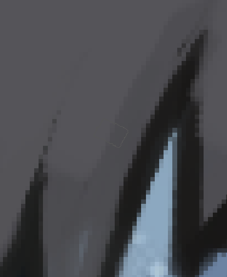
Krita"s cursor hates gray color.
Can you spot the cursor on this picture?
I can see the brush outline.
Try setting it to green. That can be seen on all colours including on green.
Try setting it to any colour actually.
It’s some shade of grey that has the problem.
 :thinking
Krita offers a handy preview feature. In your case, it’s only necessary that the gray color be on a separate layer (that is, it cannot be inside a group with the layers of the other colors….or it won’t work).
As an example, I painted the colors black and gray, each on a separate layer:
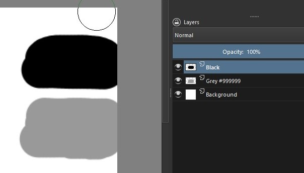
Next, you go to the layers docker and right-click on the gray layer. A drop-down menu will open, choose the first option, “Properties”.
In the dialog box, under Active Channels (1), uncheck the “Blue” option. This only affects the color preview (2) and if you like you can also adjust the Opacity (3). Give OK (4) to apply.

When you no longer need this visualization feature, just go back to the dialog box (using the path taught above): check the “Blue” again, set the Opacity to 100 and press OK. The gray will return to normal tones.
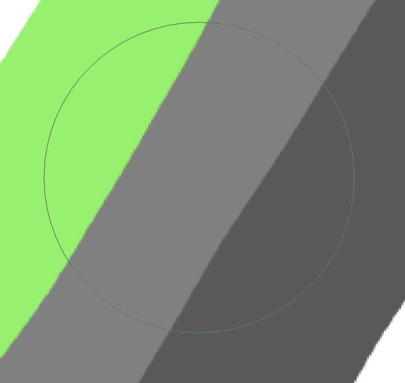
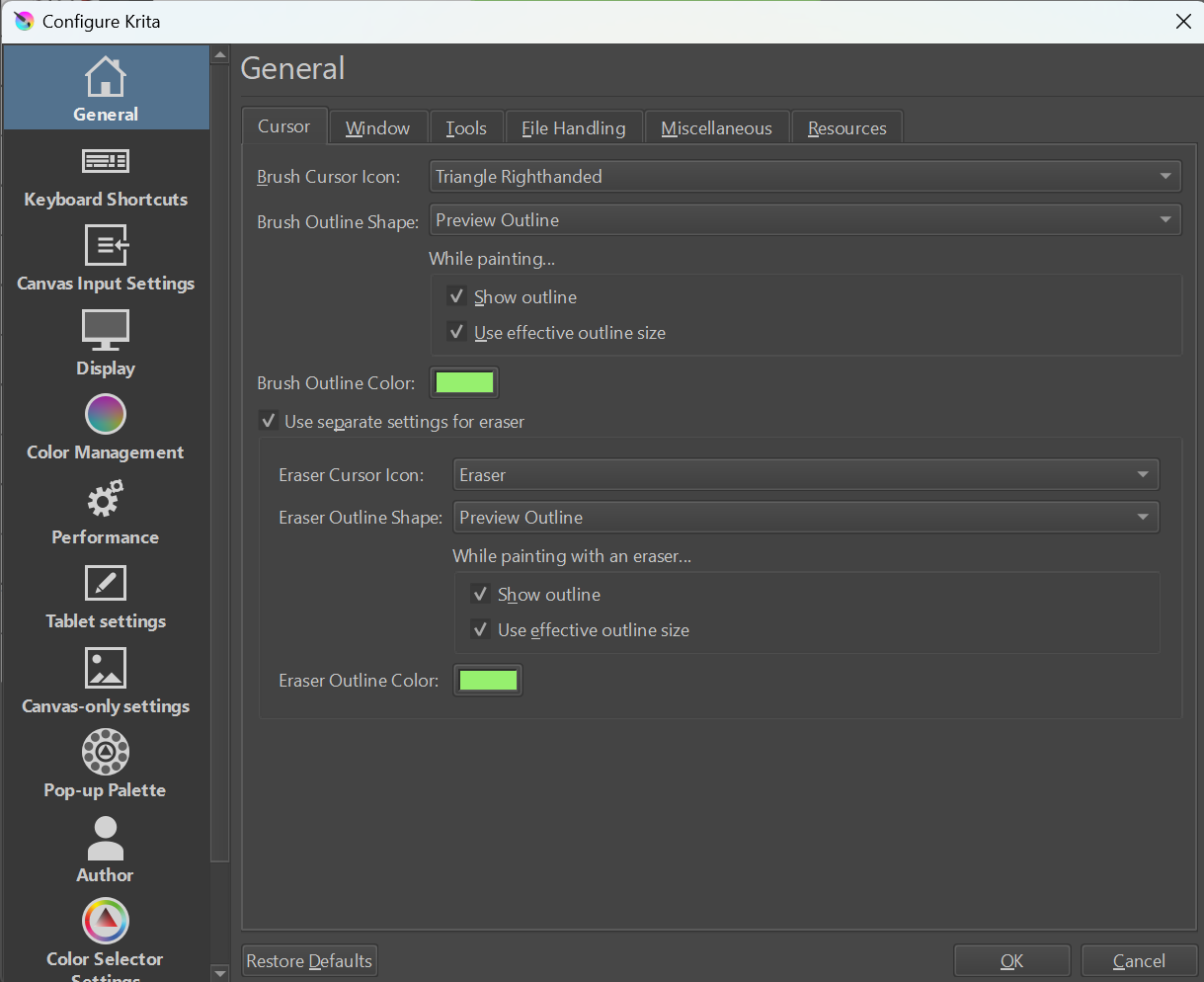
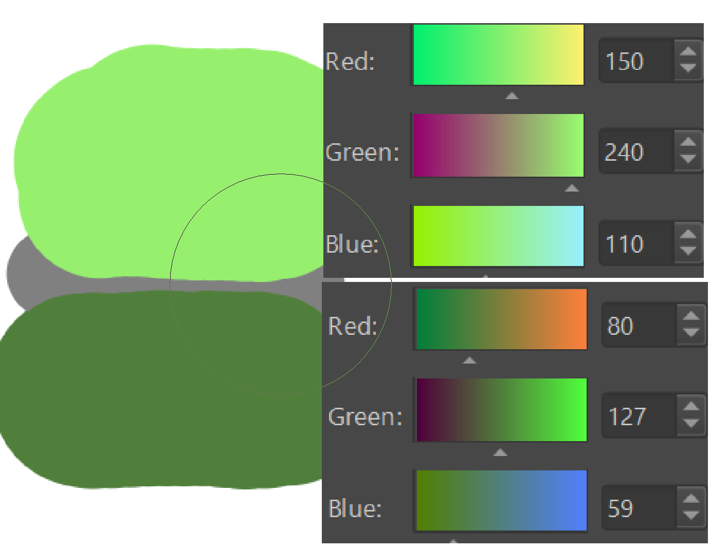
Ah, sorry, I get it now. Depending on your outline color, there are some colors where it will fail to adjust in a meaningful way. It’s probably easier to run into it with a gray outline, but I could get it with my default green as well:
The top color is my cursor outline color, the bottom one is the problematic color for it.
Hmm, perhaps this is actually worthy of a bug report. At least I can see how this behavior is not ideal, right.
In principle, it should be such that no matter the color used, any color on which the cursor hovers, should not hide the outline color.
The colour change of the outline seems to force it to be the ‘opposite’ of the colour that it’s over.
(My use of the word ‘opposite’ may be incorrect but it’s the best I can come up with and all I can figure out from simple observation.)
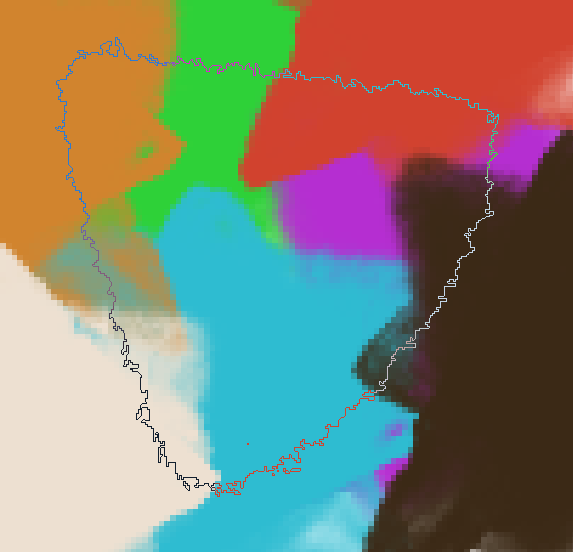
I think the colour change is done based on a determination of whether there is enough contrast/difference between the set outline colour and the image colour.
The thing is that the ‘opposite’ of a muddy greyish colour is also a muddy greyish colour:
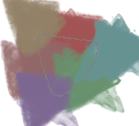
Sometimes, the decision to change the outline colour is not a good decision.
An example can be seen if you set a white outline colour.
That looks good over various image colours but has a big problem with a mid grey image colour. It gets forced to the opposite of mid grey, which is mid grey!
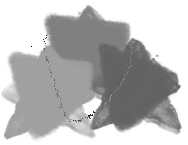
The determination of if there is enough contrast between the set colour and the image colour could be improved. The determination may be ‘arithmetic’ rather that ‘perceptual’ which would be more difficult to do.
Also, maybe a saturation shift as well as a hue and value swap could be incorporated.
I’ve changed the topic category to Artists Feedback and Testing hoping to get some developer comments and also made the title more specific.
Maybe after some developer comment.
There is a bug report something similar to this: 412011 – Changing cursor color to black in settings makes the brush outline to disappear
Some simple solution (not sure how difficult to put in code really) would be to just paint the outline black or white depending on the value of the underlying pixel. Maybe a new mode to choose.