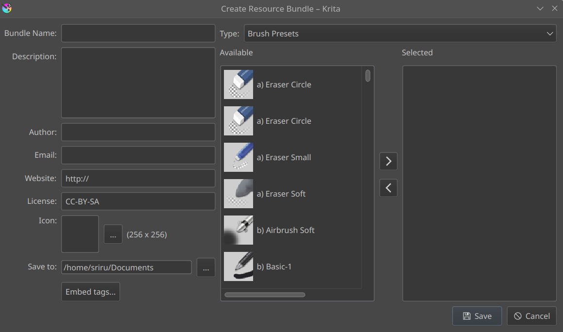
The Bundle Creator currently has the following issues:
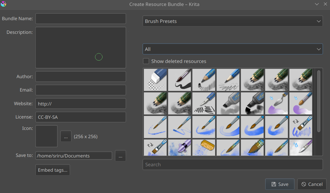
Difficult to find the specific brush preset you’re looking for. There exists no filtering by name or filtering by tag as one can find in the Resource Manager. Suggested fix: This could be fixed by using a layout similar to the left side of the Resource Manager
Embedding tags into the bundle is not really convenient. Apart from that, one cannot add custom tags in the Bundle Creator itself. Suggested fix: Again, this could be something similar to how we add tags for brushes in the Resource Manager.
Not much info is remembered after a new bundle is created. Suggested fix: Remember the options selected in the last bundle once create a new bundle is clicked. This is particularly useful when making a bundle for other people.
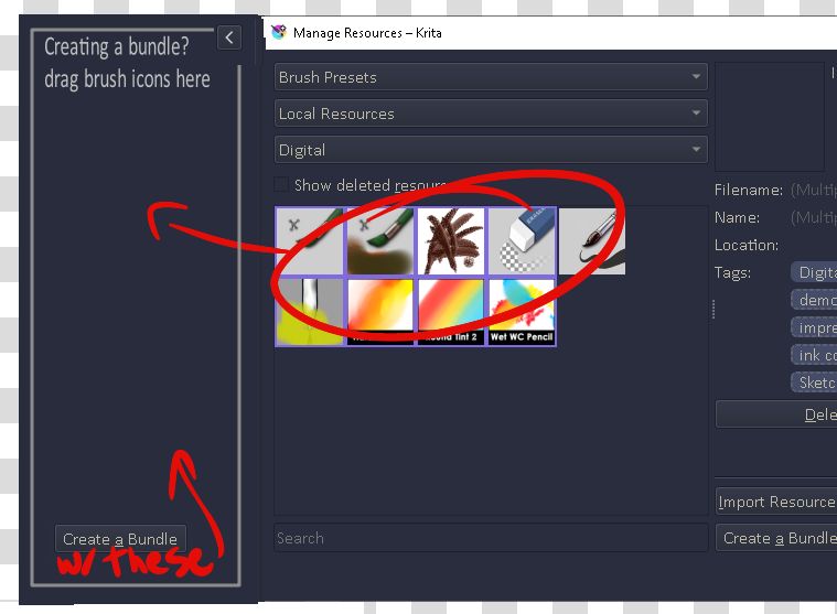
Notice how one cannot filter and add the brushes, gamut masks, etc in the old Bundle Creator.
@RamonM
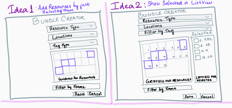
Can you please elaborate a bit on this? I’m having a bit of trouble understanding, would be great if you could explain what exactly you are suggesting, with some mock diagrams, and possibly in a more detailed manner?
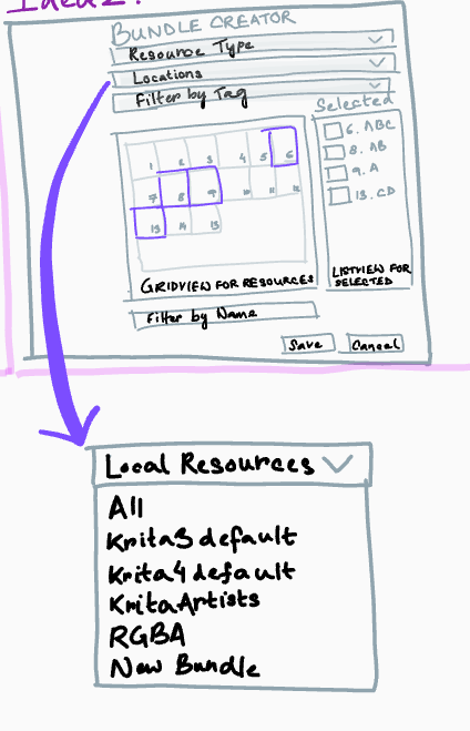
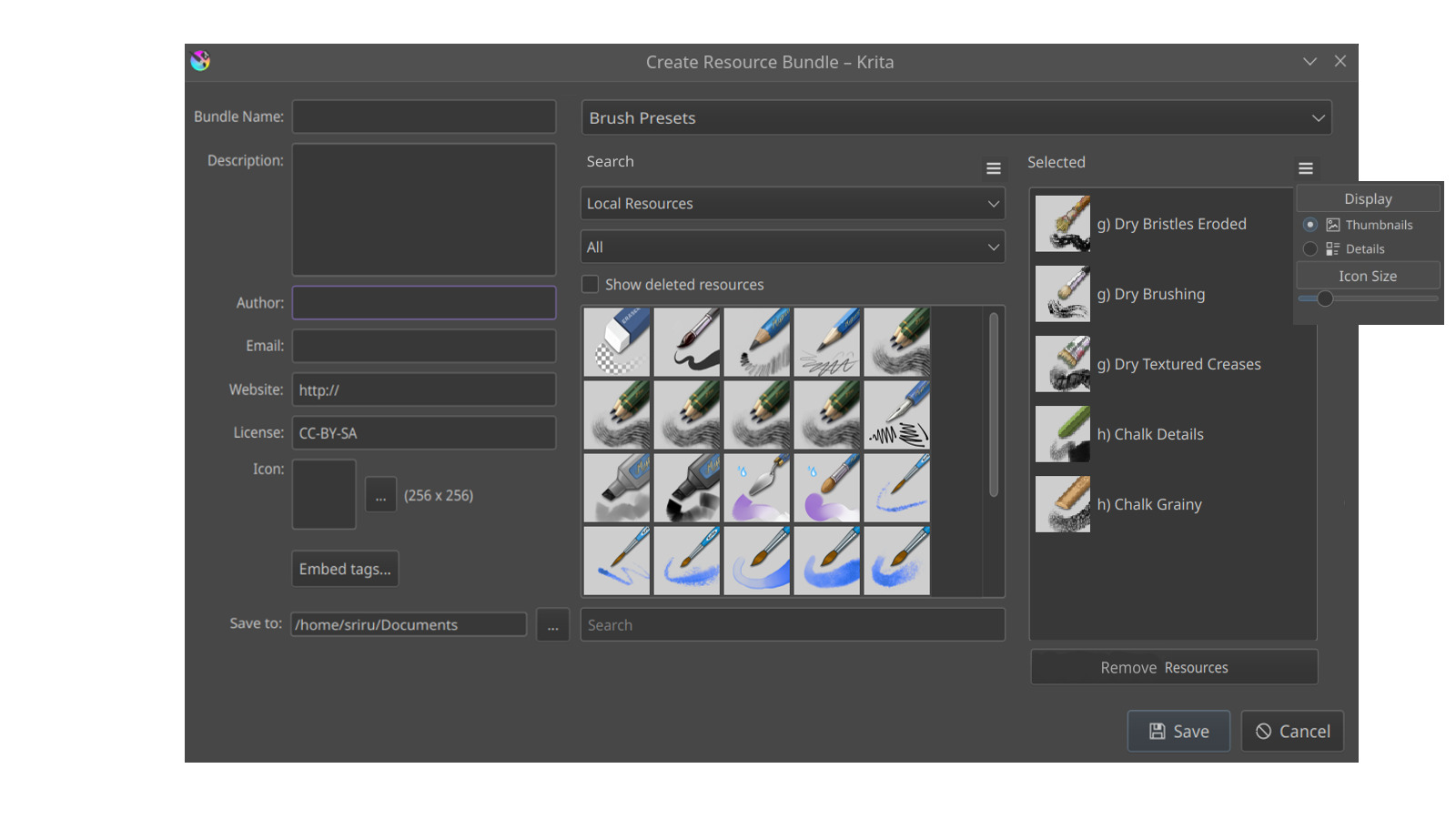
So, Idea-1 just adds the individual resources to the selected category once they are clicked, Ctrl + click in order to select multiple resources. Idea-2 displays the selected resources along with their names in an adjacent list view as shown. This is probably more suitable if you want to have a glance at all your selected resources at once. However, this can make the Bundle Creator look a little cluttered to some users.
Thoughts on which design is more preferable? And of course, any other design that someone wants to suggest!
Idea-1
Idea-2
0voters
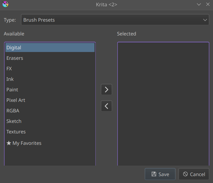
Also, the Locations Combo Box as shown below can have an All Locations option. If “All Locations” is selected, one can create a new bundle out of all the available resources across all the existing bundles. If some other option is chosen, say Krita3 default Resources, in that case only the resources in Krita3 default bundle would be shown in the grid view. This is particularly useful if one needs to create a bundle out of an existing bundle without having to go through all the resources. Or for someone who’s willing to create a new bundle from scratch, he/she can just choose “All Resources”.
@Srirupa_Datta
Thank you for working on this! Bundle Creator really needs some love!
I think we don’t have to use CTRL to select multiple. Just make it click select, click again to de-select. This list has only one job - to select resources - so it doesn’t need modifiers in my opinion
I like this idea mainly because it will be very useful to have a list of all selected assets even if we switch filtering setting to grab other resource, and we will lose sight of previously selected So extra list is very good idea!
I think it’s not a huge problem, but I have some feedback about layout of the whole window that will help with UX and make it feel lest cluttered.
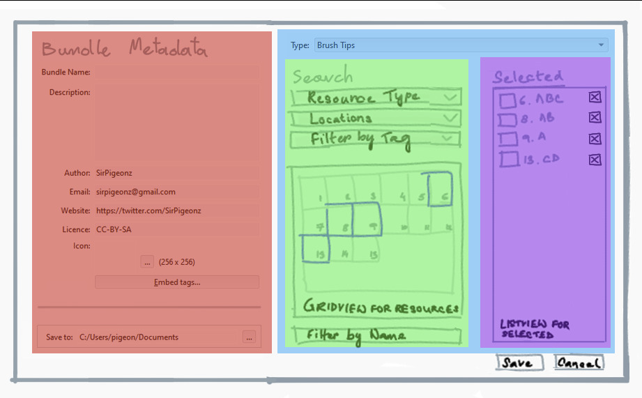
The idea is to split the window visually into sections.
Red section - will contain the metadata field for the bundle. I would also move Save location to the bottom of it and give it a frame to show that it’s a bit of an oddball there because technically its not a metadata, but we have to put it somewhere
Blue section - will contain widgets responsible to manage bundle contents.
Green section - will contain widgets responsible to help user find resources he wants.
Violet section - will help to give user an overview of what he already did and extra options for final tweaks.
For example, I would add a button to remove resources from the list if he changed his/her mind. It would be really bad UX if the user would have to go back to find the location of the resource he added AGAIN just to remove it from the list. A little Remove Button on the list will help with that I think.
Other UX tweaks that I think should be part of this rework
Bundle Creator window should be resizable. For now, it’s not, and it makes it hard to work with when you can’t make a short list of assets longer
Make a window a bit bigger - resource lists are usually big…
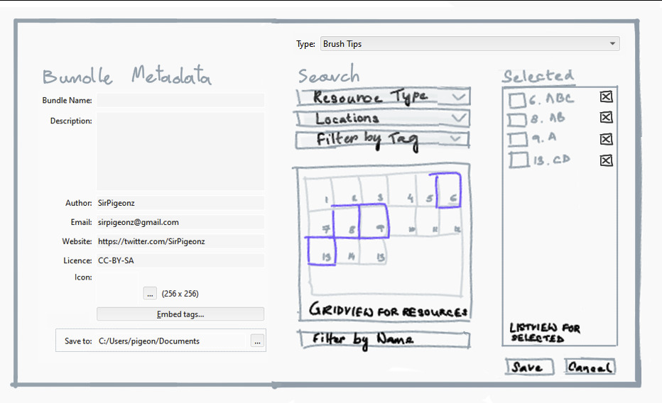
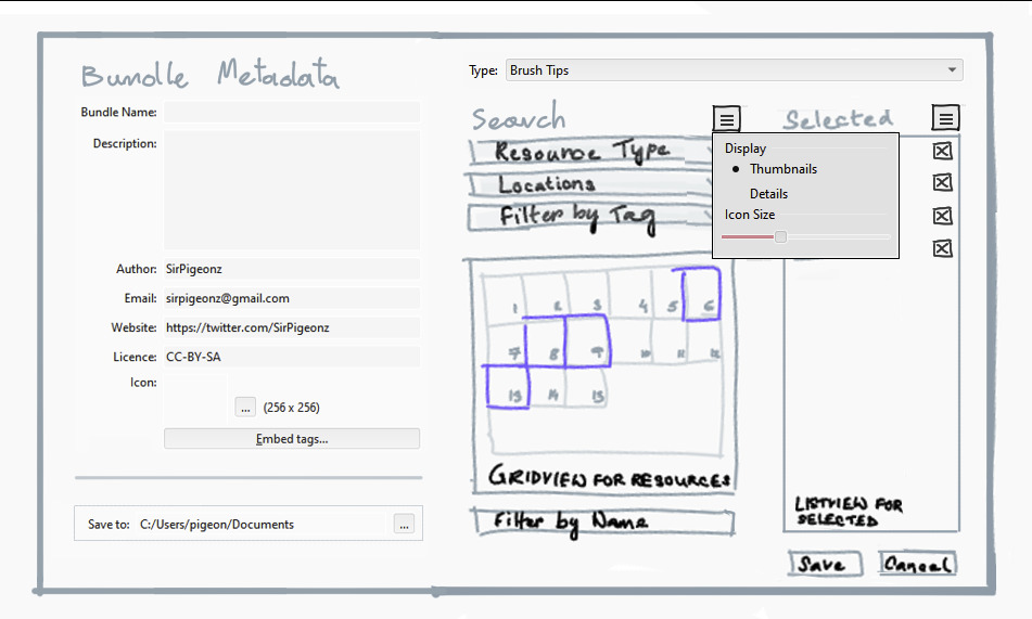
Widget with resource display settings, the same as in for example Preset Dialog. I would place it on the end of, Green and Violet sections titles. (mockup below)
I personally would also create separate Menu entry Bundle Creator there is already Action for it it just has to be place in menu.
I would consider with other devs to move Manage Resource Libraries, Manage Resources and Bundle Creator from Menu > Settings to Menu > Tools and move Menu > Tools > Scripts to Menu > Scripts
I will think more about how it should be improved and will post new findings or ideas later.
Click to select, click again to de-select resources in the gridview.
Shift Save to to the bottom.
A Remove Resource button to remove resources from the list( Selected Resources List)
A resizeable Bundle Creator Window, and a bigger window.
Widget with resource display settings for both Search and Selected Columns.
Create a separate Menu entry called Bundle Creator.
Question: So you mean Bundle Creator could now be opened directly from the Menu as well as from Resource Manager?
Move Manage Resource Libraries , Manage Resources and Bundle Creator from Menu > Settings to Menu > Tools and move Menu > Tools > Scripts to Menu > Scripts
Note: This needs to discussed with the other devs.
I kind of just repeated whatever you said, but needed to clarify.
Also, thanks for explaining in such details!
So you are suggesting to add a Drag and Drop version of the Bundle Creator in the Resource Manager itself? This is something I need to talk with the other devs and artists first. But personally, I feel like this is kind of redundant if there’s already an option of creating a new bundle from an existing bundle as I mentioned in one of my comments above. (shown below)
Which ever is easiest to implement. the main thing is being able to search for a brush as easily as we do to paint with them. Tag and typing filters is a lot better than needing to scroll through all your brushes, yes name conventions help but is tedious
Outside the brush creator but still having to do with ease of finding a brush. I’d like to have
ability to move brush order around within a tag.
“remove resource” to “remove selected” the title saying it is resources I think would enough.
having save and remove really close can cause miss clicks but I have no alternative idea for it. Things look organised properly.
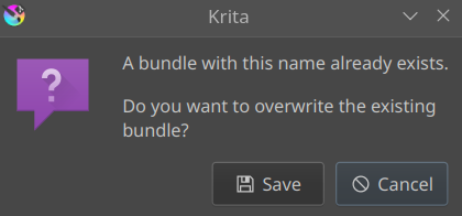
My worries with the bundle creator is not so much the UI as compared to it acctually working when hitting save. One of the smal details that come to mind is trying to save and the file already existing because it did not save properly. I would want to like overwrite so I don’t have to be write a new path for every version after a failed attempt. Maybe just a popup asking “do you want to overwrite? Yes cancel” Just to be sure and overwrite it.
Now a question out of curiosity. Will it be able add other resources like keyboard shortcuts? There are a lot of resources missing from bundle creation for what I read in the manual. But truth be told the folder system is not even fully created when starting out a new krita install and you need to create the folders or create a file to create those hidden resource folders. Honestly I would just expose everything from the get go even if the folder was empty because that already happens to some of them. There are just some resources that are choosen not to have a folder from the get go and not able to be bundled, fact I never understood.
Doesn’t this already happen when clicking on Save? Like I just checked and whenever I try to create a new bundle with an existing name in the same path, I get something like this…
Can you explain in which scenarios does the reordering of the resources help? I haven’t worked with bundles so I’m not sure about this. Also would you want this feature for the Search Resources gridview (left one) or the Selected Resourcs gridview (right one)?
you understood well. but well I have not made a bundles in a long while. I might be worried with old stuff. but I had a lot of issues making bundles in the past (in all my attempts) to the point I still have not updated my own bundle. It seems I always encounter a weird bug when i try.
Really nice! I like how you solved Remove Resource from selected list. I think this is a better solution than what I proposed and will work with both grid and list view. I agree with @EyeOdin that it should be renamed. In my opinion, to Remove from selected.
Made some slight adjustment I think worth considering:
I made Search and Select title labels bigger and aligned with the button on the side.
Aligned bottoms of the Search and Select sections with each other.
Made stronger and wider separation between two main sections. I was considering moving them to different Tabs, but not sure if that is needed. Save to moved lower and separated it with horizontal separator.
Yes, It already can be opened directly if you assign shortcut, but I think adding it as direct Menu entry will be a nice QoL feature.
@Hologram
There is already an Embed Tags button for adding tags for particular resources, though if I am not wrong we still can’t create our own tags from the Bundle Creator itself. That is something I would also add to the improvement list. Is that what you were implying?
@EyeOdin You can let me know if you face any bugs recently, I can add that to the list of improvements!
@SirPigeonz I liked the improvements you suggested, thanks!
I think the Brush Docker is completely different than the Bundle Creator, though maybe they’ll look similar if the Bundle Creator has a gridview for showing resources. I can understand why you would want the brushes ordered according to your preference in the Brush Docker, but why in the Bundle Creator?