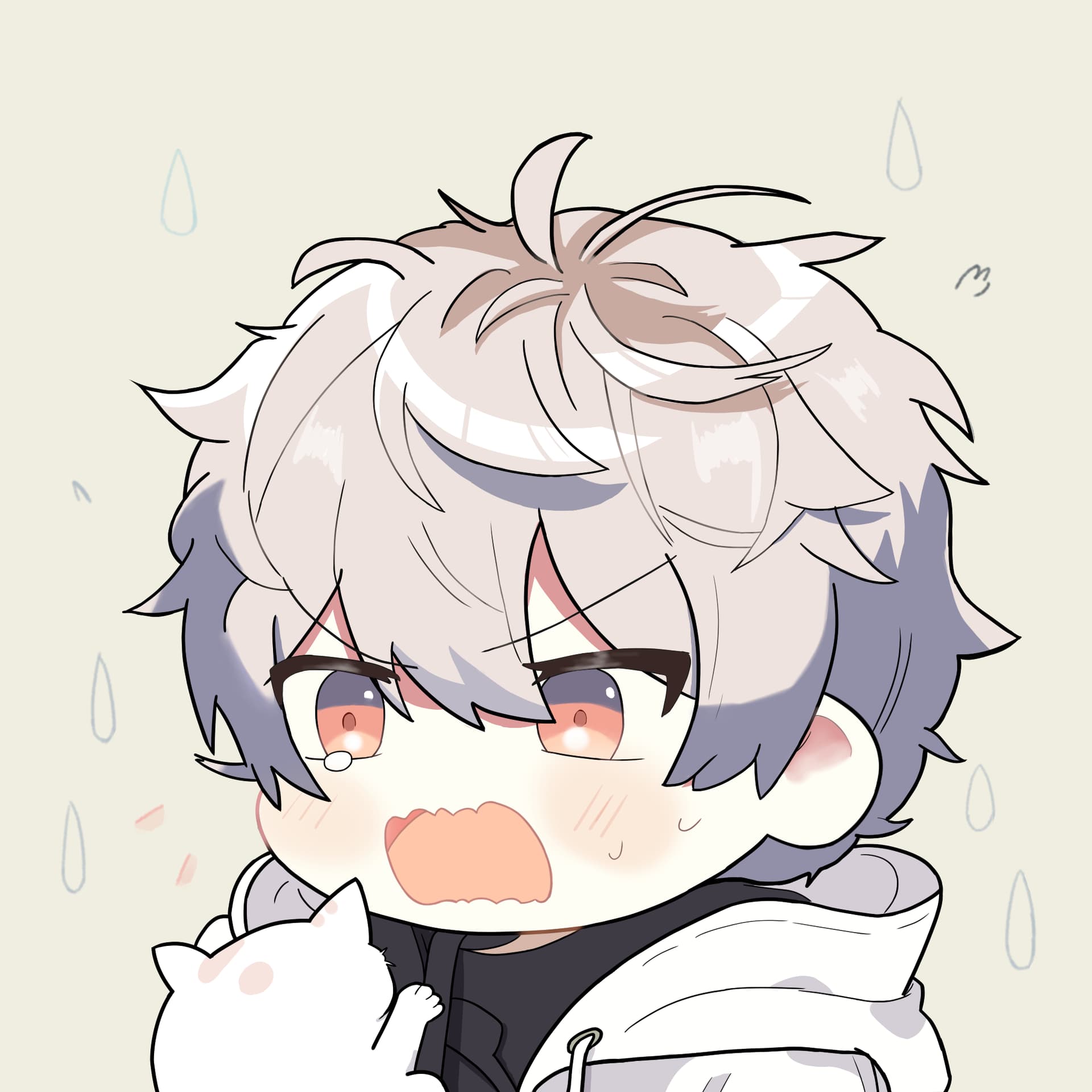
Cat Surprise - New Profile Photo

I was taken aback by the cat :scream_cat:. What should I do? :confounded:


Drawing Story

Background

This image is created in thought of profile photo, so it’s square sized and with the character’s head focused. The character is shocked by the cat jumping on him. Of course, this is the most delightful artwork I’ve ever created. :smiling_face_with_three_hearts: He’s so cute.

Goals

I’d like to draw anime-style boys for long, and after my first try, I found some of the problems and try to fix them. I have so many things to learn, but I can’t learn them all in one step. So I set these goals for this artwork:

  • :triangular_flag_on_post:Head Structure
  • 🪮Hear Partition and Structure
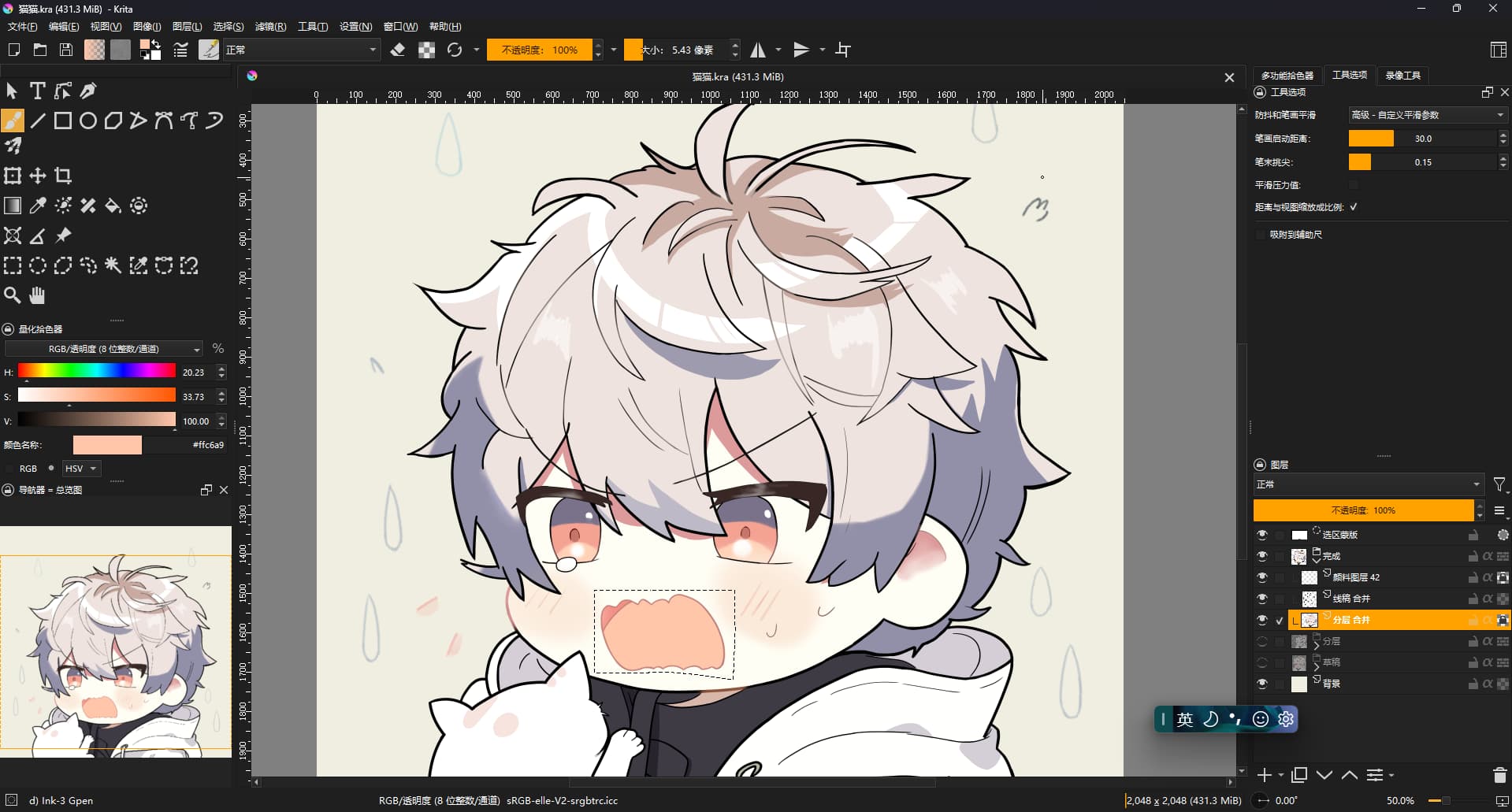
  • :technologist:Krita Workflow

After I did enough practice, I challenged myself to get this drawing done.

Improvements

Compared to my last artwork, I think I’ve got these improved:

  • :unlock:New Work Space - I twisted the shortcuts and get a new layout for Krita so that I can see the overview of my artwork to get things placed more accurately.
  • :white_check_mark:Mirrored Version Still Good - I mapped mirror canvas to key ~ which is much more easier to reach for my left hand than default m, and I keep tracking the mirrored version to make both looks well.
  • :white_check_mark:Shadow Looks Better Now - I observed some examples of shadows and found they are result of light. :rofl:Yes I just know about this. This time the shadow came from the front and up side of the character and I draw shadows and high lights keeping the position of lights in mind.
  • :paintbrush:Better hair - I followed an online lesson and find hairs has different parts. It’s more easier to draw hair keeping this in mind.
  • :open_book:Proportion Practice - I found myself can’t get the curve’s proportion properly, so I do some practice and find I can draw multiple curves and erase the unneeded ones. This helps a lot.
  • :open_book:Perspective Practice - I learned basic perspective and found myself can imagine how an anime styled head looks like in 3D in this practice.
  • :technologist:More Krita Freatures Learned - Inherit alpha, merge layers and alpha mask are so useful. Can you imagine I draw my last photo without these functions in mind?
  • :thought_balloon:Adopt my good points and avoid my shortcomings - Lesson learned from my last artwork, I didn’t draw hands, body etc in detail to make drawing a relatively good artwork possible.
  • :sparkles:Effects is Included - I add some lines and water drops around the charactor to learn how to make simple effects. This came acrossed to me when I found some broken grass in an artist’s newly posted artwork.

These improvements cover all my goals and it’s a successful challenge!

New Problems

However I still find some problems:

  • :eye:The eyes seems not to be looking at the cat. And if he lowers his head, it should looks better. I did draw the head a little bit down but it doesn’t work. I think it’s the problem of eyes’ position. Maybe perspective practice with face is needed (not just head, but also facial components like eyes and mouth.
  • :sunny:The shadow is not so realistic. I tried to use multiple color to form shadows in different parts, and it looks well for me. But I have no idea of the shadow boundary. The shadow seems to be too sharp but I don’t know how to make it softer. I’d like to blur the boundary but it just get worse.
  • :art:How to mix colors? I found other artists get multi colors mixed to draw one object, making a texture of that object, such as wood drawn in many "brown"s, not just one white color like the clothes in this drawing.

Realized Truths

If the draft is not cute, the result won’t, too.

This is the colored draft. You may notice I make the charactor to be flatter a little bit compared to
the completed version,


but it’s still cute.

So the proportions are much more important than details in my opinion.

Help Wanted

I’d like to make progress as fast as I can. :face_with_monocle:

I’m still new to digital art and could you please give me some suggestions? :hugs: Feel free to edit the image! Your help will be well appreciated! Thanks a lot! :smiling_face_with_three_hearts:

24 Likes

You are on a good way, so the only thing is practice, practice, practice, and not to forget to analyze your works to not repeat the mistakes you once made. Then everything will come from alone, but not tomorrow. But my impression is that you know this too, even if it seems you can’t wait to make and see your progress.
Do not forget to not overdo it, take your time to do other things as well, painting is for sure one of the best hobbies we can have, but there is a world beside it. :wink:

Michelist

1 Like

Wow, this reads like one of my posts :joy: Aww mate, I wish I could help you, but I kind of feel lost myself.

I’d like to make progress as fast as I can. :face_with_monocle:

I’m not a fan of “as fast as I can”, as that can lead to disappointment. I prefer to think about it this way: “try to minimize wasted time”. Which brings me to @Michelist’s mantra :slight_smile: “practice, practice, practice”. Yes, practice is good, but it’s difficult to practice correctly… Also it can be very, very exhausting if done effectively. In this sense, practice can be worse than just trying to paint another picture, but nothing is fully black or white.

Well, I’ll just refrain from giving improvement advice, until I can say with straight face “I did this and it got me these results”. I’m kind of in a slump as well. I can comment on a few things though.

:eye:The eyes seems not to be looking at the cat.

It may not be necessary to lower the head, actually. As usual, the best solution here is to look for a similar picture (the angle and eyes position) from a pro painter and see how they do this. Finding the reference for this shot may be a bit more difficult, because very often the character is looking directly at the viewer, rather than at an object in the picture.

You can guide the eyesight by carefully adjusting the amount of white area of the eye. Also, the iris can change shape a bit, and especially the inner parts like the pupil (the dot inside the eye) can shift around significantly. This is because the eye is not flat, but these structures exist at different depth, so looking from the side you get a parallax effect. But TL;DR is, yeah, you need a high quality reference to get it right for the first few times.

:sunny:The shadow is not so realistic.

This will depend on the art style you are going for (still within “anime” style, you can have many variations). It is sharp, yes, but it doesn’t necessarily look bad to me. As usual, the only way to fix this is to find suitable works of master painters and compare them and pick the parts that you like and incorporate into your own painting. If you run into something that you don’t understand, you can’t get the same effect, then it’s a good idea to come back here and ask others for suggestions. Maybe we can crack this together.

If you think this looks too simple and boring, I think what others typically do is that you have more color variation in the shadow. These are very subtle hue and value shifts. Stuff like this:

  • a narrow terminator line that separates the light and shadow area, in slightly different hue.
  • reflections from the surrounding light

I think if you look for this specifically, you will quickly see in almost every illustration.

:art:How to mix colors?

Hmm, honestly I don’t mix colors at all, at least in traditional sense to get a new color. Usually it’s a variety of these techniques:

  • lay down a flat base color
  • define areas of light and shadow (shadow 1), then as necessary or depending on the style add shadow 2 and shadow 3 areas.
  • add more detail by adding shadow terminators (the different hue edge of the shadow), reflections, or subtle gradients. Usually these additions can be layered on top with new blending modes such as multiply (for shadows), screen/overlay/etc. for lights, glow, or even just the normal blending mode.
  • By using alpha in the brush (like varying opacity/flow) you can get a mix of two or more colors. I think it’s best to not overdo it with soft brushes, but of course you really need them in a few places.
  • For actual textures (like different materials, wood, fabric, stone), you basically look for textured brushes and paint on top of previous strokes with slightly different colors and normal blending. If you want to experiment with a few new strokes, just create a layer that you can then merge down if the result looks good.

I think a good way to learn rendering and coloring is to watch uncut paint process or paint timelapse videos, again, from a pro artist. If you know your software, usually it’s as good as a tutorial and you should be able to replicate the effect. One of the artists with really beautiful renders is DDUCK KONG, you should be able find their illustration videos on YouTube and BiliBili.

However, it’s harder to find videos with male characters :smiley:

PS. Forgot to highlight this:

If the draft is not cute, the result won’t, too.

Yes, 100% true! I just recently looked at a few source files from a pro artist, and was really struck by how accurate the draft was. I mean, the line quality may be very rough, with chicken scratches or whatnot, but when you look at it as a whole, the body proportions, the perspective, the pose, it is almost perfect.

I think a good draft/rough is basically like a lower quality version of the finished thing. If you need to deviate significantly from the pose or proportions, then the structure is at risk and everything may fall apart. It’s better to step back and refine the draft at this point.

2 Likes

Thanks YRH! Your generious guide is appreciated! :smiling_face_with_three_hearts: I will keep an eye on what you have mentioned in my next practice. You did help me a lot. :hugs: Don’t be lost.

However, it’s harder to find videos with male characters :smiley:

I’ve noticed that a good pro artist is vital in your guides. Actually I have a few artists who I very appreciate. One of whom is Real_Even_ at Bilibili, a indicated male(or actually boy) artist.

It’s not a good idea to put his artwork here, but I’m refering to something like this artwork in pixiv. I mean this kind of anime-style. So by setting the goal of him, you may understand why I’m complaining the shadow is not realistic.

About this kind of anime-style, I’d like to conclude that only the charactor’s head and facial components are in highly stylish, but other parts like clothes or body and skin is kind of realistic. I do notice they have multi color to form a shadow or texture. See the histogram of that artwork by Real_Even_, it much looks like a photo, having continuous color in one picture.
histogram from real even

However, what about my new profile photo?
histogram

The comparison shows that I don’t use too many kind of color. And yes, because the only way I produce color is using b) Basic-5 Size Brush and nothing else, maybe sometime with i) Wet Circle Brush in low opacity to blur the shadow.

If you know your software, usually it’s as good as a tutorial and you should be able to replicate the effect.

I’ll learn this part by watching his painting video carefully. I’ve configured Krita and it works so well that I don’t want to use SAI2 like he does now. :star_struck:

All in all thanks YRL lol.

2 Likes

Most importantly, don’t worry as much about success as about enjoying yourself. If you enjoy yourself you will naturally continue without stressing and then success will deal with itself.

1 Like

I think you’ve got there a pretty good reference to follow! Especially these latest pictures from Real_Even_ look pretty amazing, especially the lighting and color. Also, if you zoom in, the detail is actually not fully realized, but it’s a just right amount of detail to make it look great at a intended viewing distance. There’s a lot to learn from!

Your histogram looks pretty typical for a mostly flat shaded piece. I don’t think there’s anything wrong here.

I mentioned brushes before, but essentially a set of painterly brushes like this one by David Revoy, will help you get a lot of color variety easily. Some brushes are hard and covering (these can be used to spray one color over the other) and some are glazing, which will “mix” the new color with the one below. However, this doesn’t work like traditional pigment mixing, so you will need to experiment with color selection to get the desired effect. And in some cases, you can try a different blending mode for the brush, but it may be a bit tricky to use, especially to refine with multiple strokes.

Brushes like these work very well for backgrounds and “painterly” style characters. However, I’m a bit undecided yet if they work well on characters in a typical “highly clean” anime style. The problem is that they may add too much color variety, which will look too noisy on a typical illustration, e.g. the hair. However, it could still work OK for clothes. Frankly, I don’t have enough experience with rendering to say for sure what works the best here. Still learning :slight_smile:

BTW, David published a video alongside the brushes, so you can watch it to see a demonstration of how each brush can be used.

2 Likes

OMG he’s so cute!
And it’s nice reading your thought process of your art

1 Like