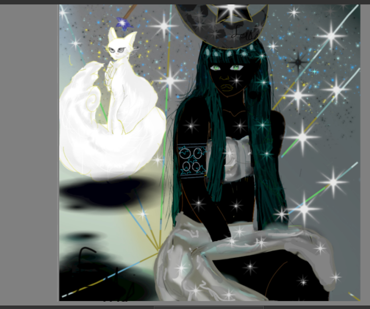
Looks really nice! Sorry I don’t really have any feedback for your piece
What kind of feedback are you looking for, precisely? : o Colors, contrast, form, etc…?
any feedback bc i dont know what i need to improve on.
Nice. Fun and evocative. Great big scene somehow. If making a movie, I think a director would show this, to frame a giant legend like figure(s) just before or after some dialogue. And like Galactus from Marvel.
I’m just a hobbyist, but I’m old enough to have looked back at my designs or favorite drawings, and say “oh no” to myself. This logo drawing I used for a while in my music, and I should have delineated more the buttox, in this logo drawing I made, to ensure no additional symbols could be derived from viewer. My feedback, is more like a little safety guard rail. Always take time when drawing around the groin area. Re-look at your drawing like 5 times, every little line, the overall shape, whim lines, your final line, and never leave any lines or overall shapes, that “seem perfect at the time” but when view closely at groin area, they can present a 2nd image. And ensure no lines or sexual subconscious images ‘may appear.’ I once drew my favorite bass guitar pose, used as a logo, but after a few years I went back to that logo and realized, the buttox of my character had a misplace sketch line in an inappropriate area, and I never even noticed till years later (unless the image got hacked?). This woman’s thighs should be drawn to only make it look like her leg, or something safe. if you allow me to extract 2nd image, instead of a giant pencil coming out of her stomach. I say this because this is pretty good and unique. I’m just trying to save you grief I experienced.
What kind of tools have you used in the past? Really good placement of stars and lines, also. At first they seem random and captivating, but I like how a 2nd viewing, they show some balance or symmetry. Here, additional viewer extraction is positive. But that shape of the giant pencil out of groin is negative and can cause grief and cut fans in half. Aside, it also has that cool Egyptian vibe which is …how to describe that art, mesmerizing, important, patterned, balanced. All the heads and feet at aligned, for example. I think stomach line is great too, maybe on inhale, maybe is pro athlete aethetic, is that why it’s great (?) but really great.
To help understand 2nd image, overall shapes that can have negative effect, look up, File:František Kupka, 1912, Amorpha, fugue en deux couleurs (Fugue in Two Colors), 210 x 200 cm, Narodni Galerie, Prague.jpg - Wikipedia
,_210_x_200_cm,_Narodni_Galerie,_Prague.jpg)
Do you see how at first, this is cool shapes, but also, it can look like a white buttox, so I kind of don’t like this painting, frantisek kupka fugue in two.