I’ve tried to save as png, jpg etc, and my paintings always loose colour, I would love to print some of them but I need to figure this out first? What should I do?
That’s a big topic and there are dozens of posts in this forum about it.
Here’s one to get you started. There is some good information to take in. If you want even more info, use the search bar at the top of the forum screen.
1 Like
Welcome to the odyssey that is the color managed workflow.
tl;dr;
make sure you work in sRGB and export in sRGB. Krita’s default color profile works best.
2 Likes
Hi, thank you, I still haven’t been able to solve it though, I found something about soft proofing and I don’t have it on,
I’m using the default settings and I’ve tried everything that has come to mind and still the photos come out lighter than what they are in Krita.
Nothing helpful in the links we provided?
Is the image on the left a png file and the .kra file is on the right?
A full screenshot showing your entire workspace including the top and bottom status bars might help.
1 Like
Soft Proofing has nothing to do with how the colors look when exporting. Its to temporarily see the image in another color profile without having to convert it. What is important is the color profile of the Krita file and what’s used when exporting the image i.e. the options you choose on the export dialogue.
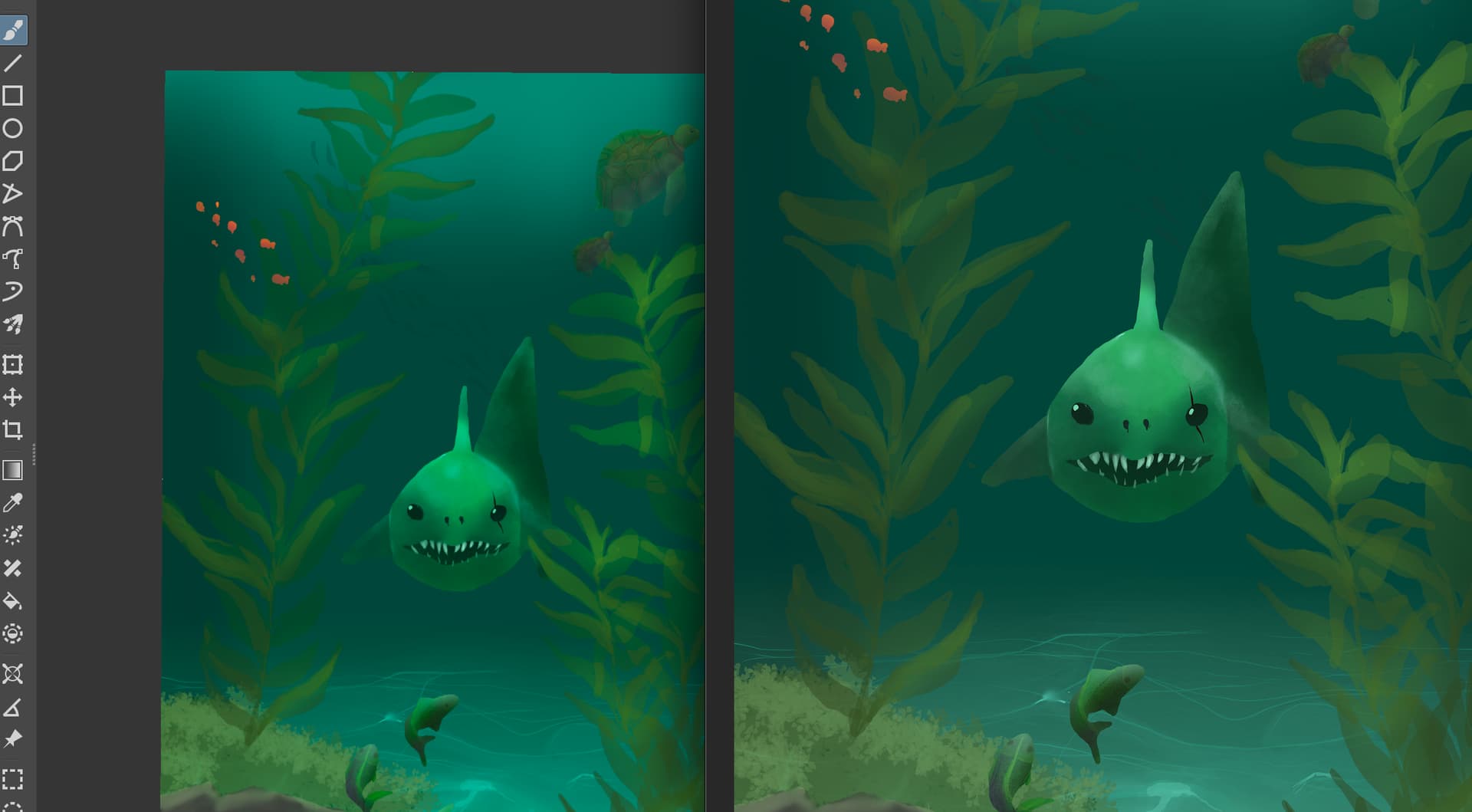
Also, perhaps it’s just my phone but I can see no difference in the image.
1 Like
That’s your phone.
@this.is.saini, please import your PNG/JPG into Krita as a reference picture, you can do it by dropping it on your canvas or using the push-pin icon and its import function (Tool Options Docker), enlarge the reference picture to the same size of your picture and put it side by side to your original KRA-file. There you will see no difference, and this is because of one reason, Krita applies to both pictures the same profile.
I guess you compare your exported pictures using a software other than Krita, and this software seems to be unable to use the embedded color profile of your PNG, and in case you are not referring to the different view on the same device but on different ones, then the issue is that you most probably do not use calibrated displays, at least not on both displays and that is the/your culprit. Only calibrated devices are capable to display the exact same picture looking the same, that is also what you could learn from the manual-category @Takiro has linked above.
But color is a swamp, and if you do not understand the ways to go in this swamp to reach the same target on every display, no matter which way was chosen, you will find your current experience strange, but it is just normal, and your last answer shows that you haven’t understood jet what the manual tries to describe and which ways you would have to go to see your pictures on every device displayed identically (what is impossible, because we consumers are unable to calibrate the display of a mobile phone, and also most tablets do not offer the possibility to adjust their displays with a color profile created with special tools to measure the characteristics of its display, so you have to use the manufacturers preset).
This also applies to different viewing apps on the same display, if one app does not use the color space a picture was saved in, then you’ll experience what you experience, that is not an issue, that is the normal insanity when it comes to the swamp or minefield of color, one wrong step, and you’re done.
Michelist
Hi, thank you for the response. I don’t think I found the solution there at least, I tried a few things but I still can’t figure it out. It must be something simple, this is when I open a new project, what it looks like in the workspace, how I save it as and the outcome!
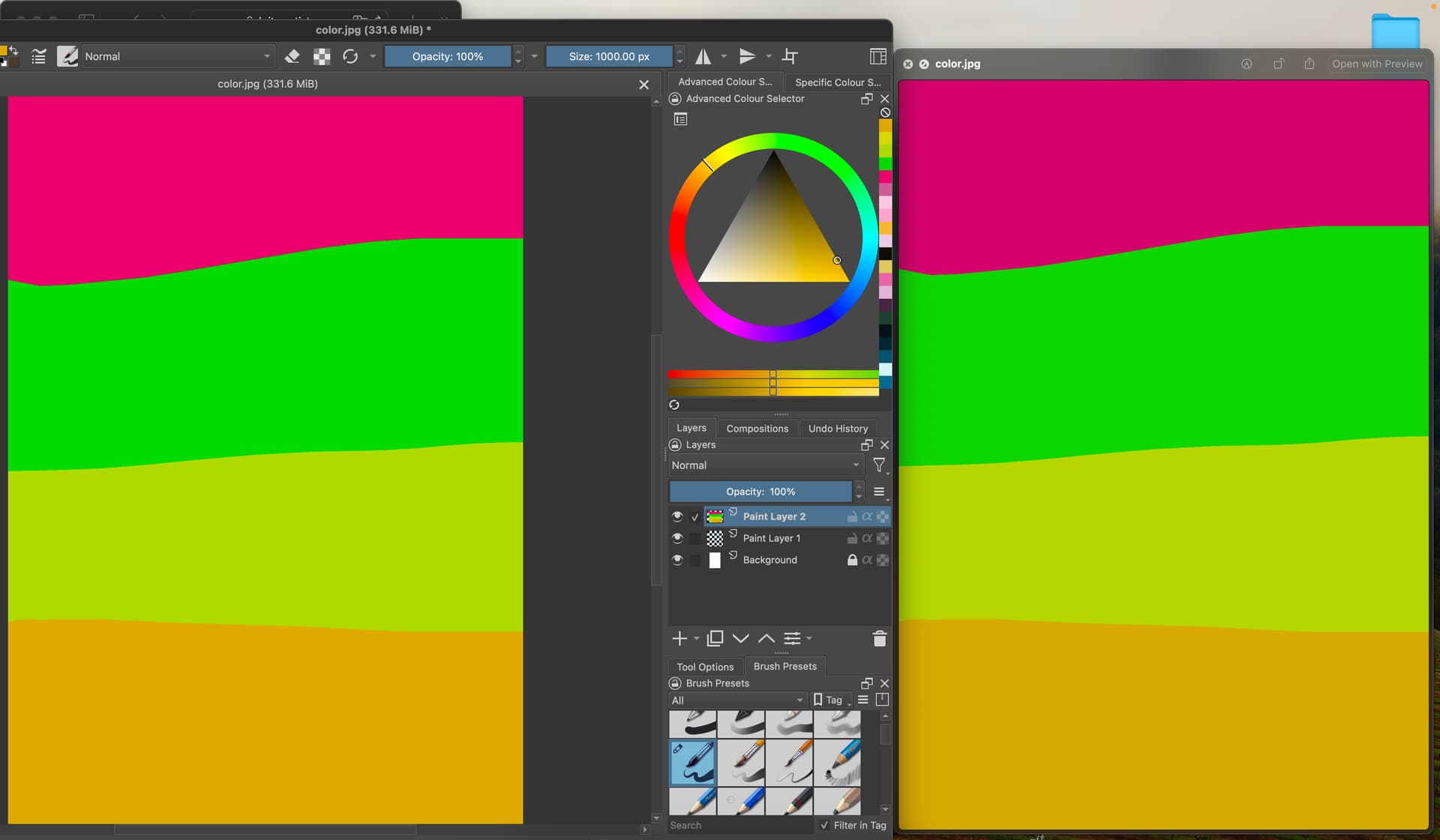
It can be seen in the pink colour more in the example but it sort of like tones down the colours and takes down the saturation I think…
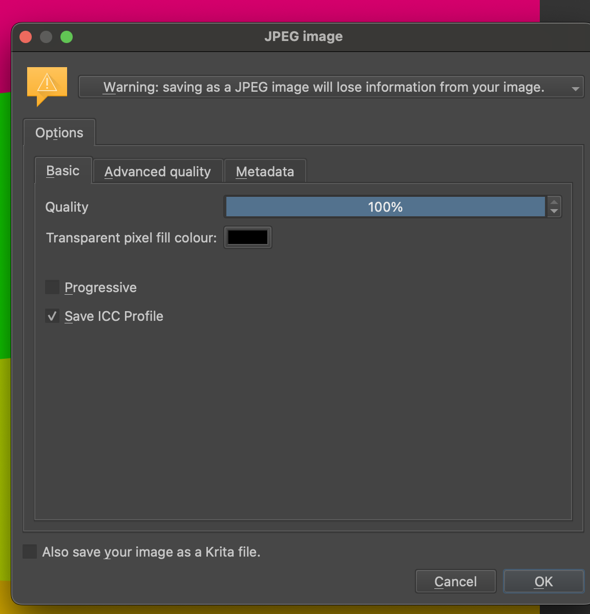
Don’t save the ICC profile into the jpg. Most consumer grade software (windows image viewer, file/web browser) can’t handle that and will interpret it wrong even if correct.
Its better to use the “Export” option instead of “Save as” because it doesn’t change the active document.
JPGs will never look exactly like in Krita because of it’s compression. Better use PNG instead (still don’t embed color profile, check the sRGB option, don’t use REC).
2 Likes
I think I’m writing you too long texts ![]()
If you simply export your last image as a PNG, i.e. save it in Krita via ‘‘File’’ >> ‘‘Export’’, and then import this image into Krita using the “Reference Images Tool” (the push-pin icon) in Krita and view it next to the original, you will see that you can’t tell any difference. Viewing it next to Krita with any third party image viewer software will do you nothing but despair, that only works with professional software, and even then only if it uses the same profile as Krita.

And this is only because many image viewers either don’t implement color profiles correctly and misinterpret the profiles, or don’t bother with color profiles at all and display it the way the programmer liked it best when creating the software. Likewise, every browser will display your image a little differently, and that’s down to the browser and not Krita or you.
But you’re not really at a disadvantage, because everyone has to deal with this, and you can only get around it if you use identically calibrated monitors and professional software like Krita, Photoshop, Blender, Inkscape, Adobe Illustrator and the like on the input side that can handle it at all, and on the output side, again, work exclusively with calibrated displays and printers and professional software.
And, if you publish such images on the Internet, then nobody who sees your images knows whether and how much they differ from your original. And again, everyone has to struggle with this, only those who don’t understand it often despair.
You should really read through Krita’s manual chapter “Color Managed Workflow” several times, e.g. every evening or every other day before going to bed or whenever it suits you best, and try to grasp the message, the essence of the knowledge conveyed there. Once it has clicked, you will probably grin about it.
Michelist
2 Likes
Thank you!
Haha, I’ll add that to my book reading list… ![]()
This topic was automatically closed 30 days after the last reply. New replies are no longer allowed.