Color modes RGB CMYK different image look after export

Hello dear Krita community! :star2::star2::star2:

My issue is the issue old as time - how do i export a file that was done in a different color space, so it stays in it?

It’s the

‘in program file looks fine, but when exported, it’s too saturated or not saturated, since the color modes for working (cmyk) change into .png/.jpg (rgb)’

Literally i ran into this issue every time i attempt to make my color wheel duller or less dull by changing my colorspace thingy. The HDR modes are all the same, the setting say output is the same color space (when i can SEE it comes out different) and everything that can say ‘linear colorspace’ says ‘linear colorspace’. Can someone solve this once and for all? And if someone already did, can i please have a link?

I just need to know which setting it is that makes the color spaces/color modes change from cmyk to rgb during export :pray::pray::pray:

In the first place, you should not be working in CMYK – especially if color management is a unknown discpline to you. Always work in RGB.

In the second place, a digital artist needs to know about color management and file formats. It’s not a matter of a setting in Krita that “fixes” an “issue in Krita”.

Please read Colors — Krita Manual 5.0.0 documentation and then File Formats — Krita Manual 5.0.0 documentation – these manual pages explain color management and the abilities of various file formats and which file format you should use for which purpose.

3 Likes

Yeah, so, as i said before, this is not my first time with this issue, and the reason for that is my failure to understand the manuals. My brain is too small for that stuff. No matter how many times i read them there is no answer for my question. At least, not one that would actually work.

I just needed duller colors, and technically my display, my color wheel and export have the same color modes, so i don’t even have any way to investigate how this is happening because it cannot be anything else i don’t think. I wouldn’t bother you if i could manage by myself.

I checked, and i am indeed using RGB rn, the color wheel is dull like i wanted… but that leads me to believe i started with CMYK as default, which is interesting to think about in context? Since i wasn’t even supposed to work in it? Is my program the wrong version, then?

I will take a screenshot if i need to. I just needed duller colors, truly. Normally i wouldn’t dare to even touch that part of Krita. Right now it just angers me a little that a program i love so much doesn’t make sense

PNG does not support CMYK. Save as a .tif if you need to embed a CMYK profile.

If you’re going to print it physically, CMYK is fine. If it’s destined for the web, conversion to an RGB space is preferred (Image->Convert Image Color Space).

I can help somewhat, but it would be handy to have these screenshots:

  • The dialog box you see for Image->Convert Image Color Space
  • The contents of every tab of “Preferences… Color Management
  • The contents of Preferences… Color Selector Settings
1 Like

Hello,
At this point there is both little and much to unpack about your situation (I’ll choose the much approach).
I’m a complete newbie when come to colors and Color Management, mostly because I’m too lazy (dumb) for it. However I’ll try to enlighten you to the best of my capabilities, also provide a good workaround for your objective (duller colors).

First: Colors and Color Modes
When starting in digital painting I can see how daunting somethings can be. Color theory maybe being the most of them. When researching you found only math, numbers, algorithms and such. It all appears too technical and complicated, but having a broad understanding of it isn’t so hard.

RGB: It is a additive mode (all colors mixed result in white), basically how colored lights interact, and theoretically it can display all the colors. It is how any monitor/TV works.

CMYK: Subtractive mode (all colors mixed result in black), it is the way physical paint work. Pigments in the real world can’t display all the colors the human eye can see, this is why is has a duller color wheel. It is also the reason printers use it.

This is one of the reasons is recommended to only paint in CMYK Mode if you pretend to print your work afterwards. Even so, the consensus is to paint in RGB and just convert a file that is going to be printed to CMYK.

Second: Colors and Krita
At the beginning you said things like:

So what is linear colorspace? Linear colorspace is specific to the RGB mode, this means you’re working on a RGB document.

However you said you were working on CMYK. You were seeing the dull colors of CMYK.
My guess: You were on Softproofing mode. This mode is enabled with the shortcut Ctrl + Y, or in the menu ViewSoft Proofing. The default mode for soft proofing is CMYK.
Here is the catch: Soft proof only affect the view inside Krita. Is a way to you to preview the colors in another Color Mode without compromise. The document still is in the Original Color Mode. You can see by the documents being exported differently.

Hopefully I’m right about this and you can see why your drawing in Krita is different when exported.

At this point you could know how it isn’t a case of just clicking a button and solving the problem. Also, how you as the artist has to be aware of certain parameters to achieve your goal.

Third: The solution?
Okay, now I hope you have a better understanding of this matter. With this a good strategy is to always work in RGB. Then how does one can have a painting with duller colors?
I can think of two possibilities:

  1. Using Gamut Maks. The Manual Page about it is really clear and simple on how to use it.
  2. Changing the Color Space only of the Color Selector. Images bellow.

Also, don’t forget what @UpsideBrigade said. Exporting as a PNG won’t retain a CMYK profile, so even more reason to keep working on RGB Mode.

Cheers.

3 Likes

Of course! Thank you for your time to respond. I honestly would love to understand this a little bit more so your help would mean a lot to me :sparkles:


I wish i could see what i did wrong. Please feel free to tell me how blind i am, because this is just plain scary to me at this point :confused:

This is very informative for me, thank you! - for taking some time to explain things clearly to me :sparkles::sparkles::sparkles:

I learned a lot from your answer and i will happily try everything you said, as well as take some notes on the color modes. I am indeed very lost sometimes, but your words actually cleared up the topic a lot :grinning_face_with_smiling_eyes:
…I never knew there was another way of getting duller colors in Krita, and i will 100% use this from now on. I could have saved myself so much trouble if i only knew this earlier! It’s very nice to know :+1:

1 Like

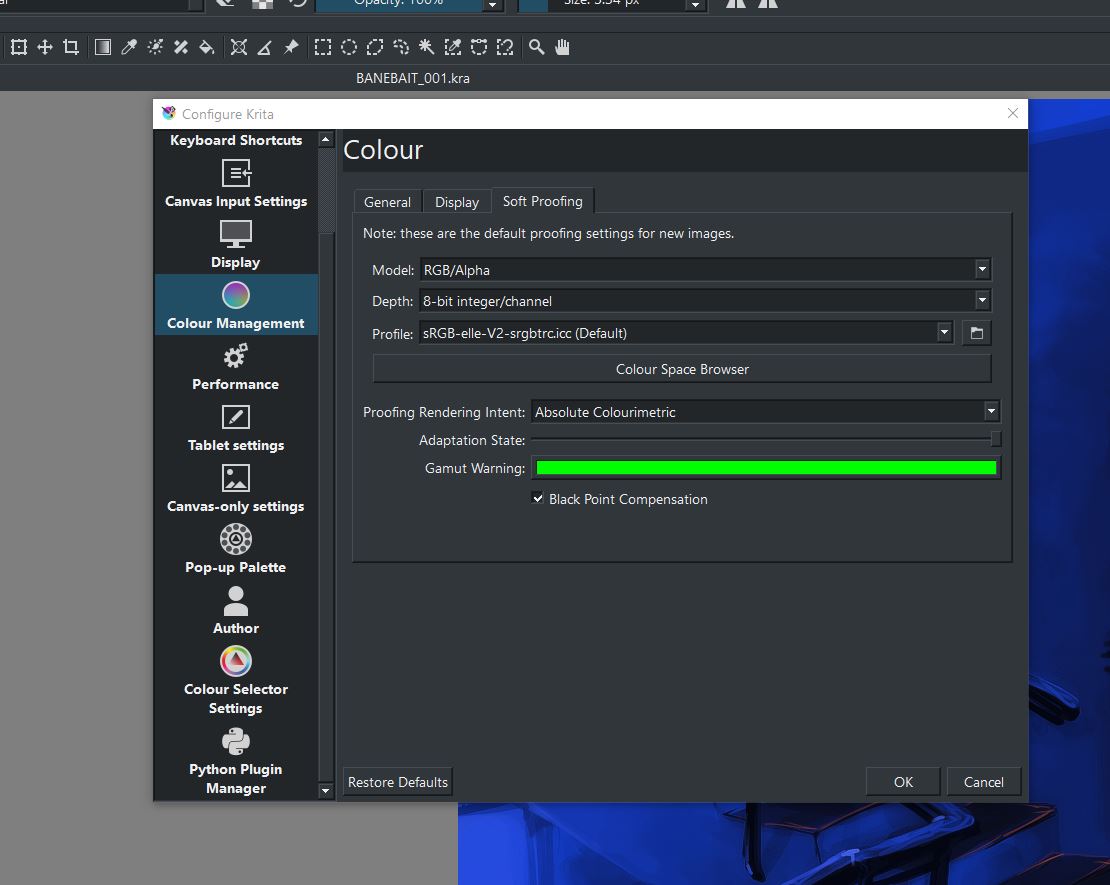
What kind of monitors do you have? Everything looks fine, but Wide-RGB for a display profile is unusual, Normally it’s sRGB for standard monitors, and P3 for UHD stuff.

I suspect that the monitor profile under Color Management->Display is incorrect. Krita might be correcting for a super-wide saturated monitor and showing you the wrong colors.

A way to test this is to change the display profile to sRGB or P3, and test with a quick, NEW test piece. See if export matches original.


Extra info if you’re interested:
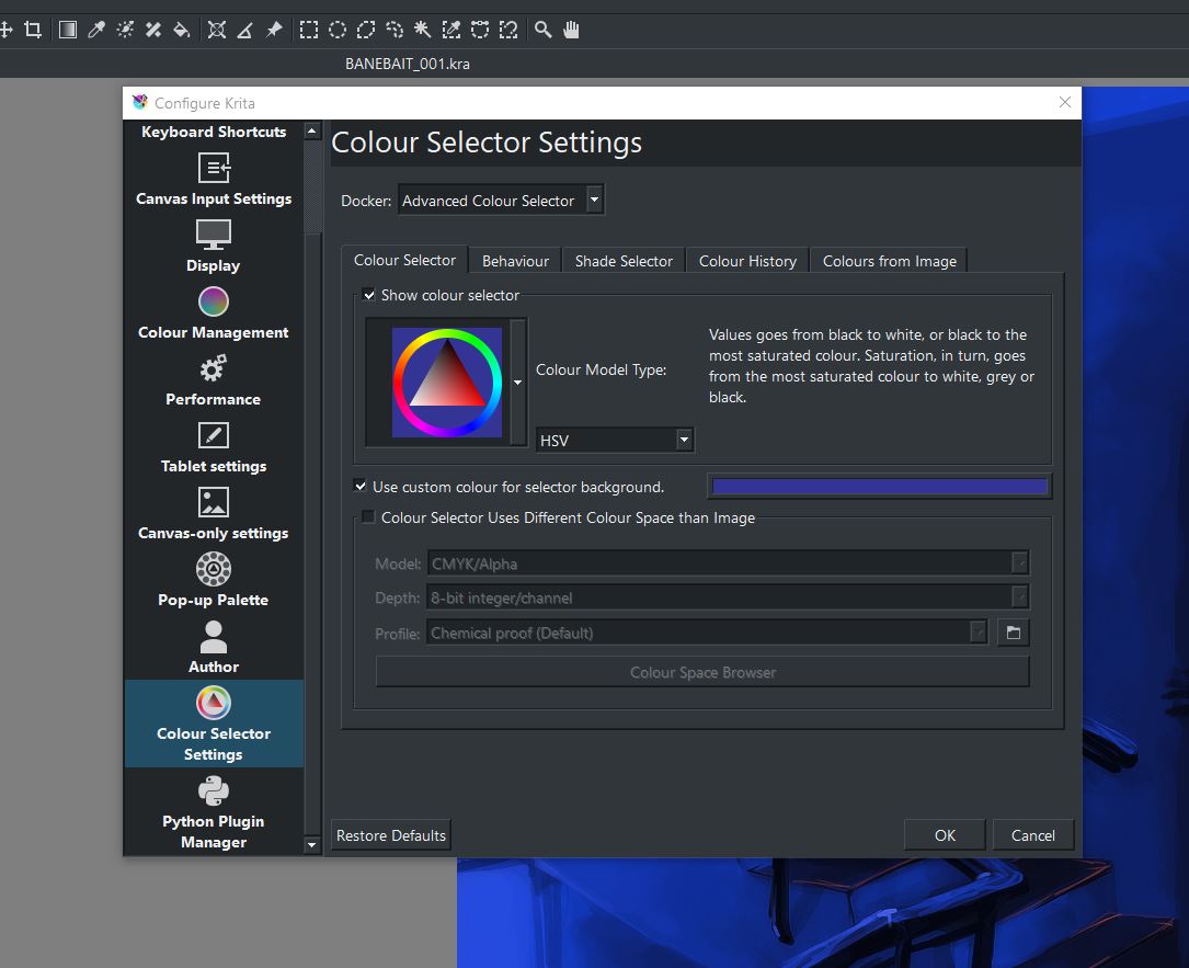
Color Management.
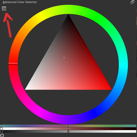
Each profile (aka color space) is like a box of crayons, with a limited palette. Krita can translate between these limited palettes to achieve the best representation of your art at all stages and on any device, no matter what’s in their personal “box of crayons”. This is the crux of color management.

The “working profile” is YOUR box of crayons. It declares the exact color in your file numerically, whether you can perceive those colors or not (it’s true!). I like to choose a wide gamut here (lots o crayons!), but many people just use sRGB or whatever their monitor sees, to simplify things.

The “display profile” is your monitor’s box of crayons. It’s not as bountiful as your working profile, but it gets by. Krita tries to match colors from your working crayons into your monitor’s crayons, so that what you see is kinda what you get. For example, if you have “periwinkle” in your painting, but your monitor can only show “light blue” or “teal”, Krita will know the discrepancy, and will tell the monitor to show “light blue” because it’s the closest. This only works well if Krita knows your monitor’s profile — i.e., the box of crayons it uses. If you give Krita a display profile that isn’t honest, then Krita won’t know how to show your colors properly. (I think this may be your problem)

The “export profile” is everybody else’s box of crayons, and is what you embed in a PNG, or convert to on final. Usually, it’s sRGB, which is a sad little box of colors, but everyone gets that box with their devices. If you export to sRGB, you can easily print your work and display it on the web, etc. It’s universal, but limited. Unless you have strong vivid stuff, sRGB is fine. The only time you’d use something else is when you’re sending out to a print house, who are expert enough to handle the exact working profile you used, and give you a more accurate result.

Hope this clears up what profiles do.

Finally, Never use CMYK for anything. Print houses prefer RGB nowadays anyway, because RGB has a wider gamut and is more “explicit” about color (CMYK is wonky with different hardware printers, and print houses use their own inks besides). It used to be that artists would “work to purpose” using CMYK directly, to save themselves proof/color correct/proof cycles. But nowadays we’re smarter than that. Just use RGB for everything unless a pro tells you not to.

3 Likes

This topic was automatically closed 7 days after the last reply. New replies are no longer allowed.