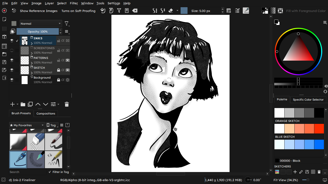
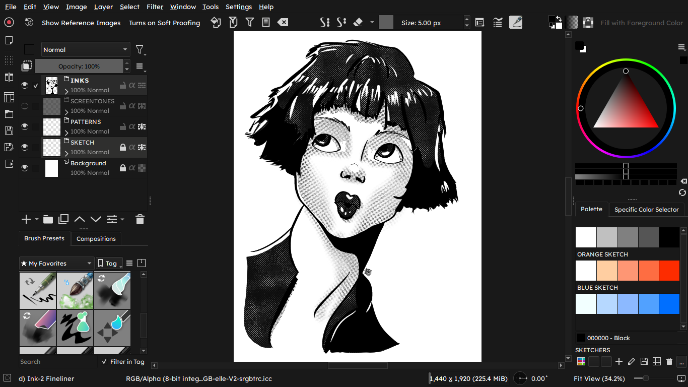
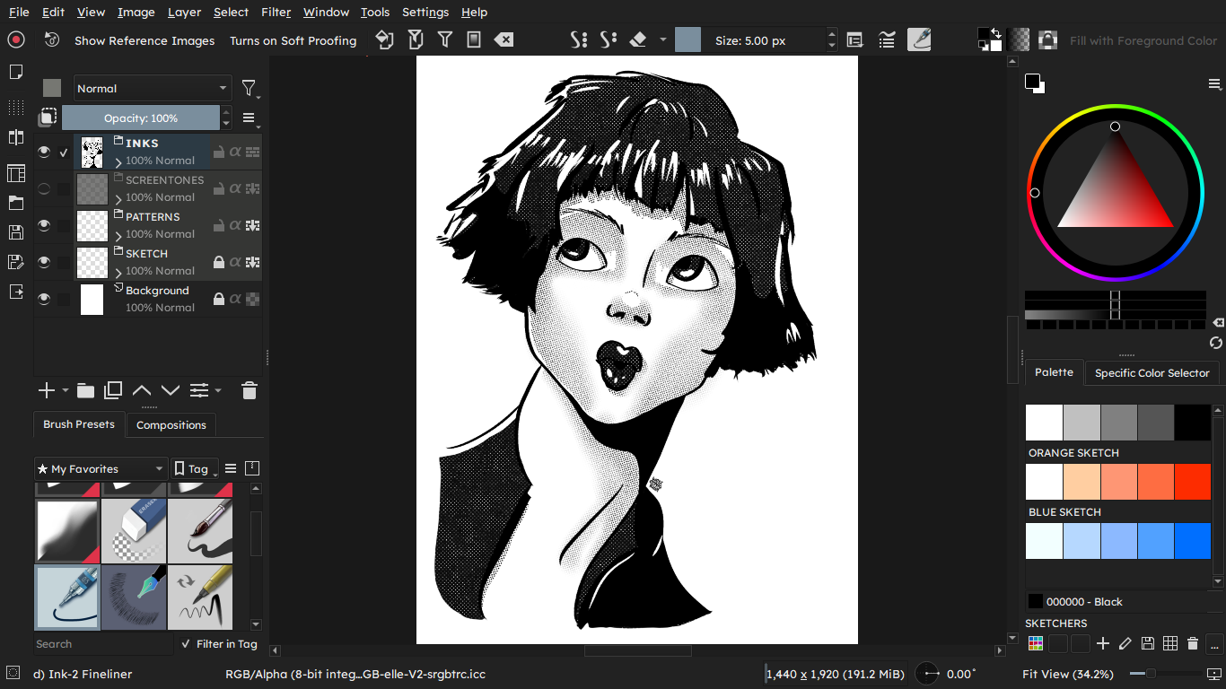
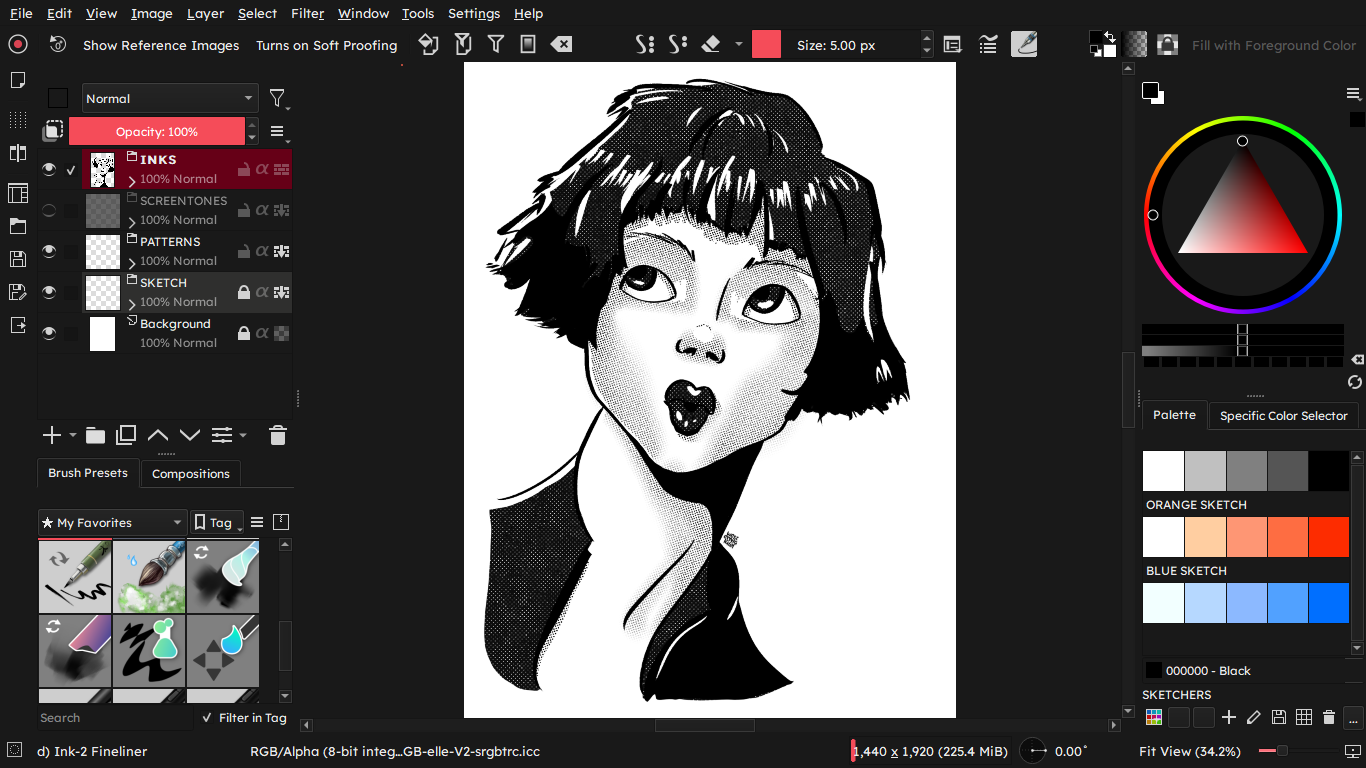
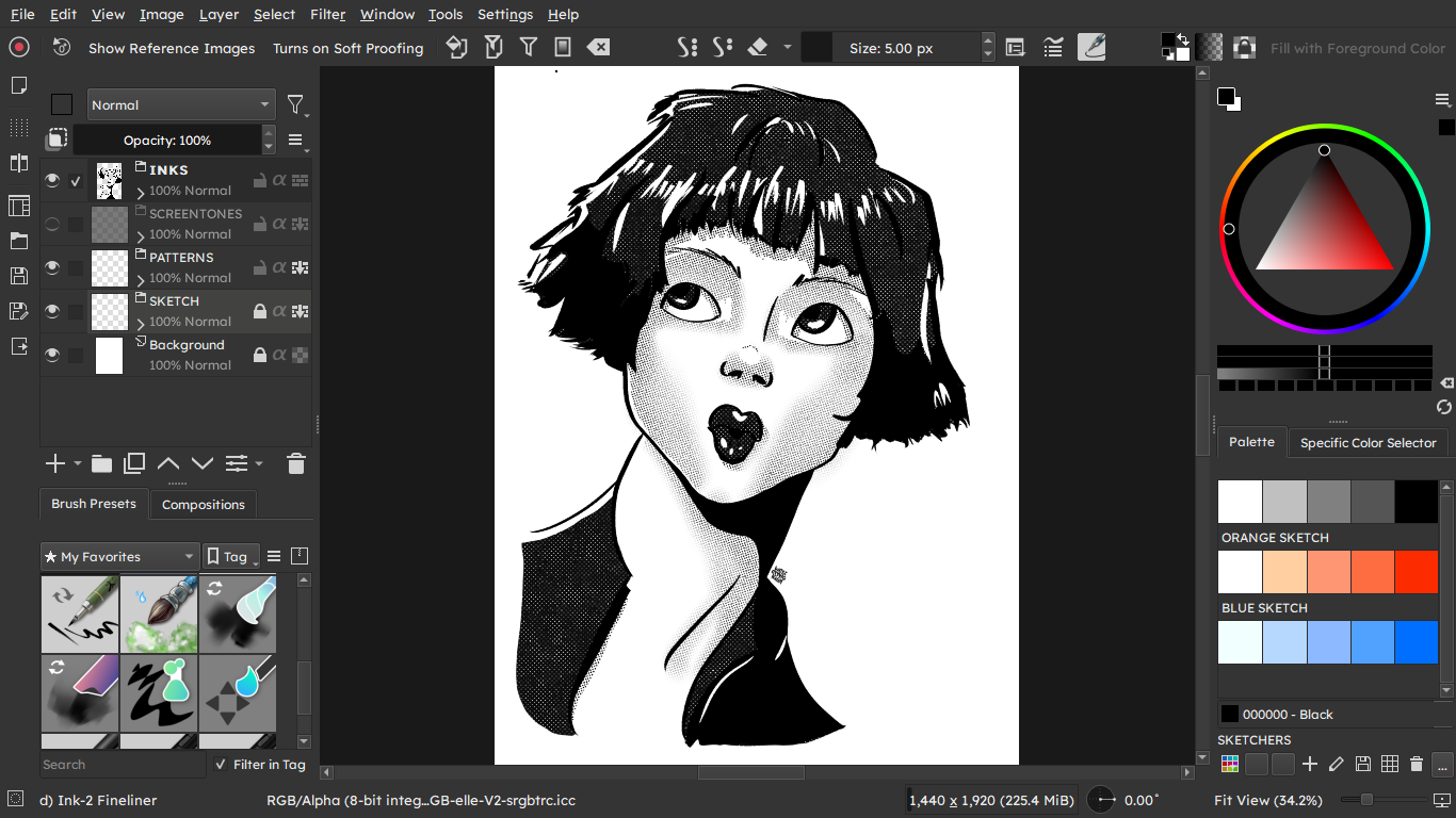
I recently had my glasses prescription updated (veredict: my eyes work even worse now!) and I thought I’d share with y’all the color schemes I’m using in Krita so I can see everything without squinting (too much).
So I giveth ye:
Krita Blackout If you like the original color scheme but wish for more contrast
Me, I can’t understand why the “white mode” was invented at all. It’s always better for the eyes. And if not working with colors, turning blue to zero is also a great win for the eyes. I use both on all devices.
People with eg. astigmatism need clarity. White-on-black tends to blur heavily; you have to remember that disabilities exist Dark mode only sites are as bad as light mode only sites, and the worse the customization, the worse the user experience is especially for disabled folk.
From what I understand, light mode was the default until someone developed the alternative, and I appreciate them endlessly, whoever they are. I don’t usually have a problem with black text on a white background (I read a lot, so, lol) but it gets tiring the longer I stare at a backlit screen even with a blue light filter, hence why I use dark mode in 99% of my apps.
Someone with astigmatism here, and I agree with this. I do find myself using a bigger font and rounder typeface with dark mode, though to be fair, everything is blurry to me regardless of color scheme if I’m not wearing my glasses, lol. My main complaint about light mode in general is the brightness and its tiring effect on the eyes (and sometimes that thing where you see a very bright light and keep seeing it for a while when you close your eyes, I don’t know what it’s called in English?)
I’ve been doing some light learning about light themes (ha!) and to my surprise, I found them actually not as horrible as I thought.
The main problem is that light themes usually use extremely bright white, but if you tone it down, or tint it with a warm, soft colour, it’s immediately much better. Everything else can be a bit lower contrast, and I’m honestly good to go.
At night I sometimes switch to light themes due to this discovery – my eyes are very tired at that point, everything melds together, but a good, fat font on a light-ish background is a lifesaver. Unfortunately, thinner/“normal” weight fonts on black == I can’t see sh
Oh yeah. I did a bit of an experiment a while back and used my browser’s color picker extension on some of the sites that give me the most trouble, and it is as you say: most of them use straight #FFFFFF, so the blue light filter? Absolute gift. I’ve had friends ask why my screen is “so orange” when my glasses already have the built-in filter, and I’m like, you wouldn’t get it
I do prefer dark mode at night, though, especially on my phone (OLED screens, also lifesavers,) with a thick font in the size my grandma uses on her phone, lol.
I like both, Light and Dark themes in general (I mean also in system, browser and other applications), the choice depends on how I feel, and I can change often sometimes.
Light themes are useful if I’m a little tired, they seem are better to keep me awake

 Dark mode only sites are as bad as light mode only sites, and the worse the customization, the worse the user experience is especially for disabled folk.

