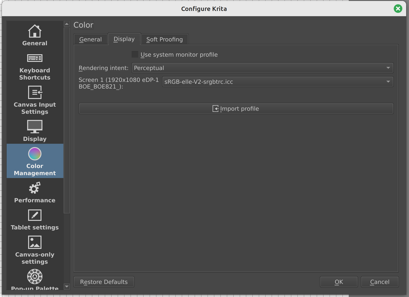
Hi, I’m struggling to make sense of color management in Krita and getting my images to look consistent across applications (namely Photoshop and additionally browsers/Windows Photo Viewer). It looks like Krita’s color spaces aren’t working correctly, and show me the same results no matter what color space I select either for the file itself or in the Color Management settings.
I’ve used Krita for painting, Photoshop for adding final touches, and WPV to view my images for years. Previously when setting up a new PC, I’ve had minor issues with color consistency at the beginning, but setting the color profile to sRGB IEC61966-2.1 in both Krita and PS seemed to fix it. I recently got a new laptop (Windows 11, Krita 5.2.2) and am running into a similar issue as before, but I can’t get around it anymore, even after trying every combination of color management setting I could think of.
My specific issue is that the paintings I create in Krita look great in Krita, but once I open them in Photoshop/WPV/Chrome, they look washed out (dark grays look nearly black in Krita but too light in other applications, but pure black still looks pure black in all applications). See image.
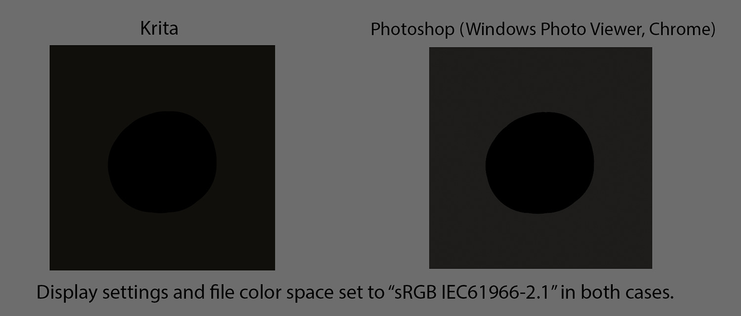
No matter what color space or display setting I use in Krita (I have tried the 2.1 color space above, plus my native monitor space, plus the default Krita “elle” space), I don’t see any difference in how the left square looks. It always looks like the example above in Krita. While in Photoshop, with all the same settings (2.1) it looks like the square on the right, but if I change the color space to my native monitor space, it makes a huge visual difference and will then look identical to the Krita example. So changing the color space appears to work in PS but not in Krita.
From what I’ve gathered, the 2.1 color space is what most applications (including web browsers) use, so in order to post my paintings online, I would need to create them in 2.1 so that I know they will always look the same in every application. Right? Obviously it would be preferable to use my native monitor color space, as it seems to have a much wider color gamut, but I guess I have to sacrifice the extra richness of color for consistency.
I am at my wits’ end after attempting to troubleshoot this for a week now. Does anyone have any idea how to get Krita to accurately display my images in the sRGB IEC61966-2.1 profile? Should I be using a different color space altogether? What am I missing? Thanks!