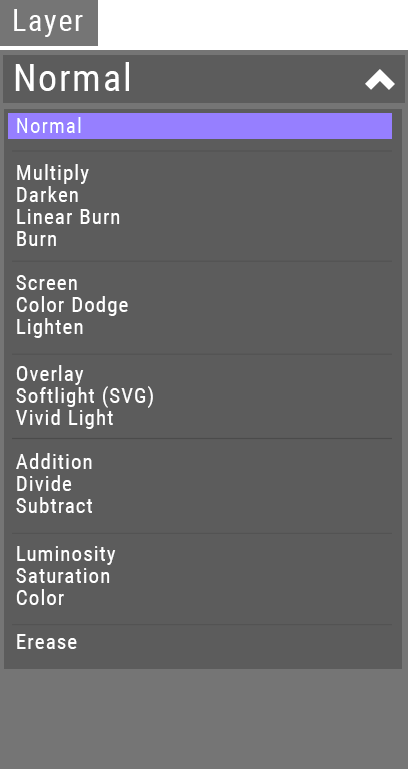
So I think the layer modes have some issues regard UI and UX.
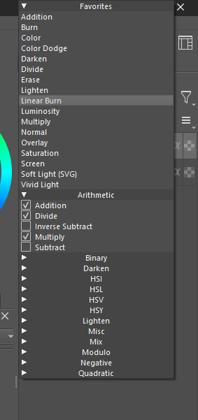
it clutters every single layer mode there even exotic ones that most of the user will never use
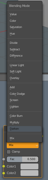
it sort the favorites in alphabetic order which dosen’t provide any useful case. Better would be to order it by common functionality or other types. For example multiply and darken makes white transparent so it makes sense to combine them in one section. lighten and screen makes black transparent. Overlay and soft light makes a 50% Grey Transparent, etc…
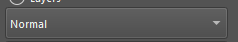
UI Issue → it dosen’t really act like a dropdown menu right now and more like a pop up even the arrow in the right side is indicating that this is a dropdown menu:
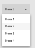
this is how you would actually think of a dropdown menu vs how krita is doing it:
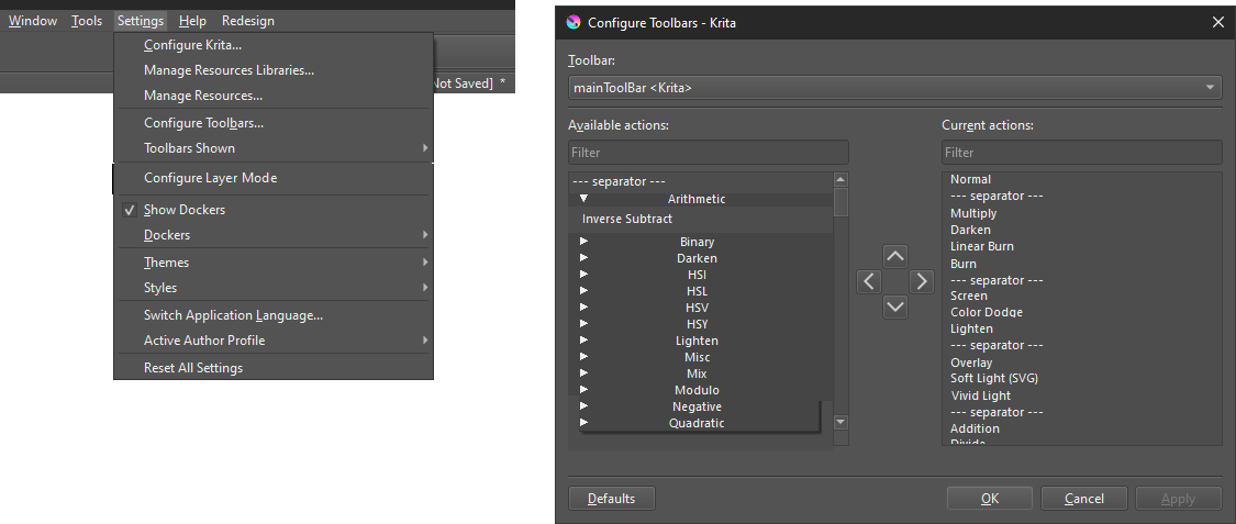
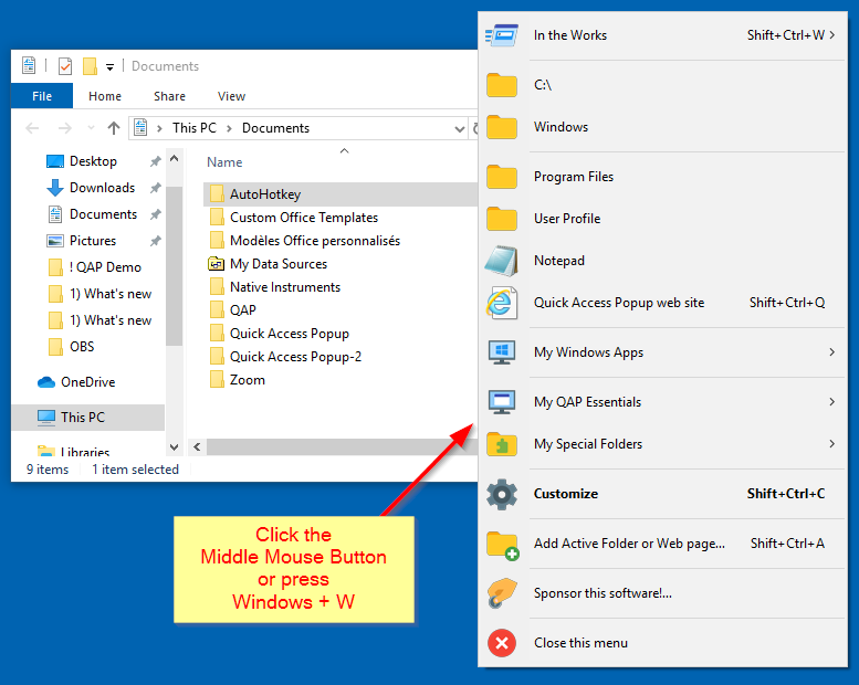
My Solution for this would be to remove the layer modes sections out of the dropdown menu and redesign the function to act the same way how you setup your toolbar:
This would resolve most of the issues and add more clearness for the user and also allow the user to sort some of the modes out or even order them differently.
A good default can be created with this too to make the transition even easier for people from other software to krita.
What also would be possible to implement is to make different presets in the configurate menu like a photoshop-, csp-, blender-,krita-preset etc.
It doesn’t act like a dropdown menu because it’s technically a Combobox
Not sure about the UI, but the idea to have something “simpler” for layer list is not bad.
I’m always lost in this list, too much modes and I often have difficulties to read it and found what I need.
But also, I like the possibility to have access to all modes, even the one I practically never use (because I like to be able to test blending modes to check if result on a layer is interesting or not…)
I would just remove it by default because a lot of user will not use it. If people want all the modes really displayed just add it to the list but I doubt to be honest that some one really need all the layer modi to be displayed to be honest there some few rare cases that people use and most of the layer modi gets ignored. It’s in my opinion not worth to keep them there and sacrafising a lot of clarity and space.
The reason it ‘pops up’ like that is to take account of a situation where the docker is short and close to the bottom edge of the screen and the list is long.
Other krita ‘comboboxes’ behave in the same way.
Maybe than a threashold would resolve this issue if the combobox are reaching the edge of the display it behaves like it does now and other wise if there is enough space it behaves like what you would expect from a combobox/dropdown menu.
I don’t think it’s useful to concentrate on the name that’s used to describe it or its detailed behaviour such as its movement when activated.
Also, I believe that these items are part of the Qt library which is a pre-packaged thing and it would be a large task and maybe not a good idea to make changes to it in that way.
The fact is that they work and people are used to them and I know of no instance where anyone thought they behaved badly or needed to be changed.
Your ideas to ‘tidy up’ and rationalise the blending modes are basically good ones though and should be discussed and considered.
But you can already add everything to the favorites list by setting a check mark, and then you no longer have to pay attention to everything hanging on the bottom and can collapse it. The functionality is already there, and the groupings are purely a matter of taste, everyone wants to have different. Okay, you can hide the selection area for optical reasons, but I can already bring up everything in the favorites as I like it.
Or do I have a translation problem here and therefore don’t understand it?
I’m probably too old to understand such things, it’s enough for me to have the functions available…
I think it is its part what UI and UX does you have in expecation and it gets fulfilled or not and not isn’t really a good thing in that case. It’s of course nothing huge breaking but the little things can also add in mass a lot to a software.
Can you sort them? No
Can you make seperators to see clearly better where the modis are? No
Andnogroupingisnotamatteroftaste can you read this really good?
Grouping them makes it easier for the eye to indentify where you looking at. But if you don’t like it for some reason with this system you would be not really forced to use it you could just remove it. That’s what Im aiming for flexibility.
More or less
But in synthesis yes, a Combobox is like a drop-down menu.
What I mean is, Krita is already using a drop-down menu, and especially a QCombobox
What you need to consider it as a drop-down menu, is to see the popup below the item, and not hover?
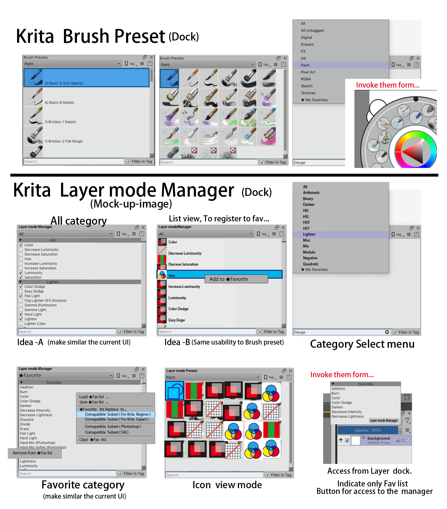
Id like it when fiddling with the blending modes were easier. Especially when you are experimenting and have a lot of groups expanded I sometimes wish I could detach the drop down like in early days of GUI applications. However my approach would be to make it a bit more similar to the brush preset docker with a search bar and the ability to have custom tags. There are a few blending modes I would put into a custom shading tag if I were able to.
This is an old thread but I’d like to revive it. The sort order of the layer modes is really something I miss hugely. I use favourites, but the modes are alphabetically sorted still.
Does anybody know if this is looked upon in development?
Anyone who starts using Krita will encounter a number of layer modes.
Beginner user feel overwhelmed ton of Layer mode list.(me too)
Why are there so few votes…?
There are no ready-to-use presets.(It’s hard to find and,no clue search keyword )
( For example , even the default ‘Normal’ mode is also buried in the middle of the list.)
I share a another ideas (Reuse the framework of Krita’s Brush Preset )
See a following screenshot.