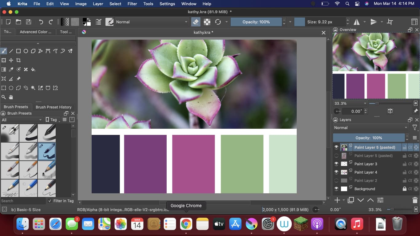
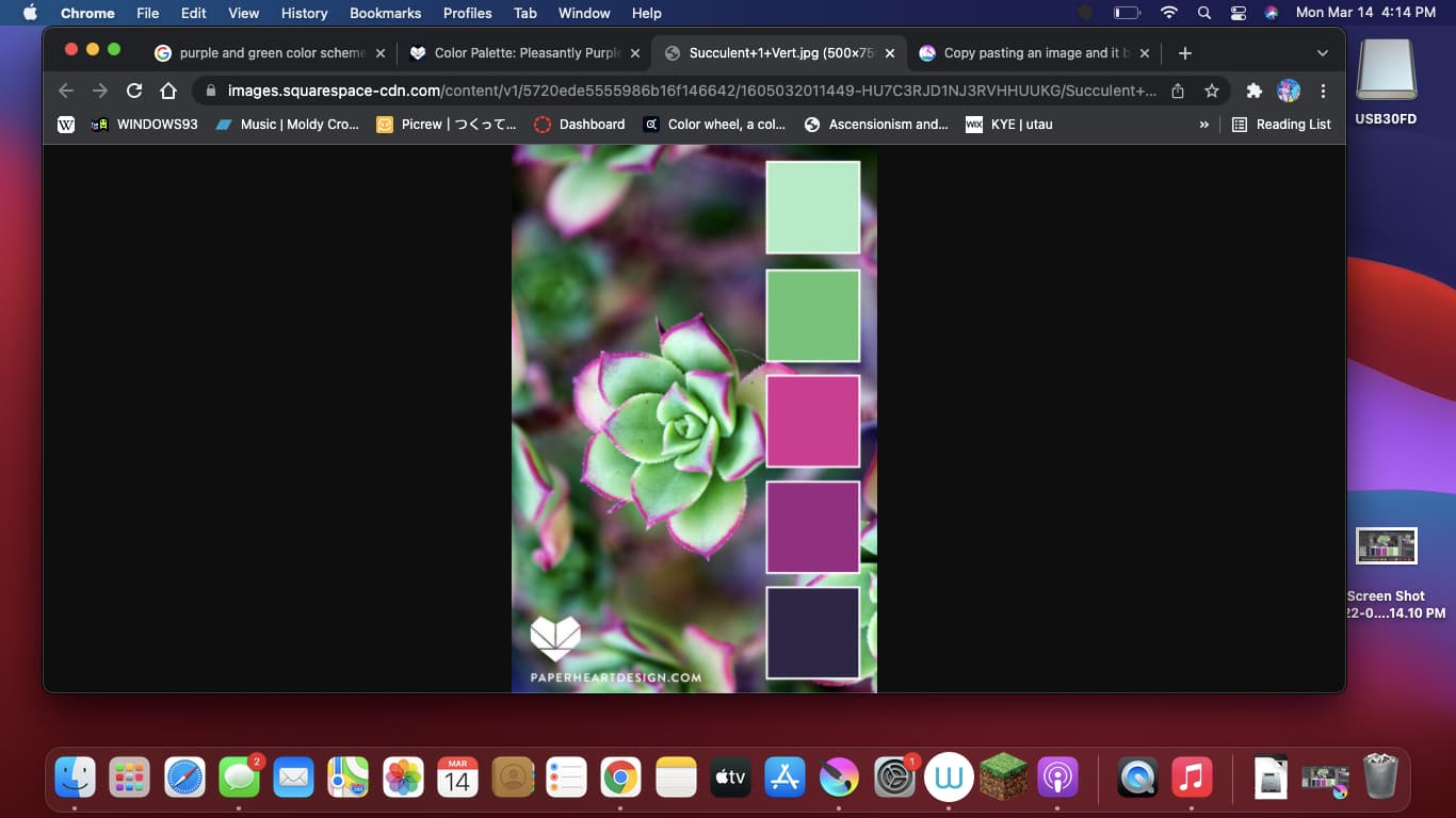
when I copy paste an image into my canvas it becomes less saturated and the colors are less vivid. is there an easy fix to this? How do I make the colors more vivid when copy pasting? I never had this problem with my PC, and am only running into this problem on my macbook air. Thank you in advance if you know how to fix this.
(as you can see below the colors are different)
Hello and welcome to the forum ![]()
Where does the image come from?
I have no experience of Macs but there is something you can do to provide more information for people who do know about them:
Make a colourful image in krita then take a full screen screenshot for uploading to a reply here.
Export it as a .png.
Open it in your image viewer then copy-paste it into krita and take a full screen screenshot for uploading to a reply.
(As a new user, I think you’ll be limited to two image uploads but you can edit your reply to add more images, I think.)
This problem is probably related to details of colour management differences between krita settings, your Mac colour management settings and maybe any embedded colour profile information in images.
It can get very complicated so you need advice from people who know about all that.
1 Like
Usually I just copy paste straight from the web. And I mean Ive tried everything, saving the images, changing the file types, screen-shotting. Something about the image is just changing when its put into the program thats making the colors duller. I tried thinking maybe its because the monitor is different than the one I have for my PC so the color count is different? but that doesnt really explain why the file itself looks normal and only changes appearance when put into krita.
Also, thank you for the advice.
Krita probably uses a different color profile than the other applications do. I can’t find it right now but I remember reading on this forum that you have to set the correct color profile for the screen in Krita’s settings. From the top of my head I think the setting is in Setting › Cofigure Krita › Display. Unfortunately I don’t know which one is the correct Mac profile.
Hi, your monitor probably has a wide amount of colors, a big volume, and your install and system provides probably a profile about it to informs software about the full boundary of the color volume (unless you mesured and created the profile yourself with a colorimeter).
Anyway, Krita found and read this profile; and then decided to display an accurate representation of sRGB picture on your device when you pasted it in your sRGB/8bit document. And sure: sRGB 8bit family are not that huge color spaces, so the result is dull, grayish. Limited as sRGB is while your device can probably display vibrant greens, purples and oranges; a symptom of larger volumes (eg. ClayRGB / AdobeRGB / Wide RGB and up).
Your webbrowser, probably doesn’t do the color management at all. Or not for this document because the profile is not found ( web browser just exands and unwrap the sRGB data of the image to your monitor full range ) . Or the picture you selected had a larger profile (ClayRGB or AdobeRGB like type of large color profile).
So, all in all, you have more than one option:
First, the simplier: for you to uncheck the “Use system monitor profile” option on Krita settings (under Color Management > Display) in case you just want your Krita canvas to follow the behavior where all data will expand to fully color volume of your monitor. But you need to know it is not accurate, and as soon someone with a color managed webbrowser will see your result, they’ll found the sRGB small/dull/greish representation.
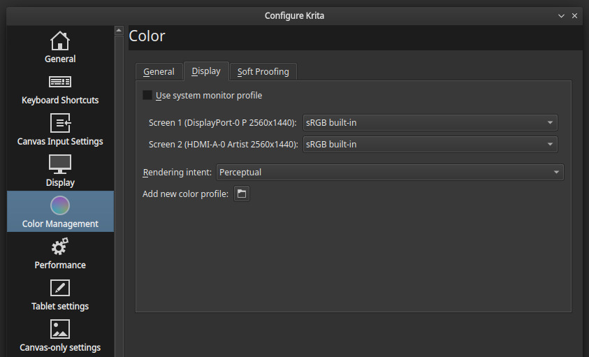
fig. panel in the settings
Second option is to aknowledge the large gamut of your monitor and work in a larger color space than sRGB. You can try to create a new document with the profile 8bit/ClayRGB (the Free/libre name of a compatible AdobeRGB1998), and retry the copy/paste.
Last, you can also setup Krita about how it paste a color volume input (the web picture), into a target volume output (your canvas) under Color Management > General. You can set there the policy.
1 Like
Yeah as deevad says, it looks like Krita picked up a display profile from macOS, possibly one calibrated for the MacBook Air.
Newer Apple devices have displays made for a color space that Apple calls “Display P3”. It’s basically the primaries of DCI-P3 but keeping the white point and transfer curves of sRGB.
Krita itself does not include a Display P3 profile, but it seems macOS should include a generic Display P3 profile located at /System/Library/ColorSync/Profiles/Display P3.icc. But I don’t have a Mac to verify that…
Btw. AdobeRGB/ClayRGB only extends sRGB by moving the green primary quite a bit towards saturated cyan to better cover CMYK printing processes, while Display P3 moves green less extremely and instead moves red too to enhance saturation in a wider hue range (DCI-P3 was designed for cinematic purpose).
This topic was automatically closed 15 days after the last reply. New replies are no longer allowed.