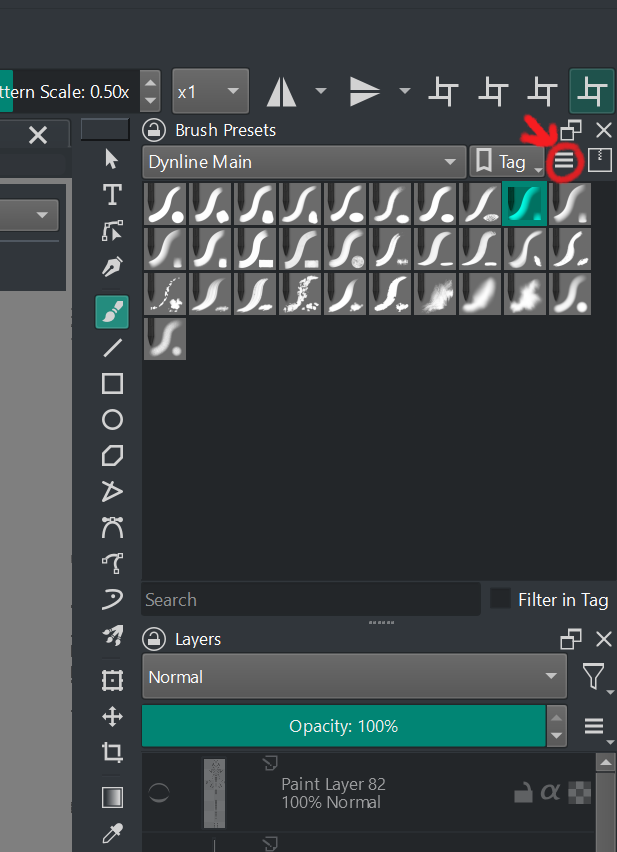
Hello! After using Paint Tool Sai 2 for a long time, I decided to try out Krita. However, I found it inconvenient that all the brushes are crammed into a single window. It takes a lot of scrolling to find the right brush when switching between them.
I’ve thought of one solution: deleting most of the brushes and keeping them within a limited frame to avoid excessive scrolling in the brush window.
However, I believe Krita could be improved in two ways:
- Mini Brush Icons: Instead of large icons, consider adding smaller ones. When hovering over these mini icons, an overlay window could display a preview of the brush.
- Subsections for Brushes: This is the most crucial improvement. Imagine having subsections within the brush window. For example, if we have a ‘Standard’ brush collection selected, we would see all brushes from that section. But what if I want to switch to my custom collection called ‘My Brushes’? How can we implement this? There are two approaches:
- First Approach: Add a dropdown menu in the brush window with the names of all collections. Users can select the desired collection from the menu.
- Second Approach: Similar to the first approach, but allow users to checkmark the collections they want to display. For instance, if I check both ‘Standard’ and ‘My Brushes,’ I would see brushes from both sets simultaneously.
Third approach: Duplicate brush windows that can be pinned to the current brush window, incorporating the first and second approaches.
Imagine having a window labeled ‘Standard’ and another labeled ‘Standard2.’ We could switch between them with a single mouse click on the tab. Convenient? Absolutely!
If you’d like to see a rough example of how this could look, let me know, and I’ll try to demonstrate it.