@SchrodingerCat I would be really glad if someone could spend some time thinking how to improve Fill Tool’s Tool Options. There are some special relationships between those settings - like “Fast Filling” disables some, “Use pattern” enables some, and all of that is pretty confusing to the end user (and there is at least one actual bug where some settings are disabled despite being used - 420295 – Fill tool's certain tool options should not be locked when Fast Mode is enabled). It would be really awesome to have a design (that would show everything much more clearly than it is right now) ready that a programmer could just implement.
Sure, I can gladly make some design proposals 
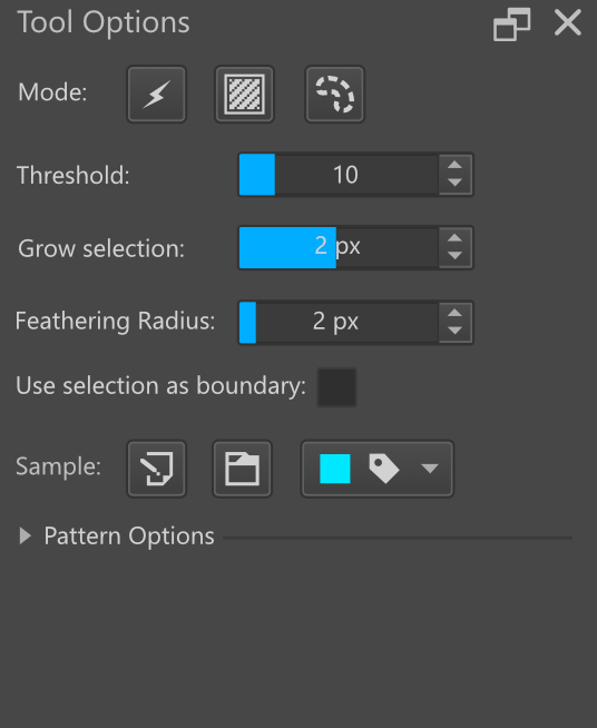
Hello @tiar  this is what I achieved, I don’t know if I used the correct icons since there is no icon for “All layers”, it looks more like a “Group of layers” although I think that would be an interesting option, fill only the layers within a group.
I thought about adding buttons since I feel that the Fill Docker has a lot of text, it would be better to simplify some things with buttons, I hope my suggestion is to everyone’s liking, in the same way that before I tried not to change the docker so much.

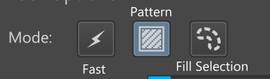
I decided to move the pattern options and fill selection to the top.
They would work in the same way as now but the occupied space is less.
Should I move this to a separate thread?
Perhaps changing “Use selection as boundary” into “limit by selection”?
The icons on the right need to be aligned a bit so everything matches in a grid better.
radial button without text on the right feels disjointed though. a isolated radial box.
The reason I didn’t use that wording is because it could give a false impression that if it’s false, then Krita will just ignore the selection and fill everything. But it only switches whether Krita treats the selection boundary as boundary or not. For example if you have a white canvas with two selected areas and you choose “false”, if you click in one selected area, it will fill the other one too (but it will still only be inside the selection). If you choose “true”, then it will only fill the selected area that you clicked on. It’s a pretty advanced functionality, usually you don’t need to change it. (Programs usually have either one or the other behaviour, I think only Krita can choose between them).
I wanted the text and the options to be closer together but I think Krita works with cells and columns, so I don’t know if it was going to be possible, as for the option I wanted to make it a button as well but I didn’t find a good icon that would represent it like this leave that option as it was.
In the same way, it is something that I did quickly yesterday in my free hours at night, there are things that could possibly be improved, but I think that something that should change in Krita is to try to use more iconography (I do not know if I use the correct term), there are easily several comboboxes that can be replaced by buttons with icons.
I don’t think “Sample” should get buttons like that because 1) they are three separate modes, you can only use one at a time, I think?, and 2) I already plan to add more, it might be confusing to have them as icons, because some might be quite similar, imagine an icon for “Sample all layers” and “Sample all layers below the current one” or “Sample all layers except for filter layers”. Other than that, it’s a great idea to use more icons. And maybe special buttons for advanced settings that are rarely used/changed.
but that is what is written there though. and the Radial says True or False to what is written.
if it is that it should be more like “boundry fill” no? making full sentences on UI is a waste of space I tend to always cut short to 2 words maximum and it is already quite big as it is just non intractable text. since it is on the left you cant even click the text to operate it. also as an alternative considering the state you can change text to make more clear what it does of what is active. I did that for Photobash and works quite well.
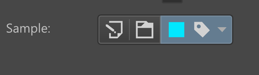
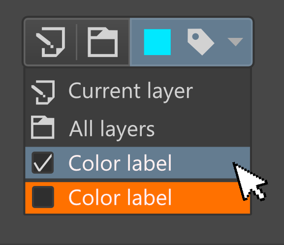
Damn that does look cool.
but I dont think Qt has merging of UI elements like in blender. At least up until now I haven’t seen it.
The combobox I am not sure, it has has hidden features I have not explored yet but placing a radial inside the combobox I am not sure it does it. I know you can place icons for the ones above.
Combobox has such weird rules over it it is really annoying. I wish I could just make one with text in the horizontal center and I would be happy already.
Yes, I know that there are limitations on the part of Qt so I opted for 2 buttons and a combobox.
Hello @tiar , what do you think of this? I don’t know if it’s possible but I think it’s also a good option.
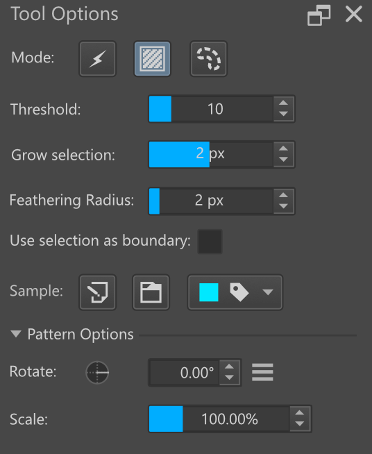
It is possible to do that just fine.
You can merge UI elements just fine, just look at the zoom widget which blends a line edit with a qcombobox. You can also do after rendering with paintevents
That is excellent news!  Although, in the end it all depends on whether the developers want to implement the idea.
I was not able to find a “zoom widget” on qt designer. with paintEvents sounds like it will become heavy.
Fundamentally speaking, all you have there is a toolbutton with a menu. All you need extra is either to paint the square or just pair it with a colored label.
I am talking about in Krita. QT Designer only includes what components you have installed. That said, many of the basic components have subcomponents in them. An example would be both mdi and dockers using a tabbar.
Also, everything is painted in the end. So unless you are doing some heavy calculations every paint event, it is no different really.
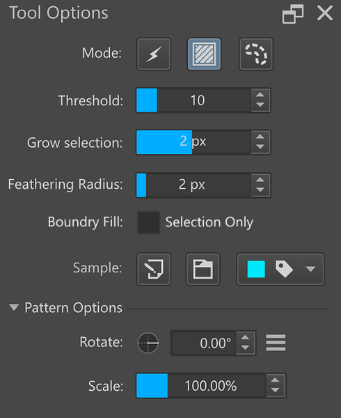
I just aligned it.
Also read a bit about that odd option that seems to have a bad name for it.
My suggestion is for it to be “Boundary Fill” with 2 options:
- “Selection Only” - this uses only the selection as a boundary to fill.
- “Selection and Pixel” - this uses the selection and pixel difference as a boundary to fill.
This to me would make much more sense to me. A combobox would work also here.
I read the manual and it really does not make sense for what it is trying to accomplish. I understand it is a boolean option but yeah that is my suggestion to make it readable.
Sometimes I feel you there is way to much complication over the names of options so they are humanly readable. I feel they should be categorized before they are individualized.
If it was just me I would do something like:
- selection threshold
- selection growth
- selection feathering
- fill boundary:
- selection only
- selection & pixel
- source sample:
- layer current
- layer all
- label color
- pattern rotate
- pattern scale
category then individuality. you can see there is 3 selection options, then you a single for fill and source and 2 for patterns. easy. also this maintains 2 words per each element. easy to read and to compact into a single column. you dont need it to make sense like a sentence that is a waste of space what you need is for it to have logical sense within itself on how it branches out to each one.
I like the modification you made, I think it would be quite a nice option to look at 
I think what Krita needs is to be more visual, I like that Krita has many options, but there are many parts where a touch-up is needed.
The only button that isn’t aligned is the colour + label dropdown. Could the label icon itself be coloured? From the looks of it, the square colour box does not serve a purpose, right? That way all buttons could be aligned.