Wow that is awesome!
great study! there are a few places where i think you could improve.
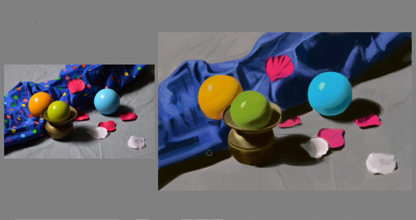
the colors are flatter than the reference. For example - the orange ball has deep browns (lots of chroma), reds, up to yellow-orange. The green likewise goes from a warm green shadow to a yellow-green. there is also some bounced light - and you have every right to mix colors from one part into another, even if they aren’t there.
the values are also a little on the light side - technically not color, but values are what will make it look more realistic.
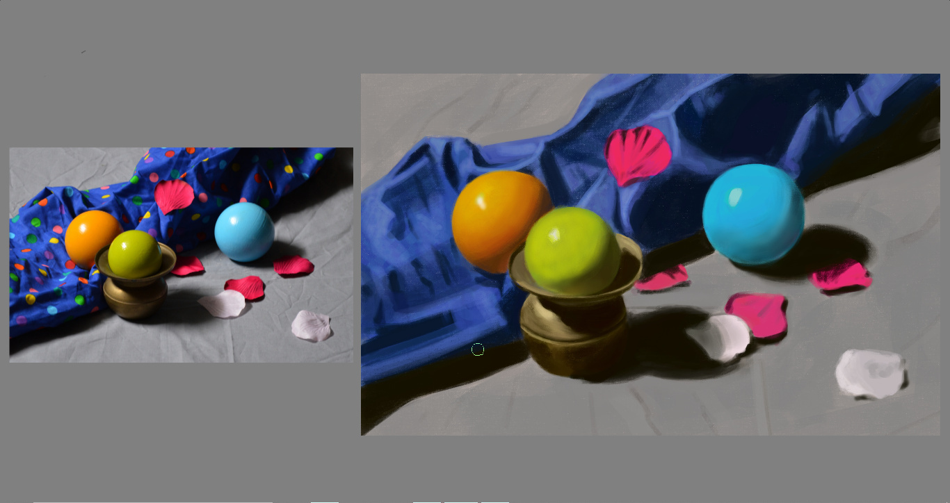
as an example - i started to touch up the colors
I agree that your version looks a bit flatter and less lively than the original.
Your orange ball isn’t picking up any of its surrounding colours. It doesn’t pick up any of the blue from the cloth, but you gave it that red spot that in the original comes from a red polka dot but which you left out. That way, the orange ball doesn’t really look like it belongs in the scene. The green ball in the photo is almost yellow in the light and where it picks up the colour of the brass, and it’s cooler in the shadows and it picks up a little light blue reflection from the blue ball. The red rose petals have a more variation in cool/warm variations.
I’ve found that I have to force myself to dare go away from the “real/local” colour of the object in hues more then you’d think to get rid of that flat look. When I think “let’s deliberately overdo it” it often turns out looking just fine. (And once you know how to overdo it, you can turn it back down if needed because you’ve understood the subject.)

Thanks @kynlo and @Rebecca you are absolutely right.
I have a question for both of you: How do I find the yellowish green on the Advanced color selector?!
Let me make sense of that question: I think that it is the natural tendency of every beginner (definitely my case around color) to start of with the local value/color and then try to change it according to the circumstances. At least that is the way I’ve approached it and that was suggested in my course - the advice was not to paint the whole object with the local color but to go from the local color to other parts of the object questioning yourself about the color changing becoming warmer or cooler than the local color. The thing is that even though I could recognize that the green ball was way warmer than the color that I picked but I simply couldn’t find it in the advanced color selector, is there a shortcut or a method you two go about to “find” the colors you need.
Or it you went the other way using filter adjustments do you have a suggestion on how to make this “quick” adjustment?
To overdo it was the other tip the instructor gave. It’s not easy for me to do, but something that I need to put into practice sooner rather than later.
I see that the value of the shadows of all the balls its way lighterthan it should be, but do you see the same in other areas?
PS: @kynlo, when I was reading your comment I was: “but the colors are perfect, much better than I remember them actually”. But then I realized I was looking at the image you had twicked and my original was completely flat. ![]()
![]() So thanks for the crits - It certainly helps a lot! I should have something up in the next couple of days and I hope you come back to continue to help me.
So thanks for the crits - It certainly helps a lot! I should have something up in the next couple of days and I hope you come back to continue to help me.
color is lengthy topic ![]()
Try not to think of the ball as having a single color - it has many, many colors - and they are all related to each other in a way that gives the sense of a single color. I don’t pick a perfect color off the wheel. It might happen by accident, but i mix my colors on the canvas. The more you mix colors, the more you will get a sense of which color you should mix in to get the shift you want.
Take the green ball for example. The green color you selected is a good starting point. you can see that some of it is more toward a light gold - so pick a light gold, and using a light opacity brush just drop a little of that color on part of the green. Did it veer too far off from the green? Color pick the green and paint it into your mix. As you get into the shadow, the green looks like its getting into more of the olive green family. Olive is warmer and less saturated than a pure green - so you start picking colors toward the less saturated yellows to mix in. Eventually you will have mixed a lot of colors together on the ball. But you may still notice that color is still off - and that goes to @Rebecca’s point - some of the color is bounced in from the environment. So pick some of the blue from the environment and lay it over the green. But not all over the green - blue color has a darker value - so you want to dapple that into the mid-tones and shadows.
there are lots of posts about how to blend colors - but that’s easy, color pick + low opacity brush + repeat. The hard part is figuring out how to get from the color you have to the color you see - that takes practice there isn’t a secret that i can share - you just have to practice matching colors and comparing colors. An oil painter might use a color checker - which lets them put a dab of paint on something that they can hold up to their reference, digital artists have it easier in that we can paint on a new layer on the reference.

So regarding the values - the shadows of the blue cloth, the vase the yellow-green ball sits in, and the blue ball look really close to the reference - even the form shadow on the yellow-green ball is close. To your point, the form shadows are generally lighter. I’m looking at all the values in your painting, and as a whole they just seem a little off because the relationships have changed.
You should feel free to increase the value of the shadows. If you don’t do it consistently across the whole image, be very deliberate about it ![]()
![]() i get images mixed up a lot - i feel your pain
i get images mixed up a lot - i feel your pain
That’s very good advice! I think more important than thinking in real colours is thinking in dark vs light, warm vs cool, saturated vs desaturated, stark vs soft contrast. A lot of subjects can be broken down to a few very common lighting situations, or “templates”, if you will, that help you make decisions regarding these three aspects, and even help you see what’s going on in the first place because our mind likes to trick us when it comes to colours[*].
Personally, I don’t really use filters much. How you pick colours also depends on your painting style, whether you paint with very opaque brushes, more transparent brushes, blending brushes… I do really like the colour picker with the outer hue ring and the inner triangle. It makes shifting your colours along dark/light, warm/cool, saturated/desaturated pretty easy. For example if you have your starting green, you can drag the hue slider on the circle towards yellow, then drag the colour in the triangle towards the white corner—voila, you have a good base for the “hit by warm light” parts of your object. You could just as well use a less opaque brush and pick a straight light yellow and glaze over your green object for on-canvas-mixing.
And yeah, as @kynlo said, it’s an iterative process most of the time because as you keep working on the surrounding objects the impressions of the colours will change and you might find you have to go back and adjust them. Also, the colours appear different in the colour picker than they appear in the spot you want to place them in because our minds are just like that. Which brings us to…
[*] Colour Constancy:
http://gurneyjourney.blogspot.com/2010/01/color-constancy.html
http://gurneyjourney.blogspot.com/2010/01/checkerboard-illusion.html
This one where James Gurney paints the same scene in three different palettes is also quite interesting:
http://gurneyjourney.blogspot.com/2011/09/part-1-gamut-masking-method.html
http://gurneyjourney.blogspot.com/2011/09/part-3-gamut-masking-method.html
(James Gurney’s book Color & Light is very excellent, by the way.)
In other words, you could colour-pick that exact yellow-ish green from the reference and it might still look wrong in your painting if the rest doesn’t fit. The good news is, though, that you don’t have to find exactly the colour of the reference—you just (“just”) have to be consistent and logical within your painting.
Thank you both this is really helping a lot!
@kynlo I don’t really like to paint with glazes I feel like i’m cheating (myself), not being true to the way I want ultimately to paint. Like I’m failing to put in the work for what truly is my objective. But maybe I’m just being stupidly stubborn and childish - never exclude that possibility. ![]()
@Rebecca Thinking about those dichotomies really helps. I could analyze and find the mistakesusing that line of thinking. My problem is that the dark vs light, saturated vs desaturated, stark vs soft contrast I could menage - the triangle more o less makes this obvious so no merit here - but even though I was aware that some colors were cooler or warmer than the reference or just weren’t reading correctly on my image I could not menage to be on top of the color selection/manipulation if I had to start by making it warmer or cooler than my starting point.
I either have a specific problem managing the color wheel in that regard or that made for one ball too many for me to juggle right now. More experiments needed to put forth a comprehensive judgement. so more to come in the near future.
Yeah, “”“Just”“”. ![]()
![]()
![]()
I hear you. We all decide on our own road - there isn’t a right one, there isn’t a wrong one - they all get you there, some faster than others. ![]()
Yeah, I’ll have to get give that a new try. I think that one of my problems with the glazing approach is that, specially digitally, I lose control of the edges ans textures pretty easily by glazing (Airbrushing).
But I think that is some part of the combo of being a beginner. ![]()
Seletions, Local Selection Masks and Layers with alpha-locking are your friends.