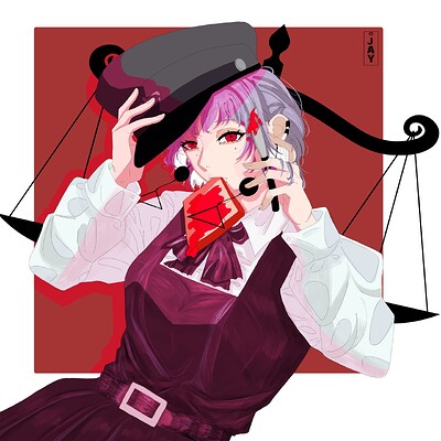
Fami fanart… ![]()
![]()
![]()
yesss!!! >///<
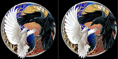
This is a very nice piece! May I suggest moving her hand with the knife more to the right in the red background? It seems that her knife and hand are lost in her hair and facial features. It would add to the visual impact. I noticed this same thing about my Raven and Dove piece. In my first rendition, the crow’s head was lost in his wing. I moved it lower so it was framed by the plain contrasting background and it seemed to really improve the visual impact, and many others agreed. ![]()
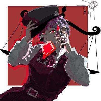
hie so you ask for critiques… if I may ; I thing that you chose where the light comes from, what is important to your image do not hesitate to get of details and make things unbalance
hier is a proposal quick of what I ll’ done if I did the shadowing
anyway you drawing is nice and i hope that helped you a bit


