for some reason drawing feels bad on digital, i try to draw with linewiegth but most bruhses feel bad to use, i think my tablet is bad or maybe its me? any tips for lineart? i got a bit frustrated, and combine that with my art block and i cant seem to improve or draw well, so i started well and got a bit sloppy.
I won’t be you nor your tablet, at least for me, it sounds that you have to first accommodate yourself to the new medium.
All your sketches show, the abilities needed are there, you will be able to do nearly everything you want, but, as said, you need to familiarize yourself with digital art - and that may take some time - about two months are not seldom.
Maybe you try felt tips or put a sheet of paper with adhesive strips on your tablet for a better feeling, I know people, please don’t laugh, it is true and works, who use spaghetti instead of the plastic tips of their tablet when they can get no felt tips, because they are said to offer friction and feeling similar to a pencil. But I have to say that I would fear a spaghetti breaking at the edge of the stylus, so I can not remove it safely from my stylus.
Another tip would be to use a protective foil and sand it down a little with a very fine-grained sanding-block, so you create a surface-friction that is more like paper.
all my sketches show? wdym, also ive been drawing for a year or so, not very consistent, but i should be acostumed to drawing digital by ow so i dont udnerstand why i cant get usted to it
I’m only seeing one of your drawings, but I see you with good skill. In a few years you’ll be much better and within the professional circle.
Are you satisfied with the result you achieve with traditional materials?
If the answer is yes, then you’ll probably have to simulate/emulate this good result in digital. So, sometimes, you’ll have to draw the line (several times) or retouch it until it looks good (yes, I mean retouch the thickness of the line if you can’t get a good result in a single brushstroke).
(You can see memes spread around social media that illustrators make about how many times they draw a single line. This happens to professionals and amateurs alike)
Finally, my suggestion: try brushes with little variation in thickness. And also try drawing with different resolutions. 300 dpi, maybe 200… if you use a very high resolution. Brush smoothing and well-regulated assistants can make a difference. Draw on a background that is not 100% white. Try some smooth paper texture.
Certainly drawing on a tablet like the Cintiq (Ipad etc.) can help a little more.
This doesn’t really look bad? Or this isn’t just the style (like the broken linework) you are going for?
You might just need to adapt. Like, you might need to redraw the lines many times too to get it to look right, which do happen in digital drawing. Zooming in seems to help in this task.
Have you tried Pen Displays? You might like drawing with it better. It combines the monitor and tablet so you drawn directly on your “drawing” instead of having the drawing surface and the display separate. Pen displays are really pricey though.
Another alternative is to draw in Vector graphics rather than in Raster graphics. Vector graphics are “cleaner” and might also work better with your style and the way you do things. Krita have a very limited Vector graphics capability though so you might instead try dedicated Vector drawing software like Inkscape instead.
I don’t know how long you’ve been involved in digital art, because I don’t know you, and you’ve only recently joined this forum, where you’ve been bombarding us with questions about how you can improve for a few weeks now. This has led me to the misunderstanding that you have only recently been trying to move from traditional to digital art, nothing more. But one thing is abundantly clear, you have all the skills needed, many users of this forum would be happy to be at your level, and my guess would be the thing you need most seems to be confidence and self awareness, be aware of your abilities, you have it all.
Have you tried watching some videos from Proko (Stan Prokopenko) on youtube?
I think his old videos on the basics of drawing human figure are great. Some of the videos where he critiques his students’ homework on the usual mistakes beginner artist did are also great. I don’t have the money to be a student but just by following his free videos and listening how he explains the mistakes and the corrections, I know what I did wrong and able to correct it. Although he himself teach a more general human figure, and not character design.
how many years would it take me u reckon? and no im not a professional, but im decent with trad lineart wise, so its odd that diital istn digitalling lol, ill def keep at it tho thanks
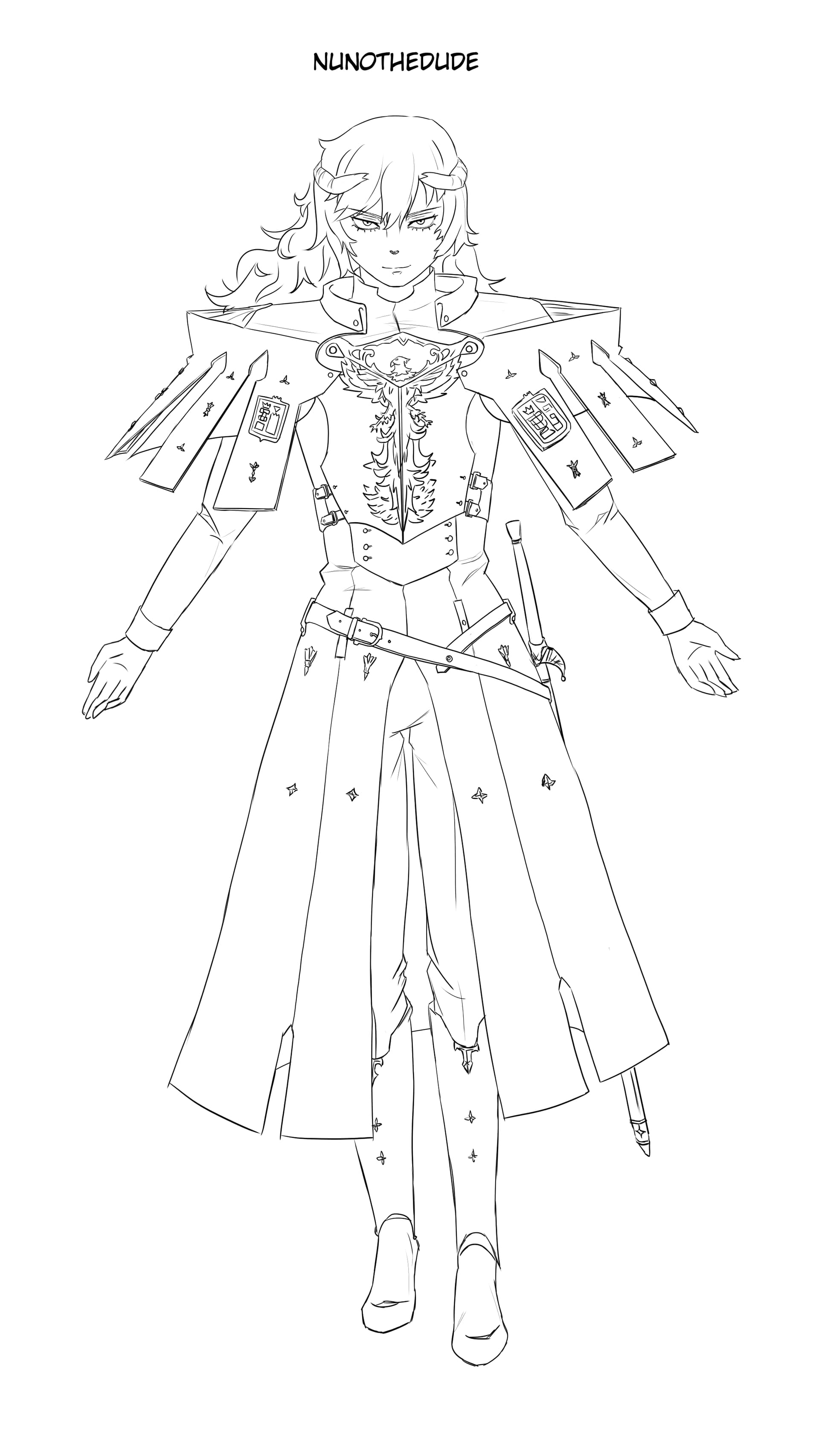
Your character is tilting to the left which makes him look like he is falling over.
His feet is pointing directly straight forward or even pointing slightly inwards, which is very unnatural.
His forearms are too short.
His hands are too small. His feet are a bit small too.
Lots of lopsided details: one hand is thinner than the other, the collar is off-center, the right side of the coat is shorter, the pauldrons(?) shapes doesn’t match well.
The sword cross-guard looks off. It is shaped like a jester’s hat which is very unusual. Maybe look for sword cross-guard references to see what they look like.
This is mostly preference but your line work is very messy which might not be what you want as a perfectionist.
Pen Displays provides a more accurate and natural way of drawing and painting digitally. Very pricey though so it is more for professionals or anyone very serious about digital painting and drawing.
Vector art are more “graphic” with perfectly smooth lines and shapes, and provides more freedom to edit them and with more accuracy, which might fit your perfectionist taste better.
Overall, it’s not bad at all. Maybe focus a little more on the proportions of the body and adjust the balance of the pose.
Now regarding the line, I recommend Marc Brunet’s videos, they helped me a lot. The tablet depends if it doesn’t have a display, I would say to get used to using it instead of the mouse to get the hang of it and practice the lines with exercises designed for this purpose. I don’t know what it’s called in English and it might sound funny but doing those activities where the child connects the dots to form the drawing helped me a lot.