Hi y’all, my name is Jordan. It’s the first time I produce a digital painting project of this scale (A3 format). I’m totally new to the technique, the software and to the use of a tablet. It’s not accurate to the reference model (trust me, that’s why I don’t show it to you), but what matters to me realizing this project was the act of stepping to digital painting for the first time.
Nice! Awesome use of texture, I love the softness of the skin and hair.
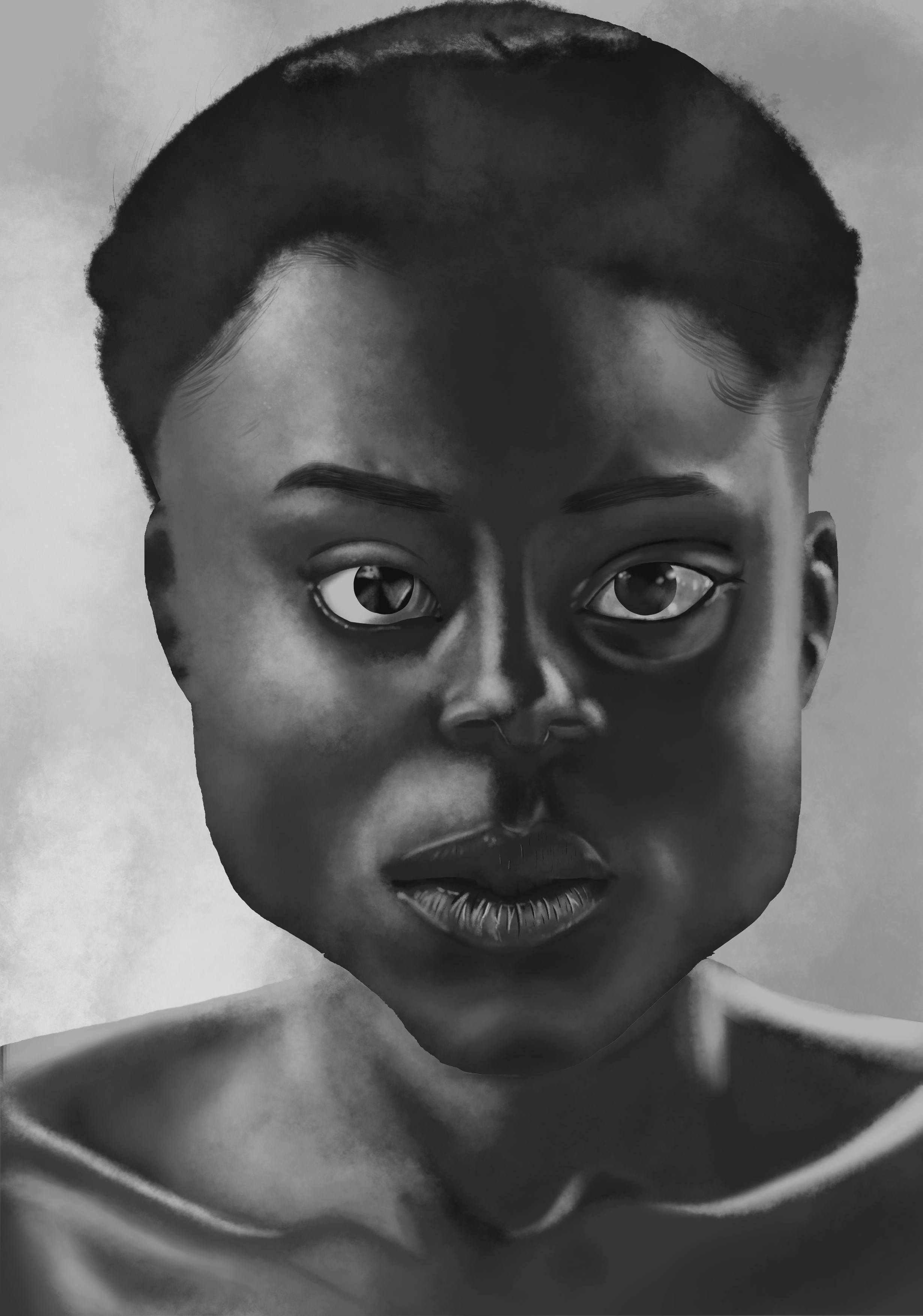
One thing I notice: the sharp edges around the face and eyes look a little flat and out of place with the rest of the picture – not necessarily a bad thing, mind you, but I think softening those up a bit would help the overall look of things. Looks like you were maybe using the selection tool for those? That can give you razor sharp edges, which are great sometimes but stand out a lot against the other softer edges.
In any case: really nice work! (I’m still getting used to digital myself, I know how weird it can be at first…)
Nice job! For a first attempt, you should definitely take it as very encouraging! Absolutely! I love the gloss on the eyes and great texturing of the lips!
Honestly, the overall features are very nicely done. I do agree that the edge of the jaw/chin, as has been commented, does strike the viewer as sharp. If you blurred that just a little, it would blend in very nicely, I think.
The only other general critique I’d make is that the features seem to have a slight variance in perspective. By that, I mean that the individual features don’t all agree as to the perspective of the face.
For example, the tip of the nose seems to be slightly point to our right, while the bridge of the nose is coming straight at us, instead of tilting a little towards the nose tip.
Also, the lips have more showing on our left then our right - almost like the head is pointing a little towards the right. But since the face is pointing straight at us though, you’d probably see an even amount of the lips on both sides of the face. In addition to this, the skin above the upper lips seems to be protruding more on the left, than the right side of the face. (Which would prob make sense if the whole head was tilted to the right, as the lips want to suggest.)
But! That is all just nitty gritty observations. Overall, the performance of the features are very well defined and nicely done! I’m def looking forward to your next portrait!
Excellent first Krita painting! Thanks for sharing.
Thank you for your encouragement, advices and for the time you took to look at my artwork and to give me feed-back.
Endeed, I used the selection tool for the face and the eyes, and now you noticed it, I did too. It was very helpful, but I gotta find and alternative have a sfumato look instead of sharp edges.
Sincere thank you for the time you took to analyse my work and to give me feedback. It was well-detailed and enlightened me on what I had to work on.
I would defend myself saying that I was trying to make a Picasso impression, but the truth is that I need to work more on my proportion and perspective skill. But for now, I believe that the key is Quantity over Quality to insure that I’m on my ease with the tool and the device (the tablet).