After a while lurking, learning and reading I’ll now give back to the community.
I was looking for good Manga guidelines to use in Krita and found so much different information about measurement that I decided to create my own on references that are quite often used in the communities.
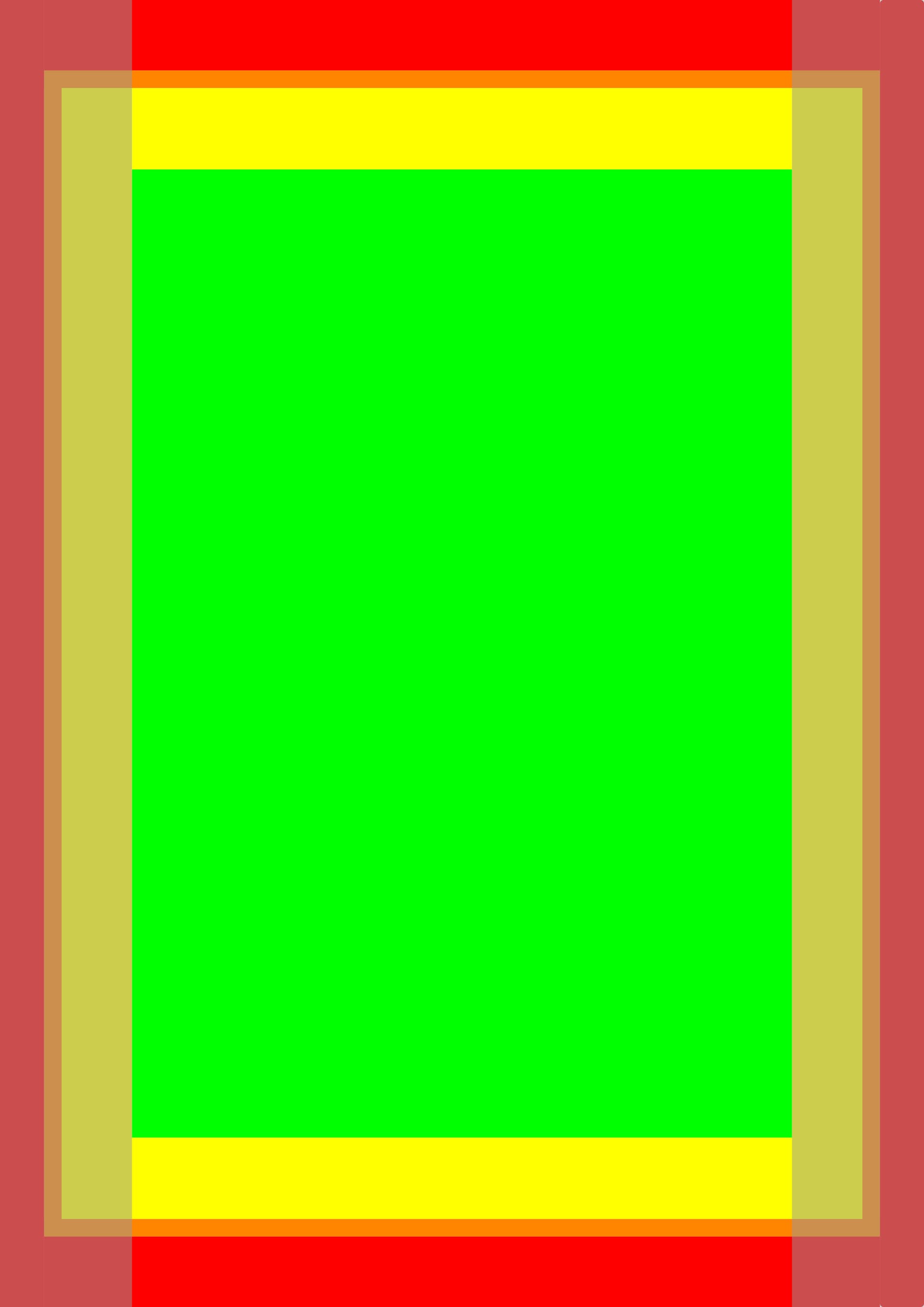
The paper format is A4 and I’ve setup the images with 300, 600 and 1200 DPI.
I’m by no means an expert on this field but I try to explain what I learned while doing my research on this topic.
The “RED” zone is the area that gets cut off while printing. The “ORANGE” zone is the bleed area to make sure you’re not adding important parts of drawing to the area which might get slight offcuts while printing. The “GREEN” zone is the safe area which you should mainly use for the really important parts of drawing/panels since it’s the center.
You can and should draw in the ORANGE, YELLOW, GREEN areas.
The greyish areas on the left and right side are the lines for even and odd pages. Stop your panels at the greyish rectangle. Have in mind which reading direction you want/need.
If you have questions I try to answer with best effort.
At the moment I have no time to look for the sources, but I’ve found a few from publishers and users.
They wrote and said that some use 1200DPI to make sure the black and white drawings are as sharp and highres as possible. To make sure the print quality is great even for very thin lines. A4 is most of the time not the end format and gets reduced to B5 or even smaller. That way with 1200DPI there should be less of a reduction on quality when scaled down.
1200 dpi should ensure that even the finest line/trace remains intact when the drawing is converted from grayscale to black and white.
But I wonder, do you still convert grayscale drawings to black and white?