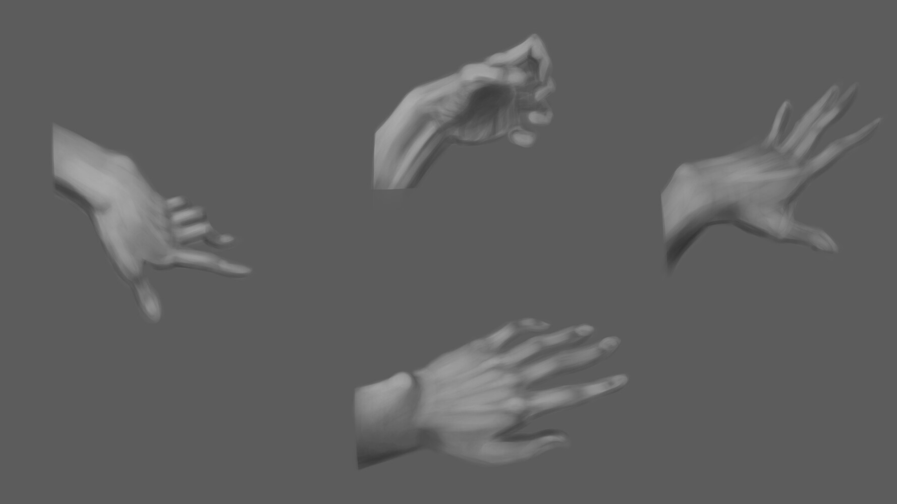
Just a quick sketch of hands, that took about 1 hour to finish. Nothing fancy here, simply trying to improve painting hands. I tried not to zoom in, so lots of details are omitted. I would like to know what you think!
The reference: https://www.pinterest.com/pin/5629568275095109/
9 Likes
You did a good job drawing what you saw but have to say your ref has a very bad lighting.
1 Like
Thank you for pointing that out! Yes, I agree that this reference lacks some deeper shadows. But I wasn’t looking for it for too long, just had a big urge to understand hands better. And I feel like it will last for a long time, until I get better at it.
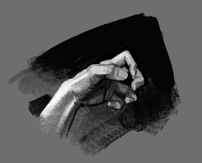
also don’t go that soft with the contrast that much. here are a few deeper blacks that I add following the ref.
before:

after:
1 Like
Thank you for this little overpaint! I will take this into account next time.
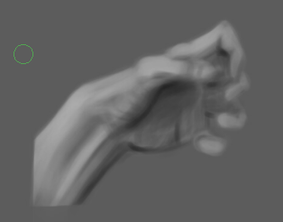
I would suggest going much bolder with the contrast. I’m not exactly nailing it myself here, but I think the value range here is more like this:
I tend to struggle with getting stuck in the midtones, I’ve found it helps to exaggerate the blacks, you can always bring some light back. But group your lights and shadows, find the overall contrast and then worry about blending and the midtones. Have you tried painting the background as well? In this case, for example, there’s a strong black bacground that really helps set the tone and is a good reference point for locking down the specific shades in any given area.
2 Likes
This is very helpful! Thank you for your advice. Yeah, one of my biggest problems is not being very confident with values. You are right, I definitely need to try and exaggerate proportions, values, colours and so on. By the way, nice painting you have done here.