Hardmode - Manually Mix Colors

Ok, sure…anyone can instantly pick colors from a color pallet/wheel/etc. Why not develop an educational feature:

  1. You must electively turn on the feature as to not “turn off” new users.
  2. You must mix your colors manually like an artist using physical mediums with various primaries, 3 color to start, 4 color for ultra-hardmode (cmyk)

This would serve to teach artists what to expect if they were to actually physically mix paints themselves and to understand tones, values, etc. I know this doesn’t supercede priority over bugs and defects, however it would be a nice selling point for educational interests. Cheers from one software engineer to another…thanks for building such a great application.

2 Likes

You can already do this manually right now using one of the Color Smudge Engine brushes. I personally really like the Wet Bristle brushes for any sort of painting requiring blending.

I recently revived a long standing request for a scratchpad docker that would allow us to dedicate some space on a side bar to use for more traditional style color mixing. You can find it here: Scratchpad Docker

The somewhat clunky approach right now is to use some unworked corner of your canvas or a dedicated layer to drop down some color dabs and do your mixing. But then you are stuck having to toggle that layer’s visibility or zooming/scrolling to reveal the area where you were doing your mixing any time you want to sample colors again. Another alternative, if you generally don’t need access to the UI much is to open up a second file and go into canvas only full screen mode with the tab key. If you are using sub-windows instead of tabs you can arrange your main canvas and your mixing canvas side by side, with the mixing canvas placed off to the side where the side bar usually is. You will have to tab back to the UI any time you want to mess with layers or switch to other tools that you may not know the shortcuts for, but it’s better than nothing if you really like to mix your own colors by hand, at least until if/when that docker becomes a thing.

3 Likes

The problem with that feature request is that in most cases, and Krita belongs to it too now, colors blend in digital art differently than with real paint. Linear color spaces help a bit: https://docs.krita.org/en/general_concepts/colors/scene_linear_painting.html but it’s still not the same. Krita had a “true” color mixing widget at some point in the past, but it had to be removed, and it turned out that people get used to digital painting pretty quickly anyway.

If you just want to limit the amount of colors you use, just use Gamut Masks: https://docs.krita.org/en/user_manual/gamut_masks.html

2 Likes

Why did the True Color Mixing Widget have to be removed? I’m currently on a quest to improve my digital color based on what I have learned from real life paint, but I feel like it’s difficult to translate the knowledge, and I have to use workarounds to achieve the same ‘vibrance’… thanks!

The libraries the code depended on came to be unmaintained; the widget wasn’t complete and finished; the author of the widget disappeared.

And in any case, it was a very simplified thing because the thing is: in the analog world you’re not mixing colors. You’re mixing light reflective/transparent pigments and binders. In the digital world, you’re mixing red, green and blue light emissions.

Thanks for the feedback. I’m trying to learn more about these differences and you just pointed out exactly what I’ve been trying to understand. However, I don’t think I understand things as well as I’d like to, and I guess it’s hard to imagine that most artists will clearly know the differences in traditional and digital.

To me, there seem to be some subtle ways that traditional paint will look better right off the bat than digital. Now I know that if an image has good fundamentals it doesn’t matter how it was made. That’s why I used the word ‘subtle’. One of these very subtle ways is color mixing. As you mentioned, in the analog world you’re mixing light reflective/transparent (translucent, refractive etc :slight_smile: ) pigments and binders. There are some very nice things that in the real world come about naturally when this happens, but in the digital world, I think artists have to use workarounds and tricks, and they have to know to do these things additionally - e.g. sometimes using Color Dodge instead of Normal blending mode, sometimes manually changing the saturation of a mixture or adding another brushstroke to pump up saturation on the edge of a shadow…

I guess I have to learn more about color spaces, mixing RGB values, the math behind blending modes etc, to realize how digital color could be bent under my will. However, I’m not completely sure that digital even has all the means to reproduce the mixing of pigments and binders from real life. Maybe there will alsways be something missing from the mathematics of RGB etc, and some entirely different simulation is needed to mimic real world pigments?

Today I was mixing some highly saturated dark blue and white in Krita, and I was disappointed by the drop in saturation when mixing white with blue. I thought, how much other stuff like this is happening when working digitally, that is subtle enough not to notice, but eventually takes away from both the joy of painting and the final liveliness of the final piece?

When mixing white Prussian Blue and Titanium White acrylics, you can see that there is a ton of saturation in the mid-tones. I am guessing this is because there is a lot of saturated pigment in Prussian Blue. In digital painting, mixing white, at least in Normal blending mode, will kill the saturation very quickly.

I’m currently looking for a way to mimic this real world behavior of mixing a dark saturated color with white while not losing saturation. Would you be able to direct me to a possible workaround or solution? Thanks!

1 Like

Welcome to the Digital Paintng :slight_smile:
Like @halla said you work with red, green and blue channels of monitor that give us illusion of other colors. Pigments in traditional are minerals that have unique properties and while mixing they give us unique results. In addition the light you direct on the canvas gives also effect while display is independent from surrounding.

In case you rush to replicate stroke you demonstrate with acrylics, you need make additional brushstrokes with other hue and saturation. Personally I prefer to use option in brush preference of random shifting Hue and Saturation for brush tip or brush stroke to dilute a monotony.

You may try RealisticPaintStudio and Artrage. They both trying to simulate changing hue while mixing colors. But those apps are really limited in functions.

And I suggest you to look different onto digital painting. If you perceive digital media as different matter it is would be much easier to accept specific color behavior. It is like you perceive charcoal as charcoal and oil as oil and watercolor as watercolor – they all unique and different from each other. Digital media are really powerful in term of controlling you work – undo, layers, transformations, filters etc. It is real heaven when you study composition and volume. Plus sharing with other through web, no need in space to storage you work (only hdd, contrary traditional – scketchbooks and shelves with paints). And digital painting obviously much cheaper. In studying digital media you will feel uniqueness of it including brushwork that hardly achieve with traditional. Also you may try to combine traditional and digital media - I often saw mixing of watercolor or colored pencil with digital afterwork.

1 Like

Hmm RealisticPaintStudio. Will check it out, thanks. There are so many painting apps nowadays…

Well, it’s not like I’m new to digital, I’ve been at it for almost 10 years now, but that just goes to show how little one can think about the intricacies of the medium. It’s easier for artists to experiment with different tools and find what works for them but there are so many aspects of art where an artist will not exactly know why something looks slightly better than something else, it’s just intuition. However, it could probably be dissected and explained by a more technical person.

I know what you mean by saying it’s better to look at digital as just another tool, yet I also think it’s good to look at the shortcomings of the medium in comparison to other media. I don’t think there’s a reason why color mixing in digital can’t be more realistic, whatever it might mean in different circumstances. It might be that we need a way to simulate thickness of paint, and how more transparent glazes will appear much more saturated, or look at some of the ways that different pigments mix and why they can look more interesting in real life as opposed to digital. I’m not necessarily interested in making digital artwork look like traditional, that’s not the point. I just see it as a major shortcoming the way that colors are mixed in digital art, and I don’t think we should be flippant about trying to mimic this particular feature. There are so many blending modes in Krita, why can’t one of them give you a more accurate pigment blending workflow? (I ask this deliberately in a provocative way, since I know it’s probably really complicated…)

Well you simply cannot replicate pigment mixing in RGB, CMYK or any other “plain” color model that merely cares about the perceptual properties of colors.
You need to do spectral simulation, and for this to work, you need to define colors in a spectral form too, as well as the light source and canvas.

Also, two sets of real paint may look very similar in pure form, but the result of mixing may be drastically different, for example because one of the original colors already is a mix of different pigments while another similar looking one isn’t.

This also means you cannot really create a spectral representation of an arbitrary screen color, you can only “guesstimate” a plausible spectrum given typical pigment properties. MyPaint does something like this since 2.0, it does a “lightweight” spectral simulation with IIRC 10 spectral samples. This does give the typical blue+yellow = green mixing, but on a quick test, some deep blue still simply desaturates when mixing in white, because there’s simply not enough information to simulate it correctly.

2 Likes

I fully support you in development and growing brush settings and options and everything that helps versatile brushwork.

What I meant is psychological side of work, especially for who are newcomers from a traditional media. It is just a big chance of getting in illusion that digital painting is almost the same as traditional + bunch a lot of computer world features. That why I exampled watercolor, charcoal and oils: you eyes 100% see in result they are different matter and therefore have to be treated differently. Computer initially cannot replace them because is also different matter. And all that fancy engines and brushes just possibilities in range of digits.
Pressing and rushing in that illusion may slow down development of artist as artist, because of concentration onto a tool but not at the essence of art and joy of creativity.

1 Like

I used your given colors on the edges and tried to mix them. Also did a extra one on the top that is the colors on the canvas. How does the transition look like?

Looks good, what was your process of mixing? Did you simply brush over the blue on the left with white?

The process? … Math~~ :ghost:

HAha well jokes aside. Since I wanted to make a mix for display purposes I used the “pigment.o” plugin but you also have “mixing color slider” plugin too by default. Pigment.O mixing section allows you to mix stuff using other color spaces beyond RGB. With the Ctrl key I clamped it to show it with even step increments. In this case I used HCY so I think you might like HSV and HSL alike.

But on the canvas I think you can simply use a brush mix method on the brush so it mixes in the given color space you want. I am really bad at painting but my current suggestion is to use the mixing method of the colors your using so the colors reflect the mix. But I haven’t tested this yet so I can’t say this for certain since I have not tested this. But you should be able to, Krita has a truck load of mixing methods for the brush.

I always hear about muddy mixing in digital painting and that only happens if your mixing stuff wrong because your expecting the real world in digital and stuff is just not like that I think. you need to understand how the color space literally works on its spacial bounds because colors is numbers in the digital and not physical properties which are much more than just color it is material and light together usually color of the object is pretty washout, just search for albedo textures.

On one color space you might be walking in a straight line but on another you might be going on a curve around the world. The cool thing about pigmento is that allowed me to see different color spaces in action against each other and see their differences. You can even just compare between Krita’s own various color pickers too at the same time.

Also if you use the RGB panel you will see a cross section of the RGB cube so whatever you do you can see in space where you are and see the muddy effect by analyzing the gradient trajectory. The muddy happens because it is mixing linearly into the other color probably interpolating in RGB too, because it is what your telling the software to do at least on this case. In the middle of the RGB interpolation you have of course desaturated and into greys that only then do a quick shift in Hue when it is closer to about 50% of it’s trajectory. Your mixing has that distinct flavour RGB interpolation.

Despite ugly technically the mix is successful.

1 Like

And even that depends on the brand you’re using – and whether it’s studio or student quality. And pigments can be different, too. Like, Schmincke has the Mussini and Norma brands of oil paints. Both brands have something they call “indigo”. Mussini has “indigo” – PB66 and “indigo hue” – PV19, PB60, PBk10". Norma has “indigo” PB60, PR101". Three different formulations for imitating something natural that’s no longer used (because of bad lightfastness).

At one painting course I attended, the teacher told us that indigo had this trick of turning brown when mixed – without realizing that that only was because we were using Norma, which has red in its mix. (They also taught us that we should never use black, but use van Dyck brown instead, which actually almost completely consists of black with a little bit of red mixed in).

Analog just doesn’t translate to digital and vice versa… For digital, it’s important to get a good grounding in color management, especially the concept of gamma. For analog, the fun is in learning to recognize the pigments and how they work.

1 Like

I’m impressed with Realistic Paint Studio and their color engine, which is their main unique feature as it says on their webpage.
realistic
sorry about the glitchy 256 color gif but this is what their color wheel looks like


mixing white into dark paints does not have the same grayed out look, and additionally they also have color get very saturated wherever it’s transparent on top of the paper

Pretty cool! I bought the program, however, I see limited use in it professionally. I still believe in Krita as the main workhorse for that (I just abandoned Photoshop a week or so ago).

Could you explain this in more detail and give a screenshot if possible? Do you mean Blending Mode? I can’t seem to find this brush mix method.

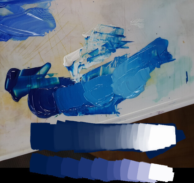
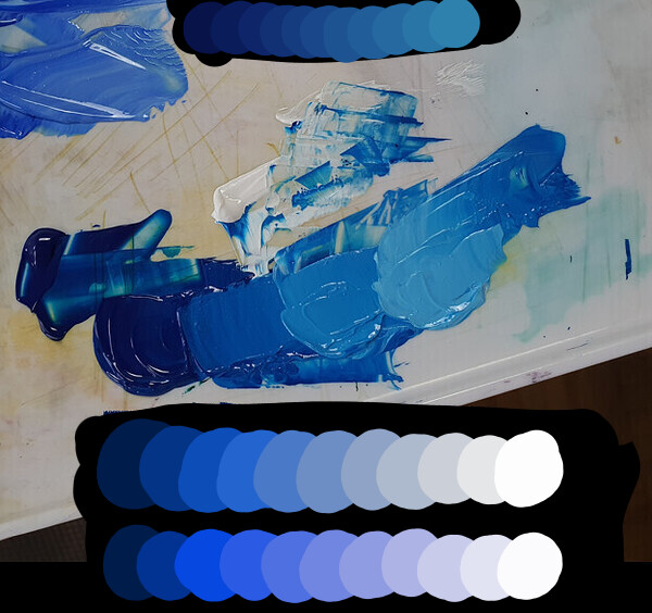
I think you put your finger on the main thing that’s bothering me, which is the muddiness. And yeah I’ve seen the Mixer Slider and that’s what the bottom mixture on my initial image was showing. So the Mixer Slider does go form dark blue to white slightly differently and it does look better to my eye. I’ve checked out Pigment.O as well and I commend you on your brilliant work!

My main concern is the mixing of paint on the actual image though, without necessarily using the color wheel or doing extra color picking to keep ‘fixing’ intermediate values while working on a painting. I guess understanding Color Management is part of understanding Color in general, just as understanding light temperature, local color, value and other areas of study. However, it seems that this understanding leads to the artist’s ability to ‘compensate’ for the shortcomings of digital color mixing.

Although I can see that it’s possible to be knowledgeable and, using workarounds, adjust these color mixtures in ways that would make them more pleasing to look at, I get the feeling that by default there is this muddy way of color mixing going on under the hood. Does this mean that every single brushstroke I make is ‘tainted’ in a way that is barely noticeable, but that could ultimately be taking a way from the joy of painting and the impact of the final piece?

I do acknowledge that color is not what makes a painting. Drawing and value is obviously more important. There are millions of beautiful digital artworks out there where the colors have been mixed in the default RGB interpolation.

I know where you’re coming from. Well, I don’t think it’s important to exactly simulate those nuances of pigments and paints you mentioned, and therefore we don’t have to worry about the thousands of various products out there.

There are just general tendencies that happen in traditional art that are pleasing for the artist and the viewer alike to look at, and if these are missing in digital, it’s a poorer medium for it. Having a dark saturated color desaturate towards gray when mixed with white, without giving any intermediate somewhat saturated midtones - that just looks off to me as a painter. I know that, having recognized it’s happening, I can fix this by upping the saturation on the color wheel slightly. But to be honest, it wasn’t even that noticeable. And so, how much of this in principle undesirable mixing behavior is going on unnoticed?

Do you have any specific advice for digital painting when it comes to gamma? Thanks.

2 Likes

it should be here.

Strangely my biggest issue is to understand and use color like a normal artist so if I give weird advice I apologize.

But on screen I really can’t give you assurances on my part for doing good mixing my advice is bound to color space limitations and on the side calculations as I really only plan to make plugins and not do source code for various reasons. What @Lynx3d said is really what you really need to do it in the canvas and as life like.

Yes under the hood things are not pretty so to speak as RGB interpolation is default in every painting application and really looks ugly in terms of color variations however it is super Clean as it avoids other Hue contamination. Not to mention as they say Grey is the mother of all colors also and it connects all of them I consider this a bigger boon. Considering Value and Intensity/Saturation/Chroma RGB maintains stability for it, it is only when the Hue shifts that the things get a little weirder for RGB, but then again if you choose a Hue based Color space the question is which one really is the best to replace RGB?

A example of RGB interpolation looking good

Every Color space has it’s own issues I think you just have to work in the one that has the rules that favor your liking the best I feel. I have constructed Pigment.O so far with that in mind so I can just change my layers and brush to use the values I will use. If it really works as practical as I expect I don’t know yet.

I must say I too would be interested in knowing more about gamma and how to use it too, as in code and as a user alike. I have been reading it and it seems a topic that I should tackle to know even if I don’t code anything related to it. If there is information to consume about such topic around that is.

We have this section of the Colors topic in the manual: Gamma and Linear — Krita Manual 5.2.0 documentation

2 Likes

I’ve been really enjoying Realistic Paint Studio. I was wondering if it would be possible to achieve similar effects while on-canvas color mixing in Krita using blending modes or filters? Maybe a new blending mode or filter would have to be designed?

Here’s a quick comparison between how the programs handle paint on the canvas. In Realistic Paint Studio dark saturated colors mixed with white produce saturated midtones. Different hues mixed together will often produce a quite saturated version of the color wheel that’s in between on the color wheel.

I’m not saying this is 100% what happens in real life, but it is arguably livelier and more exciting to look at. I was unable to find any blending modes or filters that would give a similar result, but I was wondering if in principle it could work with those methods, since it’s all about how the colors mix on the canvas?

1 Like

Yes I was searching for a blending mode for it and I was not finding one either. Math wise it would be pretty simple I think just donnonhoow fast it would be on the canvas.

How I imagine the blending mode
It would be like normal at 100% pressure replacing the color below. And the varing pressure creating transparency would control the amount of mix with the color below the brush. The mix would just be a linear interpolation but on another color space. And you could use that interpolation in HSV, HSL, HSI and HSY formats. Each would have their own distinct mix. And then the mix colors would be converted to RGB and applied on the canvas.

And the interpolated mix would affect all 3 channels and not just 1 or 2 like most blending modes you have available currently.

I think this method would give pretty similar results even though not life like of course.