Im looking for advice of how i can improve this piece. Anything is helpful, this is for a art competition due 20th so i want to add more wow to this you know. maybe make it into a gif or something but i don’t know.
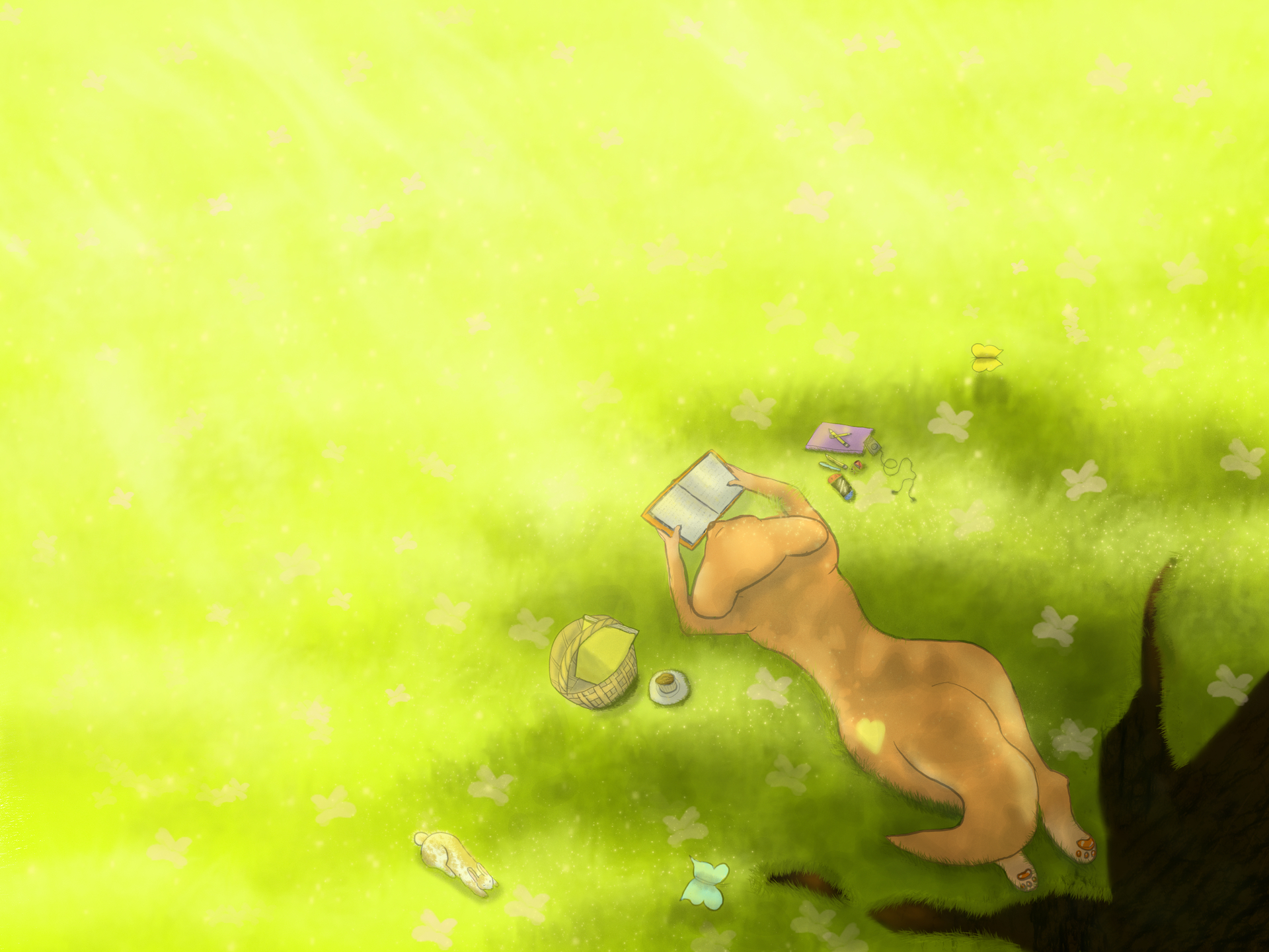
Context: sorry i didn’t think of adding some anyway it is for a challenge a youtuber created where we can use any medium and any style to make fan art of his avatar which is a slugcat called cutie. anyway i decided to just draw what im good at which is grass and stuff but i chose above angel because i cant draw faces so i avoided it lol
You’re making us guess what you are trying to accomplish with your composition and color choices. I find it super helpful when asking for help to say what I was trying to do.
If you want to make a stronger contrast between the sun and shade, I’d try to use warmer colors in the sun. Can the sunny grass look dry and brown? Could you add one or more bare patches in the sun so it looks hot and dry? Trying to get the average hue in the sunny spot to be opposite on the color wheel from the average hue in the shade is a kind of formula for making wow.
Would a tighter crop work for you? I think there is more sunny grass than you need to establish contrast. Unless you’re trying to say something by confining the area of interest to the southeast corner…
Do you think that overhead point of view pushes the viewer away a little bit rather than pulling them in? I feel kind of aloof looking at it. Maybe some more defined writing in the book would pull our attention in to see what your character is looking at.
Also, maybe good to know, is there a given topic for that competition? It can help to give clues in which direction you should change something, if there would be something that will profit from such a change.
Hi Phae, i don’t know if it’s gonna help but i think you choose a difficult camera angle for your piece i would done it a bit different like a profile view to see the face of the fox reading the book and to see the light better, so that way you could animate the butterflies and some rim light
Even if you are not good drawing faces i think you should try because how are you going to improve if you don’t try and if you start avoiding things you’ll experience going to dead ends. Another tip is always have reference close.
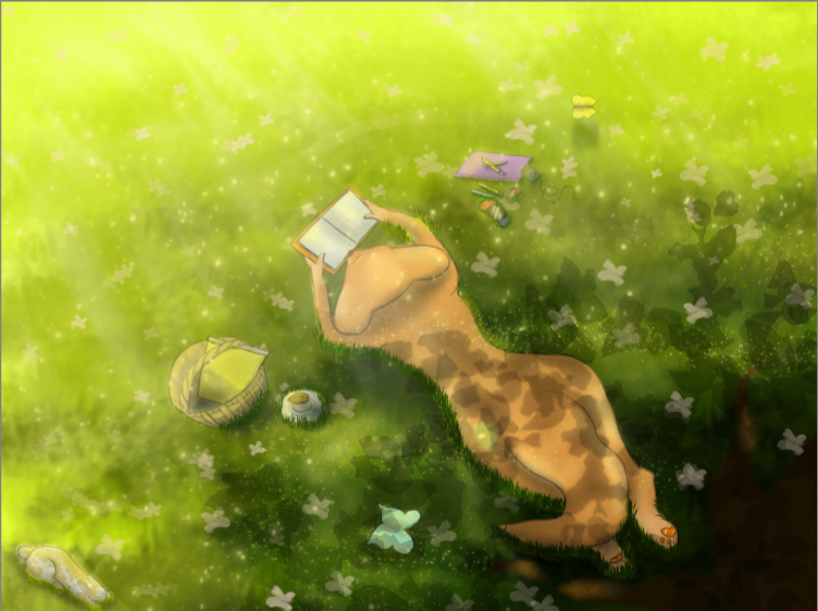
One thing I like to do with my artwork is place a new layer below the main character so I can try out many different colours or different values of the same colour. This usually helps me see new ways to make the central figure stand out from everything else.
@PhaeCat My first impression is that the piece is unbalanced because of the large empty space on the left half of the painting. My second impression is that the subject matter has a pale washed out appearance. My suggestion would be to crop the piece down to minimize the empty space, OR, add some more tree shadows on the left. I would add more contrast on the cat, the items around it and the tree shadows. Make all the shadows darker and more defined, and highlights more intense…especially where the sun peeks through the shadows under the tree.
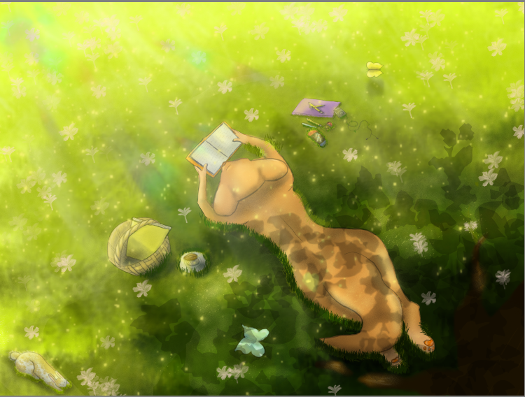
That’s a nice improvement, what i see now is that you have a layer for the leaves and you just lower the opacity but color doesn’t work like that maybe you can change it to multiply and modify the color of that layer, you can modify the edges of the shadow of the tree to be more sharp (the cast shadow is sharp) give it a good shape and then leave some gaps in the shadow to let light show here is some cool ref Foto de Susanne Jutzeler, suju-foto de Pexels: https://www.pexels.com/es-es/foto/madera-en-pie-de-pie-plantas-18060087/