You might want to get advice from the printing outfit that is going to print your work. As far as I know, no home printer using CMYK will print in neon colours.
Is there another format in which a printing house can print glowing neon colors, and I can see on the screen what it will really look like…? After all, RGB doesn’t work in this case.
You will need to get advice from the printing house and from what I hear, professional printing houses are not asking for CMYK anymore (that’s just what I read, I don’t do any printing myself). They may want you to stay in RGB and let their device to the transition. Be sure to get a hard copy proof copy from them to be sure you’re happy with the final result.
Using CMYK is mostly (but not always) just advice from outdated tutorials, or it is propagated by wannabe experts who have previously looked at the old tutorials to “show off their knowledge” on YouTube and the like.
So, it is always better to ask your print service provider first, before doing tons of unneeded work, as @sooz already hinted. That is because the most print shops/professional print services nowadays are fine with RGB pictures and convert them for you into the format they need, that is because they seldomly use CMYK these days, they shifted to other methods of printing years ago using far more colors than CMYK.
So, in most cases, you won’t need to give them CMYK pictures anymore.
In cases you mean actual glowing colors ( like those magic markers or glitter stuff) no color model or screen can show these effect colors. How it usually works in print is that either a specific color gets “keyed out”, like in old sprites, and colors with specific color codes will be replaced by these effect inks or you have an additional grayscale image that is used as a mask to later coat the print with an additional printer. You have to contact the print shops and they will tell you how they do it.
If it really is just about very bright colors. CMYK can’t show them because the color space is too small and made for paper which simply can’t glow as screens can.
Thanks for the response! I definitely need to contact the printing house, and if there is no need to convert to CMYK which gives a rather depressing and grayish color, I have to admit… So it will definitely save me a lot of unnecessary work!
This does not exclude the possibility that there are still print companies and print stores that have not yet switched to modern technology. I often think of the less affluent parts of the world where you can’t immediately make the switch to more modern technology, simply because there isn’t the money. But I think that in North America, the wealthier countries in Asia and most of Europe, CMYK is a relic of the past.
If you don’t have the money, you look for compromises so that you can still “play along”.
I believe this is an oversimplification. “CMYK like” color models still have their place in the industry even though some manufacturers put a lot of effort into pushing technology to get even closer to digital colors. There are some things that still require it (sometimes it’s also just the print shop shifting the responsibility to the artist) and there is usually a good reason for it. Some print methods even limit color palettes to very specific colors.
As usual, it is very important to know how the artwork is going to be printed and that printing will always limit the available colors, no matter what. That’s why it is important to check these things before hand. It might not be simple CMYK but it will be something along those lines i.e. any subtractive color model specific to the printer.
Anyways it’s not correct to say that CMYK is the color model of the lesser developed world, that’s just “western chauvinism”.
Modern technology got us the luxury that we don’t have to pay attention to CMYKish color that much anymore for most people but some people who need absolute color accuracy will still have to keep go down deep into the rabbit hole that’s is color management.
That’s why we all say in this topic that you should ask your service provider first before doing unnecessary work.
What I don’t do, but if one wants to read it out of my text, then one can interpret it that way. But that was not what I wanted to transport.
As a poor person, I see it differently. In the “western world” (ROFL), many companies are forced to always be at the forefront and always offer the latest products in order to avoid being shunned by customers and, in extreme cases, going bankrupt. (I’m thinking in particular of the societies in which a T-shirt or a pair of trousers is often thrown away after just one wear, and similar madness. In other words, where everything always has to be the latest and greatest, where I’m wearing my clothes till these fall apart, not only because I lack the money for such craziness, but mainly).
This is something that companies in the less affluent regions of the world are usually less negatively regarded by their customers, and so these technologies remain in use there for longer. And this has absolutely nothing to do with Western chauvinism, but is simply a bitter reality. I feel the same way, as a recipient of pocket money from the state, I have to think three times before I replace something that works with something new. Instead of buying a replacement for my two 14-year-old SSDs, I have to buy a new monitor because my current one broke three weeks after the end of the extended warranty. How and whether I will ever be able to replace my PC with a new used one is written in the stars.
In recent days I have been trying to find a printing house that can produce such vivid colors as you all suggested, even overseas. I highly recommend STAYING AWAY from the Shop1102641054 on Aliexpress, a particularly nasty seller named Young, whose response to the question of whether they can produce what I request with attached images to clarify my vision was - “then I am deleting your order!”
I would generally advise to stay away from any shop (print shop or other) that doesn’t have a well established website and a name that’s not just Shop+A bunch of numbers
Take a look at what professionals in your area recommend.
This is a good and correct suggestion! In my area, the options are quite limited, so I’m looking in all sorts of directions until I find a good solution at a decent price. Apparently a printing house in the US or North America will be able to offer more advanced solutions. I’d love recommendations from anyone who has done similar work and was satisfied!
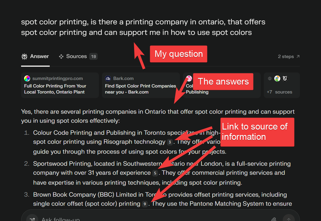
I wrote “Ontario” as a random example to limit the answers to a specific region.
You might also ask google or perplexity how to define a color in Krita as a spot color.
Popular spot color libraries are know as “Pantone Colors” (but there are other brands and vendors as well), There are online tools which can tell which pantone color might match your rgb color in Krita (search online for “rgb to pantone converter”).
For Pantone colors specifically, I remember someone worked on a free, reverse engendered ICC profile you could simply import into Krita (I don’t know if that project went anywhere though), but if you don’t have a screen calibrated it might not be worth it. Pantone colors are meant to look always the same no matter if they’re on screen, paper, plastic, glass or whatever, that’s their selling point. But the colors (inks/pigments I guess) and color profile are also copyrighted and bound to a license, and the color palette is limited for technical reasons.