Dear Krita art community, i apologize for interrupting you again with my art questions, but i am begging for answers once more.
I am going INSANE trying to find answers to my questions. Like always.
And i really want to solve this one artistic mystery that keeps on making me mad (and sad) [and confused] {and ready to die}
Can someone straight on say: what’s the realistic relation between light color and shadow color? And what saturation the light and shadow posses, and how the saturation of light affects the shadow (or vice versa)?
Every little thing i THOUGHT i knew was just dashed away, and the answers slip my mind. Having drawn multiple pictures, i have never been more curious after looking at how light is used in this post: https://www.instagram.com/p/CJdl5Sfh8N7/
I’m looking at how the light-color affects the rest of the shadows and colors on the pieces, and frankly it doesn’t make sense in my head even though it should, shouldn’t it? All i know is that it looks right, but i wonder - why?
Here’s some things i THOUGHT were true, before realizing they don’t explain the light usage in that post. Here’s some rules i THOUGHT were real. That i THOUGHT i could use one day to touch realism:
-
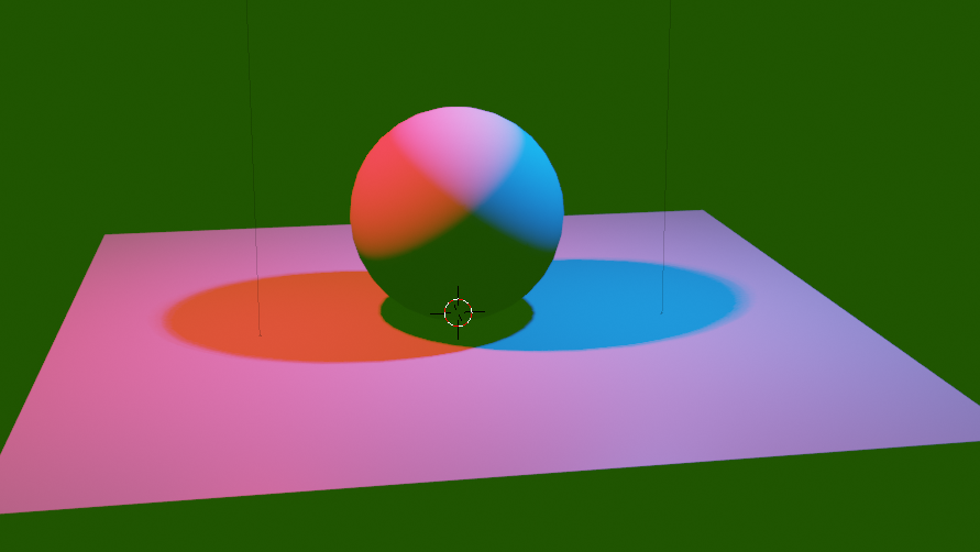
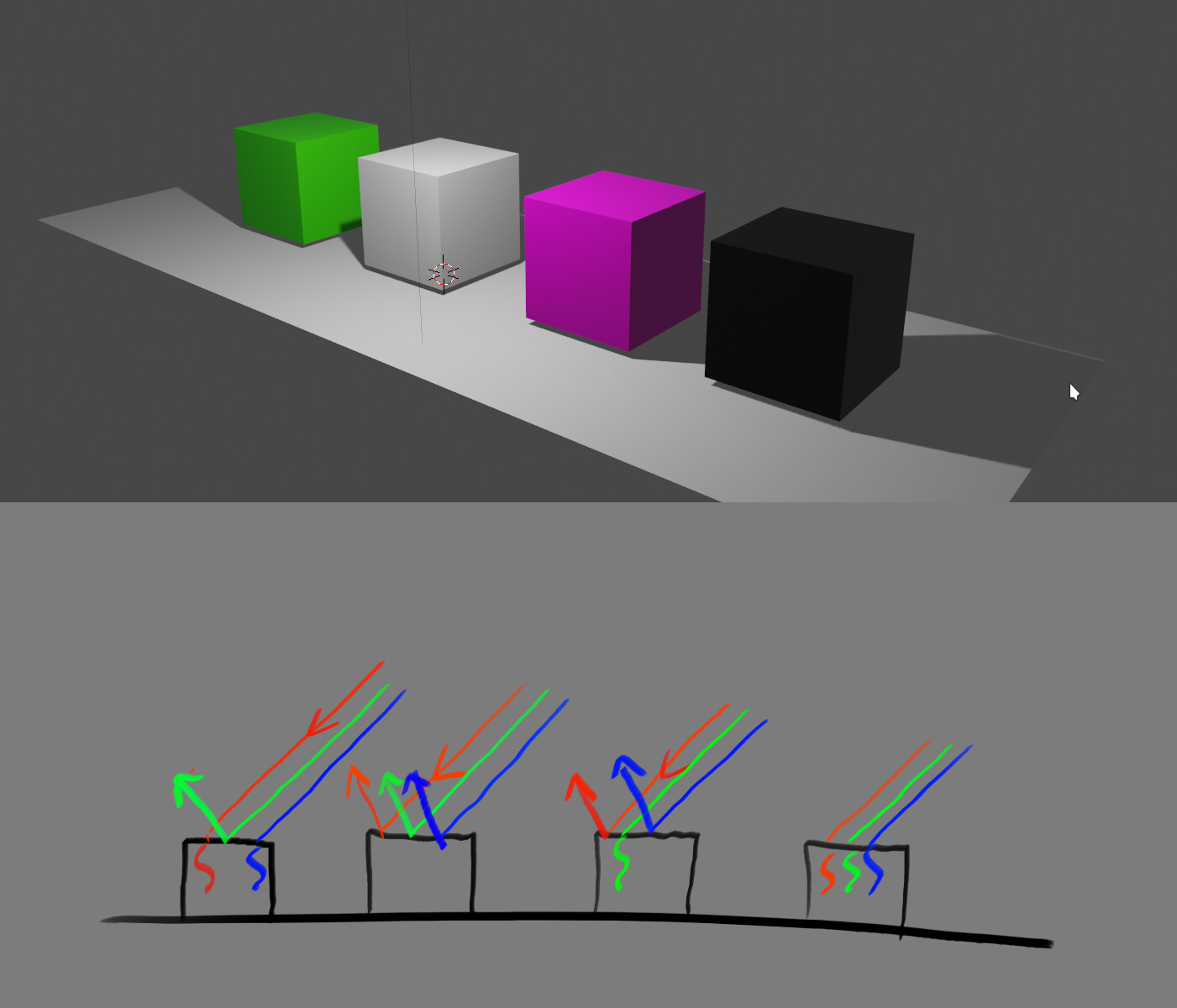
I thought, if there are two light sources, the shadow is a color that’s a mix of the two lights (as in, in sunlight, the weaker sky-light gets into the shadows, making them cold/blue, the yellow from the sun preventing total blue-ness, maybe going a bit purple?)
-
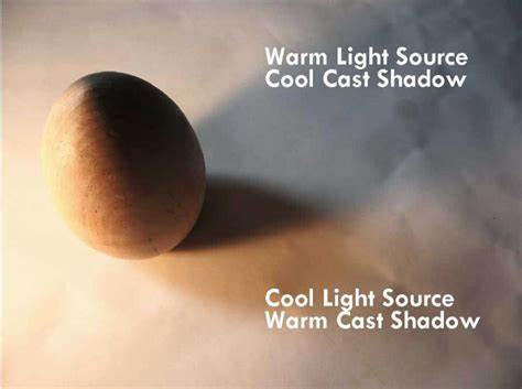
I also thought, lights have shadows that are color opposites (cold light - warm shadow, warm light - cold shadow)
or just making it darker by going towards the opposite color
-
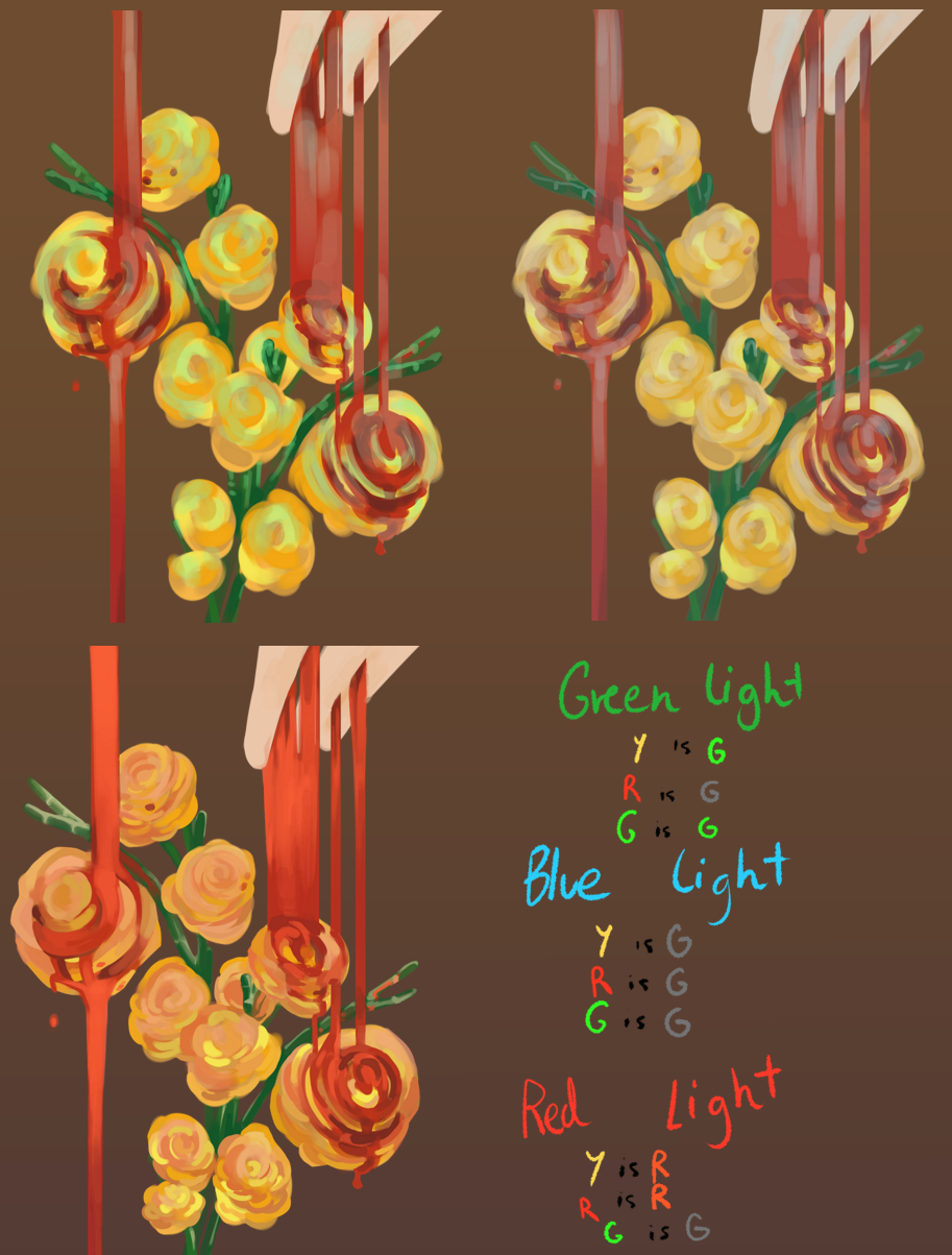
Subsurface scattering was a thing only with warm/red light on skin since it’s red(or something like that)https://th.bing.com/th/id/R9aa533b6f48422e58f8bb7152582cad0?rik=yICfPLtjjOqkIQ&pid=ImgRaw
-
The CMYK lights can intensify the color or desaturate it (blue on blue = more intense blue, red on blue = less intense blue, maybe even purple midtone?
since green=cyan+yellow, if you shine a green light on a non-cyan-or-yellow object, it will look duller)

5.the mid-tone is more saturated when it’s the same light hitting the same colored object
6. Saturated lights = desaturated shadows (and vice versa, again, maybe?)
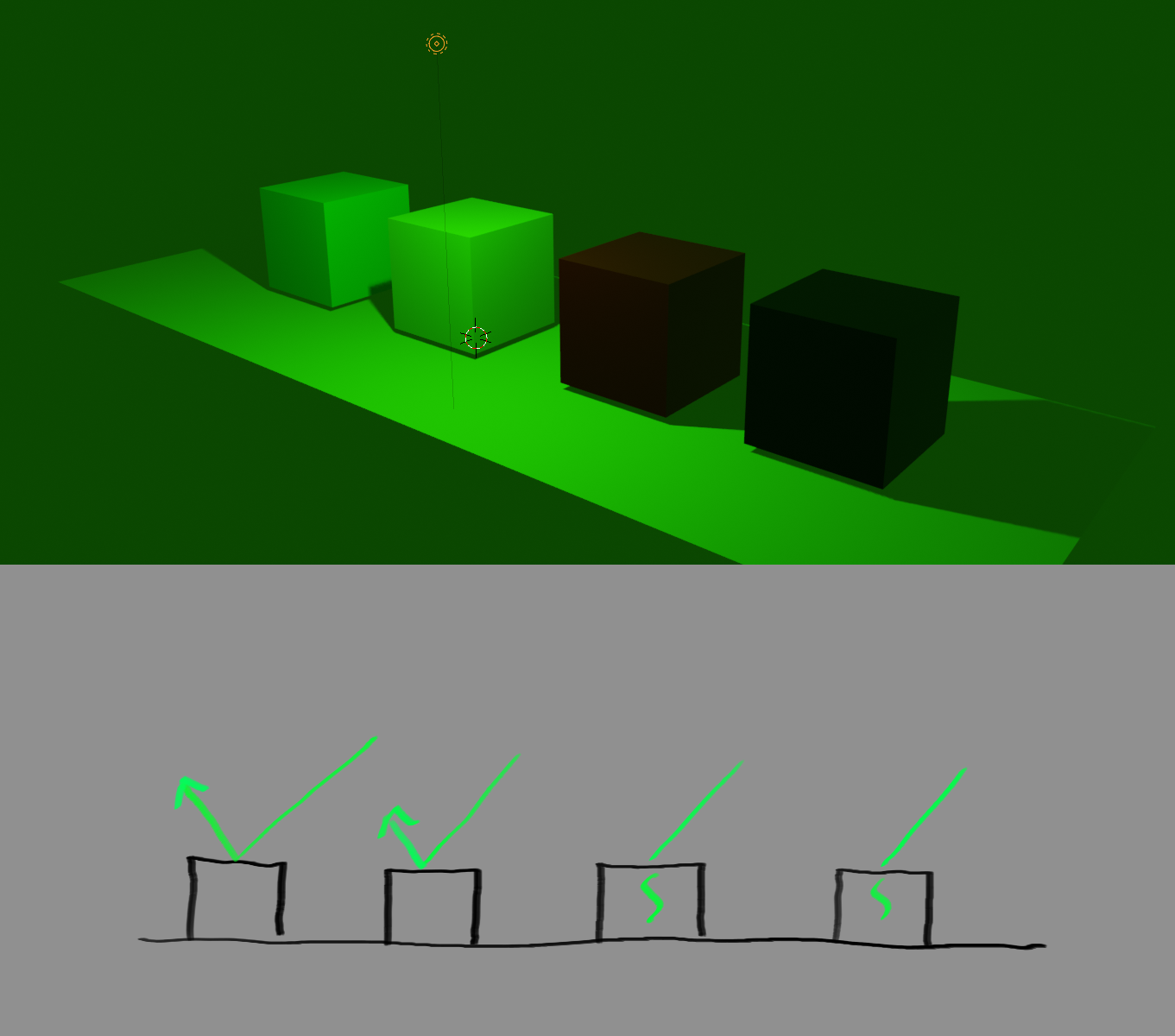
7. The darker something is, the harder it is to see color variation of the OBJECT because the OBJECT gets covered by the color/temperature of the LIGHT (as color is just material with light on it, so the lack of light would take that color clarity a bit)
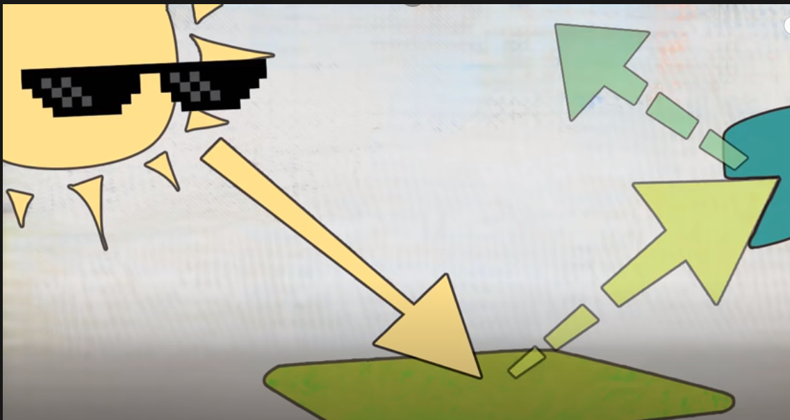
8. Light bouncing off of objects changes color, borrowing it a bit from the object they bounce off of
So yeah. That’s a bunch of contradicting statements, if i ever seen any!
Because putting this all together, i cannot explain how the light in the instagram post works. Or in some realistic artworks, too! And looking at how the light is used there, it looks correct. And even with all my rules, i cannot explain it. I cannot. because i’m too stupid for it
![]()
I appreciate whoever read this far! I would love nothing more than to know how wrong i am, or which one of the rules i learned is incorrect! I’m so sick of coming back to this topic! and failing in realistic lighting, which i am trying to understand and i fail every time. (i’m trying to figure out the rules because reference-study doesn’t teach me anything, it never did)
If you think i had all the rules SO TOTALLY WRONG i shouldn’t be an artist, i would appreciate if you told me, too. God knows i need to know if i should give up sooner rather than later - Judge my entire art-page, if you want to https://www.deviantart.com/darkrooklobby/gallery/all
That’s all. I’m so confused, i am 100% missing something crucial, and i am dying trying to figure it out, my art teachers are not helping ![]()
![]()
![]()
art videos are not helping ![]()
![]()
![]()
looking outside stopped helping ![]()
![]()
![]()
this will forever bother me ![]()
 || course for artists")