Hi,
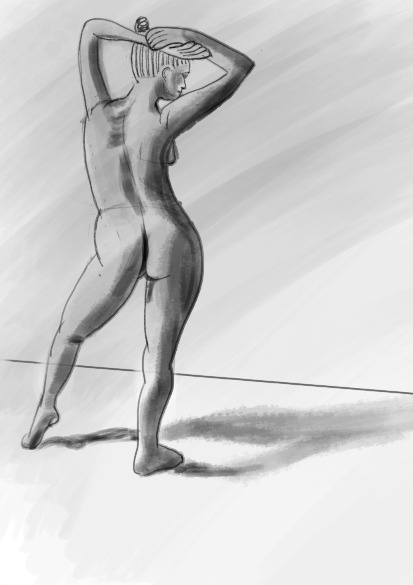
I am using krita since about 1 month and make a couple of drawings with it. I am using some layers for layout, gesture, sketching, the fine work and shadowing like in this example I did 2 weeks ago.
Till now I make always grey scale shadowing because I struggle with coloring/painitng. Today I draw following in krita and will try to use color the first time. What is the best workflow for that. I am very lost with colors. It have not to be photo realistic. A comic like or semi realistic style would be fine for the start. I do not have problems to use the tools in krita, I have for example troubles in choosing a skin color, not looking to much like the skin of a pig
Render the shapes in grayscale like it had no local color (50% gray as base)
Add a layer above with blending mode set to Overlay and “Inherit alpha” set to Yes. I put all the local colors on this one
Merge color layer with grayscale layer and start fixing lighting, because of the overlay layer it can look like it was overexposed, depending on your grayscale underpainting.
I usually start with the background at this point, when I don’t have one already (I sometimes start with the background)
Keep rendering and adding details, in back, mid and foreground until satisfied.
Thank you, I will look to it.
I my naive workflow I would have copied the lineart layer to a new layer. Than I would select for example the t-shirt with the magic selection tool, so that I can paint with the biggest brush. Darker Shadowing for the folds I would add later. That I would repeat for all other parts like pents or belt. What would be the advantage of the workflow like you mentioned? Can I later on change colors better?
That’s a normal behaviour of this algorithm. You need to use another color to show which areas should not be colored by blue. Right now the algorithm sees that you want blue, so it colors everything with blue. It doesn’t know if you want the whole character blue or just the T-shirt blue or what, so you need to use another color to show the non-blue areas. It’s a pay-off to some advantages this algorithm has over the Fill Tool.
You can mark the color transparent in Tool Options for the Colorize Mask Editing Tool.
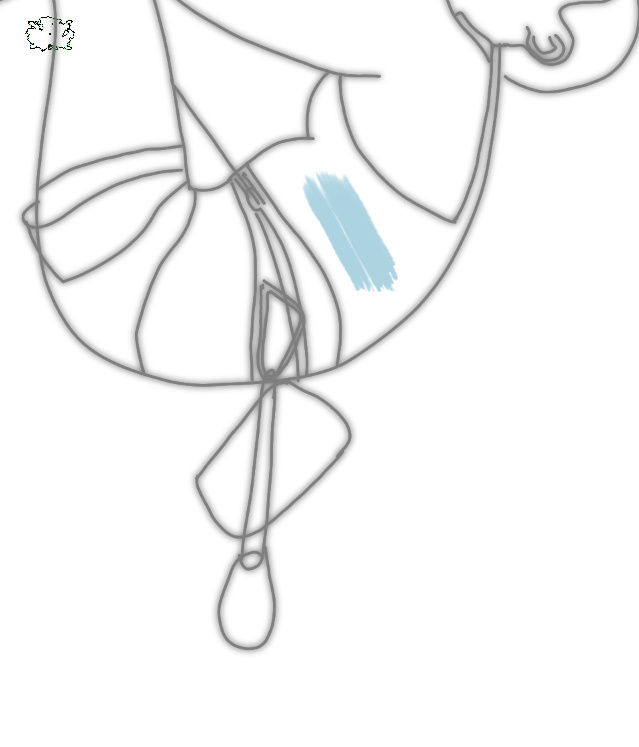
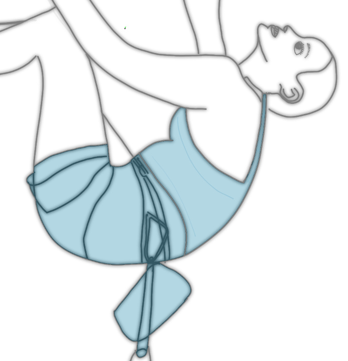
Ah okay. I set white to transparent. The result is better. I thought that the algorithm looks for ares with closed lines. I thought the t-shirt is a closed are, but the colorized mask draws till the pents… How else could I help the algorithm?
If you see that there is an area that the algorithm colors in wrong, just take the correct color and put a mark inside. And algorithm will then know that you want that color in that area. Like, if you want blue T-shirt and red pants, just use the red to mark the pants and blue to mark the T-shirt, and white to mark everything else. If you see that the algorithm colors with red something that should be blue, just add a bit of blue to it (and remove red if you see there is some red in that area). You’ll figure it out it soon
Yes that’s one thing I don’t really like about the colorize mask algorithm, it doesn’t support implicitly blank areas.
If you don’t mark a closed area, it picks a more or less arbitrary color instead of leaving it blank.
So far I still prefer the “good old” G’Mic colorize filter with random colors and flood fill/erase them as needed, instead of updating the colorize mask over and over again (which can be rather slow) until I caught all missed (or misinterpreted) spots.