I need help with my color palettes in traditional art. I’ve noticed i have this problem with acrylic paint and watercolors specifically, with other materials I’m not so sure (maybe my work with markers/colored pencils isn’t in the realism category)
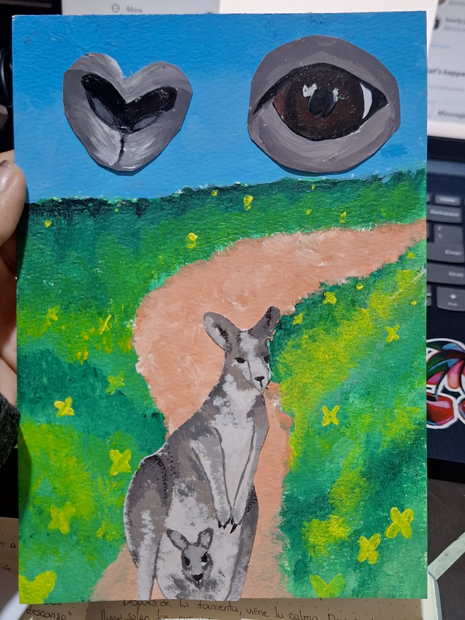
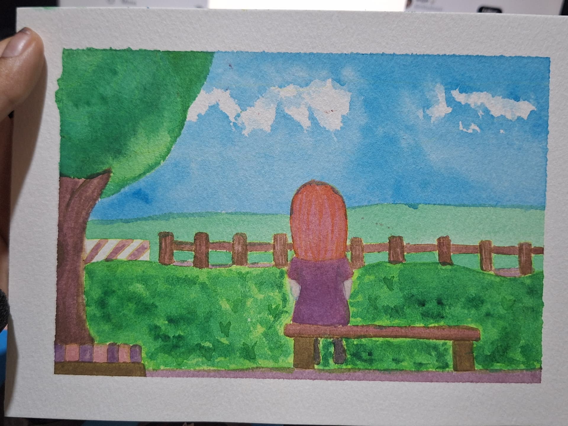
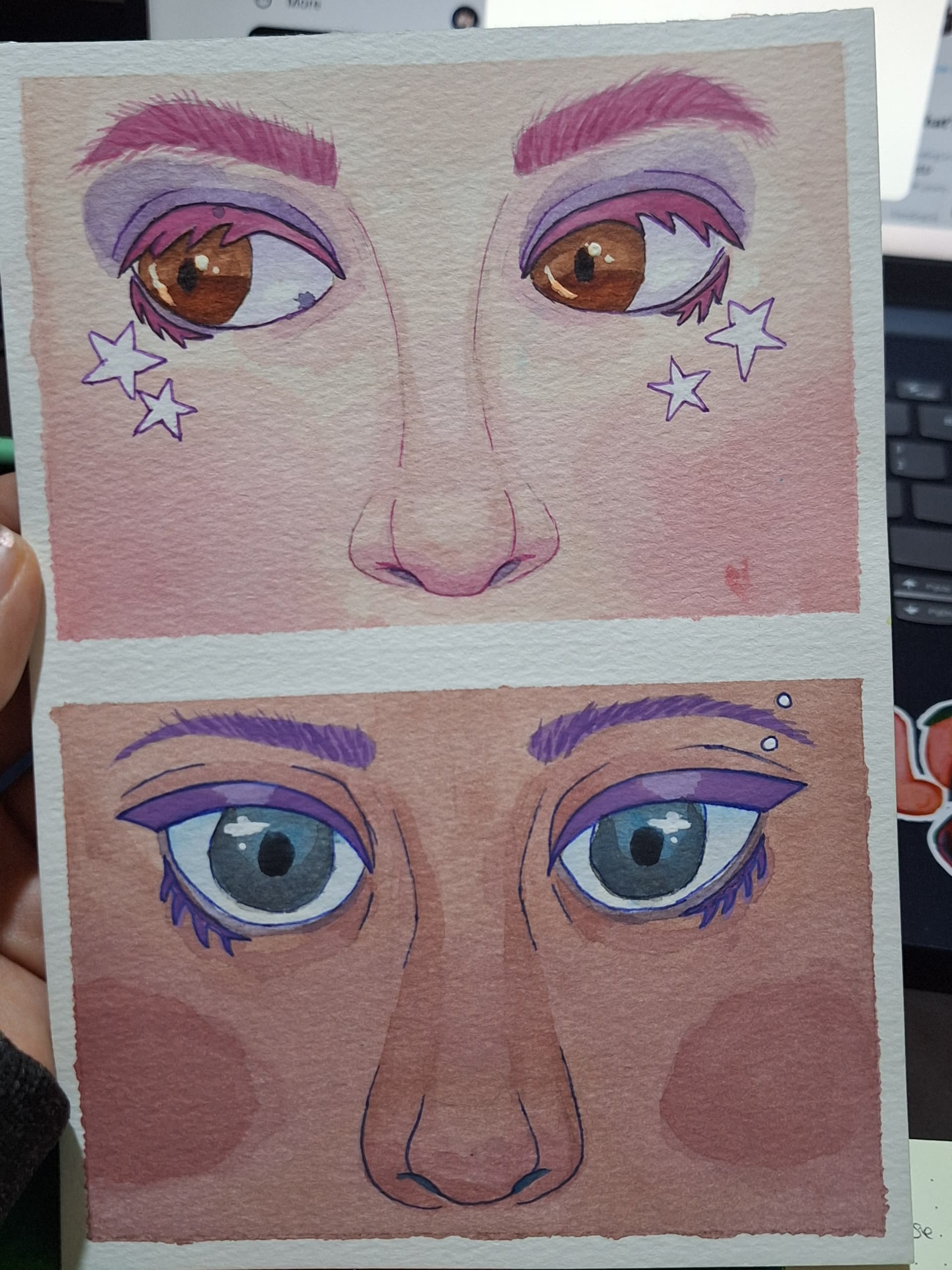
When trying to go for a more realistic-ish coloring, it looks plain and uninteresting, the way a child would color. I’m guessing it has something to do with color mixing and lightning/shading but I don’t know how to start correcting that. When i do non-realistic works/coloring with few colors I like it much better. Here so examples
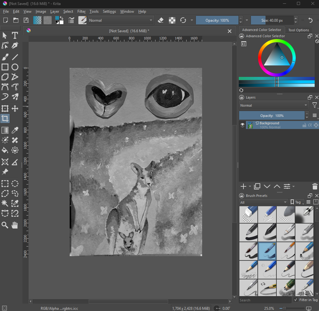
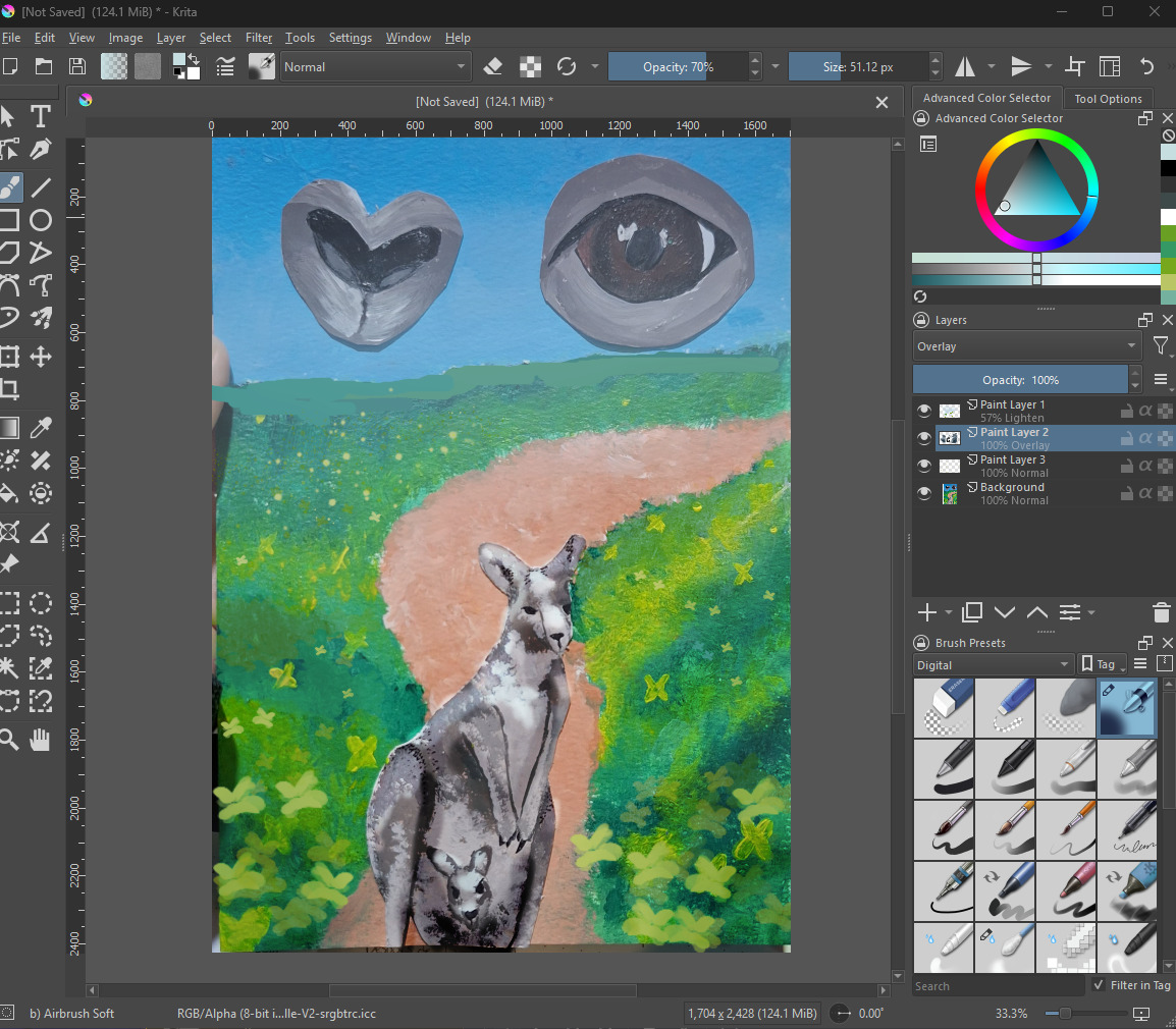
When you look at the Kangaroo image in grayscale you can see you used the same value range over the whole piece. And that makes it hard to tell the different parts of the image apart (in the sense where they are relation to each other).
Normally things that are father away become lighter and the contrast is lower (more air the light has to travel though) also everything gets a little bluer (or whatever the color of the sky is in our picture). Additionally at a greater distance details get smaller and hard to see.
I made a quick edit (only have a mouse here, sorry). I made the distance lighter. removed the big flowers in the back and replaced them with just a few springels. (You can do that by grinding the finger over your hard paint brush to produce sprinkels colors). In the foreground I added more flowers and made them bigger so they become smaller from front to mid to background.
Another thing is that the Kangaroo had a pretty uniform lighting, I gave it a bit more depth by simply make lighting more intense and shadows more dark. You want the biggest value range to be reserved for your Subject (or whatever is in your focus for the painting).
Only a quick edit but you can already see it has a lot more depth.
If you have trouble with getting the values right, perhaps doing an Underpainting can help. I didn’t work with acrylic in ages but it should be possible.
For the transition in lightness you can first draw your entire sky, even in the parts where you later want your mid and foreground. You basically want your sky to gradually vanish under the horizon line. Then when you later paint over it, what you paint will pick up color that is already on the canvas and make everything more light and blueish (assuming the sky is blue in the artwork). I’m not sure how well this works with acrylic colors since they dry relatively quickly. It’s probably easier with oil but I think can be done with acrylic paint too if you keep it wet enough. For under painting you do basically the same but you paint the values first, then let it dry and later glaze over it. Better try on a small piece first. But take my painting advice with a grain of salt. I didn’t paint traditionally in 20 years or so and never was really good at it either x3.