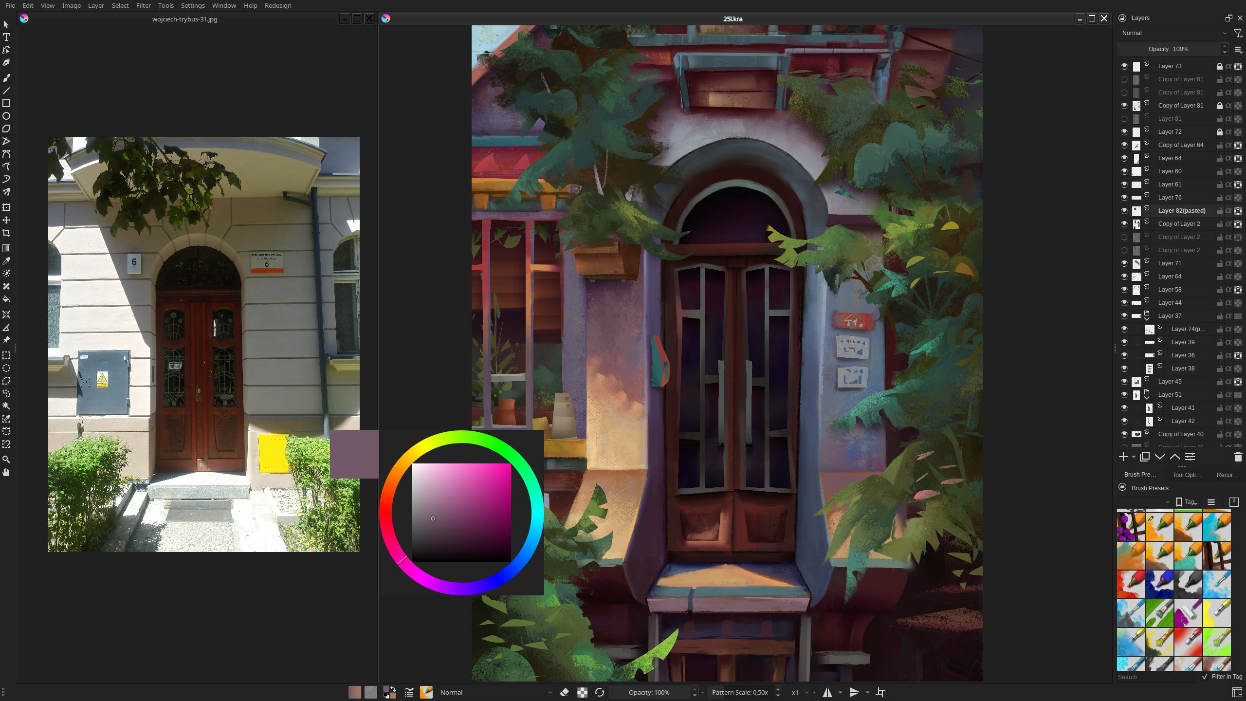
UI Redesign with my dark theme and new krita 5 interface looks georgious to me.
From the dockers I mainly use layers that take the most of the right column, while all the rarer ones are held together at the bottom.
I centered and moved the topbar to the bottom, as for me it’s easier to reach this way.
The true power is not visible though, as it relies on shortcuts - I have a whole custom scheme, with color selector, alpha and layer stack toggles, as well as custom addon tool shortcuts - it allows to switch between the freehand brush and a specific tool with a short press of a single button, as well as temporarily toggle the tool with long press.
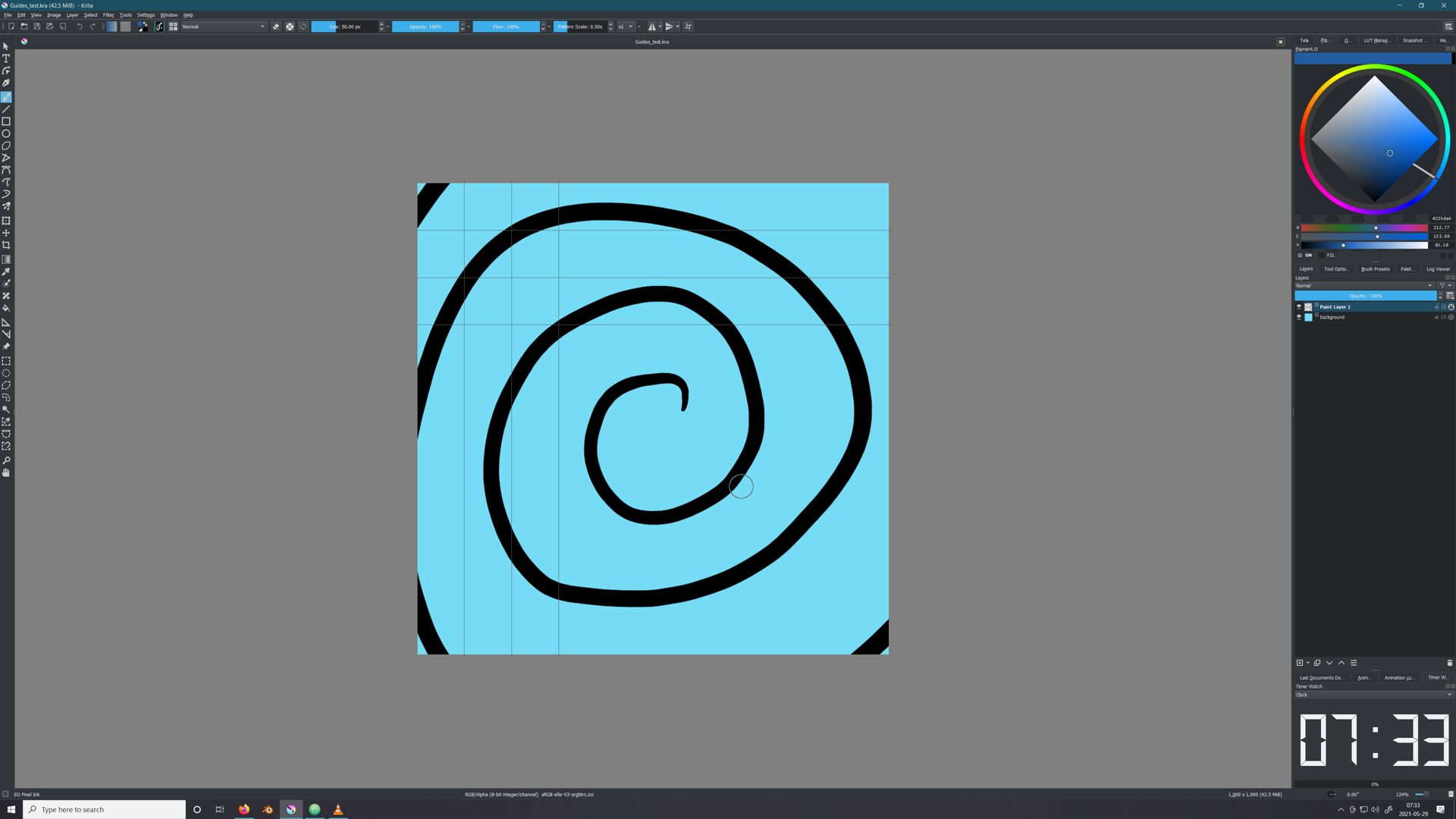
I think that’s the stop watch, not an actual clock since most people have a clock on their task bar anyway. It’s useful when you want to know the time you worked on a piece and still ticks even when you do nothing but staring at the canvas, unlike the build in timer you see under document info which only counts the total editing time. Useful if you bill by the hour.