I think I need some feedback. Color theory is tough

I’m feeling a bit lost right now

I’m drawing an illustration inspired by my country’s culture and history, featuring an indigenous warrior named Guaicapuro. I really want the sky to reflect the national flag, but every time I try (I’m probably on my tenth attempt, hahaha), the warrior or the background ends up looking really bad color-wise. It’s preventing me from adding more details or even finishing the illustration.

5 Likes

I’m trying to define the tones, but I’m having a really hard time. I’ve looked for references, but none of them are quite like what I’d like to do: a tricolor sky. I’m questioning myself a lot and I haven’t had any success yet.

The only thing left for me to do is to look for resources and see if that helps me define the tones for this piece. :smiling_face_with_tear:

1 Like

Color theory is tough. References will be helpful.

Here is a link if it will help…
Color Theory Article - MuddyColors.com

The majority of color problems that come up for me, with my photos as well as my drawings, is being/getting confused about where the light is coming from and how much light it is. In this case, are we looking at sunset, late afternoon, noon, etc? Is it going to be diffuse lighting, such as through light cloud cover, or will it be a clear sky with a sharper direct lighting able to brighten more lively colors and sharper shadows?

This leads to other things like color temperature/white balance, which affects an overall hue of the cast light. Setting sun light or fire light casts warmer light and fluorescent lights cast a more blue/cool light.

In this case, like you say, it seems more about the tone, which is more about how “gray” a color is. How much light is reaching these areas? To offset shadow/tone, you add light/tint.

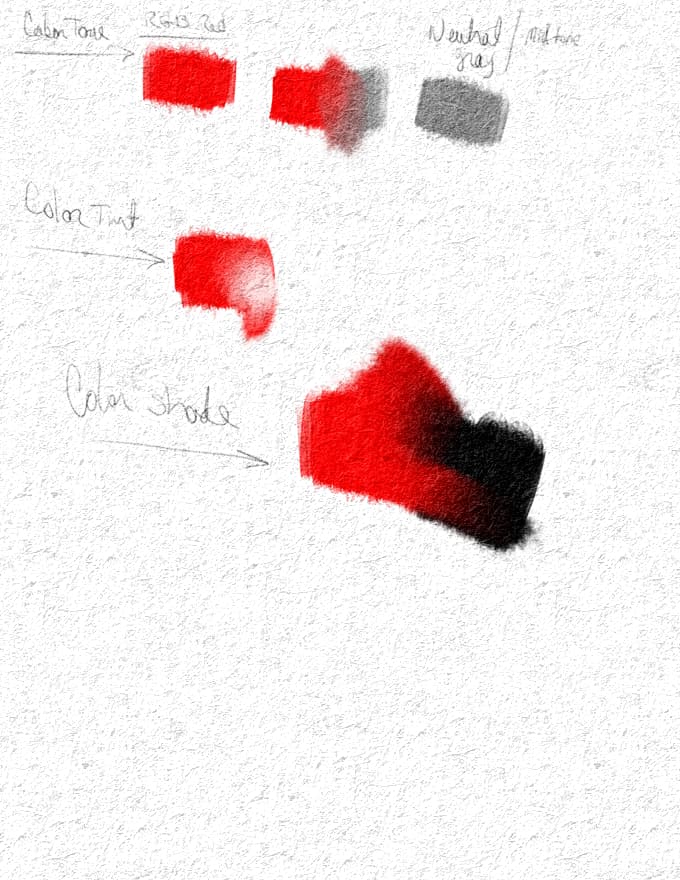
Say you have RGB Red (255, 0, 0) picked and painted on your canvas.
Creating tint is adding white to the mix, lightening the color.
Creating shade is adding black to the mix darkening the color.
Creating tone is adding neutral gray (RGB 125, 125, 125), muting the color

The more you add the more drastic the effect.

Another way to consider:
Mixing primary colors, makes the complimentary colors.
Mixing complimentary colors, makes gray.
If everything is gray, there isn’t going to be much contrast. Think TV contrast, right? Test the setting on your monitor and set the contrast way down. Everything gets real gray? Same thing in color theory.

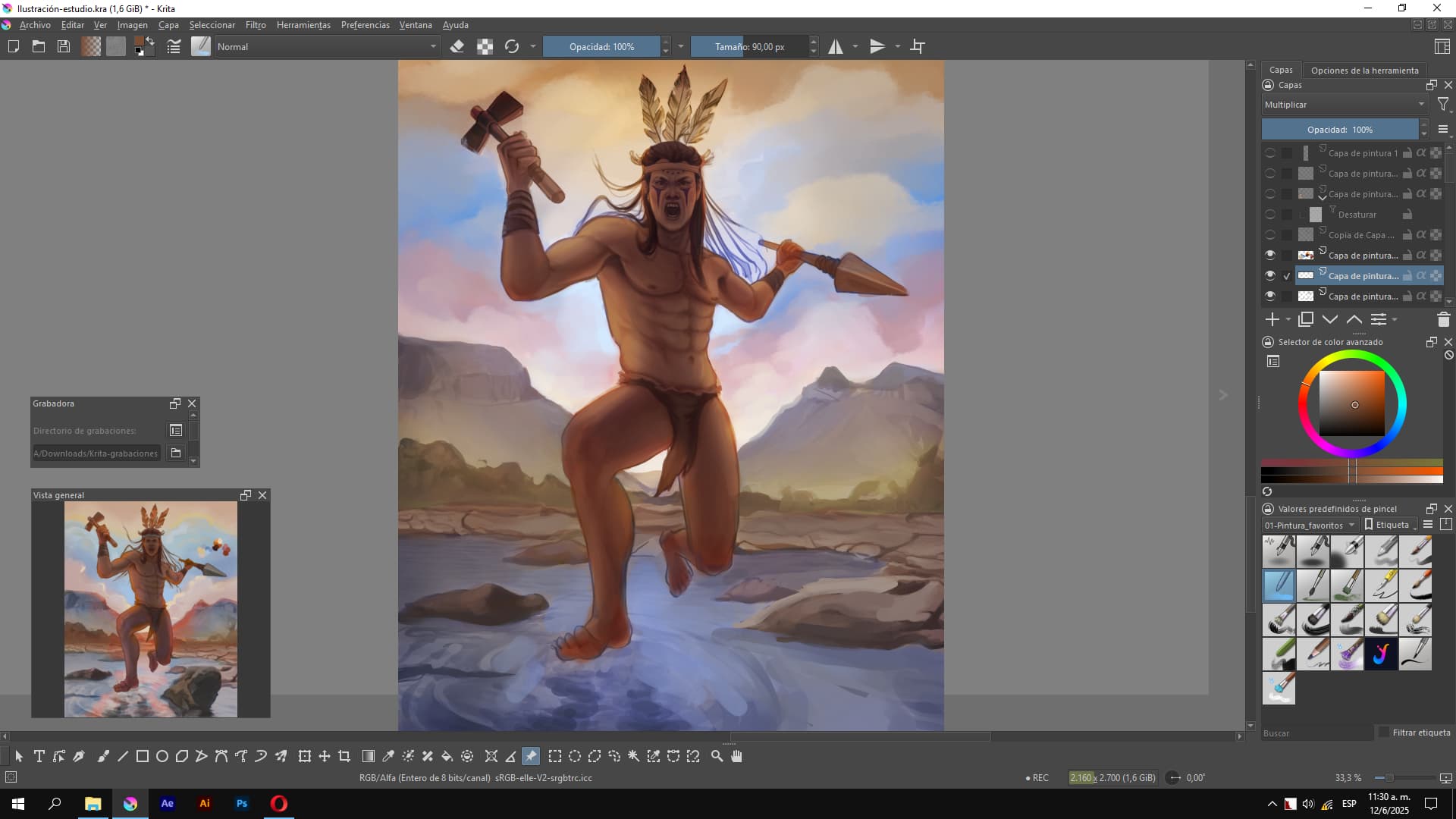
Yet another way, is to figure which of the tools built in might also help you achieve these effects easier? I notice you have many layers, layer blending modes such as lighten/darken, multiply, add, subtract will do much of this as well. I don’t understand all of them my self as I dont always use them, but I am also just getting started (more or less) after many years of not being able to art very much.

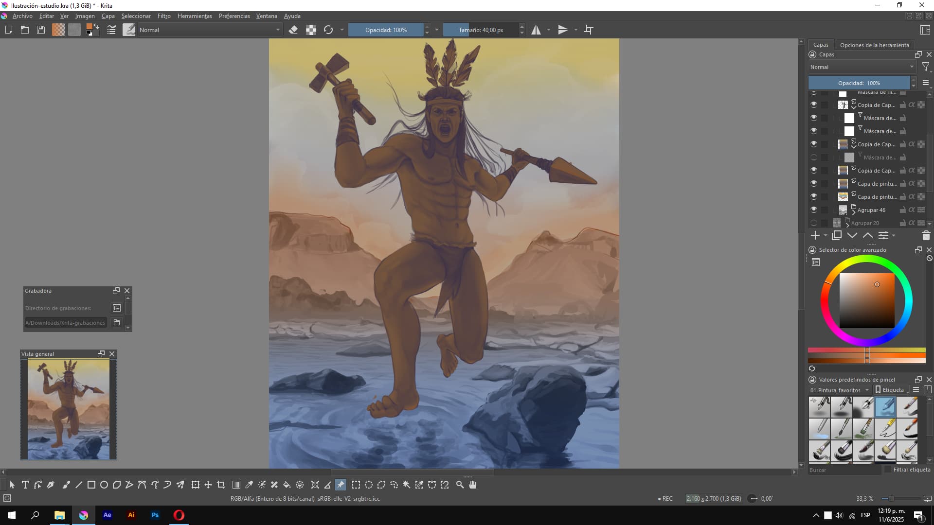
For this example, if i may, from the shadow of the warrior we see the light should be directly behind the warrior. The rock to the left and the cliff in the background on the left, seem to tell it differently. Thats the same thing I catch myself doing now and then in my own drawings.

My first overall impression here is evening/setting sun light, perhaps behind a cliff set or mountain or something so it would be less light and so a darker overall tone or being in a shadow area.

For the clouds, even though it’s background, same thing applies. Where is the light coming from and how strong is it? If the sky is more yellowish (because of the color temperature and thats where the sun is, the clouds may not seem as white (from the camera, because we’d be seeing the shadow side) which could allow for a more blended variety of yellows to oranges blending the scene with more detail, which is lost from the grayscale to the color in this case.

At least, on the monitor I am using at the moment. Different monitors can have different setups, so that may also affect how some will see this.

So muting the foreground isn’t very common, but I could see it if you intend to highlight the focus on the tricolor sky in the background, or if your looking for a more contrast-y brighter/vivid colors, skip the gray and mix colors/make your own pallet with a range from white-(color) to black-(color) for each color you want in the canvas so you have a range of value/tone that you can work through as you do your lighting pass.

When I mix my own, I can control the tone with more intention. Then you can blend the edge/areas together if you need a more seemless look. Of course, I just used RGB red as an easy to see example any hue will do the same thing. The choice really comes down to how dark to you want the shadows and how light do you want the highlights and how much in between the two. The more range you want to use the more realistic you can be in the color shading

Hope that helps. Good luck.
HL

2 Likes

You have no idea how grateful I am for your advice and recommendations. I was almost resigned to no one commenting, and your questions made me re-evaluate so many things. I was definitely completely ignoring the rock, so that’s one of the things I need to fix. Before your comment, I was trying to put my ideas in order again, so this is what I managed to create, more or less. I still feel like the colors are disorganized, and the orange (sort of red) would be the primary color and blue/purple the complementary, but I’m not where I was at the beginning. The sky should be tricolor, and I was thinking of putting the light behind the indigenous figure.

This is how it was before (Yes, a disaster, hahaha):

Now after:

With your advice, I’ll surely change some things, like the rock’s lighting, and maybe lower the intensity of the orange.

Thank you so much, I really appreciate it. Best regards, @Hawklin < 3

2 Likes

Good evening, @yartydesign.

I popped in at lunch but didn’t have time to respond.

I am very glad this was helpful. I see the difference in the lighting and the detail in the blue band of clouds shows much better; but I think I agree about the colors. This is where references may come in handy. References are not necessarily there to copy, of course, but to see how various shapes and shadows and lights play in different ways to help you “see” your own image and how it comes together. So what type of landscape is common where this takes place? Snag some free pix or look up some sunsets (or different times of day) for ideas about how clouds on the horizon might play out for you. you can still have the bands like you do but it may give you some more ideas about how to get the rest of the way there.

This may also help a bit as well, there are a number of links where artists share some of their tips on how to color gray scale. They do different things, but here’s one for an example.

Art Rocket Article - Marco Bucci

I find myself doing something similar, at least in a basic way. There is an example in this link below where I use a canvas layer for texture like canvas or paper depending on what I’m doing. then a pencil layer where the grayscale goes. Then a paint layer. When it comes to the paint layer, I simply pick one color and use that for that object. With the blending layers, you can look for the type of effect you might need, like a multiply, which darkens colors where the grayscale is at. I like the grain merge in my case as it blends the canvas with the pencil layer and that is also set to grain merge to the paint layer for a kinda of old timey printed illustration dithering kinda of thing. And its still a multiply function so it darkens the color as the shading gets heavier in the pencil layer.

Of course, there are many great examples in this link from the other artists that show case different takes on lighting and tone/value.

Krita - April Monthly Challenge

Of course, Simply mixing colors will also get you there and its good practice to remember or learn primary colors and the color wheel. Yellow and blue make green. And what shade of green? depends on the percentage of yellow and blue.

Anyway, I’m off to my next project. I look forward to seeing the result when it’s ready.

Good luck
HL

2 Likes

I’m so grateful for your advice and the links you shared! You’ve really helped me with this color process. I’m still working on the illustration but might finish it soon. I’ve looked at a lot of references, especially for the sky. It probably won’t be a realistic sky, though, because I need it to be yellow, blue, and red in that order, and that’s not typical for a sky, haha

I’ll be sharing my process here in case it helps you or anyone else who reads this. (I’m using blending modes like crazy, hahaha!)

Thanks again, @Hawklin ! I hope your projects are going great!

It probably won’t help much for this stage of the artwork, but maybe an idea for future works would be to let go of realism. When I read about the goals you tried to achieve, I had to think of this work of art: The Apotheosis of the Slavs, 1925 - Alphonse Mucha - WikiArt.org

As you see, there is also similar colours used, but the artist lets go of realism, using a limited colour palette and dark and light planes, even glow around the scene to emphasise the message. The symbolism movement was sort of opposed to realism.

That said, I like your current art as well - it just feels like you tried it the hard way. :wink:

1 Like

Wow, you really caught me off guard! Thank you so much for commenting. That reference you shared is beautiful; I’ve already saved it. I wasn’t familiar with that artist.

A close friend of mine, who was very passionate about art, always said that to make something truly unique and original, you first have to study and master the fundamentals of realism, then gradually move beyond the conventional, like a Picasso.

Honestly, I’ve faced a lot of challenges in illustration because I’ve learned everything online or by watching other artists.

Thanks again, @TaleOfACat I truly appreciate it! <3

1 Like

These are all the references I’ve been using. The hardest part was defining the character’s anatomy and handling the tones. I believe that if you want to illustrate more comfortably and efficiently, it’s important to do many studies to keep your knowledge fresh, and to divide your study into simple, intermediate practices before creating a more complete illustration.

I hope to finish it as soon as possible.

P.S. The program I’m using to view references is Pureref.